What’s Under Your Feet? Find Out With This Tool

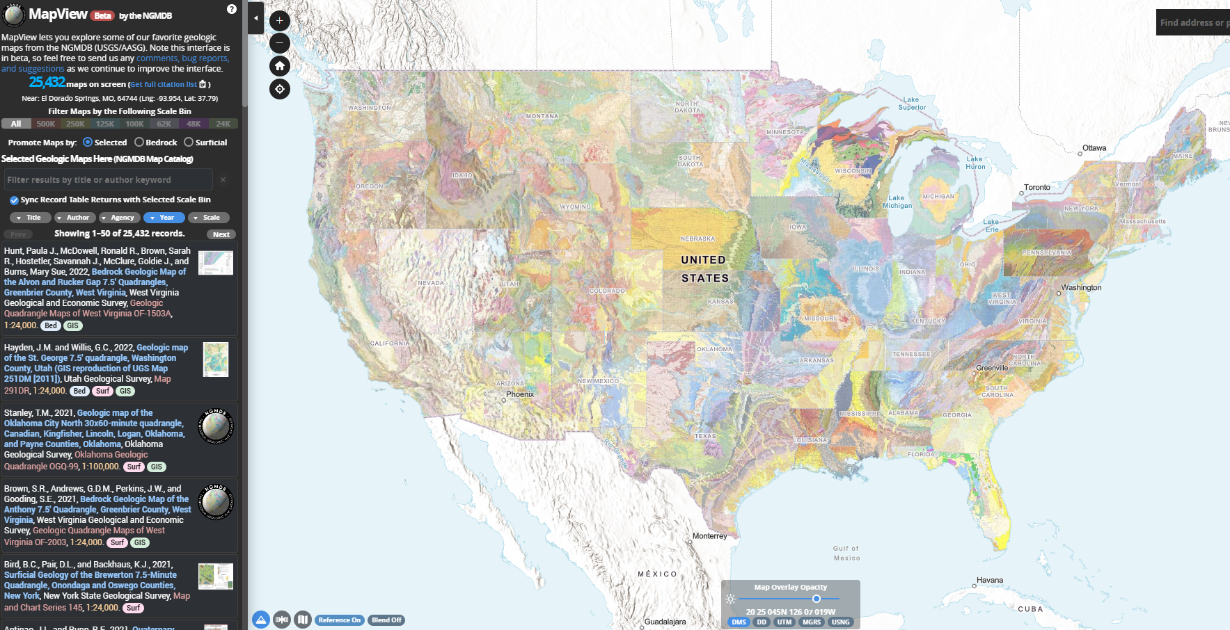
The National Geologic Map Database (NGMDB) is managed by the US Geological Survey (USGS) and Association of American State Geologists (AASG). They recently released MapView beta, which combines over 25,000 regional, state, and local geologic maps into one data viewer. Although there are other interactive geologic maps, this one is among the most detailed. As the user zooms in and out, a number in the upper left corner displays how many maps are in view, with citations. This tool is probably best used at state scales. Geologic features cross state lines, but different states are symbolized with different color scales.

Knowing the local geology is important because it has informed patterns of human development and socioeconomics more than people realize. The placement of America’s largest cities is largely due to local geology. Geology affects resource availability and ease of access or development, both of which have tremendous effects on human history. Geology provides a more detailed view of the landscape than meets the eye. And rocks are just plain cool!

HURRICANE TRACKER (REPLY TO ME)

HYDROSPHERE

This website is called the National Hurricane Center and Central Pacific Hurricane Center. This website works a bit like a news station. It’s purpose to is show what the oceans and the gulf looks like and if there is a hurricane or high winds going on in the water. The website lets you look 5 days into the future on what the weather looks like in the oceans. It predicts the wind speeds in the ocean and also the wave heights in the oceans. The site color codes the severity of the situation in the oceans. The brighter the color there is showing up, the greater the threat is. The website seems it would be most active from May 15 to November 30th because that’s when it says hurricane season is.

In class, we spent a lot of time going over hurricanes and weather patterns. This website gives great visuals of how hurricanes move in the ocean, and how we predict their movement. Although this website only shows the Atlantic and Pacific, it seems fair considering hurricanes don’t really hit anywhere else.

World’s Air Pollution: Real-time Air Quality Index

https://waqi.info/#/c/31.537/62.471/2.2z

This figure depicts the Air Quality Data in the Western Hemisphere. The Air Quality index is based on the measurements of particulate matter, Ozone, Nitrogen Dioxide, Sulfur Dioxide, and Carbon Monoxide emissions. These points are set up to monitor the PM2.5 and PM10 levels and all measurements are based on an hourly reading for more than 10,00 stations.

There are many factors that contribute to bad air quality but the two most common factors are related to ground-level ozone and particulate matter. Particulate matter contains smoke, dust, dirt, soot, and salt in the atmosphere. Factors that contribute to particulate matter include vehicles, factories, fires, and human-activity that releases particles into the atmosphere. Although ground-level ozone is not directly emitted into the air, this ozone forms when nitrogen oxide emissions react with other volatile organic compounds when introduced to heat and sunlight. These released emissions include pollutants from industrial facilities and electric utilities, vehicle exhaust, and chemical solvents. Once the air quality reaches the unhealthy range, the AQI recommends that people with compromised health should stay indoors while Hazardous conditions state that everyone should avoid outside.


NASA Interactive Climate Time Machine

This website, which is powered by the National Aeronautics and Space Administration, shows an interactive map that details how some of the key indicators of climate change have changed in Earth’s recent history. The webpage breaks down four different topics that can be used to visualize the effects of climate change. The four topics are sea ice, sea level, carbon dioxide and global temperature. Once a topic is selected, an interactive video is shown that details the shifts in these different topics over an extended period of time. For two of the topics, you have the ability to change what geographic region you view the data for.

Map of Life: Species Richness and Rarity Map

This website, the Map of Life (MOL.org), has provided an interactive map that shows species richness and species rarity across the world, showing data on the biosphere. It using a spread of colors to symbolize the different values, with purple being the least rich or rare, and red being the most. The map has three different screens: one for richness, one for average rarity, and one for total rarity. Additionally, you can click between a map view and a satellite imagery view. The map allows you to zoom in and out to see variances between regions at a large and small scale. The map also allows you to pick groups of organisms, with categories such as vertebrates, invertebrates, and plants. Within these categories are subcategory to get more specific.

Here is an image of the map feature:

URL: https://mol.org/patterns/richnessrarity?taxa=birds&indicator=sr

USGS Earthquake Map

The U.S. Geological Survey displays information relating to recent earthquake strikes around the world. The left side of the screen shows the recent earthquakes in the United States. It tells how many earthquakes have occurred in the map are over the last 24 hours. If you zoom out to the entire world, the panel adjusts to include earthquakes all over the world. On the map, each earthquake is represented by a circle with varying sizes and colors. The size of the circle represents the magnitude of the earthquake and the color represents the relative age of the earthquake. The plate boundaries are are outlined in red. Clicking on a specific earthquake takes you to another page that offers an interactive map, a regional information map, a seismicity map, and a shake map. Also, people can write up a felt report of their earthquake experience. Additionally, under settings tab, one can narrow or widen the earthquake parameters by size, time, and place.

This website is helpful for understanding where recent earthquakes struck and specific information about each earthquake. Earthquake map visualization helps to reveal patterns in earthquake behavior and helps educate others on the overall impact of earthquakes.

https://earthquake.usgs.gov/earthquakes/map/

Volcano Discovery


Volcano Discovery is a website that provides information on all things related to the lithosphere. It is run by a team of geologists based in Europe, Indonesia and Hawaii who work closely with international scientists from volcanological institutes and observatories all over the world. Together they have written a book ‘Volcano Discoveries: A Photographic Journey Around the World’, which they use to promote the various tours to active volcanoes that they offer on Volcano Discovery. Tour locations include Stromboli and Mnt. Etna in Sicily. 

It has an entire area dedicated to educating people on the causes and effects of earthquakes and volcanoes. They have a forum for the public to upload their own videos and photos of earthquakes or volcanoes that they have come across.  A key feature of the site is its Interactive Global Map of Active Volcanoes and recent Earthquakes. It also provides a breakdown of each eruption and quake.

Site: https://www.volcanodiscovery.com/home.html

Map: https://earthquakes.volcanodiscovery.com/


Polar Bears International

Polar Bears International is a website set up to help save the habitat of the polar bear, the sea ice that they call home. This includes the Arctic, Alaska, Russia, Greenland and Norway. The website’s method of doing this is focusing on climate change. They have many different suggestions on how to do this for people in many different positions; they look at how students and teachers can be leaders in the community for more green living. They look at what scientists, corporations and even small businesses can do to improve their greenhouse gas emissions.The website also has information on temperature trends, how the arctic is changing more specifically in terms of ice flows and the ecosystems overall. They make sure it is clear that there is no real debate on climate change anymore either, stating the common statistic that ninety seven percent of climate scientists agree that climate change is occurring and that it has Anthropogenic causes. This website is a great resource for information relating to climate on the arctic, and more specifically polar bears, as well as what to do to get involved and help be part of the solution.

https://polarbearsinternational.org/

GEOLOUNGE

GEOLOUNGE is an informational and interesting website. It has information about physical geography, human geography, maps, and more. Under the physical geography tab, they have tabs for biogeography and climatology. After learning about both biogeography and climatology in our class, I was intrigued by the different articles that I found. I wanted to share this article, “These Wolves in Minnesota are Very Very Territorial” that is posted on their site because it relates to our class. The article discusses how researches have used GPA collars to track the movements of 7 wolves at Voyageurs National Park in Minnesota. The data that was collected on the wolves locations is being used to understand pack boundaries and for the Project’s predation research. The screenshots I have included below show the travel paths for each of the wolves. The travel paths show how each pack adheres to territories with little overlap with other packs in the area. I thought GPS tracking of the wolves is an interesting concept and could be used to track more animals and possibly provide insights about animals travel habits which could be used to make better protected conservation areas. 

After reading this article, I clicked on a related link: “Using Remote Sensing for Mapping and Counting Animals.” This took me to GISLOUNGE, which is also another interesting and informational site, related to GOELOUNGE. 

The Living Land

ArcGIS Online has a public database of professional Storymaps on a variety of environmental and global issues. You can explore one series of storymaps titled “The Living Land,” on the distribution of human activities on the surface of the Earth. Chapter Two of this resource takes a special look at the distribution and impact of agriculture, animal husbandry, and farm land on the Earth.

Cropland mapThis storymap takes the user through the distribution as percentage of land, by regions of the world, density, and areas of highest production. It also describes how crops change the land and how each of humanities major crops (corn soy, rice, etc.) and major livestock (cows, chickens, goats, etc.) are grown around the world using aerial imagery. This storymap relies heavily on maps, as it should, to demonstrate these environmental and social issues. This includes simplified dot representation of the predominant crop in one area, to spinning globes with particular crops highlighted. This web application is a useful tool to demonstrate spatial distributions in a way that is easy to understand. It takes you through a whole system of human behavior around the world and its impacts on land (impact on pedosphere) depending on different practices.globe