Gapminder (Tools of the Geographer)

Gapminder is a helpful data-visualization website that enables you to analyze data trends spatially and temporally.

You can visualize a range of country data using a map, trend lines, or a ranking bar graph. For each option, you can watch an animation of change over time. The available data is broken down into categories such as economy, energy, environment, population, and society.

There are a many datasets embedded in the website that are very relevant to our discussions in class. One is water withdrawal (you can see it if you click on the map header and select environment > water > water withdrawal/person. I chose to compare South African and the United States over time (you can do this by pressing the play button on the bottom left corner of the data viewer). I was surprised to see how dramatically the USA has reduced its water consumption over time. This tool also helped me visualize the large gap between US water consumption and SA water consumption.

NASA’s Scientific Visualization Studio

NASA’s Scientific Visualization Studio (SVS) showcases a wide variety of NASA programs using striking images, animations, videos, and other visuals. By synthesizing complex scientific research and data with visual elements, the Scientific Visualization Studio creates a largely accessible platform to promote education and a broader scientific understanding of earth and space processes. The website has curated various galleries tied to specific NASA projects. These collections range from Air Quality to Astrophysics to Carbon and Climate projects. One of the featured collections is of ICESat-2, or the Ice, Cloud, and land Elevation Satellite-2, which launched on September 15th, 2018. ICESat-2 is NASA’s most advanced laser satellite instrument (ATLAS) and will be used to monitor changes in height, depth, and mass of ice sheets and glaciers with extreme levels of precision to better understand and predict sea-level rise. ICESat-2 will also provide essential information about forest vegetation, ocean surfaces, and urbanization, among other applications. To explain what the ICESat-2 project is hoping to accomplish and how they have gotten to this point, the SVS with Goddard Media Studios has produced many videos that explore the importance of ice sheets, how the laster altimeter technology works, and even documenting the 470-mile research expedition in Antarctica that accompanied this project. This website, with its galleries of scientific information and mapping related to climate change, glacial melt and sea level rise, hurricane and storm impacts, stratospheric ozone depletion, and forest fire intensity and prevalence are all topics we have discussed in our class. Additionally, projects like ICESat-2 demonstrate how different remote sensing technologies are being implemented for environmental and geographic research purposes.

Lightning Maps.org

This website tracks present lightning strikes and includes a database of past lightning, using colored dots on a world map to show the locations of strikes. The map on the homepage updates almost in real-time, with a delay of only a second or two, allowing you to see lightning as it strikes in Europe, Oceania, or North America. You can also use the website to see past lightning strikes in each of the regions, and you can view this information either as still images or in animations that show the lightning throughout a given day. In addition to documenting the lightning strikes themselves, the website also keeps track of the density of strikes, or how many strikes are occurring in close proximity to each other, and information on the the number of strikes that have occurred within any month in 2011 or later and for each full year in 2011 or later is also available.

The content of this website relates to our course in that it allows for a visual representation of storm systems through the electrical charges they produce. For example, when I looked at the real-time animation, the enormous number of lightning strikes occurring in the Gulf of Mexico indicated there was probably a large storm or storm system in the Gulf at that time. Similar evidence suggested to me there probably was a storm occurring in far Southeastern Australia. This website, examined over a period of time, would allow for an increased understanding of the trends affecting the development of storms likely to produce lightning. Such storms may be from larger systems, such as midlatitude cyclones, or they could be the result of isolated convection patterns in areas such as beaches, cities, and cropland. Nevertheless, the representation of lightning overlaid on a map allows for an understanding of where lightning-producing events tend to occur, and in which locations larger storm systems are likely to cause lightning and in which locations it is more likely that an isolated event is the cause. Additionally, the graphs available on lightning patterns over a period of months or years provide the opportunity to observe any trends in lightning strikes that may take place over time and to determine in which parts of the year lightning tends to strike the most.

The Royal Geographical Society: Everything Geography for the UK

The Royal Geographic Society website is a hub for everything geography for those of all ages in the UK. There are multiple components to the website that provide access to the organization’s mission, resources for learning about geography, a run down of geography programs at universities around the UK, resources for professionals, research databases, access to fieldwork projects, and an in the news tab. The in the news tab was the most interesting to me because not only does it relate to our in class assignments, but I think this is a valuable resource for those in the UK that are interested in Geography because there are several mentions of local geography exhibitions as well as giving people access to natural phenomena. Additionally, I think that the section on furthering your geography education is useful and convenient because it provides students with resources for A-levels and GCSEs (British pre-university requirements). Not only is this website very resourceful, it is also an website that welcomes people to further their knowledge of geography in an interesting and relevant way. https://www.rgs.org/

We Love an Endogenic Mystery

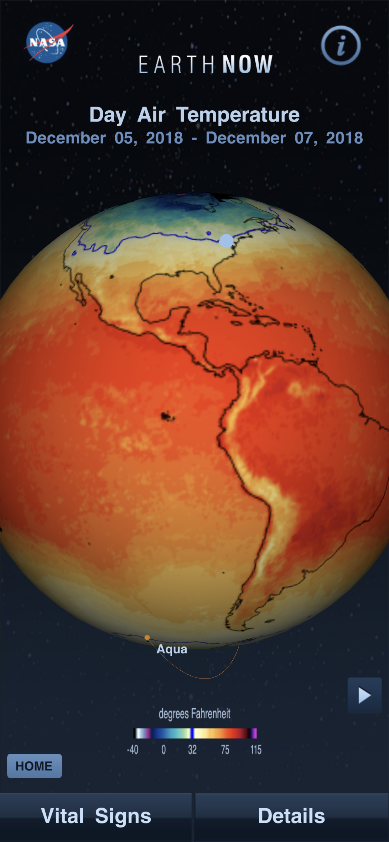
Resource: earthquake.usgs.gov

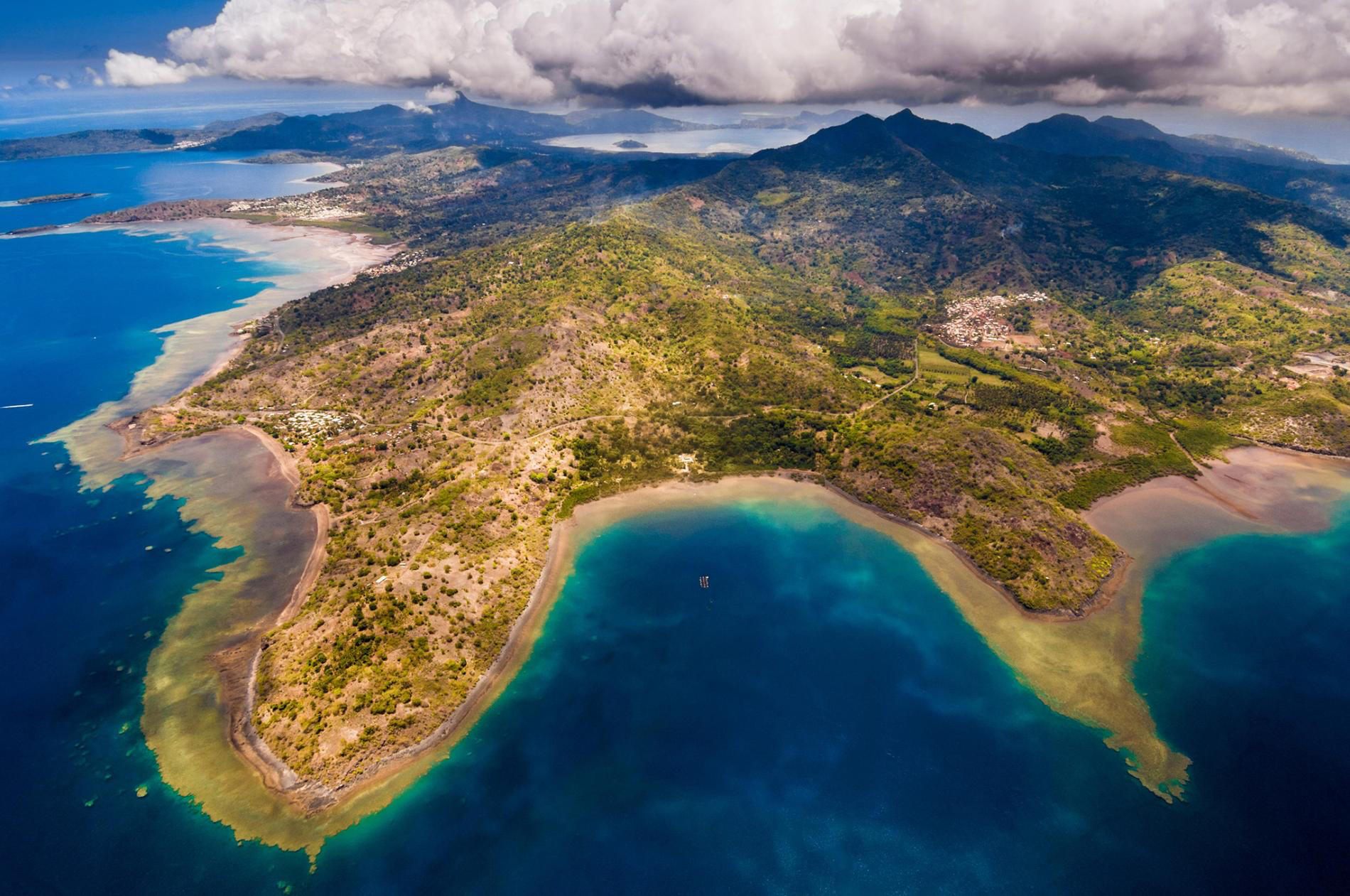
I always find it so fascinating when stories appear in the news about things science doesn’t quite know how to explain. Just over a week ago, Maya Wei-Haas wrote one such. story for National Geographic. Titled, “Strange earthquake waves rippled around the world, and nobody knows why,” the article did what it could to explain what happened just before 9:30 UT on November 11. The story gets off to an eery start, it reads like the beginning of Pacific Rim. Seismic waves started near Mayotte, an island in the Mozambique Channel, and rang sensors across the world. The seismic waves were felt from Chile to Canada. And they didn’t just have a quick  impact, Maya Wei-Haas writes, “they rang for 20 minutes” (National Geographic).

An aerial view of Mayotte’s South Island. Photograph by Hemis/Alamy Stock Photo.

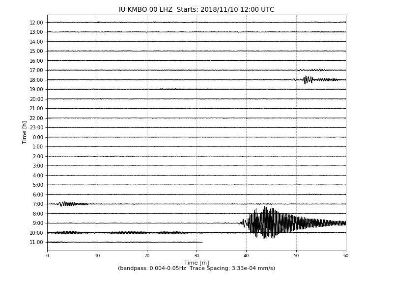
A Twitter user, @matarikipax, did some sleuthing, noting the peculiarity of the worldwide seismic wave pattern. Scientists were openly confused. There was no earthquake near Mayotte, just a series of S-waves (slow waves). S-waves move side to side, making a zig zag formation with high frequency waves. Mayotte has been dealing with earthquakes since May 2017, the largest reaching a 5.8 magnitude in May of 2018. The accompanying seismic waves made sense, as they were triggered by earthquakes, but the S-waves on November 11 were different.

Where do these data get discovered by citizen scientists like shadowy Twitter users? @mataripax turned to earthquake.usgs.gov for information, a site which hosts the United States Geological Survey Earthquakes Hazards Program. On the site, you can look at interactive maps of the latest earthquakes, report “Did You Feel It?” information, and generate charts like the one @mataripax found below.

“This is a most odd and unusual seismic signal.” Screenshot taken by Twitter user @matarikipax on November 11, 2018.

Websites like these are important, as it helps individuals remain informed about seismic and possibly destructive activity that might be happening in their own backyards. Did you know that Puerto Rico has been experiencing earthquakes this month? Just today, an earthquake occurred off the shore of Puerto Rico. While the earthquake was too far offshore to have caused any destruction, I have no doubt that had this happened off the coast of South Carolina that I would have received a push notification from my news app. Staying aware of natural seismological shifts in the lithosphere is crucial to preparedness in the future — it was thanks to @matarikipax’s tweets going viral that more individuals heard about Mayotte.

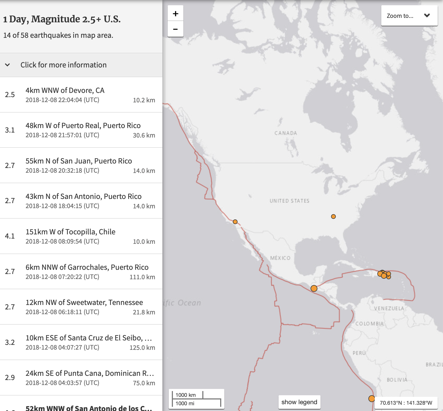
Map of most recent earthquakes from https://earthquake.usgs.gov/earthquakes/map/

The French Geological Survey (BRGM) believes that a new center for volcanic activity might be developing offshore Mayotte. It’s an unstudied area, full of secrets in way. Mayotte is in the fracture zone where Gondwana broke up, an area still shifting. Since July, Mayotte has slid over “2.4 inches to the east and 1.2 inches to the south” (National Geographic). While there is no clear indication why S-waves were felt round the world (scientists are still ruminating over the possibility of magma chambers collapsing or deflating), Mayotte seems to be the centerpiece of future endogenic studies. BRGM is planning to do further surveys to find more about the region and its submarine eruptions, ideally without interference of the Kaiju.

As BRGM conducts its surveys, visiting the maps on earthquake.usgs.gov gives you a chance to observe the secret endogenic mysteries around the world, and on America’s own turf. There was an earthquake 12km northwest and 21.8km underneath Sweetwater, Tennessee today. The lithosphere is full of fascinating surprises, many with answers. Remaining on top of earthquakes requires the dedication of citizen scientists.

Biosphere- Movebank

Movebank is an online database that tracks the movement of all kinds of animals around the world. The website includes maps of the world, and the option to choose which animals to study.  Researchers can manage, share, protect, and analyze data. Users can choose whether or not to make their data available to the public. Movebank encourages collaborations between researchers, conservation groups, and government to re-use animal tracking data for a variety of purposes. This kind of platform is similar to the iNaturalist app that we utilized for the Huguenot Flatwater lab, where we shared data and information with other app users. This website is considered to be related to the biosphere because of the focus on animal tracking.

NASA’s App, Earth Now

Looking online at NASA’s website, I saw that they released an app called Earth Now. I was interested and downloaded the app (its free). Earth Now shows you recent global climate data from Earth Science satellites. You can choose to see different elements including surface air temperature, carbon dioxide, carbon monoxide, ozone, water vapor, and gravity and sea level variations. The 3D model of Earth will show a color-coded visualization of the relative strength or weakness of an environmental condition. The app tells you the latest events going on around the world as well. It is real time and will show the most up to date data that it has. You can also go back in time to see how the environmental conditions have changed. This is a really great app because it allows you to stay up to date by checking on your phone (especially when everyone seems to be on their phones these days). This is app is very beneficial because it is an easy way for people to stay up to date and informed about the current environmental conditions of our Earth. 

I have posted screenshots from my phone of Sea Level Variation and Day Air Temperature. The third photo shows the Earth when you open the app, and it has its latest event: Phytoplankton bloom off South Africa. It also provides further information about each environmental condition and other options for viewing the data.

Tap Water Database

The Environmental Working Group (EWG) has developed an online tool called “EWG Tap Water Database” to help Americans easily access information about their drinking water. The website allows you to put in your zip code to find the surrounding tap water systems in your area. When you click on your tap water system, you can find out information such as the amount of contaminations detected above health guidelines, what the contaminants are, and how these contaminants can affect your health.

This website is beneficial because many people may not know about the possibility of contaminants in their drinking water. The database provides not only information about the health effects that can occur from drinking the water, but also compares this data on a national scale by providing EPA guidelines. This website relates to our hydrosphere unit as well as climate change because as pollutants continue to plague our waters it is important to know whether the water we are drinking is truly safe. As we have seen in presentations given in our class, water quality is an issue that is plaguing not only the U.S. but the entire world. Websites that provide useful information such as this would be beneficial to monitoring these contamination levels and promoting awareness for those who may not know about water contamination.

National Geographic Biosphere

For those interested in learning more about the biosphere, National Geographic’s page on the Biosphere provides a plethora of useful information. This could be a tool utilized by geographers as a reference, particularly for those who either are just beginning In their field or those who are interested in becoming geographers. The page begins by defining the biosphere, which is made up of the parts of earth where life exists. The webpage is broken up into three parts. It begins with an introduction, followed by information regarding the origin of the biosphere, and concluding with information regarding the biosphere reserves. Another useful tool the site provides is a vocabulary tab, which defines various key words which are used throughout page.


NASA – State of the Ocean

NASA has created an online tool called “State of the Ocean”. This tool displays an interactive map of the world’s oceans populated with data collected from satellites. Users can select which data is being presented on the map to learn about variables like temperature, currents, and salinity. For variables with years of data collection, users can select specific date ranges to view change in one variable in a particular time frame. For example, if I wanted to observe changes in surface temperature off the coast of Vietnam between 2012 and 2014, I could easily do so and even create an animation so the map will visually change. This tool is useful for oceanographers who use this data and it’s fun to use.