Real-Time Interactive Earthquake Map

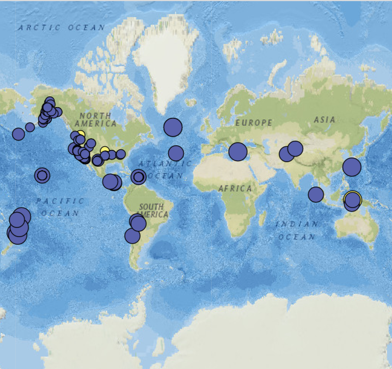
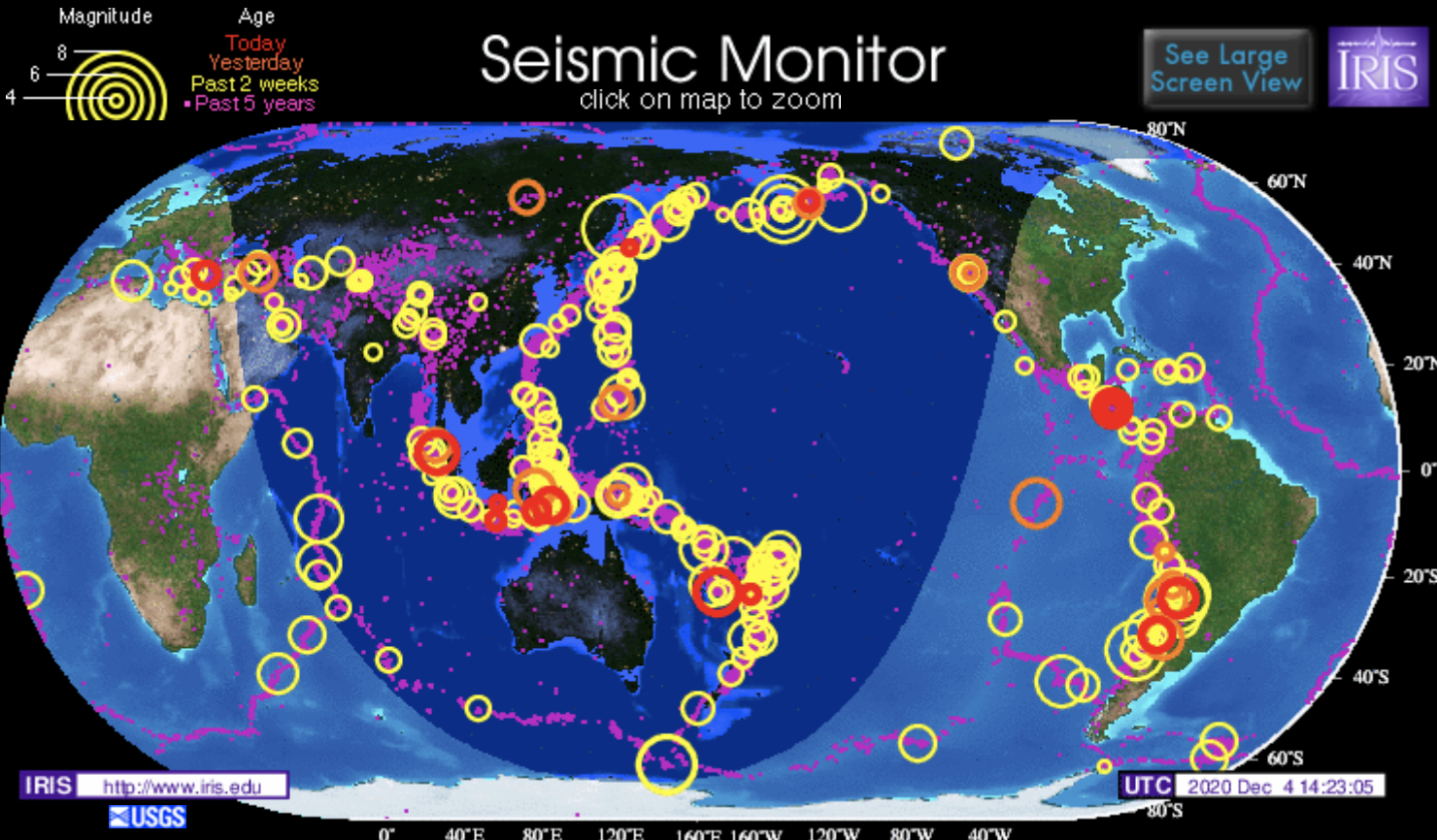
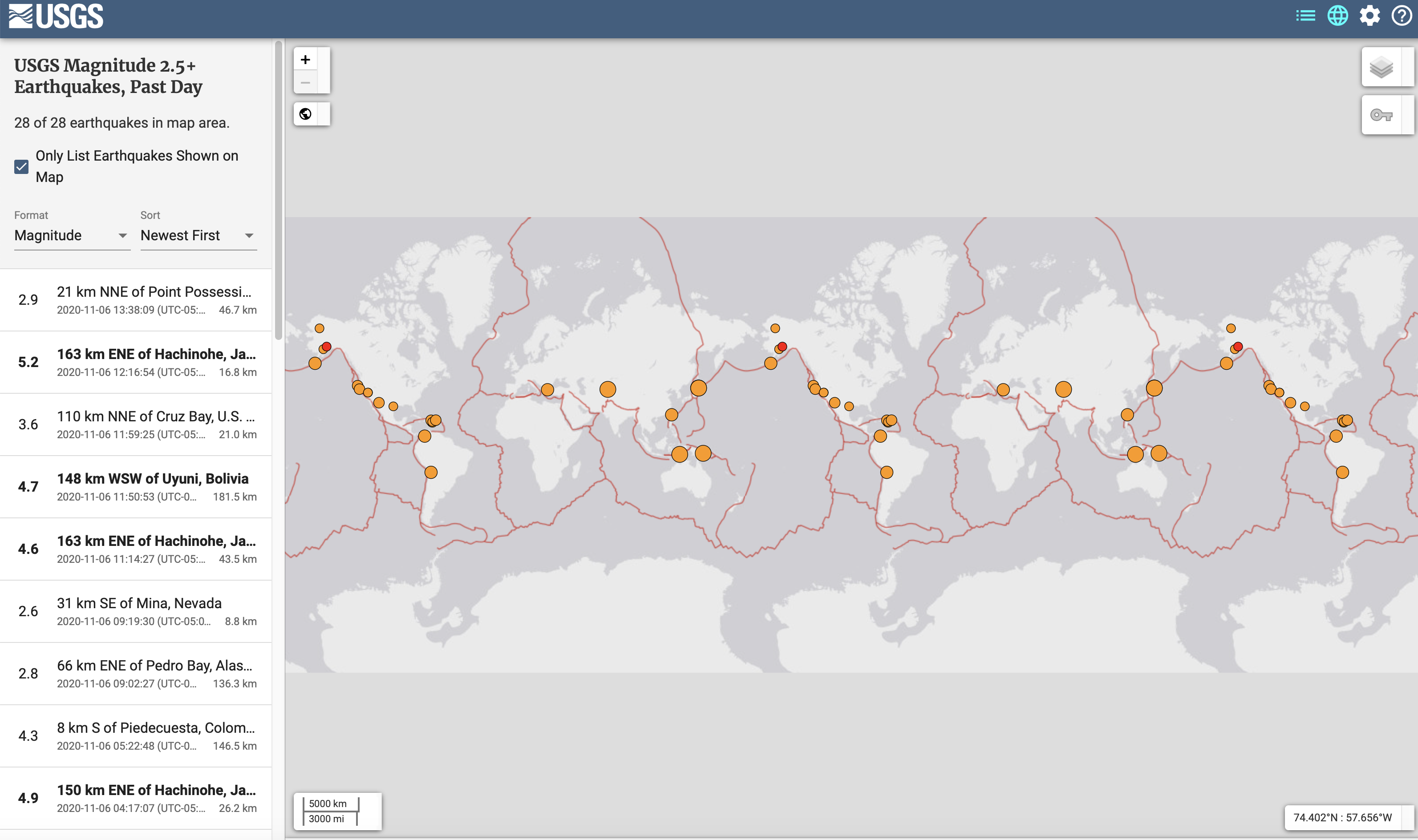
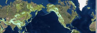
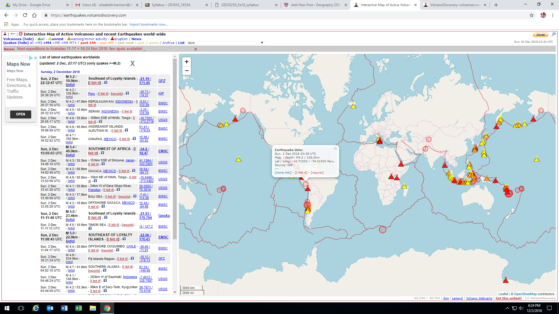
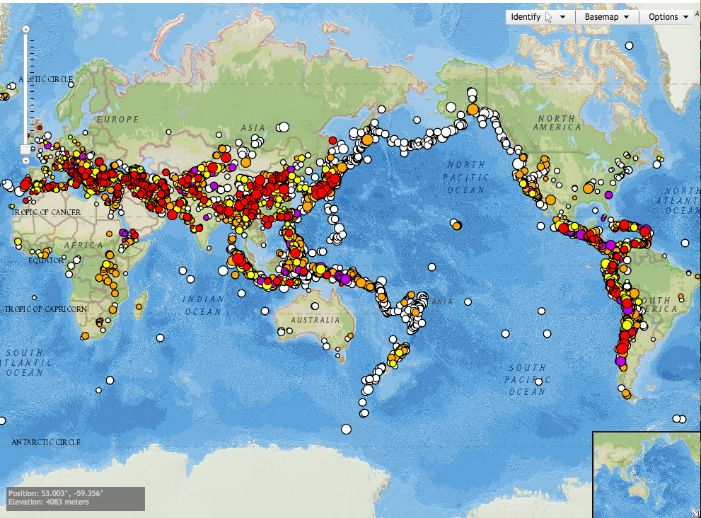
UC Berkeley’s Seismology Lab website both collects and provides information on earthquakes and solid earth processes. One of my favorite features on this website is an interactive earthquake map that shows real time data for seismic activity around the world. The interactive map component allows users to see the location, date, time, and magnitude of earthquakes that have occurred up to a week prior. Users can select specific points, change the range of data, and observe patterns of seismic activity on a global, national, regional, and even local scales. The website also connects users to resources for reporting information about earthquakes they’ve experienced so the information can be used to create maps of felt experiences and damages caused by seismic activity. Furthermore, the website provides resources on commonly asked questions and concerns about earthquakes and connects users to resources for earthquake preparedness and safety.

This website is a great tool for education both in an academic setting and for the general public. In an academic setting, this could be used to educate students on patterns of seismic activity and how they are connected to tectonic movement, faults, and other geologic processes. It can also be used to educate residents on the risks of earthquakes near them and what to do in the event of an earthquake to remain safe. I also think this website and the information it provides could be a useful resource for city planners and architects to study and implement earthquake resistant infrastructure in locations prone to high seismic activity.

Earth History! (Zazi Halla – Fall 2022, Biosphere & Lithosphere)

Link

This website, https://dinosaurpictures.org/ancient-earth#35, shows the progression of Earth all the way back to 750 million years ago during the Cryogenian Period. It is an interactive tool because you can view whatdinosaurpictures.org/ancient-earth Earth looked like by changing the time frame (ex: select “what did Earth look like (x) years ago”. Most notably, this shows changes in the lithosphere because Pangea can be seen breaking apart due to tectonic plate movement. This website also connects directly to our lithosphere unit by illustrating places where isostatic rebound can be occurring. For example, students can change the time-scale and see how glaciers have been melting (a cause of isostatic rebound).

This website also connects to the biosphere unit, because there is an option to look at Earth based on what major species were present at the time. For example, you could look at when the first algae on Earth appeared or when the first land animals appeared. Students can try to infer how atmospheric changes influence biomes across Earth and subsequently provide habitable zones for different species over Earth’s history. Additional information is also provided on the diversity of species at the time. For example, when land animals appeared on Earth, it details that during this time “Insects diversify and fish develop sturdy fins, which eventually evolve into limbs”. Very cool stuff!!

Global Seismic Activity

This website maps seismic activity globally over the past five years. The site is created by the Incorporated Research Institutions for Seismology (IRIS). On the website, there is an interactive map of the globe that maps earthquake activity over the past five years as rings. The larger the ring the greater the magnitude was of the earthquake that occurred in that designated region. The earthquakes are also organized by how long ago they occurred, and color-coded in this way. In addition to the interactive map, the site also has several embedded links that lead to pages that give more information regarding the earthquakes that are mapped. For example, some of the pages that are linked are earthquake headlines, last 30 days earthquakes, special quakes, and plate tectonics.

This website is particularly interesting because this map very well visualizes the phenomenon that the vast majority of earthquakes occur on the borders of the tectonic plates. We spent a large portion of our class talking about plate tectonics, faults, and earthquakes and how they are all directly related to each other. I feel like this website does a great job of summarizing and visualizing this concept in a central place.

USGS Magnitude 2.5+ Earthquakes Maps

The resource that I found is a website that tracks earthquakes above a 2.5 magnitude on a map and provides information on them. The website updates as these earthquakes happen, so it is an important resource as it is always being updated. The website tells you the time, depth, magnitude, and exact coordinates (along with city) of where the earthquake hit. The map is of the whole continent and shows the plate boundary lines in red and the earthquakes as orange circles. The website is a great tool for scientists or any person to study more about where these earthquakes are occurring.

In class, we spent a lot of time talking about earthquakes and read in our textbook about the catastrophic ones. This website is a great tool that allows any person with a computer instant access to know the most important information about an earthquake. I do believe that while this is an amazing resource, it is not one that is predicting the coming earthquakes. As we learned in class, earthquakes are extremely hard to predict so that does not seem feasible. However, hopefully this website could eventually provide more information on the past earthquakes and provide warnings for one that are coming(if that is ever possible).

https://earthquake.usgs.gov/earthquakes/map/?extent=-89.58486,-653.90625&extent=89.57973,245.39063&listOnlyShown=true

New Online Tool Highlights Landslide Risk

USGS has recently released a new online tool that highlights landslide risks across the country. This interactive map provides centralized access to information about landslide occurrence, and can be used as a good starting point for the public, city and emergency planners, as well as researchers interested in landslides, to go to for information. This tool marks the first attempt of a federal agency to systematically catalog all of the landslide data across the country into one centralized location, and will be incredibly useful to all interested parties. Each landslide recorded on the map can be selected, and additional information about the event will be provided, including the date of the event, and notes regarding the extent and aftermath of each event. One clear potential benefit of the tool is to show more at-risk areas of landslides, so individuals can either avoid those areas or prepare restraining walls, or other measures, to minimize landslide damage.

Article link: https://www.usgs.gov/news/landslide-risks-highlighted-new-online-tool

The Global Mountain Explorer

The geography website I choose was created by the United States Geological Survey in 2017 and is called “The Global Mountain Explorer”. This relatively new tool shows a map of mountains on top of a satellite image background giving users the most detailed view of Earth’s mountains. This resource was developed in partnership with Esri, the Center for Development and Environment of the University of Bern (CDE), the Global Mountain Biodiversity Assessment (GMBA), and the Mountain Research Initiative (MRI). The work is part of a Group on Earth Observations (GEO) initiative called GEO GNOME, GEO’s Global Network for Observations and Information in Mountain Environments. This work specifically addresses the goal to accurately delineate mountain regions using best available data. It is intended to provide information on the global distribution of mountain ranges and a variety of mountain data with a resolution 16 times more detailed than previous mapping efforts. What makes this tool useful for physical geography is that it allows anyone with connection to the Internet to observe where mountains are, what their relative altitude is, whether they are scattered or continuous, covered in snow or snow-free, etc.

https://rmgsc.cr.usgs.gov/gme/gme.shtml

Earthquake in Alaska

Claudia Ajluni

In the News #3- Lithosphere

This website, Live Science, covers scientific discoveries from a broad range of fields. There are sections for technology, health, earth, animals, etc. so there is a little bit of something for everyone. I chose to look at recent news articles in the Planet Earth section, and found an interesting article from 11/30 about an Earthquake in Alaska. The earthquake was initially reported by the U.S. Geological Survey as having a 6.6 magnitude, but it was later updated to 7.0. The photos of the damage were astounding, and it relates directly to our previous studies about the lithosphere and the causes and consequences of earthquakes. It is much more interesting reading about earthquakes when you have an understanding of why they are happening. The article then goes on to discuss the aftershocks that were occurring in the region and gives an overview of how earthquakes happen. This article is obviously very relevant to what was on our previous test about the processes that take place beneath Earth’s crust. This site was also very informative, and I highly recommend that you guys check it out. It seems to have a little bit of something for everyone, and I plan to explore it later on!

https://www.livescience.com/64206-earthquake-anchorage-alaska.html

Volcanoes: All Day, Every Day

https://www.volcanodiscovery.com/home.html

Volcano Discovery represents a tour company that offers expeditions to observe and study active volcanoes all around the world. However, the site has also come to be a hotbed of information, data, photos, videos, and first-person accounts of recent volcanic eruptions. The page I found most to be the most interesting was the continuously updated and interactive map that tracks all of Earth’s volcanic eruptions, no matter how small. Until I accessed this page I had no idea about the high frequency at which volcanic eruptions occurred around the world.

There is also a page that provides access to webcams depicting live footage of over 200 active volcanoes. Some volcanoes have as many as 37 different feeds (like Mt. Etna, Europe’s largest and most active volcano), while others only have 1, but they all offer a unique look into different kinds of volcanoes, fissures, hydrothermal fields, lava domes, and a variety of other lithosphere phenomena.

Volcano Discovery’s “Photo of the Day,” on 2 Dec 2018. Photographer Ingrid Smet.


NOAA Interactive Natural Hazards Map

The National Oceanic and Atmospheric Administration (NOAA) has an interactive map called the Natural Hazards Viewer. This map contains data on both recent and historic significant natural disasters. The dataset includes tsunami events, tsunami observations, significant earthquakes, significant volcanic eruptions, volcanoes, Deep-Ocean Assessment and Reporting of Tsunamis (DART) Deployments, plate boundaries, tsunami times, and selected significant tsunami events. When browsing the user can select which type of hazard they would like to see information on, and then the user can select different data points detailing these events.  There is a wide range of information available between points, some simply contain the date, location, and type of event, while others contain information on the fatalities, social and economic impacts, and information on the individual witnesses, and the events leading up to the natural disaster.

NOAA’s Natural Hazards Viewer compiles a large quantity of information natural disasters onto an easy to navigate and interactive interface. They get their data from the National Geophysical Data Center, which records data on earthquakes, tsunamis, and volcanic eruptions, in order to support research, planning, and mitigation efforts.  I thought this was a really interesting use of GIS in order to create a map that not only compiles all the spatial data, but contains all the social and economic data as well. I would definitely recommend everyone play around with this website at some point, it is a really fascinating, freely available resource!

https://maps.ngdc.noaa.gov/viewers/hazards/

Mapping the Last Mountain Range on Earth

Ice Stories: Dispatches from Polar Scientists provides a fascinating look into the research and expeditions of scientists in both the Arctic and Antarctic environments. The website consists of dispatches from all kinds of scientists: glaciologists, geologists, cosmologists, and even penguin biologists. The site includes profiles of over 25 scientists that detail their perspectives on various projects being conducted. While the site is somewhat dated (the last entry appears to be from 2010), it is nevertheless an amazing window into the actual research that occurs at the poles and all the fields of study to which the research contributes. A visitor can browse through entries by tag, month and year, or even look at pages for specific projects and big ideas such as ice, climate change, and astronomy in Antarctica. There are also links to webcams in Greenland and the South Pole that show each base and the weather conditions at the station.

One of the entries that caught my attention was the mapping of Antarctica’s Gamburtsev Mountains, which lie hidden underneath the ice in the middle of the continent. The scientists involved in this mission in such an unforgiving environment hoped to find clues to the formation of Antarctica itself and consequently the climate experienced on Earth today. Survey aircraft used RADAR and lasers to see through the thick ice sheet and get a glimpse of the range beneath. Other scientists used seismographic equipment to track the effects of earthquakes around the globe, ultimately hoping to discover the source of the mountains – could it be the collision of tectonic plates, or hot plumes coming from the ocean? Find out on Ice Stories.