Rainforests Being Lost! Cafe Worried About Future Business

This is a great summary website of Rainforest fast facts:Rainforests

Rainforests are a vital hotspot for biodiversity and have provided both the human and non-human world with a plethora of positive forces. Rainforests are so diverse in fauna and flora for a number of reasons: the high temperatures allow for a high levels of organismal metabolisms, the high temperatures kept the area hospitable during ice-ages and the abundant precipitation allows for a myriad of floral species to propagate.

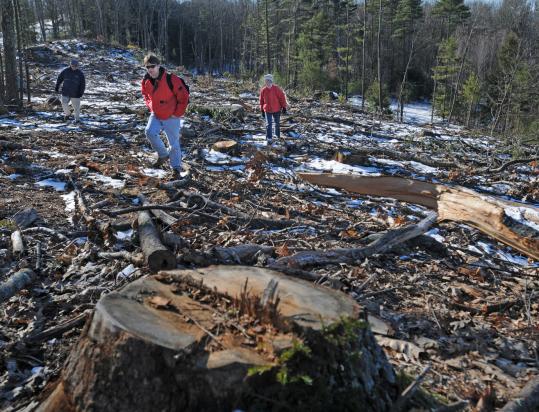
The losses of the rainforest biome have very real consequences to global biospheric health. Not only would a large carbon sink be depleted, but the previously unstable soil would be susceptible to erosion and subsequent land-loss. The unstable soils would be barren and thus more likely to cause significant runoff. The loss of the boreal biomass would also result in increased levels of global CO2 because the trees and plants act as major carbon sinks. Removal of the trees and demolition of the land result in decreased habitats for other organisms. The increased edge would also further decrease aggregate climax community.

Due to the forces of logging, climate change, development and pollution, these habitats are seriously endangered. The pharmaceutical industry is worried because the high species diversity is necessary for developing new medicines. Environmentalists are concerned because of the loss of the most biodiverse regions in the world and the implications to ecologic function. Also at stake is the ever-popular Rainforest Cafe.

“Because Giraffes, oh you know, live in Rainforests!”

I interviewed long time employee* and full-time friend Matthew Groff about his employers future.

“I’m definitely worried. Without rain forests, people are gonna walk in and be like ‘the hell is this? What’s up with the weird trees and strange croaking noises? I thought I could get food here?'” Groff added, “Rainforest Cafes everywhere will be in peril. We might have to change to–I don’t know– . . . Clear-Cut Cafe!” He presented the idea to his manager who informed him that they already considered it and found individuals are much more receptive to monkey calls, gentle mist, and lush greenery than sounds of buzz saws sheering, trees violently falling, and construction manager drawl.

“I know the mozzarella sticks were good, but we’re not coming back!”

Organizations such as “Save the Rainforest“, “Save the Rainforests Inc.” and “The Rainforest Foundation“, are all great places to educate yourself on the state of the rainforests and how you can help.

Or if you want to check out the Safari Club’s perks, check out The Rainforest Cafe .

The losses to biodiversity are incredible. Don’t let one the world’s most biodiverse restaurants collapse to an unrecoverable state.


*Matthew Groff is not a worker at Rainforest Cafe, but knows someone who is and spoke on their behalf.

The Earth’s Atmosphere

While looking through geography websites, I found this one to be quite interesting because it is a nice, short summary about our atmosphere.

Although, it is a nice, short summary it does not get into much detail about the composition of the different layers of our atmosphere. Remember, the homosphere describes the layers of the atmosphere that are well-mixed (which include the mesosphere, stratosphere and troposphere) while the heterosphere includes the thermosphere and exosphere.
Also, the diagram leaves out the thermopause, which is the outerboundary of our atmosphere.

I thought this is a good review and fun, interactive template to learn about Earth’s atmosphere. Simultaneously, it is disconcerting that such vital pieces of information could be left out of an explanatory diagram that many people learn from.

Here’s the interactive template: Earth’s Atmosphere

You should explore the rest of the website as well!


Learn more about MPAs!

After reading the 2003 article by Elliot A. Norse titled “Marine Reserves: the best option for our oceans?” and the partially opposing views of Peter Kareiva, I decided to research more on this subject of Marine Protected Areas. The timeline we created in lab stopped around the year 2003 but this topic appears to still be of high interest among the scientific community. Upon searching the web, I found NOAA’s National Marine Protected Areas Center main page to be particularly useful. To learn more about MPAs and how you can get involved, check out the links below!

About MPAs:

Ways to Get Involved!

Each day, the website displays a different headline story to inform everyone about this growing concern. For example, today the topic of “Preserving our Maritime Heritage” is featured, with related sub-news articles about Cultural Heritage MPAs listed below and other articles listed to the right.

The main story featured yesterday was about the MPA Interactive Mapping Tool, which I found really unique and entertaining. Before you actually arrive to the map, they present details on the history, metadata, uses, help with the different tools, and contact information. This online mapping tool provides data for over 1,600 MPAs across the world, offering access to spatial boundaries, conservation based classification data, and about the site management. All of this information can be obtained at any time during your visit on the map by clicking on the small, round icon labeled with a letter “i” on the top menu bar.

To operate the tool based on a specific subject matter, you can either click the drop-down menu in the box on the left and choose one of the following options: National System, Level of Protection, Government Level, Fishing Restrictions, or Management Agency. For example, one can investigate what level of protection different MPAs are currently classified (No Access, No Impact, No Take, To Be Determined, Uniform Multiple Use, Zoned Multiple Use, or Zoned w/No Take Areas).

An additional option for operating this tool is to search the MPAs by particular regions. A drop down list is located on the top right-hand corner of the screen where the following selections are available:  All Regions, New England, Mid Atlantic, SE Coast, Gulf Coast, Caribbean, Great Lakes, Pacific NW, California, Alaska, Hawaii, or the Pacific Islands. For example, Virginia is displayed under the Mid-Atlantic region.

I really recommend taking at least 5-10 minutes playing around with this awesome new tool and the MPA websites, as they are extremely informative and offer constantly updated information about this question of MPAs that we previously addressed during the class discussion.

Suggestion: check out the MPAs near the coast of your home state!  Here is the site from New Jersey’s coast and information about it: “Waters off New Jersey Closure”

Tornadoes- All the basics

NOAA’s national severe storms laboratory calls tornadoes “nature’s most violent storm.”  These violent storms are defined as rotating columns of air extending from a thunderstorm to the ground, and occur more frequently in the United States east of the Rocky Mountains than in any other location worldwide.  From what causes tornadoes to protection measures, the NSSL has covered all the bases.  Tornadoes are developed from thunderstorms and emerge in advance of east-ward moving cold fronts.  Tornadoes form when a change in wind direction creates a horizontal spinning effect in the lower atmosphere, which is then tilted upward by rising air within the thunderstorm creating a column of rotating air.

Tornadoes are often succeeded by another tornado, and therefore you rarely see a single tornado in the accompanying storm.  They have a wide range of occurrence including damaging outbreaks in the Carolinas, Pennsylvania/Ohio, and across the plains.  Tornadoes often occur in the afternoon; they can occur throughout the year, and have peak seasons depending on the location.  Some other dangers that often accompany tornadoes are lightning, flash floods, hail, and damaging straight-line winds.  Most recently, the tornadoes of March 2-3 occurring across the southeast U.S. and into the Ohio Valley region, were responsible for 41 deaths and was the second deadliest for early March in the U.S.’s history.  My own house experienced mild damage as a few windows were blown out due to the strong winds.  Some early warning signs of tornadoes include a dark, greenish sky, wall cloud, large hail, and a loud roar similar to a freight train.  Knowing these foretelling clues and staying alert to weather and news reports can help minimize lives lost due to these violent storms. The above image displays the yearly average number of tornadoes reported and the average number of deaths resulting from tornadoes by state.


Check Out the Most Recent Earthquakes in the United States!

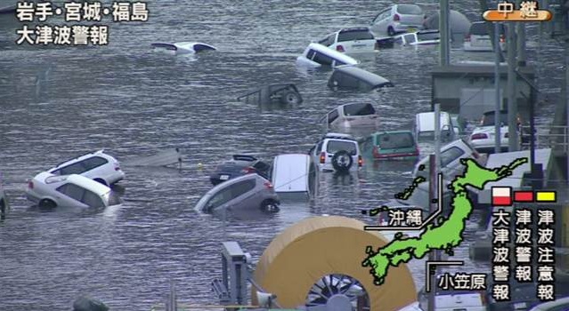
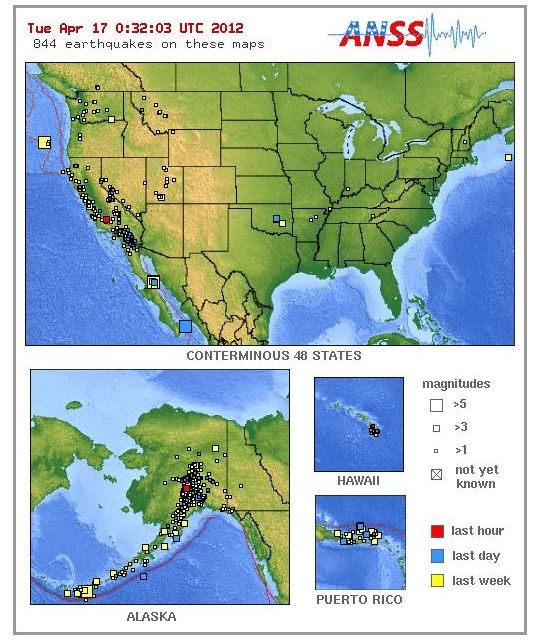
We have spent a lot of time throughout this course discussing earthquakes as they are an important consequence of the phenomenon of plate tectonics in the lithosphere and cause long lasting effects on the biosphere when they occur. In class we often focused on the largest, most local, and most significant earthquakes. The earthquake in the Philippines, the tsunamai caused by the earthquake in Japan, and the termor felt in our backyard in Mineral, VA are all events that are well documented and widely known about. However, during one of our lectures, we were presented with a slide that revealed the estimated probability of an earthquake occuring in any given region across the United States. Of course, western California and the Aleutian Islands in Alaska were the most areas of the highest expected earthquake activity. Still, there was a spot in central Virginia which was higher in probability than surrounding regions.

As I recalled that map I wondered how often do earthquakes actually occur? Are the earthquakes that we feel ourselves, and that make the news more or less the majority of earthquakes that actually occur, or do I have absolutely no idea how often the Earth is flexing it’s tectonic muscles? Luckily, I stumbled upon the site linked below which I found to be truly astonishing. The website (compliments of USGS) displays up-to-date earthquake occurrences across the United States and symbolizes them by intensity as well as how long ago they occurred. I was shocked to see that when I last checked, in the previous hour there had been seven earthquakes in the US including Alaska and Hawaii.

http://earthquake.usgs.gov/earthquakes/recenteqsus/


Just click the “Refresh” button to view the most recent earthquakes in the US!

Furthermore, you can follow the link below which focuses on the southeast United States where you can see it looks like there have been four or five earthquakes in Virginia in the past six months, but when you zoom in it displays that there have actually been close to 20 in the past six months! Something, I was definitely not aware of.

http://folkworm.ceri.memphis.edu/recenteqs/

These maps reinforced in my mind the idea that battle between tectonic plates is a constant war being waged, and that the times when we can actually feel the ground trembling ourselves are just grand moments in the eternal push-and-pull of the earth’s tectonic plates, and that perhaps one of the most revelant ways that science can save human lives is through furthering our knowledge of these natural forces.

Conor, out

Earth’s Surface: Peaks to Depths

I found this neat diagram below titled “tallest mountain to deepest ocean trench” on Our Amazing Planet.

Some of the connections I’ve made to our study of physical geography include the relationship between altitude and air pressure, the formation of different types of clouds, levels of oxygen, orogeny, and the formation of islands.

For example, the air pressure right around the peaks of the Himalayas is .33 atm which is a third of that measured at sea level, exemplifying the inverse relationship between altitude and air pressure that we have learned about.

The infographic provides points along altitude that indicate how long it takes to boil an egg, which relates to our study of water- a liquid boils at the temperature when its vapor pressure equals the surrounding pressure, thus explaining why it takes longer to boil at higher altitudes.

I enjoyed Googling different peaks that  I was not familiar with such as Puncak Jaya in Papua, Indonesia which is the world’s highest island peak. When looking into this island I found that it was created in the late Miocene Melanesian orogeny, caused by oblique collision between the Australian and Pacific plates.

See the animated map of the extent of the glaciers of the Carstens Range (including Puncak Jaya) from 1850 to 2003 which depict a significant retreat of glaciers in this equatorial geographic location. It was interesting to connect this to our study of temperature and seasonality around the equator.

One of the reasons this image caught my eye was it’s information on oceanic life and geography below sea level, which I am extremely interested in and is one of the reasons I chose to study abroad in Australia.

It is just amazing to see in terms of depth how far down the oil riser goes for an oil rig in comparison to the depth records of scuba divers.

The diagram illustrates the increased pressure below water and depicts how far humans have gone within an atmospheric diving suit as well as the deepest nuclear submarine achieved by the Soviets. I was surprised how much further down the Titanic was found.

The diagram allows for a great comparison of depth with other iconic locations such as how deep the grand canyon is below sea level, that sharks are found within 7,000 feet from sea level prior to the “midnight zone” of no sunlight, and that the average ocean floor depth is 12,000, however the oceanic trenches that we’ve studied are beyond 20,000 feet below sea level.

Volcanoes

After talking about volcanoes in class I became interested in learning more about them. I came across an interactive website that explains how volcanoes form and how humans react to them. The site features different sections about volcanoes each featuring their own video clips.

The mantle is a large layer of rock that is mostly solid. Rock from the mantle will melt and is able to move to the Earth’s surface through weak spots in the crust in a volcanic eruption. Most volcanoes occur on plate boundaries or over a hot spot. Colliding plates or convergent plates tend to create large, classic, cone-shaped volcanoes called stratovolcanoes. These volcanoes also tend to be particularly explosive. At separating plates or divergent plates, shield volcanoes tend to be formed. Shield volcanoes have gently sloping sides and the lava flow tends to be calm and smooth. Hotspots also cause shield volcanoes to form.

Volcanic eruptions cause many different types of hazards. In an explosive eruption, pent-up gases escape violently and magma bursts from the volcano. The cooled magma can cover large areas with a thick layer of ash, which is very detrimental. Pyroclastic flows are a mixture of hot gas and cooled magma. These flows are very dangerous as the flows move at very high speeds, so the destruction is spread over large areas quickly. Volcanic eruptions can also cause earthquakes, tsunamis, or the release of suffocating gases. All of these hazards pose threats to human life, property, and the environment.

Scientists are becoming more and more accurate in detecting the warning signs of volcanoes. Many different types of tools, such as the correlation spectrometer, have been developed to aid scientists in their predictions. Although volcanologists are becoming very skilled at predicting the likelihood of an eruption many different barriers remain. Monitoring potential eruptions is expensive. There are many volcanoes in the world that only erupt every hundred or thousand of years. Thus, scientists are not able to fully monitor every site. However, for the most part with monitoring devices people will be warned well before a disastrous volcanic eruption occurs.

http://www.dosomething.org/files/pictures/Volcano.jpg

http://www.dosomething.org/files/pictures/Volcano.jpg


Source: http://www.learner.org/interactives/volcanoes/entry.html


What’s Your Water Footprint?

Ever wondered how your water consumption compared to the national average?

Well now you can find out!

Go on http://environment.nationalgeographic.com/environment/freshwater/water-footprint-calculator/ and calculate your water footprint.

According to National Geographic, almost 95 percent of our water footprints are attributed to these indirect forms of water consumption. This brief and entertaining (watch the duck!) calculation takes into account the water used in your home, diet, energy consumption, travel, as well as the clothes and goods you buy each year.

After talking about the average amount of water used per person in specific countries in class, I found it really intriguing to test how I compared to the national average.

I use 1,451 gallons per day compared to the U.S. average of 1,981 gallons per day. What about you?

Also, underneath the calculator there are a few more interesting and interactive links concerning water usage so check those out too!

Japan’s Triple-Threat Crisis Interactive Map

After attending the inter-disciplinary presentation on Japan after one year of the triply devastating earthquake, tsunami and nuclear power events, I wanted to do more research on the events of the day March 11, 2011. The chain of events were extremely well documented, and can be found on many websites and blogs, such as the Huffington Post. I found an interactive map from CNN that shows the countrywide impact of the tsunami, earthquake and nuclear power plant failures.

Map of Japan after 2011 Earthquake

The interactive map allows the user to manipulate settings between broad categories of events on March 11, as well as casualties and damages caused. One can see that the epicenter of the 9.0 earthquake was located extremely close to the northeastern coast of Japan, in addition to the recorded 13 aftershock earthquakes that were measured to posses almost as much energy as the original 9.0 earthquake. The most casualties (over 19,000 total) were along the northeastern coast of Japan, but casualties were observed throughout the country. The worst damage was found along the entire northern land of Japan. After the events of March 11, 2011, Japan lost over $44 billion in infrastructure.

Cars Floating in Japan after Tsunami

The nuclear power plant near Minamisoma video shows utter destruction of the city, where panic grew even more after discovering the possibility of  nuclear power plant failure. Many people were displaced due to the earthquake, tsunami, and radioactive zone around the 54 nuclear power plants in Japan. Currently, there are two power plants that are being used for Japanese power and electricity, but by this summer there will be no usable nuclear power plants in Japan. This creates a large economic and political problem for Japan, where there is an apparent shortage of power and electricity in a highly industrialized country. Adding to the problem, Japan is not a naturally resource-rich country: it must import the fossil fuels to make up for the loss of nuclear power (what used to be 30% of the country’s power generation). It is probable that Japan will resort to importing  high amounts of fossil fuels (such as coal, oil and natural gas) as power to stabilize the country in the near future.

Japan is on its way to recovery and reconstruction after a devastatingly large earthquake, tsunami and threat of nuclear power plant meltdown, and it will be interesting to watch what Japan must do to remain a large worldpower.

Website: http://www.cnn.com/SPECIALS/2011/japan.quake/map/