James River Report Card 2011

In doing research on the James River in conjunction with our lab and class discussion, I came upon an interesting and relevant report on the current state of the James River. The pdf attached here shows a detailed account of how the James River is doing today, in comparison with recent years and the history since environmental records have been recorded.

The report gives the current state of the river a C overall, a score lower than I anticipated. After our walk around Belle Isle, it seemed like the James was in pretty good shape, but the evidence shows there is significant room for improvement in some areas. In terms of wildlife, the report card confirms that the population of small-mouthed bass has improved, but is still only at about half of the population goal. Another successful area of wildlife in the river system is the bald eagle, which has reached its goal for a healthy population.

The river scored a B- in Habitat, its highest scoring section. While the river has seen improvements overall in the long term, in the short term it is obvious that it still struggles from too many nutrients and sediments, which is leading to abundant algae and poor water clarity. Richmond needs to invest more money in the protection of runoff in order to improve the score for this section.

With regard to pollution and plans for restoration, the river scored a C in both categories. The levels of nitrogen and sediments in the river are still unsustainably high. The city works to protect the area of the river and improve the riparian zones around the river, but more needs to be done in order to bring the James River to the set level of cleanliness.

Questions to think about:

What is a realistic goal for improvement in the river for next year? Which area of the river should Richmond focus on improving? How could efforts be increased? How could awareness in the community and surrounding areas be increased?

Check out the report card here! State of the James River 2011

Source: http://www.jamesriverassociation.org/the-james-river/state-of-the-james/


“My Environment” Interactive Map

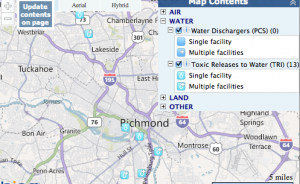
If you are wondering how Richmond compares to other parts of the country in terms of water and energy usage, head to the “My Environment” tool on the EPA website. It allows users to search for cities nationwide, displays a map with local sources of air, water, and land pollution.  As geography students, this tool allows us to apply concepts we are learning about water, the atmosphere, and environmental processes to local spaces.  The icon for each source reveals the name and address of each potential source of pollutants:

The site also compares local energy production to local energy consumption in terms of coal,natural gas, petroleum, and other sources of energy. Both Virginia and my home state of North Carolina consume more petroleum than any other energy source. While according to the data NC only produces nuclear energy, VA produces coal, natural gas, nuclear, and renewable energy. Data contained on the page is time sensitive, and users can even find out the daily air quality at their location. On the day of this post, my hometown was experiencing the most air pollution from particulate matter, while Richmond’s air was most polluted by carbon monoxide.

The site also encourages community interaction, and contains a “My Community” link where users can report on positive changes being make for the environment. Though the Richmond page does not currently have any news showing, we already know from our geography class that the city of Richmond and the University of Richmond are sensitive to protecting our natural resources.

Auroras: How they work and how to see one!

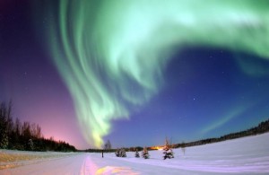
Aurora Borealis


Auroras are something I have always heard about, but I have never been sure of what they are exactly. We have all seen the pictures of the beautiful green, red, and blue lights in the sky, but I would bet that few of us have ever seen one in person. The National Oceanic and Atmospheric Administration website says that there is almost always at least a small aurora somewhere in the sky, but they are generally difficult to see. This is because they are most common in the far northern and southern latitudes. In the north, the best locations tend to be Canada, Alaska, Northern Greenland, Scandinavia, and Siberia for seeing auroras. Also, the best time to see an aurora is in the middle of winter between 10:00 p.m. and 2:00 a.m.

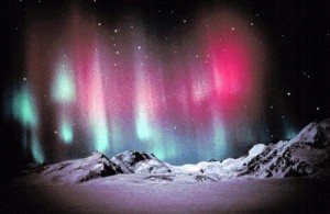
The northern and southern versions of auroras were first named in 1621 by a French Scientist named Pierre Cassendi. The northern lights, or Aurora Borealis, were named after the Roman goddess of dawn (Aurora) and the Roman god of the north wind (Boreas). The southern auroras are named Aurora Australis for “southern dawn.”

The formation of Auroras begins on the Sun 93 million miles away and ends 60 to 600 miles above Earth’s surface. The Sun sometimes emits highly charged protons and electrons. This solar wind then energizes protons and electrons within Earth’s magnetic field, which travel down magnetic field lines to Earth’s atmosphere near the poles. These charged particles then excite atmospheric gas atoms and molecules. As they relax back down to their normal state, the molecules and atoms release the energy as visible light, which we see as auroras.

The National Oceanic and Atmospheric Administration (NOAA) keeps track of these solar storms that can lead to auroras. Strong storms can cause trouble with satellites, power grids, GPS signals, communication technology, and even astronaut safety. Luckily for us, it also means that they monitor where and when auroras occur on Earth. You can visit the Space Weather Prediction Center’s Aurora website to see the current auroras. If you happen to be far north and there is a strong storm, maybe you’ll get a chance to see one. I hope I do someday!

Aurora Australis