Earth:: a global map of wind, weather, and ocean conditions

https://earth.nullschool.net/ 

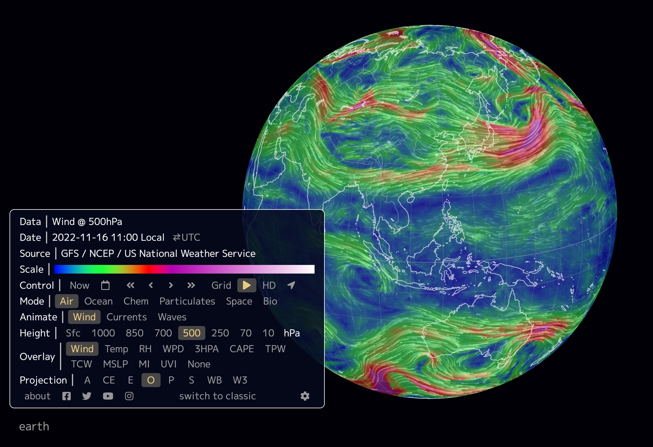
This website functions like google earth where you can spin the globe around, zoom in, and zoom out. However, instead of displaying satellite images, the earth’s surface displays patterns of wind, weather, and ocean movement. Using this site one can look at the live wind patterns such as jet streams and identify large ocean currents. Similarly, users can use the site to investigate trends in temperature seeing both the latitudinal and continental effects on temperature. Finally, this site can also be used to display concentrations of particulate matter and chemical pollutants. for example, users are able to see clear trends of higher CO2 levels in population centers.

Overall this site provides an easy to use interface to visualize and explore trends in abiotic factors including the atmospheric and hydrosphere conditions. This site could be particularly useful as a teaching tool. Teachers could ask their students to identify and screenshot areas of the world that exhibit the trends and patterns that are being taught, such as those related to the Coriolis effect, unequal warming, particulate matter, or ocean currents.

Climate Monitoring

The National Centers for Environmental Information, an office of the National Oceanic and Atmospheric Administration (NOAA), includes products by category surrounding the monitoring of the climate. The objective of the National Centers for Environmental Information is to develop products and services spanning all the science disciplines and allow for enhanced data discovery. Their website is “one of the largest archives of atmospheric, coastal, geophysical, and oceanic research in the world.” There is data for monthly climate reports, including reports on wildfires, droughts, tornadoes, snow, and ice, and overall information about the climate. You are able to specify what year, month, and type of report you would like to view. Once decided on what you would like to look at, there is a national overview that lays out significant climate anomalies and events for the specific month and year that was chosen. There will also be maps detailing the average temperatures and precipitation percentages. There is much more to this website besides the climate reports, however, I chose to just focus on one aspect. The main goal of these reports is to display monthly summaries of climate-related occurrences on the global and national scale.

The climate reports are extremely relevant to our class, as we have an entire chapter of our textbook dedicated to water, weather, and climate systems. We will spend a decent amount of time discussing the atmosphere, as well as the climate. Through these monthly climate reports we can compare months to examine how the climate/temperature has changed and come up with potential reasons as to why. Throughout week 2 we are going to focus on the atmosphere as well which has to do with the climate, weather, and other things occurring.

Below is an example map of the temperature, and significant climate anomalies and events for the month of July. 

Climate Action Tracker

Climate Action Tracker is an independent scientific website focusing on tracking global warming and climate change goals. There is data for most countries in the world, and they have detailed graphs and maps that highlight each country’s emissions and projected future data. They also include detailed explanations with each graph and country to go into more detail on what that country is doing to improve their carbon footprint and their predictions for the future. Their main goal is to bring awareness to climate change and prevent us from superseding the catastrophic 2 degree warming threshold. 

This is super relevant to our class and the material we learned. We spent a lot of time on climate change, including the how’s and why’s of it, and what needs to be done to prevent catastrophic damage. This website reinforces that knowledge and provides even more in-depth information about it. The graphs especially are a great way to visual the data that we learned and to conceptualize it on a global scale. Below, I’ve included an example graph of Chile, which shows just one country’s work towards reducing emissions.

https://climateactiontracker.org


World Meteorological Organization: Climate Indicators

This website provides a trustworthy source for climate data. The data presented is assessed, catalogued and verified by an International Expert Group on Climate Data Modernization (IEG-GDM) assembled by the World Meteorological Organization from various disciplines. This section of the website contains a list of seven (7) main indicators scientists use to evaluate the state of the climate. These indicators are: surface temperature, CO2 concentration in the atmosphere, ocean heat content, sea level, ocean acidification, sea ice, ice sheet extent, glacier mass balance, precipitation, and extreme indices for temperature and precipitation. These statistics all provide up to date information, most of the graphs showing data from 1950 forward to 2020. Additionally each of the 7 indicators feature data visualizations from a variety of sources. Pros of the website are that it is easy to navigate and the information is visually presented in a readable and straightforward format. Since there isn’t an overwhelming number of graphs for most of the indicators, I think it would be better however, to include a small description of the information being presented for each graph rather than requiring the user to open a link to another page for more information.

Atmosphere Design Lab

This website is an atmosphere design lab from the Smithsonian Institute. You can adjust the levels of carbon dioxide, oxygen or ozone in the atmosphere. Once you choose a gas, there are statistics about the levels of that gas in the atmosphere and what would happen if you changed the levels. There are also helpful examples from other points in history when different levels of these gases were present. For example, if you have more oxygen than the average amounts found on earth today, there would be a chance of things spontaneously combusting. This interactive site is helpful for people who want to learn more about the composition of the earth’s atmosphere but don’t know where to start.

URL: http://forces.si.edu/atmosphere/interactive/html/index.htm

A picture of the site is below.

Interactive Atmospheres: Jet Stream and Weather Maps from netweather.tv

netweather.tv is a site that provides a wide variety of interactive maps for current and predicted atmospheric patterns, including jet stream, storm risk, lightening detection, and weather radar maps. This site provides weather-related information for travel such as snow reports, predicted temperatures in high-volume travel destinations, and holiday weather. Live reports from meteorologists are also available. While this is a U.K.-based site which focuses on nations in and surrounding the U.K., there are numerous tools for monitoring atmospheric conditions in the U.S. and non-U.K. European nations.

https://www.netweather.tv/charts-and-data/jetstream


NASA’s Scientific Visualization Studio

NASA’s Scientific Visualization Studio (SVS) showcases a wide variety of NASA programs using striking images, animations, videos, and other visuals. By synthesizing complex scientific research and data with visual elements, the Scientific Visualization Studio creates a largely accessible platform to promote education and a broader scientific understanding of earth and space processes. The website has curated various galleries tied to specific NASA projects. These collections range from Air Quality to Astrophysics to Carbon and Climate projects. One of the featured collections is of ICESat-2, or the Ice, Cloud, and land Elevation Satellite-2, which launched on September 15th, 2018. ICESat-2 is NASA’s most advanced laser satellite instrument (ATLAS) and will be used to monitor changes in height, depth, and mass of ice sheets and glaciers with extreme levels of precision to better understand and predict sea-level rise. ICESat-2 will also provide essential information about forest vegetation, ocean surfaces, and urbanization, among other applications. To explain what the ICESat-2 project is hoping to accomplish and how they have gotten to this point, the SVS with Goddard Media Studios has produced many videos that explore the importance of ice sheets, how the laster altimeter technology works, and even documenting the 470-mile research expedition in Antarctica that accompanied this project. This website, with its galleries of scientific information and mapping related to climate change, glacial melt and sea level rise, hurricane and storm impacts, stratospheric ozone depletion, and forest fire intensity and prevalence are all topics we have discussed in our class. Additionally, projects like ICESat-2 demonstrate how different remote sensing technologies are being implemented for environmental and geographic research purposes.

“Up in Smoke: The pros and cons of burning rubbish” : Madison Sweitzer

Photo from The Geographical 

An article from The Geographical, the official magazine of the Royal Geographical Society. In London, they are currently burning 53% of trash, which is an amount that has almost doubled in the last decade. The British government is looking to cut down on the amount of burned trash, and the Treasury has announced that it now is considering imposing a tax on the incineration of waste, creating an active opposition to what was originally thought of as a favorable alternative to adding waste to landfills. One positive of the burning trash is that it can be used to generate steam energy, and it lowers the physical amount of trash in landfills. However, opposition to this process critiques that incinerating plants have never been required to report particulate emissions in enough detail to moderate the potential health impacts. The plants are also contributing to greenhouse gas emissions, with approximately each ton of waste burned adding one ton of carbon dioxide to the atmosphere. The last critique is that increasing incineration may decrease motives to recycle. Although the negatives appear to outweigh the positives, this situation does demonstrate the importance of trying to best consider all components of the Earth when making environmentally-conscious decisions. By this I mean that in this instance it appears that the damage to the atmosphere would outweigh any benefit to the biosphere of less physical trash, but it is important to assess both. This article relates to our discussion of climate change in class, and specifically how humans may be contributing to it, through greenhouse gas emissions such as this. It also introduces the political component of addressing climate change, such as the tax considered in this article, and how that may help to combat the further damage.


Article Source

Tracking Lightning

LightningMaps.org is a map that shows lightning strokes around the globe in real time. The site gathers data from radio frequency signals that collect information on where lightning strokes occur. This is a community driven website so the information is crowdsourced and does not come from one specific governmental agency. Operators at radio frequency stations submit their information and the website then creates digital markers at the locations where lightning is being recorded. Due to a large network of operators sending information, the accuracy of the strokes is about one mile. This system covers specific areas in Europe, America, and Oceania. The website also stores strokes for up to 24 hours.

This website is especially interesting because amateur weather scientists can get involved recording lightning and adding to a global database. Also, this website acts as a good supplement to people who are looking to follow storms in real time. The website is easy to use with just a few buttons and four different overlays.

https://www.lightningmaps.org/blitzortung/europe/index.php?lang=en

National Geographic Encyclopedic Entries

The National Geographic encyclopedic entries page is a really useful tool for our Physical geography class since it provides various entries on class related concepts like hot spots, El Nino, earth’s crusts, continental drift, etc. It’s really easy to use, you can either enter the topic you are interested in looking for or just scroll down the pages looking for it. Each entry provides a set of images, definitions, animations, videos, background information, related material and even useful sources that connect to other articles about the subject.  There’s even a complete vocabulary tap that expands on explaining each key term’s definition and use. This would be a really useful tool to study for our final exam since you can search in a more interactive way concepts that you feel you need to look up more information about.

https://www.nationalgeographic.org/encyclopedia/