Global Climate Information Visualizing Tool

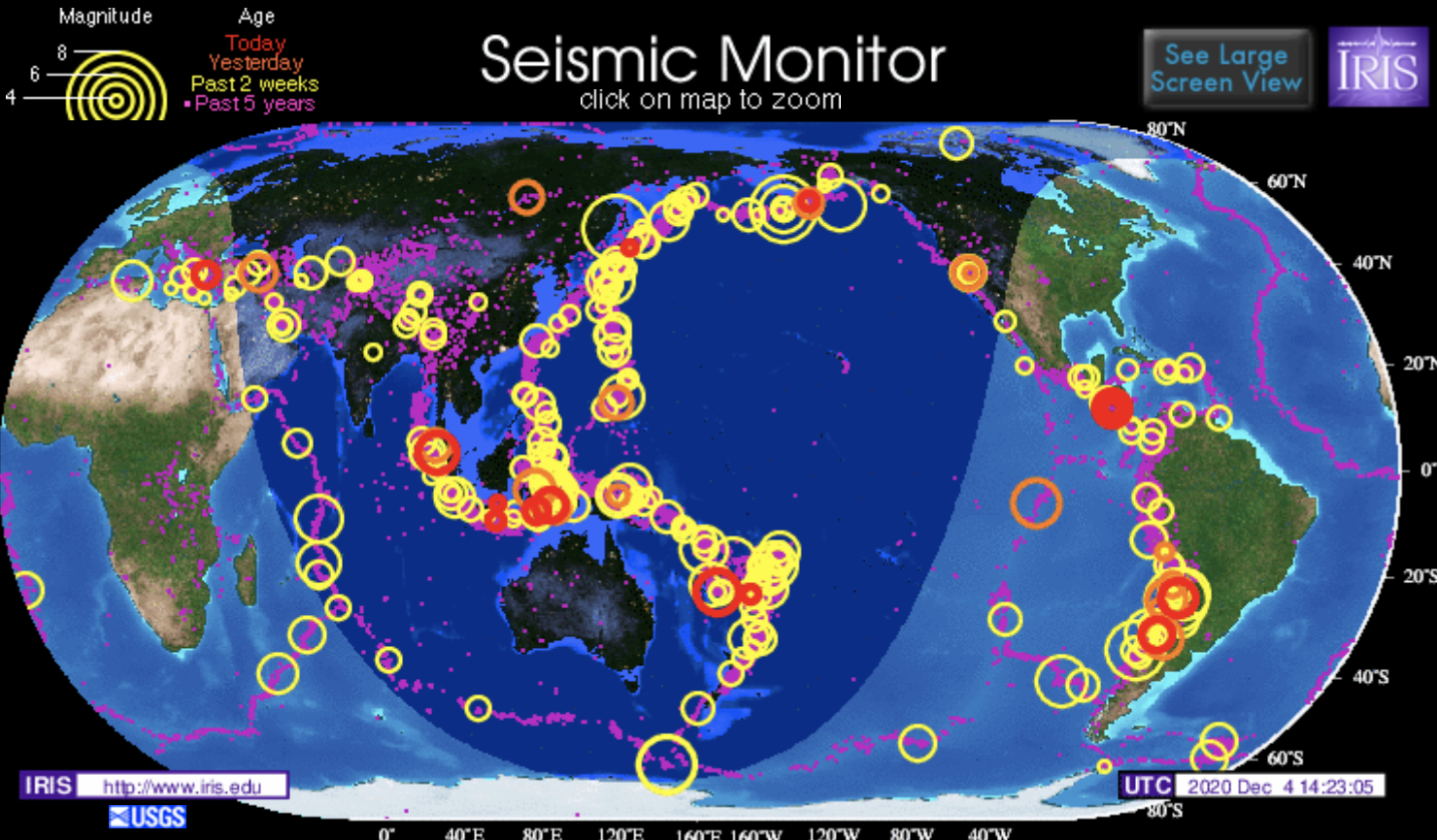
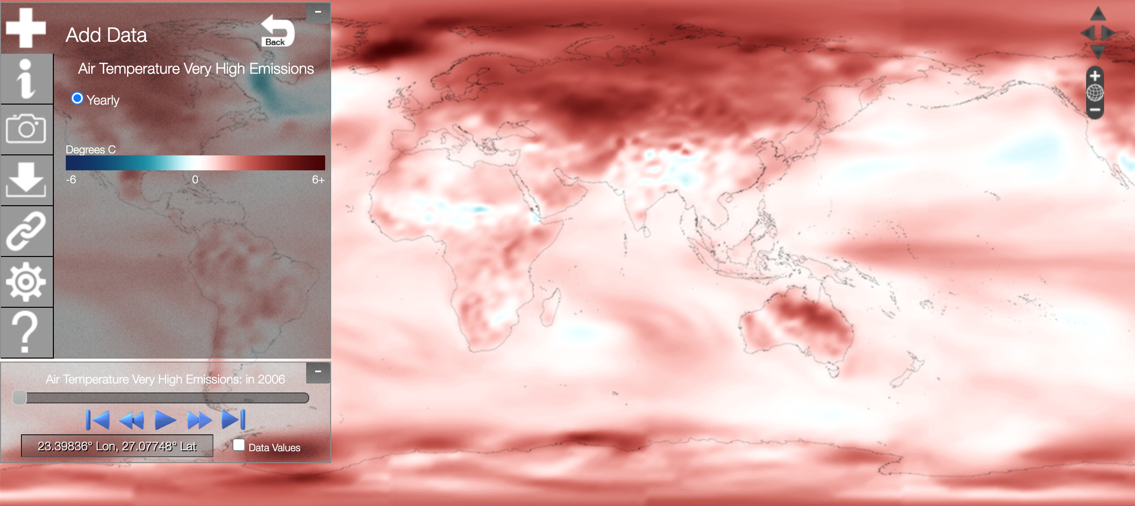
NOAA View is a data exploration tool produced by the National Oceanic and Atmospheric Administration (NOAA) and developed by the NOAA Environmental Visualization Laboratory. This interactive map contains over 100 different datasets on a wide range of topics related to the Earth system: ocean, atmosphere, land, cryosphere, climate, and weather models. On the left, click at “Menu” and then “Add Data” to select the dataset to visualize. At the lower left corner, click at “Time” and drag the button to see how data change by time. Users can also click on areas of interest for more detailed information.

I found this an awesome website because of the enormous amount of data available to visualize. For example, under “climate”, we can choose to look to “observations” or “simulations”. I really like the “simulation” tool as we can simulate how ocean/air temperature, precipitation, or sea ice concentration change under low, moderate, high, or very high emissions.

Global Seismic Activity

This website maps seismic activity globally over the past five years. The site is created by the Incorporated Research Institutions for Seismology (IRIS). On the website, there is an interactive map of the globe that maps earthquake activity over the past five years as rings. The larger the ring the greater the magnitude was of the earthquake that occurred in that designated region. The earthquakes are also organized by how long ago they occurred, and color-coded in this way. In addition to the interactive map, the site also has several embedded links that lead to pages that give more information regarding the earthquakes that are mapped. For example, some of the pages that are linked are earthquake headlines, last 30 days earthquakes, special quakes, and plate tectonics.

This website is particularly interesting because this map very well visualizes the phenomenon that the vast majority of earthquakes occur on the borders of the tectonic plates. We spent a large portion of our class talking about plate tectonics, faults, and earthquakes and how they are all directly related to each other. I feel like this website does a great job of summarizing and visualizing this concept in a central place.

USGS Magnitude 2.5+ Earthquakes Maps

The resource that I found is a website that tracks earthquakes above a 2.5 magnitude on a map and provides information on them. The website updates as these earthquakes happen, so it is an important resource as it is always being updated. The website tells you the time, depth, magnitude, and exact coordinates (along with city) of where the earthquake hit. The map is of the whole continent and shows the plate boundary lines in red and the earthquakes as orange circles. The website is a great tool for scientists or any person to study more about where these earthquakes are occurring.

In class, we spent a lot of time talking about earthquakes and read in our textbook about the catastrophic ones. This website is a great tool that allows any person with a computer instant access to know the most important information about an earthquake. I do believe that while this is an amazing resource, it is not one that is predicting the coming earthquakes. As we learned in class, earthquakes are extremely hard to predict so that does not seem feasible. However, hopefully this website could eventually provide more information on the past earthquakes and provide warnings for one that are coming(if that is ever possible).

https://earthquake.usgs.gov/earthquakes/map/?extent=-89.58486,-653.90625&extent=89.57973,245.39063&listOnlyShown=true

Forest Plots

ForestPlots.net is a website dedicated to tracking tropical forests. ForestPlots contains consistent data on over 2 million individual trees from over 4000 plots in 54 countries. The locations of the plots are displayed on a map on the website, and the data on individual trees may be downloaded for use in scientific studies. The data on this site allow scientists to study tropical forests worldwide and collaborate with other scientists working on tropical forests, which is important as tropical forests are vital to the health of the Earth, especially given our current context of climate change. The website receives funding from UK National Environment Research Council and The Royal Society. This website is relevant to research of the biosphere, and I know we will be able to recognize the importance of the data provided when we get to the biosphere unit.

Already, working on the campus tree survey, we have looked for trees in the Eco-Corridor; although we are not in a tropical forest, the focus of ForestPlots.net, our data will certainly be similar in content and format to the data on ForestPlots.net. I am sure our data will be useful in a similar manner to the data on ForestPlots if it becomes published in any way. ForestPlots.net does make one wonder as to whether there are any similar resources dedicated to forests that are not necessarily tropical.

https://www.forestplots.net/

image.png

Problems visualizing size on a map because of distortion? Not with this website!

I came across this handy cartographer’s tool that allows you to take any country on Earth and drag it across a mercator projection map to reveal its “true” size relative to the countries you put it near. As we’ve learned, no flat map perfectly shows the relative sizes or distances perfectly without distortion. However, with the mercator projection, arguably the most widely used map, this distortion can be pretty extreme at the poles, where little to no distortion occurs near the equator. This map is very useful for geographers looking to better visualize the error that map projections create while learning more about the different kinds of projections. On the screenshot below, I’ve shown the true size of Russia compared to the US and Greenland compared to Africa. Russia is still significantly bigger than the US, but Greenland is noticeably smaller than we would normally think it is due to distortion.

https://thetruesize.com/#?borders=1~!MTc5MTcyNjY.MTQ2NTgz*MzYwMDAwMDA(MA

Coastal Change Hazards

The Coastal Change Hazards (CCH) site developed by the USGS features a plethora of information to equip anyone, average citizen or researcher alike, living near or simply concerned about any coastal area within the US. The CCH features information on a variety of natural phenomena that impact coastal communities including tides, waves, and weather – namely the hazards presented by severe storms, equipped with the Coastal-Marine Hazards and Resources Program (CMHRP). This information is acquired from Research, delivered to the Stakeholder Engagement and Communication (SEC) sector, and is applied in the Technical Capabilities and Applications (TCA) sector of the CCH program. Secondary pages within the CCH site include the Coastal and Marine Hazards Resource Program (CMHRP) -which includes a USGS Coastal and Marine Geology Data Catalog, a decadal strategic plan, and newsletter – Pacific Coastal and Marine Science Center, St. Petersburg Coastal and Marine Science Center, Woods Hole Coastal and Marine Science Center, and “science stories” about coastlines around the nation.

While coastal counties (with the exclusion of Alaska) account for only 10% of the landmass of the US, 40% of the nation’s total population occupies them!

https://www.usgs.gov/natural-hazards/coastal-marine-hazards-and-resources/science/coastal-change-hazards?qt-science_center_objects=0#qt-science_center_objects