
I came across this handy cartographer’s tool that allows you to take any country on Earth and drag it across a mercator projection map to reveal its “true” size relative to the countries you put it near. As we’ve learned, no flat map perfectly shows the relative sizes or distances perfectly without distortion. However, with the mercator projection, arguably the most widely used map, this distortion can be pretty extreme at the poles, where little to no distortion occurs near the equator. This map is very useful for geographers looking to better visualize the error that map projections create while learning more about the different kinds of projections. On the screenshot below, I’ve shown the true size of Russia compared to the US and Greenland compared to Africa. Russia is still significantly bigger than the US, but Greenland is noticeably smaller than we would normally think it is due to distortion.
https://thetruesize.com/#?borders=1~!MTc5MTcyNjY.MTQ2NTgz*MzYwMDAwMDA(MA
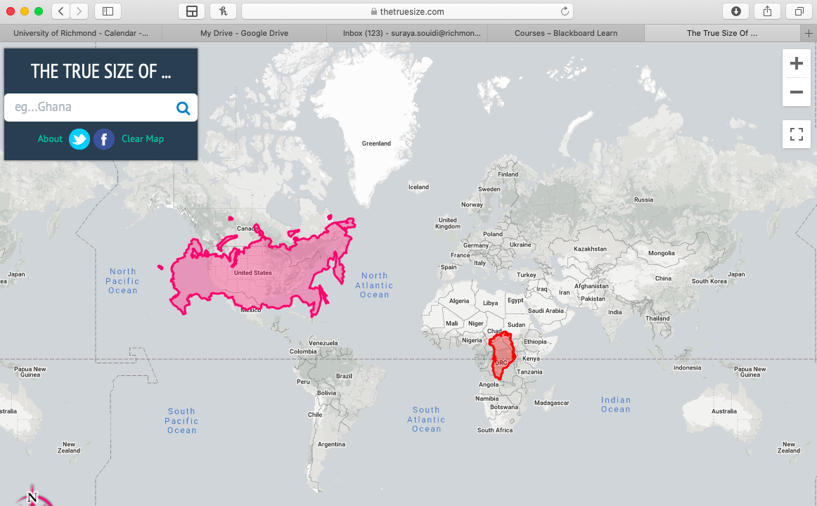
I really like this. At times when I am a more casual map reader, I like having the natural shape of land masses preserved, which is what the Mercator Projection is supposed to do well. This map, though, allows me to maintain shape and get a better idea of relative size. Still, though, if you try dragging a large region to a pole, it will distort, as the top will have to stretch more than the bottom. Moving the contiguous US to the North Pole, for instance, causes the US’s northern border to appear as a western border. Hence, this sort of interactive map could be useful in general for learning about the distortion of map projections.
This website is a super cool visualization of the distortion the Mercator Projection causes. for most of my life, I always thought places like Greenland and Russia were just unbelievably large and while they are still large landmasses this website puts into perspective their actual size compared to other countries closer to the equator. Additionally, a funny social media relation, I actually saw a girl on tik tok talking about this very website the other day and how it amazed her what the actual size of the countries closer to the poles was and was asking the tik tok public why this was.
This is an interesting website. I play around with it and it’s really cool that we can visualize the actual countries’ size by comparison. Thanks for sharing!