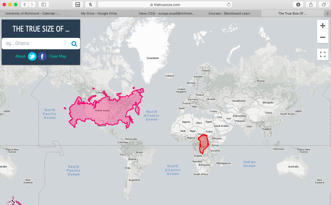
I came across this handy cartographer’s tool that allows you to take any country on Earth and drag it across a mercator projection map to reveal its “true” size relative to the countries you put it near. As we’ve learned, no flat map perfectly shows the relative sizes or distances perfectly without distortion. However, with the mercator projection, arguably the most widely used map, this distortion can be pretty extreme at the poles, where little to no distortion occurs near the equator. This map is very useful for geographers looking to better visualize the error that map projections create while learning more about the different kinds of projections. On the screenshot below, I’ve shown the true size of Russia compared to the US and Greenland compared to Africa. Russia is still significantly bigger than the US, but Greenland is noticeably smaller than we would normally think it is due to distortion.
https://thetruesize.com/#?borders=1~!MTc5MTcyNjY.MTQ2NTgz*MzYwMDAwMDA(MA