
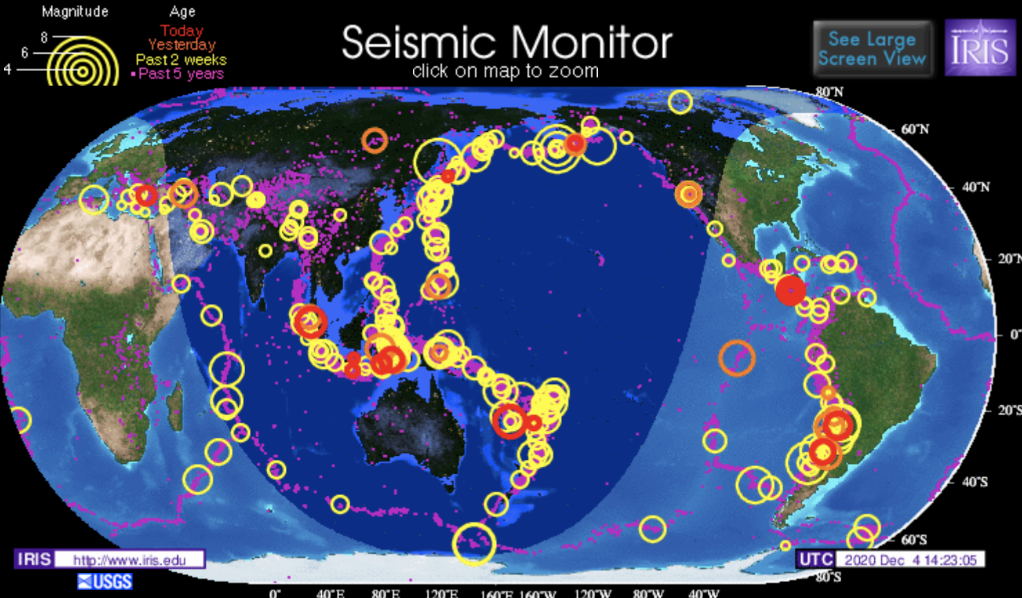
This website maps seismic activity globally over the past five years. The site is created by the Incorporated Research Institutions for Seismology (IRIS). On the website, there is an interactive map of the globe that maps earthquake activity over the past five years as rings. The larger the ring the greater the magnitude was of the earthquake that occurred in that designated region. The earthquakes are also organized by how long ago they occurred, and color-coded in this way. In addition to the interactive map, the site also has several embedded links that lead to pages that give more information regarding the earthquakes that are mapped. For example, some of the pages that are linked are earthquake headlines, last 30 days earthquakes, special quakes, and plate tectonics.
This website is particularly interesting because this map very well visualizes the phenomenon that the vast majority of earthquakes occur on the borders of the tectonic plates. We spent a large portion of our class talking about plate tectonics, faults, and earthquakes and how they are all directly related to each other. I feel like this website does a great job of summarizing and visualizing this concept in a central place.
This map was fun to interact with because it was interesting to see and learn about the magnitude of past earthquakes. I found it interesting to look along the fault lines to see how many/how big these earthquakes can be. It looked like there was is a commonality between the south pacific and the higher magnitude earthquakes. Although there are more earthquakes throughout the Caribbean, there are at a less-magnitude.
I like how the website uses various symbols, colors, and sizes to visualize the magnitude and age of seismic activities around the globe. We can also click to zoom and see a specific area. I agree that it connects to our lecture on plate tectonics and earthquakes really well. Thanks for sharing!