
I found this neat diagram below titled “tallest mountain to deepest ocean trench” on Our Amazing Planet.
Some of the connections I’ve made to our study of physical geography include the relationship between altitude and air pressure, the formation of different types of clouds, levels of oxygen, orogeny, and the formation of islands.
For example, the air pressure right around the peaks of the Himalayas is .33 atm which is a third of that measured at sea level, exemplifying the inverse relationship between altitude and air pressure that we have learned about.
The infographic provides points along altitude that indicate how long it takes to boil an egg, which relates to our study of water- a liquid boils at the temperature when its vapor pressure equals the surrounding pressure, thus explaining why it takes longer to boil at higher altitudes.
I enjoyed Googling different peaks that I was not familiar with such as Puncak Jaya in Papua, Indonesia which is the world’s highest island peak. When looking into this island I found that it was created in the late Miocene Melanesian orogeny, caused by oblique collision between the Australian and Pacific plates.
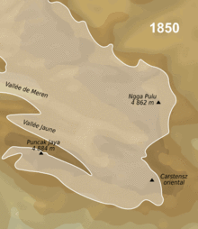
See the animated map of the extent of the glaciers of the Carstens Range (including Puncak Jaya) from 1850 to 2003 which depict a significant retreat of glaciers in this equatorial geographic location. It was interesting to connect this to our study of temperature and seasonality around the equator.
One of the reasons this image caught my eye was it’s information on oceanic life and geography below sea level, which I am extremely interested in and is one of the reasons I chose to study abroad in Australia.
It is just amazing to see in terms of depth how far down the oil riser goes for an oil rig in comparison to the depth records of scuba divers.
The diagram illustrates the increased pressure below water and depicts how far humans have gone within an atmospheric diving suit as well as the deepest nuclear submarine achieved by the Soviets. I was surprised how much further down the Titanic was found.
The diagram allows for a great comparison of depth with other iconic locations such as how deep the grand canyon is below sea level, that sharks are found within 7,000 feet from sea level prior to the “midnight zone” of no sunlight, and that the average ocean floor depth is 12,000, however the oceanic trenches that we’ve studied are beyond 20,000 feet below sea level.

Very cool schematic. I personally love reading mind-blowing facts about the earth which are abundant in that diagram. The idea that the highest flying bird is over 3,000 feet above the peak of Mt. Everest! Amazing.
Also, in my other geography class (Spatial Analysis) I just completed a computer programming project measuring Oceanic NPP (Net Primary Producers) with two different algorithms. I eventually generated maps that displayed the productivity levels of the oceans just as with the first few global images at the top of the diagram. Interesting stuff!
This is a really great diagram! It creates a uniform link between all of the “-spheres” we have studied throughout the semester, particularly the atmosphere, hydrosphere, and lithosphere.
As I scrolled down the image it really brought into perspective the variety of sizes, temperatures, pressures, and altitudes found throughout our planet. It was cool to notice the different times it takes to boil an egg, anywhere from 18 minutes at 29,000 feet to 3 minutes at 1,000 feet.
The “Death Zone,” found above the 26,000-foot mark was an interesting concept because the air does not contain sufficient oxygen to sustain human life, which is somewhat comparable to our solar system’s habitable zone studied this semester. If you scroll a little up you can see Mount Everest is even higher than that, which is amazing to think that humans have climbed it. However, it also makes sense that no one lives in that region. Overall, this diagram really exemplifies the enormity of the ocean depths and everything found within it, how much more we have to discover, and the close relationships among all the topics we discussed this semester.
That is a great diagram! I especially like how the diagram demonstrates the ocean depths in relation to the mountains we see on Earth’s surface. I think what I took away from this, more than anything, is the great power that plate tectonics have at altering and shaping our environments – look how great the total difference in elevation from the Mariana Trench to Mt. Everest.
Oh, and I could not help but notice, and frown at, our digging depths.
I find this diagram really interesting! I like how the diagram really tries to incorporate the biosphere and how life is diversified through the changing depths and heights of Earth. This diagram really helped me appreciate how much area in the ocean and in the atmosphere still has much more to be discovered. Overall,this diagram really does a great job at showing how varied our world is and also how connected the different environments are.