Climate Monitoring

The National Centers for Environmental Information, an office of the National Oceanic and Atmospheric Administration (NOAA), includes products by category surrounding the monitoring of the climate. The objective of the National Centers for Environmental Information is to develop products and services spanning all the science disciplines and allow for enhanced data discovery. Their website is “one of the largest archives of atmospheric, coastal, geophysical, and oceanic research in the world.” There is data for monthly climate reports, including reports on wildfires, droughts, tornadoes, snow, and ice, and overall information about the climate. You are able to specify what year, month, and type of report you would like to view. Once decided on what you would like to look at, there is a national overview that lays out significant climate anomalies and events for the specific month and year that was chosen. There will also be maps detailing the average temperatures and precipitation percentages. There is much more to this website besides the climate reports, however, I chose to just focus on one aspect. The main goal of these reports is to display monthly summaries of climate-related occurrences on the global and national scale.

The climate reports are extremely relevant to our class, as we have an entire chapter of our textbook dedicated to water, weather, and climate systems. We will spend a decent amount of time discussing the atmosphere, as well as the climate. Through these monthly climate reports we can compare months to examine how the climate/temperature has changed and come up with potential reasons as to why. Throughout week 2 we are going to focus on the atmosphere as well which has to do with the climate, weather, and other things occurring.

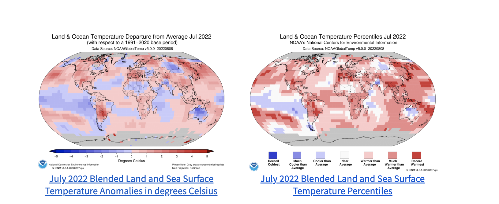
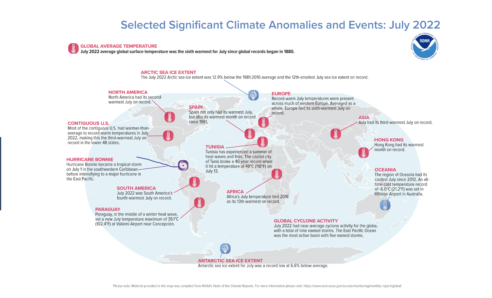
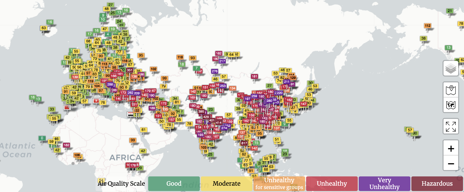
Below is an example map of the temperature, and significant climate anomalies and events for the month of July. 

Global Climate Information Visualizing Tool

NOAA View is a data exploration tool produced by the National Oceanic and Atmospheric Administration (NOAA) and developed by the NOAA Environmental Visualization Laboratory. This interactive map contains over 100 different datasets on a wide range of topics related to the Earth system: ocean, atmosphere, land, cryosphere, climate, and weather models. On the left, click at “Menu” and then “Add Data” to select the dataset to visualize. At the lower left corner, click at “Time” and drag the button to see how data change by time. Users can also click on areas of interest for more detailed information.

I found this an awesome website because of the enormous amount of data available to visualize. For example, under “climate”, we can choose to look to “observations” or “simulations”. I really like the “simulation” tool as we can simulate how ocean/air temperature, precipitation, or sea ice concentration change under low, moderate, high, or very high emissions.

HURRICANE TRACKER (REPLY TO ME)

HYDROSPHERE

This website is called the National Hurricane Center and Central Pacific Hurricane Center. This website works a bit like a news station. It’s purpose to is show what the oceans and the gulf looks like and if there is a hurricane or high winds going on in the water. The website lets you look 5 days into the future on what the weather looks like in the oceans. It predicts the wind speeds in the ocean and also the wave heights in the oceans. The site color codes the severity of the situation in the oceans. The brighter the color there is showing up, the greater the threat is. The website seems it would be most active from May 15 to November 30th because that’s when it says hurricane season is.

In class, we spent a lot of time going over hurricanes and weather patterns. This website gives great visuals of how hurricanes move in the ocean, and how we predict their movement. Although this website only shows the Atlantic and Pacific, it seems fair considering hurricanes don’t really hit anywhere else.

World’s Air Pollution: Real-time Air Quality Index

https://waqi.info/#/c/31.537/62.471/2.2z

This figure depicts the Air Quality Data in the Western Hemisphere. The Air Quality index is based on the measurements of particulate matter, Ozone, Nitrogen Dioxide, Sulfur Dioxide, and Carbon Monoxide emissions. These points are set up to monitor the PM2.5 and PM10 levels and all measurements are based on an hourly reading for more than 10,00 stations.

There are many factors that contribute to bad air quality but the two most common factors are related to ground-level ozone and particulate matter. Particulate matter contains smoke, dust, dirt, soot, and salt in the atmosphere. Factors that contribute to particulate matter include vehicles, factories, fires, and human-activity that releases particles into the atmosphere. Although ground-level ozone is not directly emitted into the air, this ozone forms when nitrogen oxide emissions react with other volatile organic compounds when introduced to heat and sunlight. These released emissions include pollutants from industrial facilities and electric utilities, vehicle exhaust, and chemical solvents. Once the air quality reaches the unhealthy range, the AQI recommends that people with compromised health should stay indoors while Hazardous conditions state that everyone should avoid outside.


Global Seismic Activity

This website maps seismic activity globally over the past five years. The site is created by the Incorporated Research Institutions for Seismology (IRIS). On the website, there is an interactive map of the globe that maps earthquake activity over the past five years as rings. The larger the ring the greater the magnitude was of the earthquake that occurred in that designated region. The earthquakes are also organized by how long ago they occurred, and color-coded in this way. In addition to the interactive map, the site also has several embedded links that lead to pages that give more information regarding the earthquakes that are mapped. For example, some of the pages that are linked are earthquake headlines, last 30 days earthquakes, special quakes, and plate tectonics.

This website is particularly interesting because this map very well visualizes the phenomenon that the vast majority of earthquakes occur on the borders of the tectonic plates. We spent a large portion of our class talking about plate tectonics, faults, and earthquakes and how they are all directly related to each other. I feel like this website does a great job of summarizing and visualizing this concept in a central place.

American Rivers

American Rivers is a website all about educating and influencing policy to protect wild rivers, restore damaged rivers, and conserve clean water for people and nature. They provide updates in science as well as social updates related to their mission.  They include have a sustainable approach by approaching this with the triple bottom line. They discuss how rivers connect to environmental justice, how they are economic engines, and the new policy in Colorado that is a win for healthier rivers.

They go into a lot of depth on each one of their goals and the science behind what they do. For example, in their restoring damaged rivers section, they start by explaining key figures like how many dams have been removed since 1912 as well as a spatial analysis of this by providing a map.

Then they talk about all the different ways to restore rivers like restoring flood plains, replacing culverts, and river restoration resource centers.

They acknowledge a systems thinking approach by including information about energy development. Hydropower, mining, and fracking all contribute to river health. For all of their claims and steps forward, they provide external links and scientific research to support their information.

From Garlic Mustard to to Lettuce Aphids to Egyptian Geese – Stay Up to Date!

EDDMaps collects crowdsourced sightings of plants, insects, diseases, and animals to track distribution and presence across the US. It enables users to report a sighting accompanied by a photo, creates interactive maps of all sightings of a particular species, provides information on each species’ taxonomy and native territory, and provides downloadable datasets including all sightings of a particular species. Users can easily access maps that show all states or counties with reported sightings or look more generally at the entire country, and grouped point symbology makes it easy to identify areas of the country where the species is most common. Additionally, this website offers user support in accessing and using the available data as well as training in reporting species sightings. The images below feature the information available if I am interested in coyotes (Canis latrans).

The crowdsourced nature of this website is incredibly important to the thoroughness of its data collection. Rather than being limited to a specific team of people, data is being collected on a much wider scale by including the sightings of anyone with access to technology. Such maps of species distribution are valuable in tracking the movement of invasive species and the growth or decline of specific populations. By making this data downloadable and available to others, the site promises to expand access to the data and allow for further study.

This interactive distribution map reporting all recorded coyote sightings in the US

A specific record on the map

Counties with reports (left); States classifying species as “invasive” (right)

https://www.eddmaps.org/


Climate Action Tracker

Climate Action Tracker is an independent scientific website focusing on tracking global warming and climate change goals. There is data for most countries in the world, and they have detailed graphs and maps that highlight each country’s emissions and projected future data. They also include detailed explanations with each graph and country to go into more detail on what that country is doing to improve their carbon footprint and their predictions for the future. Their main goal is to bring awareness to climate change and prevent us from superseding the catastrophic 2 degree warming threshold. 

This is super relevant to our class and the material we learned. We spent a lot of time on climate change, including the how’s and why’s of it, and what needs to be done to prevent catastrophic damage. This website reinforces that knowledge and provides even more in-depth information about it. The graphs especially are a great way to visual the data that we learned and to conceptualize it on a global scale. Below, I’ve included an example graph of Chile, which shows just one country’s work towards reducing emissions.

https://climateactiontracker.org


USGS Magnitude 2.5+ Earthquakes Maps

The resource that I found is a website that tracks earthquakes above a 2.5 magnitude on a map and provides information on them. The website updates as these earthquakes happen, so it is an important resource as it is always being updated. The website tells you the time, depth, magnitude, and exact coordinates (along with city) of where the earthquake hit. The map is of the whole continent and shows the plate boundary lines in red and the earthquakes as orange circles. The website is a great tool for scientists or any person to study more about where these earthquakes are occurring.

In class, we spent a lot of time talking about earthquakes and read in our textbook about the catastrophic ones. This website is a great tool that allows any person with a computer instant access to know the most important information about an earthquake. I do believe that while this is an amazing resource, it is not one that is predicting the coming earthquakes. As we learned in class, earthquakes are extremely hard to predict so that does not seem feasible. However, hopefully this website could eventually provide more information on the past earthquakes and provide warnings for one that are coming(if that is ever possible).

https://earthquake.usgs.gov/earthquakes/map/?extent=-89.58486,-653.90625&extent=89.57973,245.39063&listOnlyShown=true

Which Country produces the most pumpkins? Which country consumes the most wine? Which country has the most endangered animals? Look at Worldmapper!

Image

Worldmapper is a website that shows all kinds of different maps. The maps are not true to size and are distorted to show the percentage of what it is measuring in relation to all of the other countries. There are over a 1000 maps on this website demonstrating different topics from categories, like: connectivity, health, economy, education, environment, habitation, health, identity, people, resources, and society. The maps are of the whole world, but when searching for a particular map, you can also search by region. I think this website is super fun to look at because it has countless maps of a vast range of topics… under the economy and resources tab, there is a map about pumpkin production, yet under the health tab, there are monthly maps about the COVID-19 cases in each region. Each map provides a color key, as well as background about the topic below the map. I’d encourage you to go on this website and click around! Its pretty interesting to see the different maps of topics that you may not have seen maps of before like, countries with the most chickens, countries that have had the most avalanches and landslides in 2000-2017, countries the drink the most wine, and countries with the most Genetically Modified Organism (GMO) production. It is also interesting to see maps of topics we have discussed in class like carbon emissions, and pollution.

www.worldmapper.org