Forest Plots

ForestPlots.net is a website dedicated to tracking tropical forests. ForestPlots contains consistent data on over 2 million individual trees from over 4000 plots in 54 countries. The locations of the plots are displayed on a map on the website, and the data on individual trees may be downloaded for use in scientific studies. The data on this site allow scientists to study tropical forests worldwide and collaborate with other scientists working on tropical forests, which is important as tropical forests are vital to the health of the Earth, especially given our current context of climate change. The website receives funding from UK National Environment Research Council and The Royal Society. This website is relevant to research of the biosphere, and I know we will be able to recognize the importance of the data provided when we get to the biosphere unit.

Already, working on the campus tree survey, we have looked for trees in the Eco-Corridor; although we are not in a tropical forest, the focus of ForestPlots.net, our data will certainly be similar in content and format to the data on ForestPlots.net. I am sure our data will be useful in a similar manner to the data on ForestPlots if it becomes published in any way. ForestPlots.net does make one wonder as to whether there are any similar resources dedicated to forests that are not necessarily tropical.

https://www.forestplots.net/

image.png

Problems visualizing size on a map because of distortion? Not with this website!

I came across this handy cartographer’s tool that allows you to take any country on Earth and drag it across a mercator projection map to reveal its “true” size relative to the countries you put it near. As we’ve learned, no flat map perfectly shows the relative sizes or distances perfectly without distortion. However, with the mercator projection, arguably the most widely used map, this distortion can be pretty extreme at the poles, where little to no distortion occurs near the equator. This map is very useful for geographers looking to better visualize the error that map projections create while learning more about the different kinds of projections. On the screenshot below, I’ve shown the true size of Russia compared to the US and Greenland compared to Africa. Russia is still significantly bigger than the US, but Greenland is noticeably smaller than we would normally think it is due to distortion.

https://thetruesize.com/#?borders=1~!MTc5MTcyNjY.MTQ2NTgz*MzYwMDAwMDA(MA

Coastal Change Hazards

The Coastal Change Hazards (CCH) site developed by the USGS features a plethora of information to equip anyone, average citizen or researcher alike, living near or simply concerned about any coastal area within the US. The CCH features information on a variety of natural phenomena that impact coastal communities including tides, waves, and weather – namely the hazards presented by severe storms, equipped with the Coastal-Marine Hazards and Resources Program (CMHRP). This information is acquired from Research, delivered to the Stakeholder Engagement and Communication (SEC) sector, and is applied in the Technical Capabilities and Applications (TCA) sector of the CCH program. Secondary pages within the CCH site include the Coastal and Marine Hazards Resource Program (CMHRP) -which includes a USGS Coastal and Marine Geology Data Catalog, a decadal strategic plan, and newsletter – Pacific Coastal and Marine Science Center, St. Petersburg Coastal and Marine Science Center, Woods Hole Coastal and Marine Science Center, and “science stories” about coastlines around the nation.

While coastal counties (with the exclusion of Alaska) account for only 10% of the landmass of the US, 40% of the nation’s total population occupies them!

https://www.usgs.gov/natural-hazards/coastal-marine-hazards-and-resources/science/coastal-change-hazards?qt-science_center_objects=0#qt-science_center_objects

National Geographic: Paul Salopek’s Out of Eden Walk

Paul Salopek, a slow journalist with National Geographic, is walking the world by foot over the span of a decade, specifically following the paths of our first ancestors who, during the Stone Age, walked out of Africa and into the rest of the world. He seeks the human experience in relation to our Earth. This website is his public journal. Every form of media is bundled up to best represent the human experience. Using ESRI to map his journey and publish dispatches regularly, Paul Salopek essentially connects raw geographic coordinates to stories of individual people and experiences.

https://www.nationalgeographic.org/projects/out-of-eden-walk/

World Meteorological Organization: Climate Indicators

This website provides a trustworthy source for climate data. The data presented is assessed, catalogued and verified by an International Expert Group on Climate Data Modernization (IEG-GDM) assembled by the World Meteorological Organization from various disciplines. This section of the website contains a list of seven (7) main indicators scientists use to evaluate the state of the climate. These indicators are: surface temperature, CO2 concentration in the atmosphere, ocean heat content, sea level, ocean acidification, sea ice, ice sheet extent, glacier mass balance, precipitation, and extreme indices for temperature and precipitation. These statistics all provide up to date information, most of the graphs showing data from 1950 forward to 2020. Additionally each of the 7 indicators feature data visualizations from a variety of sources. Pros of the website are that it is easy to navigate and the information is visually presented in a readable and straightforward format. Since there isn’t an overwhelming number of graphs for most of the indicators, I think it would be better however, to include a small description of the information being presented for each graph rather than requiring the user to open a link to another page for more information.

NASA Interactive Climate Time Machine

This website, which is powered by the National Aeronautics and Space Administration, shows an interactive map that details how some of the key indicators of climate change have changed in Earth’s recent history. The webpage breaks down four different topics that can be used to visualize the effects of climate change. The four topics are sea ice, sea level, carbon dioxide and global temperature. Once a topic is selected, an interactive video is shown that details the shifts in these different topics over an extended period of time. For two of the topics, you have the ability to change what geographic region you view the data for.

USGS Earth Explorer

The USGS (United States Geological Survey) Earth Explorer website is a tool that allows you to find satellite imagery data for any given geographic coordinate. To get the data, you can either enter an address, a city, or a set of coordinates into the search criteria search bar, set the date range you would like to receive satellite imagery from, decide what dataset(s) you’d like to get satellite data from (such as Landsat, AVHRR, Sentinel, Radar, etc., these are all different types of satellites that have sensors which give data at different pixel and temporal resolutions. The one you use depends on the type of data you’re looking for.), and then click the “results” button to see the images. This is a tool that would be useful for a geographer because it could be used for various geography fields, such as Remote Sensing and GIS due to its geographic and spatial data.

Below is a picture of one of the houses I grew up in (blue point) located on a zoomed in map of Round Rock, Texas, which I accessed by typing the address into the USGS Earth Explorer search engine!

URL: https://earthexplorer.usgs.gov/

Incident Information System

The Incident Information System (inciweb.nwcg.gov) allows people to find information about wildfires and report new fire incidents. By searching a state, one can find any wildfires in the area and read about the situation’s status, coordinates, fire type and size, and view related news articles and photographs in a full report on the incident. The ability to file reports and have all relevant information in one place is valuable in an effort to prevent wildfires and inform the public on fires in the United States. It can also be useful to scientists conducting research on topics like climate change where abundant country-wide information on wildfires would be beneficial.

https://inciweb.nwcg.gov

Discover Life: A Global ID tool

Discover Life is a website which aims to map the distribution of species across the globe, as well as help biologists ID species that they find. You can use the search feature to search for plants or animals, finding a map of their distribution, identification pictures, ID guides, scientific name, references, and more for the species. One of my favorite features at the top of the website is the IDnature guides. If you click on IDnature guides, you can check select general traits of what you are trying to ID. Try clicking through the check boxes with a specific animal in mind, and then click “search” next to the trait. On the left side of the screen, an updated list of species with all the traits you’ve searched for are available. click “simplify” (towards the left of the screen, above the potential species) once you have a few traits selected, and the questions will become more specific to sift through the remaining animals. Eventually these questions will key out one species! If you are using this to ID something, it is incredibly helpful because it refines itself to only present relevant questions. A picture of this feature is attached to the bottom of this post.


https://www.discoverlife.org/

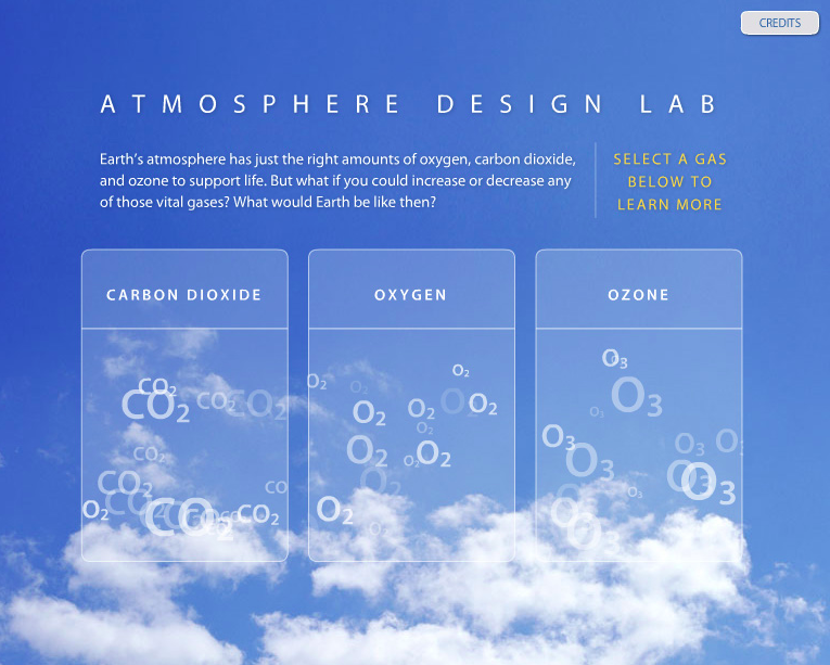
Atmosphere Design Lab

This website is an atmosphere design lab from the Smithsonian Institute. You can adjust the levels of carbon dioxide, oxygen or ozone in the atmosphere. Once you choose a gas, there are statistics about the levels of that gas in the atmosphere and what would happen if you changed the levels. There are also helpful examples from other points in history when different levels of these gases were present. For example, if you have more oxygen than the average amounts found on earth today, there would be a chance of things spontaneously combusting. This interactive site is helpful for people who want to learn more about the composition of the earth’s atmosphere but don’t know where to start.

URL: http://forces.si.edu/atmosphere/interactive/html/index.htm

A picture of the site is below.