Map of Life: Species Richness and Rarity Map

This website, the Map of Life (MOL.org), has provided an interactive map that shows species richness and species rarity across the world, showing data on the biosphere. It using a spread of colors to symbolize the different values, with purple being the least rich or rare, and red being the most. The map has three different screens: one for richness, one for average rarity, and one for total rarity. Additionally, you can click between a map view and a satellite imagery view. The map allows you to zoom in and out to see variances between regions at a large and small scale. The map also allows you to pick groups of organisms, with categories such as vertebrates, invertebrates, and plants. Within these categories are subcategory to get more specific.

Here is an image of the map feature:

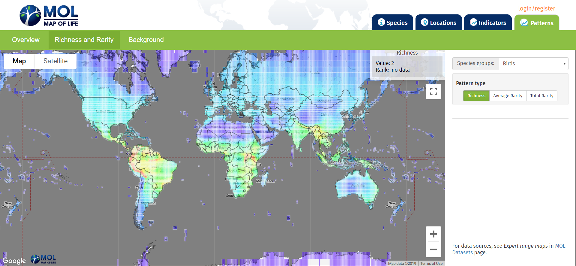
URL: https://mol.org/patterns/richnessrarity?taxa=birds&indicator=sr

New Online Tool Highlights Landslide Risk

USGS has recently released a new online tool that highlights landslide risks across the country. This interactive map provides centralized access to information about landslide occurrence, and can be used as a good starting point for the public, city and emergency planners, as well as researchers interested in landslides, to go to for information. This tool marks the first attempt of a federal agency to systematically catalog all of the landslide data across the country into one centralized location, and will be incredibly useful to all interested parties. Each landslide recorded on the map can be selected, and additional information about the event will be provided, including the date of the event, and notes regarding the extent and aftermath of each event. One clear potential benefit of the tool is to show more at-risk areas of landslides, so individuals can either avoid those areas or prepare restraining walls, or other measures, to minimize landslide damage.

Article link: https://www.usgs.gov/news/landslide-risks-highlighted-new-online-tool

Interactive Atmospheres: Jet Stream and Weather Maps from netweather.tv

netweather.tv is a site that provides a wide variety of interactive maps for current and predicted atmospheric patterns, including jet stream, storm risk, lightening detection, and weather radar maps. This site provides weather-related information for travel such as snow reports, predicted temperatures in high-volume travel destinations, and holiday weather. Live reports from meteorologists are also available. While this is a U.K.-based site which focuses on nations in and surrounding the U.K., there are numerous tools for monitoring atmospheric conditions in the U.S. and non-U.K. European nations.

https://www.netweather.tv/charts-and-data/jetstream


The Global Mountain Explorer

The geography website I choose was created by the United States Geological Survey in 2017 and is called “The Global Mountain Explorer”. This relatively new tool shows a map of mountains on top of a satellite image background giving users the most detailed view of Earth’s mountains. This resource was developed in partnership with Esri, the Center for Development and Environment of the University of Bern (CDE), the Global Mountain Biodiversity Assessment (GMBA), and the Mountain Research Initiative (MRI). The work is part of a Group on Earth Observations (GEO) initiative called GEO GNOME, GEO’s Global Network for Observations and Information in Mountain Environments. This work specifically addresses the goal to accurately delineate mountain regions using best available data. It is intended to provide information on the global distribution of mountain ranges and a variety of mountain data with a resolution 16 times more detailed than previous mapping efforts. What makes this tool useful for physical geography is that it allows anyone with connection to the Internet to observe where mountains are, what their relative altitude is, whether they are scattered or continuous, covered in snow or snow-free, etc.

https://rmgsc.cr.usgs.gov/gme/gme.shtml

USGS Earthquake Map

The U.S. Geological Survey displays information relating to recent earthquake strikes around the world. The left side of the screen shows the recent earthquakes in the United States. It tells how many earthquakes have occurred in the map are over the last 24 hours. If you zoom out to the entire world, the panel adjusts to include earthquakes all over the world. On the map, each earthquake is represented by a circle with varying sizes and colors. The size of the circle represents the magnitude of the earthquake and the color represents the relative age of the earthquake. The plate boundaries are are outlined in red. Clicking on a specific earthquake takes you to another page that offers an interactive map, a regional information map, a seismicity map, and a shake map. Also, people can write up a felt report of their earthquake experience. Additionally, under settings tab, one can narrow or widen the earthquake parameters by size, time, and place.

This website is helpful for understanding where recent earthquakes struck and specific information about each earthquake. Earthquake map visualization helps to reveal patterns in earthquake behavior and helps educate others on the overall impact of earthquakes.

https://earthquake.usgs.gov/earthquakes/map/

Wildebeest Migration Tracker

Image

This website gives frequent updates about the Wildebeest migration in the Serengeti happening currently. You can watch videos, read comments, or look at a map of the migration route of these Wildebeests on this website. There are updates almost daily from people that are watching this migration in person and observing where the animals are going and how they are fairing in their migration journey.

Image result for wildebeest great migration map"

Figure 1: Map of the Wildebeest Great Migration (https://www.discoverafrica.com/migration/map/)

Through looking at this website you can learn about the travel of species and why those species would want or need to migrate around, including climate or predatory reasons. There is also a live feed of the migration and maps of the path of migration for every month, as well as general information about Wildebeest migration patterns.

https://www.discoverafrica.com/migration/map/ 

Volcano Discovery


Volcano Discovery is a website that provides information on all things related to the lithosphere. It is run by a team of geologists based in Europe, Indonesia and Hawaii who work closely with international scientists from volcanological institutes and observatories all over the world. Together they have written a book ‘Volcano Discoveries: A Photographic Journey Around the World’, which they use to promote the various tours to active volcanoes that they offer on Volcano Discovery. Tour locations include Stromboli and Mnt. Etna in Sicily. 

It has an entire area dedicated to educating people on the causes and effects of earthquakes and volcanoes. They have a forum for the public to upload their own videos and photos of earthquakes or volcanoes that they have come across.  A key feature of the site is its Interactive Global Map of Active Volcanoes and recent Earthquakes. It also provides a breakdown of each eruption and quake.

Site: https://www.volcanodiscovery.com/home.html

Map: https://earthquakes.volcanodiscovery.com/


USGS’s Waterwatch

The U.S. Geological Survey’s WaterWatch displays data relating to hydrological events throughout the country in real time.  Interactive graphs, maps, and tables show streamflow, flood areas and drought areas. Maps and data can be viewed on both national and state scales.  Past streamflow data can be easily accessed. Annual summaries of streamflow data are also kept on this website. All this data can be displayed in a surprising number of ways.  WaterWatch’s toolkit section features 21 different graphs, charts, tables, and maps displaying and comparing streamflow data. My personal favorite is the customizable Streamflow Map Animation that shows streamflow data on a map over a period of time:

https://waterwatch.usgs.gov/index.php?id=ww_animation

The USGS stores enough water data to drown any student or professional researcher.  Such data is collected by over 3,000 USGS stream gauges throughout the country. Streamflow data is important to measure on such large scales because rivers and streams connect surface runoff to to large water bodies and groundwater.  Streamflow for all streams is therefore vital to the water cycle.

Polar Bears International

Polar Bears International is a website set up to help save the habitat of the polar bear, the sea ice that they call home. This includes the Arctic, Alaska, Russia, Greenland and Norway. The website’s method of doing this is focusing on climate change. They have many different suggestions on how to do this for people in many different positions; they look at how students and teachers can be leaders in the community for more green living. They look at what scientists, corporations and even small businesses can do to improve their greenhouse gas emissions.The website also has information on temperature trends, how the arctic is changing more specifically in terms of ice flows and the ecosystems overall. They make sure it is clear that there is no real debate on climate change anymore either, stating the common statistic that ninety seven percent of climate scientists agree that climate change is occurring and that it has Anthropogenic causes. This website is a great resource for information relating to climate on the arctic, and more specifically polar bears, as well as what to do to get involved and help be part of the solution.

https://polarbearsinternational.org/

GEOLOUNGE

GEOLOUNGE is an informational and interesting website. It has information about physical geography, human geography, maps, and more. Under the physical geography tab, they have tabs for biogeography and climatology. After learning about both biogeography and climatology in our class, I was intrigued by the different articles that I found. I wanted to share this article, “These Wolves in Minnesota are Very Very Territorial” that is posted on their site because it relates to our class. The article discusses how researches have used GPA collars to track the movements of 7 wolves at Voyageurs National Park in Minnesota. The data that was collected on the wolves locations is being used to understand pack boundaries and for the Project’s predation research. The screenshots I have included below show the travel paths for each of the wolves. The travel paths show how each pack adheres to territories with little overlap with other packs in the area. I thought GPS tracking of the wolves is an interesting concept and could be used to track more animals and possibly provide insights about animals travel habits which could be used to make better protected conservation areas. 

After reading this article, I clicked on a related link: “Using Remote Sensing for Mapping and Counting Animals.” This took me to GISLOUNGE, which is also another interesting and informational site, related to GOELOUNGE.