
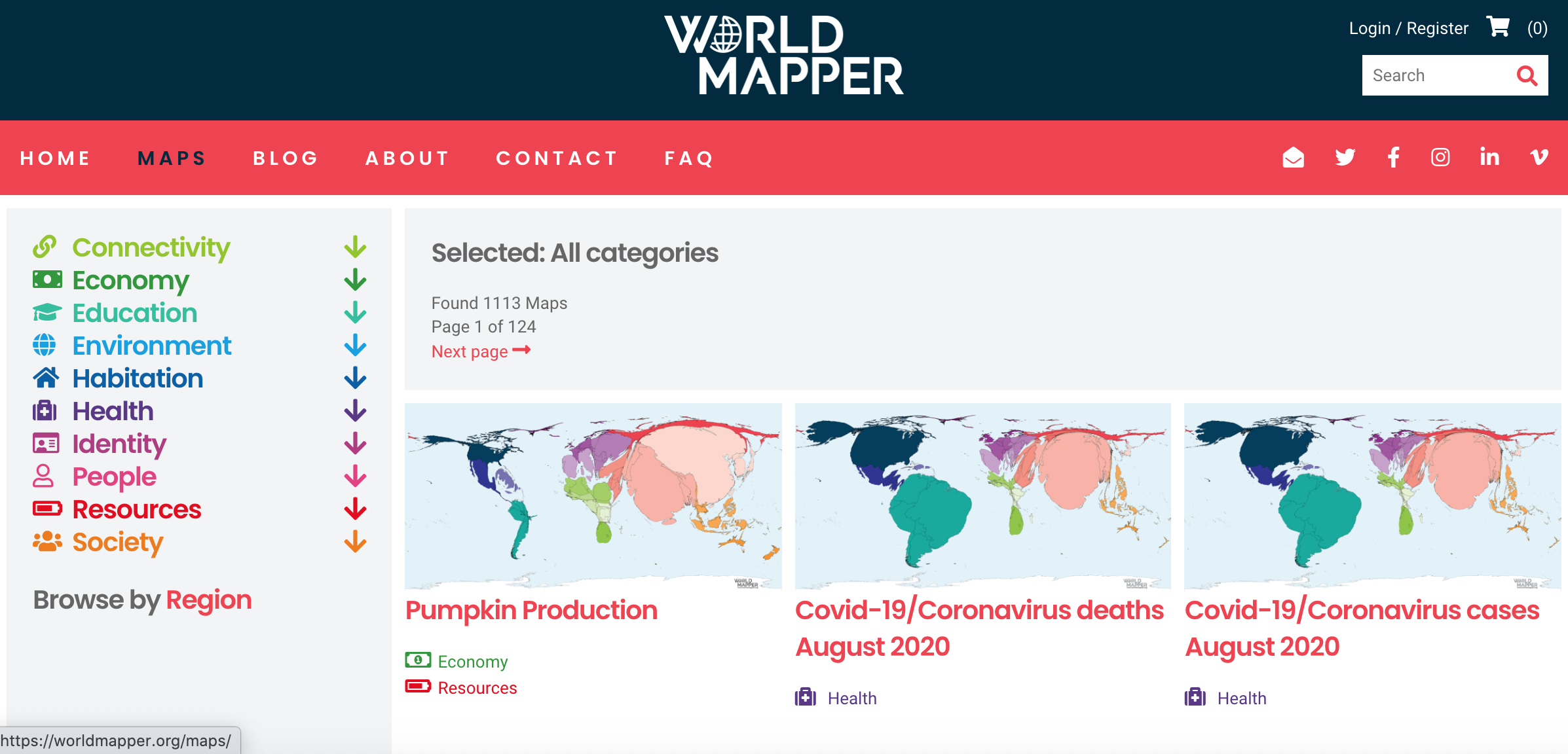
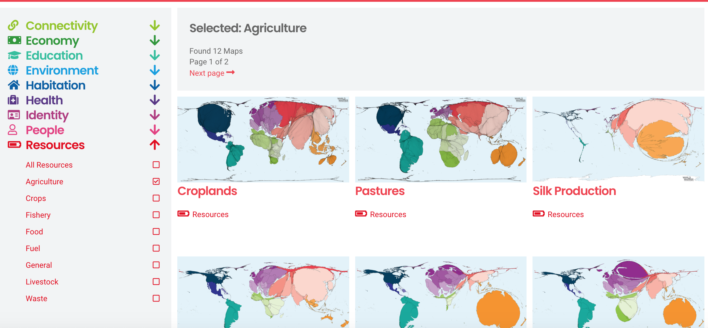
Worldmapper is a website that shows all kinds of different maps. The maps are not true to size and are distorted to show the percentage of what it is measuring in relation to all of the other countries. There are over a 1000 maps on this website demonstrating different topics from categories, like: connectivity, health, economy, education, environment, habitation, health, identity, people, resources, and society. The maps are of the whole world, but when searching for a particular map, you can also search by region. I think this website is super fun to look at because it has countless maps of a vast range of topics… under the economy and resources tab, there is a map about pumpkin production, yet under the health tab, there are monthly maps about the COVID-19 cases in each region. Each map provides a color key, as well as background about the topic below the map. I’d encourage you to go on this website and click around! Its pretty interesting to see the different maps of topics that you may not have seen maps of before like, countries with the most chickens, countries that have had the most avalanches and landslides in 2000-2017, countries the drink the most wine, and countries with the most Genetically Modified Organism (GMO) production. It is also interesting to see maps of topics we have discussed in class like carbon emissions, and pollution.
www.worldmapper.org
These maps are always fun. When in the description above I read that there were monthly COVID maps, the first thing I thought was that someone should make an animation of them–and behold, that animation was already on this website! I think, however, that in the end, a simple choropleth map is best for comparing quantities between countries; it can be difficult in a distorted map to distinguish regions beyond a certain point. The advantage to maps such as these over choropleth maps is that it is easier to display a continuous range of values, thereby avoiding the issues associated with dividing values into classes.
This is so cool! I thought the pigeon map was particularly interesting- not only did I learn about the worldwide distribution of pigeons as livestock, but I also learned that pigeons are raised as livestock period. Although maybe not the most practical for an understanding of regional patterns between countries as Charles pointed out, these maps are a fun visualization of global distribution!
I love this resource. I can so picture using this in a casual writing assignment in some other Geography or Environmental class to show the data in a fun and interesting way. I’m such a visual learner, and I’m glad that there’s maps that have really interactive and visually stimulating methods of showing data like this database does. Thanks for sharing!
Entering this website, I chose the interactive map of COVID-19 in Africa because I wanted to see the cases in a poor country. This Map showed the cases and deaths of certain countries in Africa. Egypt was the first country in Africa to report a case of coronavirus. As of today, Africa has 115,639 reported cases and 2,858 death which is the smallest number of all major geographical locations.