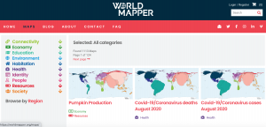
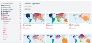
Worldmapper is a website that shows all kinds of different maps. The maps are not true to size and are distorted to show the percentage of what it is measuring in relation to all of the other countries. There are over a 1000 maps on this website demonstrating different topics from categories, like: connectivity, health, economy, education, environment, habitation, health, identity, people, resources, and society. The maps are of the whole world, but when searching for a particular map, you can also search by region. I think this website is super fun to look at because it has countless maps of a vast range of topics… under the economy and resources tab, there is a map about pumpkin production, yet under the health tab, there are monthly maps about the COVID-19 cases in each region. Each map provides a color key, as well as background about the topic below the map. I’d encourage you to go on this website and click around! Its pretty interesting to see the different maps of topics that you may not have seen maps of before like, countries with the most chickens, countries that have had the most avalanches and landslides in 2000-2017, countries the drink the most wine, and countries with the most Genetically Modified Organism (GMO) production. It is also interesting to see maps of topics we have discussed in class like carbon emissions, and pollution.
www.worldmapper.org


