More on the slinky

My friend Allen Downey posted a model of how the falling slinky behaves, with the goal of calculating how the top end moves. (In my post, I focused just on the fact that the bottom end stays still for so long.) Allen’s approach is clever and gets some of the large-scale features right but is wrong in detail (as he agrees). Let me see if I can fix it up a bit.

Allen observes that the slinky seems to completely collapse from the top down. That is, at any given moment, there’s a point above which the slinky is completely collapsed and below which it’s the same as it was originally. He uses that, along with the fact that the center of mass has to descend in the usual constant-acceleration way, to work out the rate at which the top end has to move. The problem is that the analysis assumes the slinky has uniform density, which isn’t true: it’s much more stretched out at the top than at the bottom.

Warning: equations and integrals ahead. Skip to the graphs near the end if you want.

To fix this up, we need to know how the density varies along the slinky’s length. I claim that, to a pretty good approximation, the initial density is proportional to 1/sqrt(y), where y is the height measured up from the bottom of the slinky. Here’s why.

Consider a small piece of the slinky at height y, with width dy. If L(y) is the linear mass density, then the mass of this piece is L(y) dy, and the force of gravity on it is g L dy. Initially, this piece is at rest, so this force must be balanced by the spring tension on either side of it. The tension in the spring is proportional to 1/L (the more the spring is stretched, the smaller the mass density). The upward forces by the pieces right above and below the segment in question are proportional to [1/L(y+dy)] and 1/L(y) respectively. Since they pull in opposite directions, the net force is the difference between these two, which is dy times the derivative of 1/L. So

(1/L)’ = constant times L.

The solution to this is L  proportional to 1/sqrt(y+constant). We want the tension in the spring to be essentially zero at the bottom, so the constant inside the square root is zero. (This approximation breaks down somewhere very near the bottom, but I’m not too worried about that.)

For convenience, I’ll choose my unit of length so that the initial length of the slinky is 1 and my unit of mass so that the constant of proportionality in the density is 1:

L(y) = y-1/2, for 0<y<1.

As you can check by doing a couple of integrals, in these units, the total mass of the slinky is 2, and the center of mass is initially 1/3 of the way up.

Now adopt Allen’s model. At any given time t, there is some Y(t) such that the part of the slinky above Y has completely collapsed and the part below hasn’t moved at all. We’ll assume that the collapsed part can be modeled as having zero height, so that all that stuff is at the height Y. Then the  position of the center of mass is

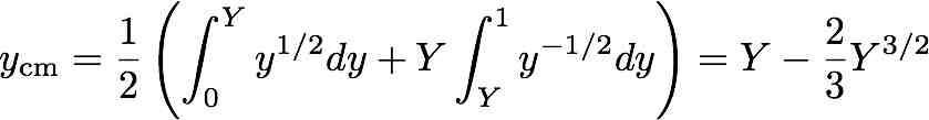
We know that the center of mass must drop according to the usual free-fall rule,

ycm = 1/3 – (1/2) gt2.

Having already chosen weird units of length and mass, we might as well choose units of time so that g = 1.

Now we set those two expressions for the center of mass equal and solve for Y. Sadly, the resulting equation is a cubic. Cardano and Mathematica know how to solve it, but the solution is a very complicated and unenlightening formula. Here’s a graph of it, though.

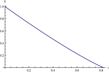
For those who skipped over the equations and are just joining us, this is, according to my model, the position of the topmost point on the slinky as a function of time.

Here’s the interesting thing: this graph looks really really close to a straight line. That is, the top of the spring moves at roughly constant velocity. Allen’s original argument led to the conclusion that it moves at exactly constant velocity, which turns out to be not that far wrong.

Here’s a graph showing the velocity of the topmpost point on the slinky as a function of time:

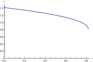
The top end actually slows down a bit, according to this model.

We offer a computational methods class from time to time in our department. It’d be a nice assignment to model this system numerically in detail and compare the results both with the above model and with video-captured data from a real falling slinky.


Fun for a girl and a boy

Check out this video of a falling slinky:

[Update: Video was wrong for a while. I think it should be right now.]

The person who made this, who seems to go by the name Veritasium, has some other sciency-looking videos on his YouTube channel, by the way. I haven’t checked out the others.

In principle, it should be obvious to a physicist that the bottom of a hanging slinky can’t start to move for quite a while after the top end is dropped. To be specific, the information that the top end has been dropped can’t propagate down the slinky any faster than the speed of sound in the slinky (i.e., the speed at which waves propagate down it), so there’s a delay before the bottom end “knows” it’s been dropped. But it’s surprising (at least to me) to see how long the delay is.

There are a couple of different ways to explain this. One is essentially what I just said: the bottom of the slinky doesn’t know to start falling because the information takes time to get there. The other is

[T]he best thing is to think of the slinky as a system. When it is let [go], the center of mass certainly accelerates downward (like any falling object). However, at the same time, the slinky (spring) is compressing to its relaxed length. This means that top and bottom are accelerating towards the center of mass of the slinky at the same time the center of mass is accelerating downward.

These are both right. Personally, I think the information-propagation explanation is a nicer way to understand the most striking qualitative feature of the motion (that the bottom stays put for so long). But if you wanted to model the motion in detail you’d want to write down equations for all the forces.

Anyway, it’s a nice illustration of a very common occurrence in physics:  you can give two explanations of a phenomenon that sound extremely different but are secretly equivalent.

(I saw this on Andrew Sullivan’s blog, in case you were wondering.)

Kahneman on taxis

The BBC podcast More or Less recently ran an interview with Daniel Kahneman, the psychologist who won a Nobel Prize in economics.

He tells two stories to illustrate some point about people’s intuitive reasoning about probabilities. Here’s a rough, slightly abridged transcript of the relevant part:

I will tell you about a city in which two taxi companies operate. One of the companies operates green cars, and the other operates blue cars. 85% of the cars are green, and 15% are blue. There was a hit-and-run accident at night that clearly involved a taxi, and there was a witness who thought that the car was blue. They tested the accuracy of the witness, and they showed that under similar conditions, the witness was accurate 80% of the time. What is your probability that the cab in question was blue, as the witness said, when blue is the minority company?

Here is a slight variation. The two taxi companies have equal numbers of cabs, but 85% of the accidents are due to the green taxis, and 15% are due to the blue taxis. The rest of the story is the same. Now what is the probability that the cab in the accident was blue?

Let’s not bother doing a detailed calculation. Instead, let me ask a qualitative multiple-choice question. Which of the following is true?

  1. The probability that the cab is blue is greater in the first scenario than the second.
  2. The probability that the cab is blue is greater in the second scenario than the first.
  3. The two probabilities are equal.

This pair of stories is supposed to illustrate ways in which people’s intuition fails them. Supposedly, most people’s intuition strongly leads them to one of the incorrect answers above, and they find the correct one quite counterintuitive. Personally, I found the correct answer to be the intuitive one, but that’s probably because I’ve spent too much time thinking about this sort of thing.

I wanted to leave a bit of space before revealing the correct answer, but here it is:

Continue reading Kahneman on taxis

Creationism: it’s not just for Americans

Interesting report from Nature about the teaching of evolution (or rather the lack of it) in South Korea.

Mention creationism, and many scientists think of the United States, where efforts to limit the teaching of evolution have made headway in a couple of states1. But the successes are modest compared with those in South Korea, where the anti-evolution sentiment seems to be winning its battle with mainstream science.

A petition to remove references to evolution from high-school textbooks claimed victory last month after the Ministry of Education, Science and Technology (MEST) revealed that many of the publishers would produce revised editions that exclude examples of the evolution of the horse or of avian ancestor Archaeopteryx. The move has alarmed biologists, who say that they were not consulted.

One interesting contrast between US and Korean creationism:

However, a survey of trainee teachers in the country concluded that religious belief was not a strong determinant of their acceptance of evolution.

It’s not totally clear to me what the reason is if not religious belief.

Another interesting nugget:

It also found that 40% of biology teachers agreed with the statement that “much of the scientific community doubts if evolution occurs”; and half disagreed that “modern humans are the product of evolutionary processes”.

I’ve always imagined that relatively few biology teachers are actual creationists: I imagine that they actually know that there’s a complete scientific consensus that evolution is right, even if they don’t teach it in class as much as they should (often due to external pressures). But according to this, lots of South Korean biology teachers are sincere creationists. It started me wondering whether the same is true in the US.

Here’s a survey of US biology teachers that addresses the question. Almost all of the survey has to do with what teachers teach in class (and is very interesting). As far as I can tell, there’s just one question that’s about what the teachers actually believe:

The questions are different, so it’s hard to do a head-to-head comparison between the US and South Korean teachers. Clearly everyone in the last group would disagree with the  statement that “modern humans are the product of evolutionary processes,” and everyone in the second group would agree with it, but what about the majority in the first group? I suspect that many of them would agree with the statement, but it’s hard to know for sure.

This is a depressing subject for most scientists, so here’s one little ray of sunshine from the survey:

Or does the fact that I’m encouraged to see that “only” 13% of science teachers believe this simply show how depressingly low my expectations are?

Anyway, if you’re interested in this stuff, it’s worth browsing around the rest of the survey results.

Auntie Beeb

I got an email from someone at the BBC last week, asking for permission to use some images of mine (as opposed to images of me, in which they have expressed no interest) in an upcoming documentary. The images in question are ones I made to illustrate some aspects of the maps made by the COBE satellite about 20 years ago. I was a bit surprised that they wanted them, but of course I’m happy to help out.

Because the images are so old, I couldn’t lay my hands on decently high-resolution versions of them. All I could find were copies at various web sites such as this one by Wayne Hu. It turned out to be easy enough just to remake them, so that’s what I did. In fact, thanks to the HEALPix software package, it was easy to make versions that were considerably better than the originals.

The BBC may not end up using the images. I’ll go ahead and put them up here with a bit of explanation anyway.

COBE made all-sky maps of temperature variations in the cosmic microwave background radiation. The pattern of hot and cold regions in these maps provided invaluable information about the early Universe and won a couple of people the Nobel Prize. The COBE maps look like this:

(I didn’t make this one, by the way. The COBE team did. The rest of the images in this post are mine.)

The COBE instrument had imperfect resolution (like all telescopes), meaning that it couldn’t see features smaller than some given size. It also had significant noise in the images, because the signals it was looking at were very weak. So the relation between what COBE saw and what’s actually out there is not obvious. Here’s one way to illustrate the difference.

Suppose that COBE had been designed to measure the Earth, rather than the Universe. Then the “true” signal it would look at is something like this:

(This is a map of the elevation of Earth’s surface.)

The telescope’s resolution is such that features smaller than about 7 degrees are blurred out, so the map would be degraded to something like this:

To make matters worse, there is noise (random “static”) in the data, which would make the actual observed map look more like this:

(By the way, I wasn’t terribly precise at this stage in the process. The noise level is roughly equivalent to the COBE noise level, but only roughly.)

You can see the large-scale features (e.g., continents) peeking out from the noise, but especially on small scales the signal is dominated by noise.

There are various ways you can “filter” the data to reduce the effects of noise. The optimal filter (for some definition of “optimal”) in this situation is called the Wiener filter. This is essentially a way of smoothing out the data to get rid of the small-scale variation (which is mostly noise) and keep the large-scale stuff (which is mostly signal). If you apply a Wiener filter to the noisy map above, you get this:

This is what you might reasonably expect to see if you observed the elevation of Earth with a COBE-like instrument. The large-scale features do correspond roughly to real things, but you can’t trust all the details.

Note that this is not a criticism of the COBE work — it’s just that the signals they were looking for were very hard to measure. That’s why other telescopes, most notably the successor satellites WMAP and Planck, were necessary.

Telescope lost and found

Some of you probably already know about this, but for those who don’t, here’s a strange story. A telescope designed to observe the cosmic microwave background radiation was on its way to the NASA balloon launch facility in Palestine, Texas, when it went missing for about  three days.

The driver of the truck containing the telescope disappeared for a while, then turned up without the trailer containing the telescope. The trailer turned up later. The driver won’t say what happened.

Apparently the telescope is fine. All that was missing from the trailer were “two bicycles and three ladders.”

The cost to replace the telescope would have been enormous, but of course it’s an extremely illiquid asset — who would you try to fence it to?

Since I work in this field, it’s no surprise that I know many of the people involved in the experiment, and of course I’m very relieved for them and for the cosmology community.

I feel a strong connection to this story, because many years ago I was briefly a member of a team that flew a similar (albeit much more primitive) microwave background telescope from the balloon launch facility in Palestine. I wasn’t involved in the project for very long, and my only real contribution was driving the truck containing the telescope back from Palestine to California with my friend and fellow graduate student Warren Holmes. Nowadays, apparently they outsource tasks like that to professionals rather than grad students. Look how well that worked out.

A couple of elitist coastal vignettes about Palestine:

  1. One guy on the experiment was a vegetarian. Options for him were not plentiful. He got mighty sick of the salad bar at the Golden Coral.
  2. One of the more interesting places to visit in Palestine was the pawn shop. As I recall, about 80% of the shelf space was taken up by two items: guns and guitars.


The new MCAT

Only about two months late, I finally got around to reading the New York Times Education Life piece on the new MCAT (the test taken by applicants to US medical schools). Self-centered soul that I am, I’ve primarily paid attention to what’s happening to the physics content of the MCAT, not about what other new subjects are being added.

The short answer is social sciences, primarily psychology and sociology.

This may well be a good idea, although the primary reason for the change, according to the article, strikes me as bizarre:

 In surveys, “the public had great confidence in doctors’ knowledge but much less in their bedside manner,” said Darrell G. Kirch, president of the association, in announcing the change. “The goal is to improve the medical admissions process to find the people who you and I would want as our doctors. Being a good doctor isn’t just about understanding science, it’s about understanding people.”

The adoption of the new test, which will be first administered in 2015, is part of a decade-long effort by medical educators to restore a bit of good old-fashioned healing and bedside patient skills into a profession that has come to be dominated by technology and laboratory testing.

The hypothesis that studying psychology and sociology will improve bedside manner is far from obvious, to say the least. Studying psychology to improve this sort of skill is about as likely to work as studying physics to improve your ability to play baseball.

Let me stipulate a couple of things. This is not intended as a putdown of psychology as a discipline. Physics is worth studying even if it doesn’t improve your batting average, and psychology is worth studying even if it doesn’t improve your bedside manner. Similarly, I’m not claiming that the change in emphasis on the MCAT is a bad idea — in fact, it may well be very sensible. I just don’t think this is a good reason for it. I doubt very much that anything you could put on a multiple-choice test would select well for bedside manner.

A few other little things:

1. The article begins with an anecdote about a medical ethics class that had a sudden increase in enrollment due to students wanting to be ready for the new MCAT. But the new test doesn’t roll out until after these students will have taken the MCAT. Perhaps what the test really needs is an emphasis on arithmetic.

2. Some of the graphics in the article are truly atrocious.

Presumably the point of this one is to tell you something about the gender balance at different stages of the application process. Without actually counting the little purple and orange folks, can you tell whether the percentage of women goes up or down at each stage?

Then there’s this one.

Again the point is presumably to show how the percentages of different groups change from the applicant pool to the accepted pool. Can you tell from this graph whether the green percentage went up or down? The magenta percentage? (Confession: I cropped out the legend, which listed the percentages, so in fact you’d know the answers if you saw the original graph. But if the only way to tell the interesting information is by reading the numbers from the legend, what’s the point of the pie chart?)

Also, because the wedges are different heights, the volumes aren’t proportional to the actual percentages. This is a classic how-to-lie-with-statistics problem.

These graphs aren’t quite perfectly designed to obscure the relevant information, but they’re close.