I got an email from someone at the BBC last week, asking for permission to use some images of mine (as opposed to images of me, in which they have expressed no interest) in an upcoming documentary. The images in question are ones I made to illustrate some aspects of the maps made by the COBE satellite about 20 years ago. I was a bit surprised that they wanted them, but of course I’m happy to help out.
Because the images are so old, I couldn’t lay my hands on decently high-resolution versions of them. All I could find were copies at various web sites such as this one by Wayne Hu. It turned out to be easy enough just to remake them, so that’s what I did. In fact, thanks to the HEALPix software package, it was easy to make versions that were considerably better than the originals.
The BBC may not end up using the images. I’ll go ahead and put them up here with a bit of explanation anyway.
COBE made all-sky maps of temperature variations in the cosmic microwave background radiation. The pattern of hot and cold regions in these maps provided invaluable information about the early Universe and won a couple of people the Nobel Prize. The COBE maps look like this:
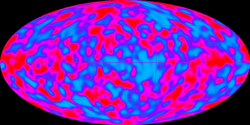
(I didn’t make this one, by the way. The COBE team did. The rest of the images in this post are mine.)
The COBE instrument had imperfect resolution (like all telescopes), meaning that it couldn’t see features smaller than some given size. It also had significant noise in the images, because the signals it was looking at were very weak. So the relation between what COBE saw and what’s actually out there is not obvious. Here’s one way to illustrate the difference.
Suppose that COBE had been designed to measure the Earth, rather than the Universe. Then the “true” signal it would look at is something like this:
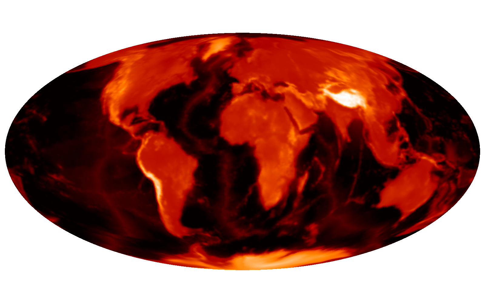
(This is a map of the elevation of Earth’s surface.)
The telescope’s resolution is such that features smaller than about 7 degrees are blurred out, so the map would be degraded to something like this:

To make matters worse, there is noise (random “static”) in the data, which would make the actual observed map look more like this:
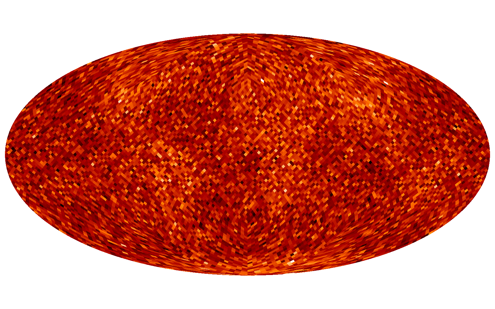
(By the way, I wasn’t terribly precise at this stage in the process. The noise level is roughly equivalent to the COBE noise level, but only roughly.)
You can see the large-scale features (e.g., continents) peeking out from the noise, but especially on small scales the signal is dominated by noise.
There are various ways you can “filter” the data to reduce the effects of noise. The optimal filter (for some definition of “optimal”) in this situation is called the Wiener filter. This is essentially a way of smoothing out the data to get rid of the small-scale variation (which is mostly noise) and keep the large-scale stuff (which is mostly signal). If you apply a Wiener filter to the noisy map above, you get this:
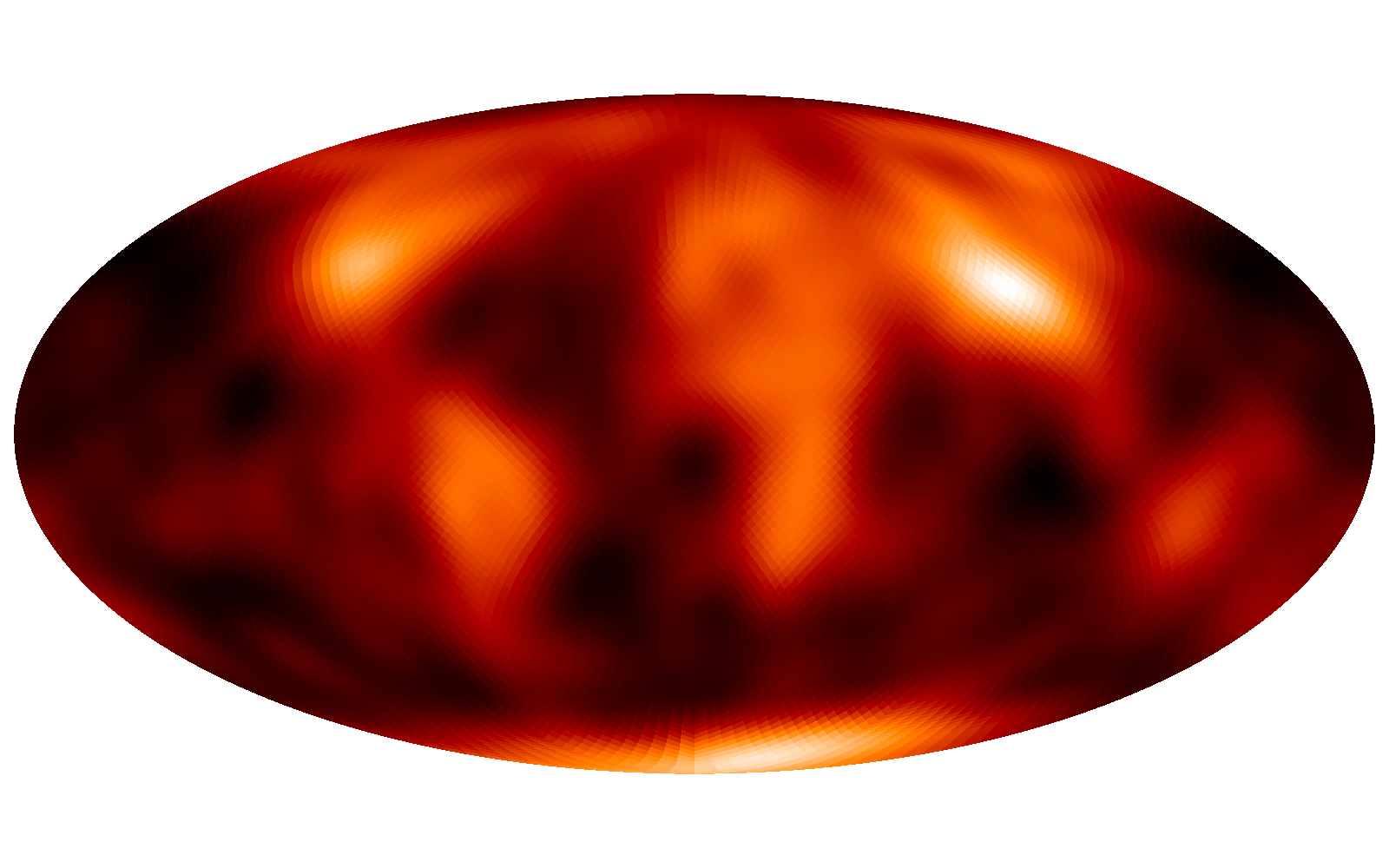
This is what you might reasonably expect to see if you observed the elevation of Earth with a COBE-like instrument. The large-scale features do correspond roughly to real things, but you can’t trust all the details.
Note that this is not a criticism of the COBE work — it’s just that the signals they were looking for were very hard to measure. That’s why other telescopes, most notably the successor satellites WMAP and Planck, were necessary.
Nice explanation of noise filtering, Ted. Do you know what the upcoming BBC series is about? If they’re going to address issues like how scientific inference works when the actual data consists of messy things like noisy sky maps, my interest is piqued.