United States Exports and Imports of Commodities: 1967

Our map titled “United States Exports and Imports of Commodities” is a fascinating cartographic production due to its unique ability to synthesize a large amount of economic information while still retaining the spatial properties which characterize maps. The piece was finished in 1967 and published in the “National Atlas of the United States” in 1970 during a time period when the United States was looking to secure the political and economic allegiance of a number of countries who had recently gained their independence, especially in Africa. Also, the map began its rhetorical life during the heat of the Vietnam War, an event which possibly influenced some of the cartographic decisions in the map’s creation including denying any sort of economic relations with communist countries. The base map was originally found in National Geographic, although data from the US Bureau of the Census. This sort of collaboration in the production of the map hints at its intention. Rather than trying to enhance the readers understanding of domestic geology (as most of the other maps in the “National Atlas of the United States” did), the map points to the soft power of the United States. Soft power differs from hard power in that hard power relates to military strength and other observable, overt forms of control and domination, while soft power is more insidious, referring to control through value systems or ideologies. By presenting a world in which the US’s economic power reaches all recesses of the map, the audience becomes aware of the hegemonic economic power of America throughout the globe. Further analysis of the map reveals that the cartographic choices employed try to present the most objective map possible while letting readers know who the true global leader in trade is.

The map itself utilizes a Van Der Grinten Projection, which is centered on the United States and appears to enlarge the entire Northern Hemisphere. The arrows indicating the scope of economic relations with various regions of the world make it seem as though the United States is the hub of all global financial activity; the tree from which worldwide economic roots are spread. The use of arrows becomes particularly interesting when we look at the Soviet Union. Given that this map was published during a time when both the US and the USSR were battling for control of the newly founded “Third World”, it is no coincidence that the arrows surround and choke the Soviet Union, showing the world that any country not aligned with the US could face a sort of economic death. The use of pie charts allows viewers to gain a deeper understanding of the individual relationship the United States has with each country. The pie charts incorporate the idea of a cartogram into the map by resizing each individual graph depending on the extent to which the US trades with these nations. The four legends in each corner of the map add detail in an attempt to prove that this production is 100% objective and without bias, even though any informed map reader knows that a two-dimensional representation of the three-dimensional world is bound to contain distortions and imperfections. Historical context allows readers to understand that Japan is one of the United States’ biggest trading partners due to our interest in rebuilding their devastated economy after World War II. Also, high quantities of exports to and imports from Canada is most likely the result of geographic proximity and the fact that we were political allies during the Cold War. Color choice was another important cartographic decision because the bold pastel colors of various import and export commodities allow viewers to easily differentiate the different sectors of trade from one another. Although it is quite easy to get lost in all the detail and information being presented on the page, this map continues to live out its rhetorical life because it provides viewers with a political, economic and historical snapshot of the United States during 1967.

“United States Exports and Imports of Commodities” is a fascinating artifact from a time period in which the United States was trying to expand its international power. This goal is reflected through the map in a number of ways, from novel visual representations to an abundance of auxiliary information within the map. We enjoyed exploring the notion of soft power when discussing the map, and how not all forms of control necessitate the use or demonstration of military superiority.  While interpreting the map was a time consuming and thought provoking process, we hope that the class has gained a deeper understanding of the amount of decisions that go into creating a given map.


Li Li and Pat

Posted in Uncategorized | Comments Off on United States Exports and Imports of Commodities: 1967

Lunar Wall Mosaic Presentation!

The Aeronautical Chart and Information Center’s map, “The Lunar Wall Mosaic”, created in 1962, depicts the moon’s surface, which consists of labeled craters and mountains[i]. The map’s depiction of the moon is sincere; however, the moon’s surface is not a remarkably intriguing territory. After a few minutes of examination, the map will most likely lose its audience’s attention. As a result, the important component of this map is its creation not its presentation. Lunar mapping enabled humans to visit and study the moon, as a map should, but the actual act of mapping the moon carried substantial political connotations.

Lunar mapping began in the early 1600’s and continued to develop throughout history. In the early 1600’s, William Gilbert created the first known map of the moon using naked-eye observations[ii]. The mapping of the moon became more detailed after scientists invented and improved telescopes. Lunar mapping reached its “hay-day” during the 1950’s and 60’s when placing a person on the moon became a possibility. However, after the United States successfully landed humans on the moon with the Apollo 11 mission, lunar interest faded rapidly and subsequent lunar investigation dwindled dramatically.

Mapping the moon was essential for a reason astronomer Zdenek Kopal captures particularly well in his statement “before travelers are able to visit the moon, it needs to be mapped”, however, mapping the moon was not a simple process[iii]. For astronauts to land on the moon, they needed to know exact details of the surface such as its slope and composition. Early astronomers used craters and telescopes to label the moon, establish longitude and latitude and estimate elevation, and detailed photographs later enabled more precise marking. Because the moon’s surface does not experience erosion similar to that on Earth, cartographers used novel techniques such as airbrushing to create lunar maps.

The two authorities that needed lunar maps the most during the 1950’s and 60’s were the United States and the Soviet Union. These two superpowers engaged in a “space race” in which they competed to explore space. As a result, the ability to map the moon carried political connotations. Mapping the moon demonstrated the ability of the two authorities to organize their resources and power. Because the United States and the Soviet Union were engaged in the Cold War, lunar mapping became a form of psychological warfare. As the United States mapped the moon, or vice versa, the citizens of the opposing power may have worried about being technologically inferior. Those citizens may have had thoughts such as “why are we not mapping the moon and sending more satellites into space” or “is our enemy gaining greater control over the final frontier”.

In addition to political implications, lunar mapping had military connotations. If an authority mapped the moon, that may have meant they were able to map the rest of the world. Therefore, if the United States managed to map the moon, was it able to map Soviet Union? Furthermore, mapping the moon revealed supplies of resources available on the moon’s surface. If the United States located these resources, the Soviet Union might have worried that the United States would have greater access to resources if there were ever a global shortage. “Lunar Wall Mosaic” highlights the important development of lunar mapping, which enabled astronauts to land on the moon and had significant political and military connotations during the Cold War.

Notes

[i] Aeronautical Chart and Information Center. Lunar Wall Mosaic. (Missouri: Aeronautical Chart and Information Center, United States Air Force, 1962). March 24, 2014.

[ii] Wilford, John, “Extraterrestrial Mapping: the Moon” in The Mapmakers: Revised Edition, (New York: Vintage Books, 2001), 427 and 428.

[iii] Kopal, Zdenek, “Essentials for Mapping the Moon” in American Scientist, Vol. 47, No. 4, (Sigma Xi, The Scientific Research Society, 1959), 505.

Robert Hicks and Robert Nogay

Posted in Uncategorized | Comments Off on Lunar Wall Mosaic Presentation!

Atlas of Disease: World Distribution of Spirochetal Diseases


AGS Spirochetal Small.jpg

Boils, blisters, and bruises cover the southern hemisphere and make it the foreign and scary “Third World”. However, is this true or is this map trying to project certain ideals and interests on its audience?

The Atlas of World Disease was created in 1950 by Dr. Jacques May after the end  of World War II and during the Cold War. In this time period, Africa was in the process of rapid decolonization and the United States feared whether these new “Third World” countries would become democratic or communist. The creation of this atlas was funded by a three-headed beast consisting of the American Geographical Society, the United States Armed Forces, and various pharmaceutical corporations (Barney 2). It can be assumed that each of these groups had specific ideals and interests that they wanted to get across in this atlas so that it could be used as a piece of propaganda. One of the more interesting maps within the Atlas of World Diseases is the “World Distribution of Spirochetal Diseases” which depicts the prevalence of the diseases yaws, pinta, and bejel. This map lived a very active rhetorical life, making its way into the Council on Foreign Relations, boardroom meetings at corporations like Pfizer, congressional reports, and military advisor’s hands in areas such as Vietnam (Barney 2).  Although the uses of the map may have changed, the projection always stayed constant.

This map uses a Briesemeister equal-area projection that was commonly utilized during the Cold War as a way to show how close the United States and the USSR are. However, in this map, the Northern Hemisphere is covered up, causing the reader’s eyes to shift to a different center of the map—Africa. Through this projection and the elimination of the Northern Hemisphere, the Southern Hemisphere and the “Third World” countries become the focus of the map.

Following the projection of the map, one of the first things that a reader is drawn to is the set of pictures that are used to block off the Northern Hemisphere. These pictures serve a dual purpose. Not only are these pictures able to cover the Northern Hemisphere, making it appear clean and impervious to disease, but they also increase both the credibility and emotion of the map. By showing the deformities and the damages caused by these diseases, the pictures enhance the reader’s fear of these diseases as well as allow the reader to believe more in the scientific and factual nature of this map.  By causing the reader to both fear and believe the ideals that are radiating from this map, the map is able to become more powerful and influential in its true meaning.

Once the reader moves on from the pictures in the map, he/she is immediately drawn towards the deep red color that seems to have infected the “Third World”. However, if the reader looks closely, they will see that the deep red color represent only 1% or more of the population having the disease, a relatively small scale. As a result of this, the question arises of why is the color red used and why would the map maker want there to be as much deep red as possible in the map?

This question could have many different answers, but the most likely one relates to how this is a Cold War map. Dr. Jacques May most likely wanted to use red to represent communism and make the American public and all of the readers of this map fear the idea of communism seeping into these “Third World” countries and spreading like a disease. Dr. Timothy Barney reaffirmed this concept by stating that, “Color and density are, obviously, common tools for cartographers- and here the rhetorical choice of red and pink hues offers a sense of urgency, alarm, and infection” (Barney 25).  This map’s ability to create a fear of communism in the “Third World” attributes to how this map could be used as propaganda.

While the map of the “World Distribution of Spirochetal Diseases” appears at first glance to be based on the factual mapping of disease in “Third World” countries, this is not the case.  The scientific appearing map is actually a Cold War map that is used to divide the Northern and Southern Hemispheres for a specific reason. The main purpose is to impart a fear of the beginning and spreading of the disease we call communism in the impoverished “Third World”.


Sources:

 Barney, Timothy. “Diagnosing the Third World: The “Map Doctor” and the     Spatialized Discourses of Disease and Development in the Cold War.” Quarterly Journal of Speech 00.00 (2014):             1-30. Print.


Posted in Uncategorized | Comments Off on Atlas of Disease: World Distribution of Spirochetal Diseases

Mapping Facebook’s Global Revolution

A global revolution started inside a dorm room in April 2004. Shocking, right? These days maybe not, but in 2004 nobody would’ve predicted how broadly the social media site Facebook would cover the world given its humble beginnings. Even Mark Zuckerberg, founder of Facebook, might not have predicted his company’s impact on a map one decade later. Thanks to Facebook’s Silicon Valley neighbor Google and its “Google Trends”, we have access to that map over 6 years time. Facebook represents a larger reality than most people would think and these maps provide the ability to see it. As social media sweeps the globe, so does the demand for information, connection, and various freedoms the Internet can provide. Facebook is inspiring human agency and, based on how quickly the company is growing, the world is clearly loving it.
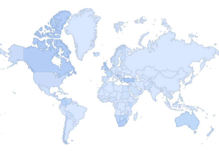
 Jan-Jun 2008

Let’s start in 2008, when Facebook began to break onto the international social media stage. First, the projection is almost like a Mercator map due to its distortions. By preserving angles and shapes of small masses and distorting the size of larger masses, we see the Northern Hemisphere is larger than the Southern Hemisphere. Mercator maps are used to create straight lines from one object to another, but its unclear why the authors chose this. The maps are shaded in blue (Facebook’s primary color) to signify each country’s “Search Volume Index”. SVI is a relative measurement calculated to find the average traffic for the time period that you see on the result page. This means that if a certain country’s population just recently discovered Facebook, it will be a darker blue. Trending creates more traffic and more hits, and therefore the SVI goes up. Trending is ignited when Facebook releases additions like more languages, mobile apps, Skype video chat, and other features to make headlines. At this point in the company’s career in 2008 there are roughly 90 million online users globally, but we can see that Facebook is still on the “come-up”, as SVIs are low, signified by the light blue. Each individual country’s color is based on their SVI relative to their future SVI, and the SVIs of other countries.

We immediately see there are some silences in the map, as well as political choices the maps’ creators have made. It’s critical to question why the United States is no darker than most countries around them even though Facebook and the Internet were built and first established in the U.S. This is because the map doesn’t show the number of users per country. Mexico and the U.S. are the same color in this first map because trending is low. However, the respective reasons for little trending are different; the United States has already established a solid followership while Mexico has not. Facebook is beginning to trend in countries like Turkey, the U.K., South Africa and Australia, and their SVIs are slightly higher. To be clear, the maps are essentially pointing out what is exponentially popular at a certain time rather than the numerical degree of its popularity (or total amount of users). It’s also crucial to point out that national boundaries are highlighted, which is a political statement. The authors are declaring each nation possesses unique interests in Facebook, and yet Facebook is transcending those barriers. If we took away the gray lines, the tie-dye blues left would show connectivity between countries. Facebook is free flowing into whatever market allows its presence, and national borders can rarely hinder that process.
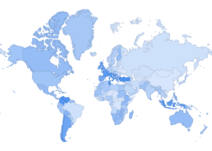
 Jan-Jun 2010

In 2010 we see substantial growth in Europe, Indonesia [i], and parts of South America. While there are more gradual changes between 2008 and 2010 in Turkey, Columbia, Chile, and a few other countries, Indonesia becomes a darker blue very quickly. Indonesia, like many Asian countries, is becoming increasingly connected to the Internet. With the world’s fourth largest population Facebook is capable of trending incredibly quickly, just as it did. It is fair to say that most of the world, including many African countries, has started to pick up on the Facebook revolution. The national boundaries shown become irrelevant because the darker colors represent a newfound connection and freedom. However, there are three big outliers and all happen to be some of the world’s biggest populations. Those are China, Brazil, and Russia. The reason for these giant absences in the Facebook population must’ve infuriated Zuckerberg at the time. In 2010, other forms of online social media dominated. Qzone (China), Orkut (Brazil), V Kontakte (Russia) were all established as the most popular social site throughout their countries. The blatant absence of Facebook in populated or at least technologically advanced nations subtlety points out that there are indeed competitors to Facebook’s global dominance. However, Facebook has an advantage over other social media sites because its widespread popularity creates more opportunities for connection around the globe.
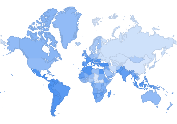
Jan-Jun 2012

By the time 2012 hits, Brazil has said goodbye to Orkut and hello to Facebook. With Facebook trending in almost every other country in South America, it makes sense that Brazil, in order to connect to its neighbors or European roots in Portugal, would gravitate to the most globally popular social media site. Another new country that abruptly trends is India. Given its second largest population in the world, a country like this might create a ripple effect that draws intrigue from other countries. This is where social media can become overwhelming for governments of countries that notoriously blockade much of the Internet. Facebook serves as a form of free speech, a right that not enough nations afford their citizens. A phenomenon such as Internet freedom can especially act as a liberator for overly censored countries. In the 2012 map, many countries in Southeast Asia, Africa, and the Middle East follow India with increasingly blue SVIs. In all of these areas, widespread Internet access is a recently developed concept, and it seems realistic to believe that newcomers to the Web will choose to spend time on what is popular, secure, and grants online freedom. The Spring Awakening in 2011 occurred among Middle Eastern and African countries, and social media played a large role in gaining support and funding. These movements were drastic examples of how Facebook and other media sites granted people abilities and agents to overthrow a government.
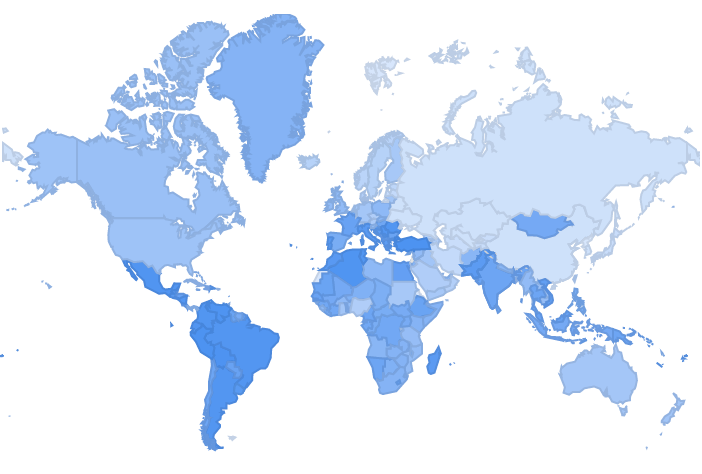
Jan-Jun 2014

Finally, we get of glimpse of the Facebook revolution operating as we speak. Much of the “Western World” is a lighter shade of blue to signify that Facebook is thoroughly established among target audiences. Countries like the U.S., U.K., Canada, Australia and parts of Europe have remained light blue or even become more light blue since 2008, meaning trending has died off and the “Wow, this is new!” factor is gone. Countries in South America, Africa, Asia (Mongolia!), and the Middle East continue to grow dark blue as these regions gain more access to Internet and learn of its ability to connect and empower. The absence of Facebook in China and Russia could be due to strong censorship by their respective governments, or because Qzone and V Kontakte still have very strong fan bases. Regardless, there is no denying that Facebook has reached billions of people including citizens of those countries. The map implicitly states countries disallowing Facebook are choosing not to participate in something that has benefitted the rest of the world with its connectivity.

What is Facebook? It is a vehicle for connection, individuality, and agency. These maps’ lives show that the world is itching for these types of freedoms. Natural, social, and political boundaries have barred many nations from each other for centuries. For the first time in history Facebook is transcending barriers, bringing societies together, and celebrating this change. As a result, the world gets smaller as Facebook grows. These maps matter because it shows us firsthand how people react to this newfound freedom online. The darker colors show a desire to connect with different cultures they didn’t know about before because they were too censored or the world was too big. The maps don’t need numbers or words to speak for the freedoms Facebook affords. If drastically different cultures can embrace Facebook the same way, Facebook must provide a shared element of inclusiveness that humans naturally strive for. Facebook is shrinking the globe rapidly – shockingly, it’s growing even faster and it all started in a dorm room.

Pete

[i]  Quick note about Indonesia: I lived in Java and Sulawesi for three months in 2012, and Facebook is HUGE. Almost everybody I met had it, including my homestay mother who would even go online at the dinner table.

Notes

“Google Trends.” Google Trends. http://www.google.com/trends/explore#q=facebook (accessed April 2, 2014).

Kureshy, Sabrina. “The Story of China’s Biggest Social Network: Qzone.” China Internet Watch. http://www.chinainternetwatch.com/3346/tencent-qzone/ (accessed April 2, 2014).

Price, Chuck. “How to Use Google Trends for SEO.” Search Engine Watch. http://searchenginewatch.com/article/2292198/How-to-Use-Google-Trends-for-SEO (accessed April 2, 2014).

Quigley, Robert. “geekosystem.” Geekosystem Map of the World Drawn Entirely Using Facebook Connections Comments. http://www.geekosystem.com/facebook-connection-world-map/ (accessed April 2, 2014).

Smith, Justin. “A World Map of Leading Social Networks – Inside Facebook.” Inside Facebook. http://www.insidefacebook.com/2009/06/08/a-world-map-of-leading-social-networks/ (accessed April 2, 2014).

Posted in Uncategorized | Comments Off on Mapping Facebook’s Global Revolution

Atlas of the Week

The Klencke Atlas was created in 1660, and is considered one of the largest atlases in existence. The atlas is around 5’9” tall and 6’3” wide when opened. This atlas contains 37 maps that can be removed from the atlas and displayed on a wall. In 2010, the atlas was put on public display for the first time in approximately 350 years at the British Library. This atlas was created to serve as an encyclopedic summary of humanity’s knowledge of the world’s geography at the time of its creation. The immense size of the atlas as well as the wide range of regions it covers, allows the atlas to convincingly suggest that its maps are accurate reproductions of reality. Furthermore, the ornateness of the atlas reminds us of a maps ability to serve as not only a utilitarian object, but also as a work of art.

Posted in Atlases of the Week | Comments Off on Atlas of the Week

The Corporate States of America

Created by Steve Lovelace

According to the map’s creator, Steve Lovelace, brand loyalty may soon take on a whole new meaning. Lovelace’s map, titled The Corporate States of America, is a visual representation of his theory that the modern nation state will soon no longer exist, and that corporations will begin to behave as our feudal lords. He notes that technological advancements such as the printing press and railroads helped engender cultural identities and the modern nation state as we know it. He goes on to say that the same technological advancements that led to the development of nation states will be the cause of their demise. Lovelace argues that the introduction and improvement of technologies such as air travel, internet, and television, gave much of the world a similar cultural background. He believes that because such a wide scale cultural normalization is occurring, nation state borders will soon become irrelevant. Lovelace predicts that as multinational corporations grow, nation states will weaken. He believes that eventually people will owe their health and safety to giant corporations who will form a “corporate oligarchy” (1). However, Lovelace’s political intentions for the map appear to be secondary to the overall novelty of the map. Because this map is so visually stimulating, its message has been transformed and altered to meet the expectations and interests of its audience.

The lack of immediate information about the map lends importance to the map’s rhetorical life. In other words, one should be aware of the process the author went through to create the map, one should be aware of the map’s circulation, and one should be aware of the author’s intentions. Without much explanation, it is easy to see how this map could become misleading. After all, one is not able to easily discern Lovelace’s methodology in selecting a corporation for each state. Some may look at the map and believe it depicts each state’s most popular corporation, others may interpret the map and suggest that it is representing the most profitable, or largest corporations. In fact, numerous blogs and websites definitively state that the map shows the most popular brands and where they are located. (See citation 2). However, none of these interpretations are true. In reality, Lovelace simply chose the brands he felt most accurately represented each state (3). In other words, the map was built on stereotypes. This means that the process behind mapping The Corporate States of America was subjective, as is the methodology behind the creation of all maps (4). While Lovelace’s map is not depicting the most popular brands, it is somewhat accurately depicting which brands are stereotypically associated with each state. As a result, these brands serve as representatives for the cultures of each state. This concept may be concerning for several states. I’m looking at you Florida. Regardless, the map continues to be circulated as a map depicting states’ most popular brands.

When one considers the author’s original intention for the map, it seems harmless that his picks would be arbitrary. However, this map is not being circulated as an artistic rendering of his predicted world future, which can be problematic in a number of ways. Examining how successfully people have distributed the map as a representation of something it is not, truly highlights a map’s capacity to persuade one of its veracity. As Dennis Wood notes, maps create reality, rather than reproduce it (4). However, the average viewer will most likely take a map at face value. The mentality that maps are accurate representations of reality was probably what enabled so many people to cite the map in ways it was not originally intended to be cited. In fact, the most common interpretation of the map, that it is a factual representation of the most popular brands from each state, completely ignores what Lovelace originally attempted to convey when he created the map. This is problematic as the complex cultures and histories of each state have been reduced to a single recognizable logo. And with states such as Wyoming which simply do not have many widely recognizable brands, the broader cultural and historical contributions of certain states may become devalued. Furthermore, Instead of discussing Lovelace’s prediction of the future, most people are distracted by the map’s novelty and are content to argue about which corporations Lovelace picked to represent their states, failing to realize, or care about, the political intentions Lovelace had for this map. Nevertheless, Lovelace’s map serves as an excellent example of the tensions between cartographic intention and cartographic reception.

An author is never fully able to predict or control the ways in which a map will be examined or interpreted. However, this unpredictability is what gives a map its rhetorical life. With The Corporate states of America, the tension between the author’s intentions and the map’s reception is what gives the map such a vivid character. This being said, it is the circulation of the map and people’s willingness to accept whatever claim is tied to it, rather than its content, which enables The Corporate States of America to be our map of the week.


Bibliography:

  1. “Corporate Feudalism: The End of Nation States”  MARCH 14, 2012, see http://steve-lovelace.com/corporate-feudalism-the-end-of-nation-states/
  2. The Corporate States of America: A Map That Shows Each State’s Most Famous Brand Room for argument?” June 27, 2013, see http://www.adweek.com/adfreak/corporate-states-america-map-shows-each-states-most-famous-brand-150794
  3. “The Corporate States of America” JUNE 1, 2012, see http://steve-lovelace.com/the-corporate-states-of-america/
  4. Denis Wood, The Power of Maps (New York: Guilford Press, 1992), 17-19.
Posted in Maps of the Week | Tagged , , | Comments Off on The Corporate States of America

Map Links

http://www.businessinsider.com/22-gorgeous-maps-that-define-the-united-states-of-america-2013-7

This link brings you to the “22 Maps that Define the US,” where it shows different maps about the US.

Posted in Uncategorized | Comments Off on Map Links

Atlas of the Week

World Atlas - Maps, Geography, travel

http://www.worldatlas.com/aatlas/world.htm

The Worldatlas is a website that has many different atlas’ of the world. On the website you are able to click on each of the continents and it brings you to a new page where there are different interesting facts about the continent. For example, if you click on North America, there is information about the history, geography, and different maps of North America. I find this atlas very intriguing because there is so much information in one place. Overall I really liked how much information was involved in this atlas, it was very fascinating.

Posted in Uncategorized | Comments Off on Atlas of the Week

The Human Journey Map


When studying the history of humans, science often points to Africa as the starting point of humankind. Scientists and anthropologists have collected evidence such as fossil records, and radio carbon dating. The history of humankind is important when studying maps about the migration of humans around the world. The Human Journey map is a map of the migration of human beings from East Africa to other regions and continents around the world. The map was created with information collected by Spencer Wells, and IBM’s Genographic Project. The Genographic Project focuses on the DNA aspect of migration. Wells would collect the DNA by using a random sample in Astoria, Queens, New York, by swabbing the inside of random people’s mouths. According to Denis Wood, the authorship of the map is one of the most important things when it comes to perception. Wood also states that a map has the power to construct a reality. The map itself can alter a viewer’s opinion based off what is being portrayed. The Human Journey Map is simple and easy to read, which presents the idea that a map is the best way to convey the information. The Human Journey Map can be viewed as a map that is trying to prove that science can determine migration patterns and the origin of human life.

According to The Human Journey map, human kind began in East Africa. The map is on the National Geographic website making it a credible source of information. From there, humans migrated across the world to West Africa, Australia, the Middle East, Southeast Asia, East Asia, Siberia, Southern Europe, North America, and South America. The use of color in the map compels me to wonder why the authors used the colors as they did. The Western Hemisphere (North and South America) is pink while the Eastern Hemisphere varies in color. The choice of color could have several different meanings, one of which could be because the Eastern Hemisphere was developed and migrated through sooner than the Western Hemisphere. Another possibility could be the colors are based off of the year/years the continent or region was migrated to. Notice how North and South America were both first migrated to 15,000 years ago, and they are both pink, whereas the regions in the eastern hemisphere are not the same colors nor were they migrated to in the same years. This use of color proves that maps are based off the author and what the author wants the audience to perceive. National Geographic portrays the colors this way possibly because they want the audience to perceive the colors as indications where migration began.

When looking at the map, the positions of the land masses tells the audience how the authors wanted the map to be perceived. The map has Africa right in the middle making it so the audience can see that human kind was started in Africa and that it was the center of life 200,000 years ago. The continents/regions are also very close together and almost seem like they are outlined by a circle. This feature of the map makes it so everything seems closer and that migration wasn’t as hard as it really was. It makes it so the audience believes that migrating around the globe was a circular path and that it started in the Eastern Hemisphere and worked its way all the way to the Western Hemisphere. The simplicity of the map makes it easier for an audience to understand it even though this is a very complex matter. The map, The Human Journey, also has a key or a legend that describes the basics of what is going on in the map. It tells the audience how “the dates here represent the first arrivals in a region.” This helps the audience understand how the migration of humans happened.

The Human Journey map describes the migration of humans throughout the last 200,000 and the dates humans migrated to each continent/region. Although the map proves to be decently accurate, there are some areas of concern. The map makes a generalization of where humans migrated to, making it seem as if there was a migration of humans to each part of each region/continent. In reality there were specific points in which humans migrated to and the map clearly leaves them off. In the map there are arrows that point to the region where migration occurred. The map could have shown the exact locations of migration, making the map more accurate. The arrows in the map make it seem that the migration of humans was exactly how the map says it was. There are always other possibilities, the authors decided to not show us or because they are bias toward a certain theory of migration. Another area of concern is the map makes it seem like all humans have been the same for the last 200,000. When reading about the map it states that there DNA evidence was used to make this map. Although this DNA evidence is used to create this map, it does not account for the evolution of humans over this time period. National Geographic only accounts for one side of the migration argument. Although this idea that human life started in East Africa is most widely used theory of migration, there are other theories that are not portrayed in this map. The silences that the Human Journey Map provide us with, show that National Geographic is trying to show their idea about migration.
 

Maps present an audience with an idea of reality and the reality is determined by its authors. In The Human Journey map the authors use DNA evidence to portray an idea of how human migration occurred. Audiences will read the map and perceive the different aspects of the map to create their own reality. The Human Journey Map proves that all maps have silences due to a specific point that is being made. In the Human Journey Map specifically it shows the audience that National Geographic used DNA to portray that migration started in East Africa.

Vincent Colapinto

Works Cited

“The Big Idea — Genography — National Geographic Magazine.” The Big Idea — Genography — National Geographic Magazine. N.p., 17 Aug. 2009. Web. 17 Mar. 2014. <http://ngm.nationalgeographic.com/big-idea/02/queens-genes>.

“The Story of Africa.” BBC News. BBC, n.d. Web. 17 Mar. 2014. <http://www.bbc.co.uk/worldservice/africa/features/storyofafrica/index_section2.shtml>.

Wood, Denis, and John Fels. The Power of Maps. New York: Guilford, 1992. Print.

Posted in Uncategorized | 1 Comment

The Digital Atlas of the United States!

http://130.166.124.2/USpage1.html?PHPSESSID=46825bef8c347cc1ba305b1b7d6a8910

This atlas, The Digital Atlas of the United States, provides interesting depictions of United States’ data such as population focal points, race distribution and income distribution. This information sounds bland, and one might think, “oh great, more maps telling me wealthy people live in New York”, but I assure you, the maps are worth inspecting. The maps breakdown their topics into interesting sub-topics, and they depict, for example, income distribution based on race and occupation. The manner in which the maps present the data is interesting to compare to Mark Newman’s presentation in my blog post below. The data the atlas uses is from around 1990, which enables these maps to tell interesting historical stories. These stories are educational and entertaining; this digital atlas is worth a few minutes of examination.

William Bowen. The Digital Atlas of the United States. California: California State University, Northridge, 2000. http://130.166.124.2/USpage1.html?PHPSESSID=46825bef8c347cc1ba305b1b7d6a8910.

Robert Nogay

Posted in Uncategorized | Comments Off on The Digital Atlas of the United States!