
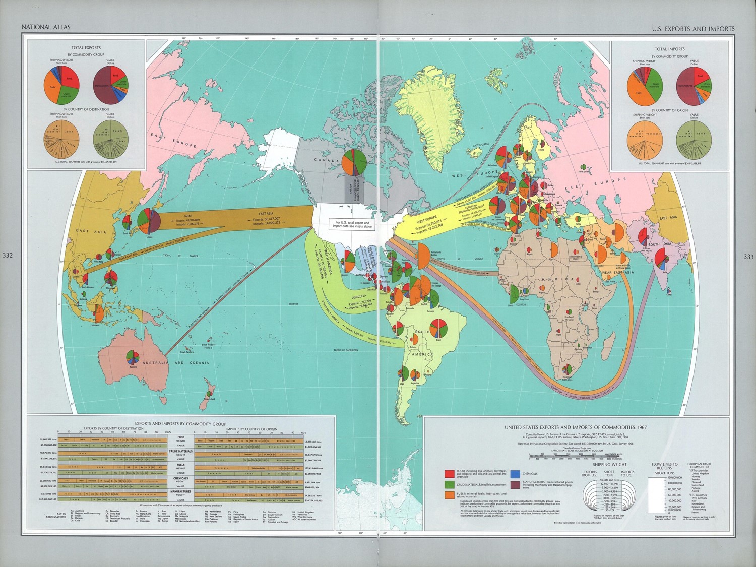
Our map titled “United States Exports and Imports of Commodities” is a fascinating cartographic production due to its unique ability to synthesize a large amount of economic information while still retaining the spatial properties which characterize maps. The piece was finished in 1967 and published in the “National Atlas of the United States” in 1970 during a time period when the United States was looking to secure the political and economic allegiance of a number of countries who had recently gained their independence, especially in Africa. Also, the map began its rhetorical life during the heat of the Vietnam War, an event which possibly influenced some of the cartographic decisions in the map’s creation including denying any sort of economic relations with communist countries. The base map was originally found in National Geographic, although data from the US Bureau of the Census. This sort of collaboration in the production of the map hints at its intention. Rather than trying to enhance the readers understanding of domestic geology (as most of the other maps in the “National Atlas of the United States” did), the map points to the soft power of the United States. Soft power differs from hard power in that hard power relates to military strength and other observable, overt forms of control and domination, while soft power is more insidious, referring to control through value systems or ideologies. By presenting a world in which the US’s economic power reaches all recesses of the map, the audience becomes aware of the hegemonic economic power of America throughout the globe. Further analysis of the map reveals that the cartographic choices employed try to present the most objective map possible while letting readers know who the true global leader in trade is.
The map itself utilizes a Van Der Grinten Projection, which is centered on the United States and appears to enlarge the entire Northern Hemisphere. The arrows indicating the scope of economic relations with various regions of the world make it seem as though the United States is the hub of all global financial activity; the tree from which worldwide economic roots are spread. The use of arrows becomes particularly interesting when we look at the Soviet Union. Given that this map was published during a time when both the US and the USSR were battling for control of the newly founded “Third World”, it is no coincidence that the arrows surround and choke the Soviet Union, showing the world that any country not aligned with the US could face a sort of economic death. The use of pie charts allows viewers to gain a deeper understanding of the individual relationship the United States has with each country. The pie charts incorporate the idea of a cartogram into the map by resizing each individual graph depending on the extent to which the US trades with these nations. The four legends in each corner of the map add detail in an attempt to prove that this production is 100% objective and without bias, even though any informed map reader knows that a two-dimensional representation of the three-dimensional world is bound to contain distortions and imperfections. Historical context allows readers to understand that Japan is one of the United States’ biggest trading partners due to our interest in rebuilding their devastated economy after World War II. Also, high quantities of exports to and imports from Canada is most likely the result of geographic proximity and the fact that we were political allies during the Cold War. Color choice was another important cartographic decision because the bold pastel colors of various import and export commodities allow viewers to easily differentiate the different sectors of trade from one another. Although it is quite easy to get lost in all the detail and information being presented on the page, this map continues to live out its rhetorical life because it provides viewers with a political, economic and historical snapshot of the United States during 1967.
“United States Exports and Imports of Commodities” is a fascinating artifact from a time period in which the United States was trying to expand its international power. This goal is reflected through the map in a number of ways, from novel visual representations to an abundance of auxiliary information within the map. We enjoyed exploring the notion of soft power when discussing the map, and how not all forms of control necessitate the use or demonstration of military superiority. While interpreting the map was a time consuming and thought provoking process, we hope that the class has gained a deeper understanding of the amount of decisions that go into creating a given map.
Li Li and Pat