
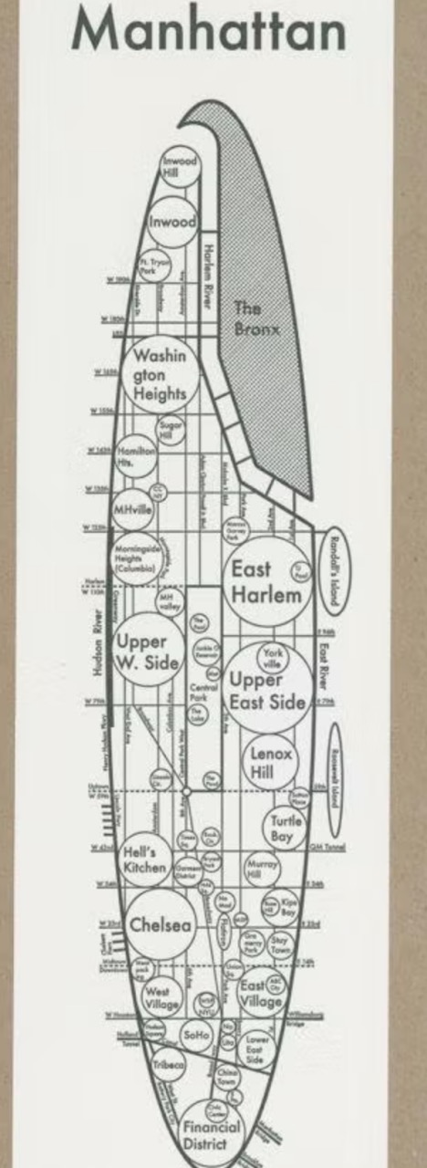
As a member of Generation Z, our inclination to rely on navigation tools like Google Maps and other satellite-based apps is ingrained in our travel habits. When we get to a new city, we use Google Maps on our phones to navigate to the destination we want; when we want to eat outside, we use Uber to get there, also with navigation by satellite map. While the precision and accuracy of these maps are unparalleled, offering realistic views and intricate details, the experience on our phone screens can feel as cold as the precision itself. The map above at first glance looks adorable or cartoon-like, as it is basically made of circles and text, but we can recognize this is the map of Manhattan. Why? Beyond the prominent titles, the distinctive city shape is the key to instant recognition. This prompts the question: What inspires this unique visual representation?
In 2009 after college, Archie Archambault, the map creator, found himself getting lost. He noticed that despite their practical utility, Google Maps failed to provide him with a local’s sense of neighborhoods, effective citywide navigation, or an accurate reflection of his personal perception regarding the time it took to travel from one point to another. “I was super absorbed in the GPS,” he told Slate. “But a Google map has a scientific feel. I wanted to communicate the idea of a city on paper.” Then, he started to draw a circle with a cross hair in it, dividing it into quadrants. He started exploring streets and neighborhoods by all means of transportation possible, getting an on-the-ground feel for the urban landscape. That first sketch led him to create his first map of Portland and became the genesis of a quirky map-making process that he still uses today.
Archie Archambault placed great emphasis on expressing the locals’ sense of community in his maps. “I build a map in my head and then I talk with locals to see if my perception matches up with their experience of a city,” Archambault said, adding that he tries to informally poll the widest range of people possible, including his favorite insider resource: real estate agents. “They are the ones who end up naming emerging neighborhoods,” he says, “and who really know the whole layout of a city.” Besides talking with locals, to pursue what he calls the “mental and cultural groundwork” to make each map, he transports himself in different cities according to the culture and landscape of each city. He drove as locals do in Atlanta. He would ride a bike in D.C. and New Orleans. He said it was the easiest way to autonomously get around and at his own quick pace, to create a mental road map. Also, to get a feel for how locals perceive a city like Washington, D.C., the designer often asks locals to sketch their own mental map. Archambault’s maps are subjective and even familiar to people who really live in a city or certain area.
Archambault crafts minimalist maps tailored to different cities, such as shaping D.C. as an imperfect diamond and Manhattan as a long oval. His distinctive style, marked by typography and circles, follows a centuries-old tradition of circular maps. The circle, chosen for its gentle impact on the eye, is considered the simplest and most beautiful shape. Archambault employs text decoratively, drawing inspiration from The New Yorker’s New Yorkistan cover, aiming for clear, concise, and simple maps that subjectively reflect reality through local neighborhood names.
What I see through the map and the process of his design is that his maps are not cold construction displays, but subjective humanistic expressions with warmth. While we can navigate with maps on phone, it is just cold and superficial like that. Archambault ‘s map is humanistic and warm, we can see the culture and local spite of a city behind the map. With such subjective purpose, we see the subjective influence on the design of the map. It feels like we human are really an organic part of the city. Actually I think such map can somehow improve the charisma of cities because it really represents the unique of the cities which attracts people to visit and even make commercial impact. The specific cultures uncovered by the map maker and locals can somehow attract more people to settle down and even make new cultures themselves when they feel they are also part of the cities throughout the maps. It all comes from such subjective design style. It really embraces citizens. It is such subjective features that make the map such attractive and useful for people.
Reference:
Archambault, Archie. “Circular City Maps: Minimalist Designs Printed on a 19th Century Letterpress.” Slate, December 2013. https://slate.com/human-interest/2013/12/circular-city-maps-archie-archambault-designs-minimalist-city-maps-printed-on-a-19th-century-letterpress.html.
Pinterest. “Beautiful Landscape Painting.” Pinterest, Accessed November 26, 2023, https://www.pinterest.com/pin/45176802485938592/.
The idea of “humanistic expression with warmth” in this map is attractive. When we use maps today, we’re merely looking for scientific precision but overlook that maps can be artistic and humanistic. I like how you described the map experiences on phone screens as “as cold as the precision itself”. The precision draws every street and city around the world identical to each other. When we open Google Maps, we can discover all the details of a city but it doesn’t help us understand how life could be living in it. Science without humanistic expression can be so cold. The map introduced here managed to incorporate personal and subjective elements into the map while keeping its basic utility. It might not be as precise as Google Maps, but it conveys a clear impression of the city to its audience. It maps the city as a place of people, a home to its residents instead of a place of buildings and streets. The artistic appearances like oval and diamond tie the space as a whole and convey to its audience a distinct first impression. And I agree that a map with humanistic expression would attract more tourists and residents to live in the cities and create new cultures together.
I really enjoyed reading this post and learning about the map you chose. I find this map so interesting because of its purpose to provide something that hyper-accurate maps like Google Maps can’t. This map is so relevant because, as you mentioned in your analysis, it maps the city of Manhattan from the perspective of locals, which makes it significantly more practical for getting familiar with a city. Additionally, I liked how you brought the making of his maps into your analysis. By including details of him asking locals if they approved of his maps as he perfected them, it helps the reader understand how much work went into the maps and gain a better understanding of his map-making process. The author of these maps, Archie Archambault, used circles abundantly in the Manhattan map to make repetition and smoothness stand out in the map. I feel that this repetition of similar shapes and curves makes up for the map’s lack of color and other aspects that could’ve helped the map further stand out. When I first looked at this map it immediately reminded me of the cartograms we looked at in class. Overall, I think this is a very interesting map, and you did a great job analyzing it.