
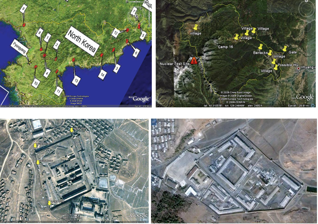
North Korean Prison Camp Maps (Google Earth)
These maps display the precise locations of North Korean prison camps as well as zoomed in images of them in great resolution via satellite imagery with Google Earth. The set of maps shows over 15 camps, a few of which are dangerously close to nuclear testing sites, that have clear labor progress visible within them. The activity within these camps, as well as just their presence as a whole, show clear proof of North Korea’s human rights violations. This is significant as the nation had been denying the existence of these camps for years beforehand and has attempted to shift blame onto the United States, claiming the U.S. had “human rights abuses” of their own.
Google Earth publishing the images allows the general public to have easy access to seeing the cruelties of North Korea, which was never possible beforehand. This enables people to see what’s truly going on inside of their locked borders and also enables witnesses from inside the camps to have their stories corroborated. Without control of the narrative because of these new technologies as well as fast spreading of information on the internet, North Korea cannot hide their evils from the world. In this sense, Google Earth is used as a political tool for the United States saying to North Korea “you can’t hide from us” and displaying technological powers along with it.
This draws connections to FYS Rhetorical Lives of Maps through the Farman Article and how Google Earth transcends cartography and changes the whole landscape. Because these are true satellite images, it is extremely difficult to find bias and political influences which we have learned that all maps include. These maps also show the “democratization” of maps mentioned by Farman as everyone is able to have access to them online and possess their own uncontested opinions about them. With all of that taken into account, these maps are extremely relevant to this course and to cartography as a whole as they show the progress and digitization of cartography. Denis Wood’s argument that cartography is dead and becoming too “real” is seen through Google Earth and one can only imagine this continues to be proven true through technological advancements.