
PJM1135_01, 8/13/14, 5:44 PM, 8C, 5610×7707 (203+208), 100%, Repro 2.2 v2, 1/15 s, R57.7, G33.6, B51.9
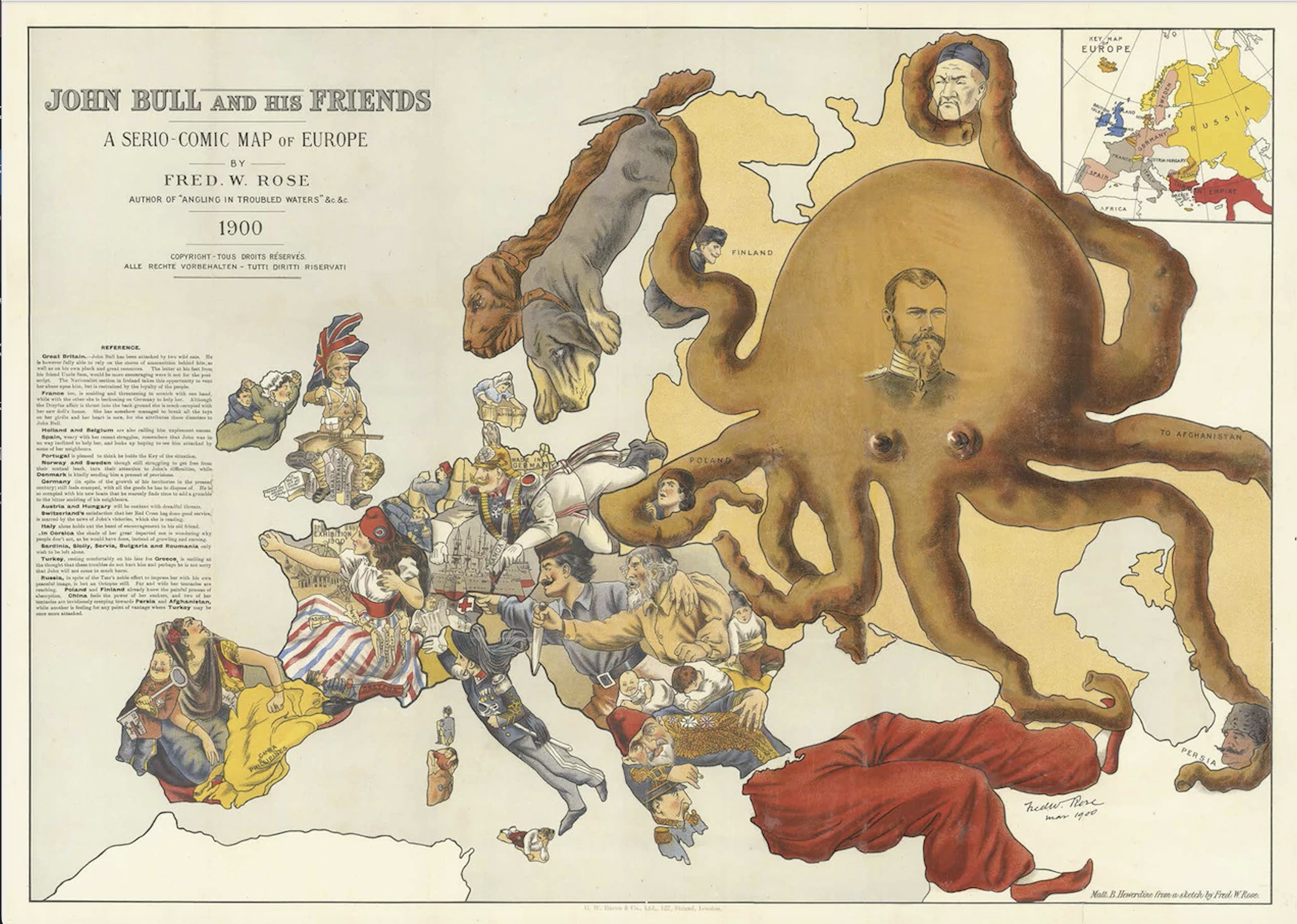
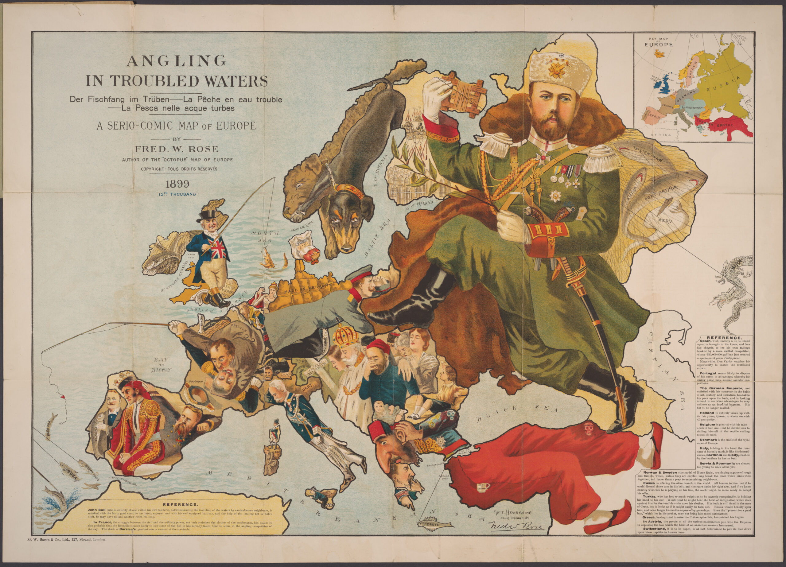
Imagine looking at a map and discovering that it’s not just a geographical representation but a witty commentary on the political tensions of the time. That’s exactly what happened with the satirical maps created by English cartographer Frederick William Rose during the Second Boer War. These maps not only provide a unique insight into the political propaganda of the late nineteenth century but also a glimpse into the cultural attitudes towards imperialism and colonial expansion. Today, we’ll take a closer look at two of Rose’s most famous maps, “Angling in Troubled Waters” and “John Bull and His Friends,” and explore how they skillfully depict the tensions between nations and ultimately, the impact of these tensions on the start of World War 1.
This map of the week is two maps that fit together to create a clearer view of what was happening in 1899-1900 in Europe. These maps were created during the Second Boer War. This war took place in South Africa and was fought between the British Empire and the two different Boer Republics in South Africa. This impacted the culture in Europe due to Germany and Russia supporting the Boers, creating tension with the British Empire. These two maps display how tensions rose leading to the start of World War 1. As a British cartographer, Rose could have taken an interest in the rising levels of hostility between the European nations during this period. Frederick William Rose was the most famous active satirical mapmaker in the late nineteenth century. But he is elusive even going by a pen name Fred. W. Rose to maintain his privacy. Rose was born in London, giving the insight that his maps could have a British superiority ingrained in them.
This pair of maps has been rewarded with the status of map of the week due to its witty response to the tensions that happened in Europe. This is clear even through the maps being titled “Serio-Comic Maps”. An aspect of the maps is that they are a joke and not taken seriously. In both of these maps Roses used somewhat cruel stereotypes to represent each of these countries. In both maps the Ottoman Empire is depicted with a large nose, reinforcing this cruel stereotype.
In the map “Angleing in Troubled Waters” many of the countries are displayed fishing for colonies. This shows the importance of colonial expansion at this time but also how it affected relationships with other European countries. Then only one year later in the map “John Bull and His Friends” Rose showed how the tensions between the nations changed from being predominantly in colonies to shifting back to the European nations. The fishing for colonies is over and many countries are displayed in military regalia holding weapons as the continent is amping up toward war.
One of the major differences between the maps is Tsar Nicholas ll of Russia. In the map “Angleing in Troubled Waters” the Tsar is standing upon Türkiye and Eastern Europe. This does not show Russia taking over Türkiye and Eastern Europe but implies that Russia is above these parts of the world. It is also shown that Russia has China on a fishing line showing Russia attempting to colonize China. The second map “John Bull and His Friends” displays the escalation Tsar Nicolas ll of Russia is taking to expand the Russian Empire. In this map, the Tsar is displayed as an octopus strangling Poland, Finland, Persia, Afghanistan, and parts of the Ottoman Empire. Rose uses the sign of the octopus to explain Russia’s increasing attempts at Imperialism.
In conclusion, the satirical maps created by Frederick William Rose during the Second Boer War provide a unique insight into the political tensions and propaganda of the late nineteenth century. The maps, “Angling in Troubled Waters” and “John Bull and His Friends,” display the shift in tensions between nations from being predominantly in colonies to shifting back to the European nations leading up to World War 1. Rose using a map as a base for the satirical cartoon allows people to gain context of how these different European relationships worked while including the spatial dynamics. The maps highlight the growing imperialism of Russia and the impact of the war on cultural attitudes towards colonial expansion. Overall, these maps are an important reminder of the role of propaganda in shaping political attitudes during times of war.
Works Cited
“Angling in Troubled Waters: A Serio-Comic Map of Europe.” Cornell Library Digital Collections, August 25, 2015. https://digital.library.cornell.edu/catalog/ss%3A3293834.
Mason, Betsy. “Check out These Propaganda War Maps.” Culture, May 3, 2021. https://www.nationalgeographic.com/culture/article/propaganda-war-maps-galler.
“Rose, Frederick William.” Daniel Crouch. Accessed September 29, 2023. https://www.crouchrarebooks.com/discover/mapmakers/rose-frederick-william.
Blog Link:
https://blog.mastermaps.com/2010/05/thematic-mapping-in-slovakia.html
This blog displays the different thematic mapping of Slovakia.
Atlas of the Week:
https://maps.lib.utexas.edu/maps/slovakia.html
The atlas that I chose is the University of Texas at Austin “Perry-Castañeda Library Map Collection” on Slovakia. I found this intriguing due to this atlas not only shows current-day Slovakia but also shows back to when Slovakia was still a part of Czechoslovakia. I found particle intrigue with the topographic maps as you can see how the land of Slovakia has changed from 1942-1959. I also found it fascinating the level of detail that was in some of these maps for how old they were. This atlas provides beneficial information regarding Czechoslovakia and Slovakia.


Podcast: Play in new window | Download
I really enjoyed this choice of maps, because they represent how artistic, yet intentionally meaningful maps can be. Although these maps don’t have standard projections, they are able to encapsulate the international conflict of the time through the use of very pointed cartoons and distinct coloring. I also appreciate how you gave us two examples of these maps, to show how the artist was able to make the world “morph” as time went on, and I think they express how creative cartography can be.