
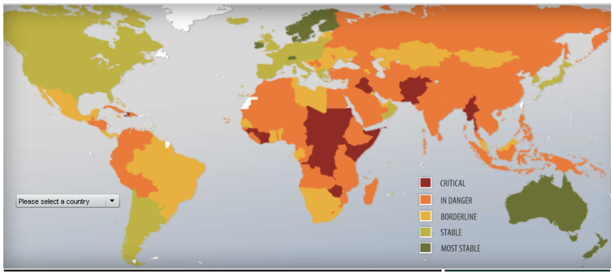
2009 Failed States Index Map by Foreign Policy Magazine
Tommy Cahill
December 6, 2023
The 2009 Failed States Index by Foreign Policy Magazine is a Mercator Map projection of the world that organizes different countries on whether or not they can be qualified as a “Failed State.” The cartographers of the map used many different factors to create this map, as there are five different classifications that a country can fall into. These categories, ranging from most stable to least stable, are listed as “most stable”, “stable”, “borderline”, “in danger”, and “critical”.
According to the London School of Economics, a “failed state” is a country that is no longer “able to perform its basic security and development functions” (lse.ac.uk), and may also have certain regions of it controlled by paramilitary or rebel factions. Countries identified on the map under the “critical” category such as Afghanistan, Somalia, and the Democratic Republic of the Congo are commonly associated with large-scale government instability and political strife. Fragile states, such as Yemen or Niger, are at a severe risk of collapse, but could still enforce their national security to defend their boundaries, as a fragile state still has the capability to do so. However, these countries still struggle with faulty education systems, poor health care resources, and wide-scale government corruption.
This map is biased towards the United States and other western countries in a multitude of ways. For example, it would be a fair assumption that any country on this map highlighted in light or dark green holds an amicable relationship with the United States, the country where Foreign Policy Magazine is based. Many countries in yellow, orange, or red are more likely to have a more contentious relationship with the United States. The governments in green countries will be more likely to be democracies, republics, or hold other forms of multi-party governments opposed to the yellow, orange, or red countries, which may be more accustomed to one-party dictatorships.
Another way this map is also biased towards the United States is because the United States chooses to not collect data on Taiwan. Due to a 1972 visit to China by president Nixon, the United States agreed to recognize the People’s Republic of China over the island state of Taiwan. The Failed States Index does not collect any data on Taiwan, as they do not want to go against official U.S. diplomatic accords, but also acknowledge that the island of Taiwan operates under a different government than that of mainland China.
Finally, if one compares the 2009 Failed States Index to the 2023 edition of the World Freedom Index, a map that analyzes everyday freedom such as the freedom of speech, the press, and economic mobility across the world, one will find a frightening similarity between the two maps. Take a look at the 2023 Freedom In the World map here:
https://freedomhouse.org/sites/default/files/2023-03/FIW_World_2023_DigtalPDF.pdf
Bilguun Anar Erdene
December 6, 2023
When looking at the map, there is an apparent division between the Western world and the rest of the world. This is a theme that appears recurrently through a wide range of maps regarding different categories such as wealth disparity, gender equality, discrimination policies, average lifespan, etc. It is important to ask how a “failed state” is defined. While many of the attributes seem justified, Foreign Policy Magazine took into account measurements that pertain primarily in Western societies. For example, Bhutan uses gross national happiness and health to determine how successful their nation is. They were the first country in the world to define happiness as a national policy. The very essence of freedom is also another subject that is nuanced and can have different interpretations among different cultures.
This map, like most maps, is designed in a simple way to grasp the attention of the audience and briefly display the content that was collected. It ignores centuries of colonialism, foreign intervention, conflicts, genocide, and numerous other events that lead many of these countries to appear red or orange on the map. Many of the Western European countries and their former settler colonies are green because of their successful exploits of the indigenous people, and their global dominance over the past few centuries which established the global standards of the world we live in today. They continue to interfere and hinter the development of these countries that are in critical condition.
Aside from looking at bias, it is difficult to judge countries based on a few attributes. Some countries are incredibly wealthy and have low crime rates, however they have no freedom of speech or expression and other constricting laws. Other nations have the freedom of speech and let people live freely, but have high levels of poverty, lack of infrastructure and high crime rates. The question is whether freedom or safety is more important? This map groups a multitude of countries who have completely different standards of living into one group. This map gives a glimpse into the current state of the world, and is a great source of information for looking into America’s current state of foreign affairs.
Works Cited
- “Crisis, Fragile and Failed States Definitions Used by the CSRC.” n.d. https://www.lse.ac.uk/international-development/Assets/Documents/PDFs/csrc-background-papers/Definition-of-a-Failed-State.pdf.
- National Counterterrorism Center. n.d. “National Counterterrorism Center | Groups.” Www.dni.gov. https://www.dni.gov/nctc/groups/al_qaida.html.
- BBC. 2022. “What Is Russia’s Wagner Group of Mercenaries in Ukraine?” BBC News, April 5, 2022, sec. World. https://www.bbc.com/news/world-60947877.
- Freedom House. 2023. “Marking 50 Years in the Struggle for Democracy FREEDOM in the WORLD 2023 Highlights from Freedom House’s Annual Report
on Political Rights and Civil Liberties ANNIVERSARY EDITION 50.” https://freedomhouse.org/sites/default/files/2023-03/FIW_World_2023_DigtalPDF.pdf.
- Rampe, William. 2023. “What Is Russia’s Wagner Group Doing in Africa?” Council on Foreign Relations. May 23, 2023. https://www.cfr.org/in-brief/what-russias-wagner-group-doing-africa.
Foreign Policy Magazine. 2009. Failed States Index Map. https://foreignpolicy.com/2009/06/21/the-2009-failed-states-index/.