
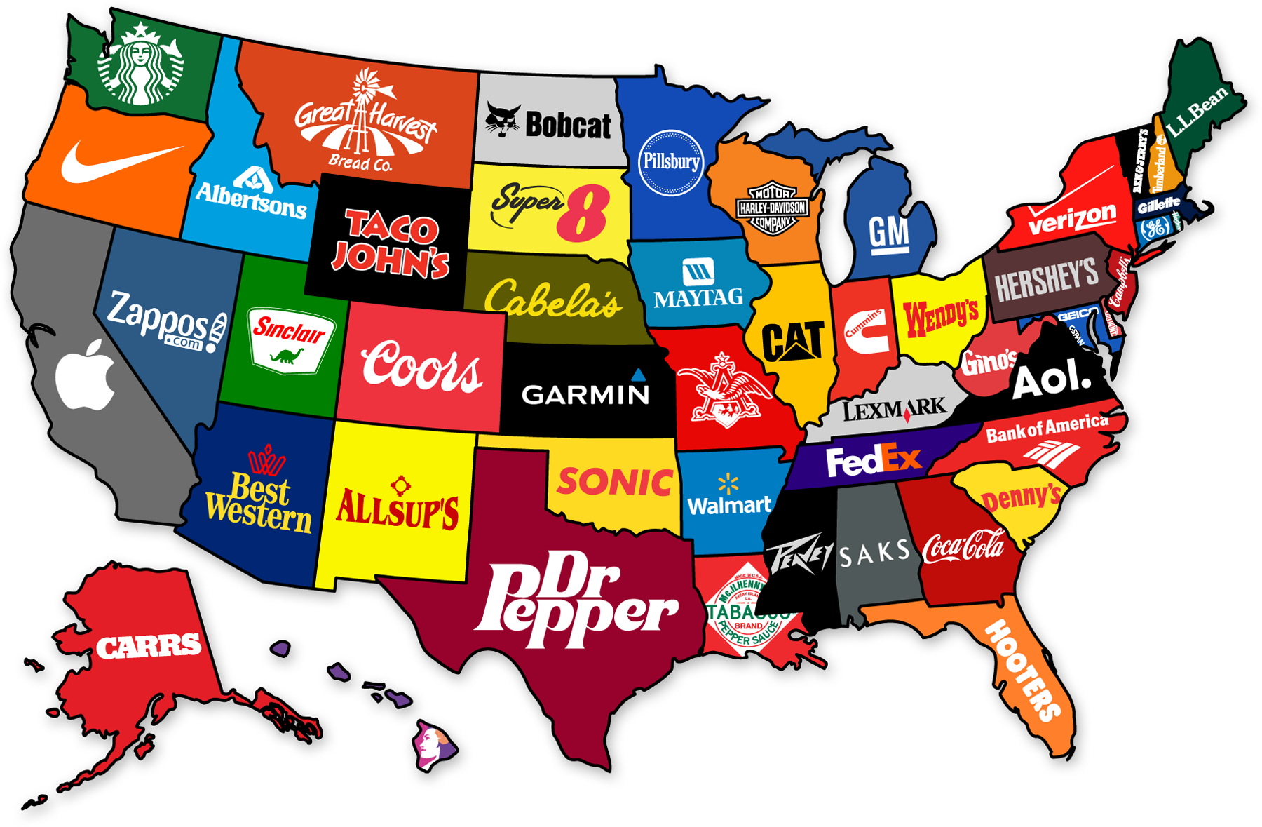
Created by Steve Lovelace
According to the map’s creator, Steve Lovelace, brand loyalty may soon take on a whole new meaning. Lovelace’s map, titled The Corporate States of America, is a visual representation of his theory that the modern nation state will soon no longer exist, and that corporations will begin to behave as our feudal lords. He notes that technological advancements such as the printing press and railroads helped engender cultural identities and the modern nation state as we know it. He goes on to say that the same technological advancements that led to the development of nation states will be the cause of their demise. Lovelace argues that the introduction and improvement of technologies such as air travel, internet, and television, gave much of the world a similar cultural background. He believes that because such a wide scale cultural normalization is occurring, nation state borders will soon become irrelevant. Lovelace predicts that as multinational corporations grow, nation states will weaken. He believes that eventually people will owe their health and safety to giant corporations who will form a “corporate oligarchy” (1). However, Lovelace’s political intentions for the map appear to be secondary to the overall novelty of the map. Because this map is so visually stimulating, its message has been transformed and altered to meet the expectations and interests of its audience.
The lack of immediate information about the map lends importance to the map’s rhetorical life. In other words, one should be aware of the process the author went through to create the map, one should be aware of the map’s circulation, and one should be aware of the author’s intentions. Without much explanation, it is easy to see how this map could become misleading. After all, one is not able to easily discern Lovelace’s methodology in selecting a corporation for each state. Some may look at the map and believe it depicts each state’s most popular corporation, others may interpret the map and suggest that it is representing the most profitable, or largest corporations. In fact, numerous blogs and websites definitively state that the map shows the most popular brands and where they are located. (See citation 2). However, none of these interpretations are true. In reality, Lovelace simply chose the brands he felt most accurately represented each state (3). In other words, the map was built on stereotypes. This means that the process behind mapping The Corporate States of America was subjective, as is the methodology behind the creation of all maps (4). While Lovelace’s map is not depicting the most popular brands, it is somewhat accurately depicting which brands are stereotypically associated with each state. As a result, these brands serve as representatives for the cultures of each state. This concept may be concerning for several states. I’m looking at you Florida. Regardless, the map continues to be circulated as a map depicting states’ most popular brands.
When one considers the author’s original intention for the map, it seems harmless that his picks would be arbitrary. However, this map is not being circulated as an artistic rendering of his predicted world future, which can be problematic in a number of ways. Examining how successfully people have distributed the map as a representation of something it is not, truly highlights a map’s capacity to persuade one of its veracity. As Dennis Wood notes, maps create reality, rather than reproduce it (4). However, the average viewer will most likely take a map at face value. The mentality that maps are accurate representations of reality was probably what enabled so many people to cite the map in ways it was not originally intended to be cited. In fact, the most common interpretation of the map, that it is a factual representation of the most popular brands from each state, completely ignores what Lovelace originally attempted to convey when he created the map. This is problematic as the complex cultures and histories of each state have been reduced to a single recognizable logo. And with states such as Wyoming which simply do not have many widely recognizable brands, the broader cultural and historical contributions of certain states may become devalued. Furthermore, Instead of discussing Lovelace’s prediction of the future, most people are distracted by the map’s novelty and are content to argue about which corporations Lovelace picked to represent their states, failing to realize, or care about, the political intentions Lovelace had for this map. Nevertheless, Lovelace’s map serves as an excellent example of the tensions between cartographic intention and cartographic reception.
An author is never fully able to predict or control the ways in which a map will be examined or interpreted. However, this unpredictability is what gives a map its rhetorical life. With The Corporate states of America, the tension between the author’s intentions and the map’s reception is what gives the map such a vivid character. This being said, it is the circulation of the map and people’s willingness to accept whatever claim is tied to it, rather than its content, which enables The Corporate States of America to be our map of the week.
Bibliography:
- “Corporate Feudalism: The End of Nation States” MARCH 14, 2012, see http://steve-lovelace.com/corporate-feudalism-the-end-of-nation-states/
- “The Corporate States of America: A Map That Shows Each State’s Most Famous Brand Room for argument?” June 27, 2013, see http://www.adweek.com/adfreak/corporate-states-america-map-shows-each-states-most-famous-brand-150794
- “The Corporate States of America” JUNE 1, 2012, see http://steve-lovelace.com/the-corporate-states-of-america/
- Denis Wood, The Power of Maps (New York: Guilford Press, 1992), 17-19.