Tag Archives: Map of the Week

Cartographic Irony: When Protesting Oppression Oppresses

This gallery contains 4 photos.

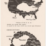
Protest maps allow marginalized groups to harness the “mythical power” of maps to challenge the status quo. But even protest maps can use harmful stereotypes and gross distortions to make their arguments about social change.   This map is important because … Continue reading

More Galleries | 2 Comments

Map of the Week: NUKEMAP

Some individuals have the power to launch nuclear strikes with the ability to wipe out a parcel of land the size of Texas, Alex Wellerstein has NUKEMAP. NUKEMAP is a one man project that Wellerstein built just over ten years … Continue reading

Posted in Maps of the Week | Tagged , , , | Comments Off on Map of the Week: NUKEMAP

Map of the Week

During the cold war, the Soviet Union’s Military secretly mapped the world with such precision, that in certain areas, it would appear they were preparing for an invasion. In total, the Soviet Union created more than 1.1 million different maps … Continue reading

Posted in Maps of the Week | Tagged | 2 Comments

The Best Night Of Your Life: Charting Population Through Drinking Establishments

The ‘pub crawl’ is a ubiquitous facet of British popular culture. The premise is simple: you and your friends proceed from one bar to the next, typically without a structured, predefined plan for the evening. But what if you did … Continue reading

Posted in Maps of the Week | Tagged , , , , , | Comments Off on The Best Night Of Your Life: Charting Population Through Drinking Establishments

The Statistics of Slavery

Does the appearance of a map reflect its true intentions? While I was searching for maps, I came across this map and perceived it as a scientific map. After further analysis of the propaganda found in the map, my initial … Continue reading

Posted in Maps of the Week | Tagged , | 2 Comments

How to Destroy Almost Half of the World

Is it possible to destroy almost half the planet based off only one criterion? Nate Silver of the 538 blog does just that with his map that excludes the countries in the lowest 5% of the GDP. By taking all … Continue reading

Posted in Maps of the Week | Tagged , , , , , | Comments Off on How to Destroy Almost Half of the World

The Corporate States of America

According to the map’s creator, Steve Lovelace, brand loyalty may soon take on a whole new meaning. Lovelace’s map, titled The Corporate States of America, is a visual representation of his theory that the modern nation state will soon no … Continue reading

Posted in Maps of the Week | Tagged , , | Comments Off on The Corporate States of America

Map of the Week: Map of Stereotypes

Borat, Chili con Carne and Soccer Moms: these are just a few of the labels that graphic designer Yanko Tsvetkov uses to distinguish parts of the known world. At first glance, these obscene, bright colored words take its readers aback … Continue reading

Posted in Maps of the Week | Tagged , , | 3 Comments

Map of the Week 6 (October 21-27): A Cartogram of the World’s Population

  A Cartogram of the World’s Population             David Salisbury, a well-respected geographer from the University of Richmond, said, “all maps are lies and are out-of-date the minute they are published.” Most would hear this statement when seeing a map … Continue reading

Posted in Maps of the Week | Tagged , , , | 1 Comment

Map of the Week 4 (September 30-Ocotber 6): The Racial Dot Map

Source: http://demographics.coopercenter.org/DotMap/index.htmlSource: The United States of America has had a tumultuous past regarding race relations, as you may have learned a thing or two about in history class. Borders of states were often shaped with race and culture in mind, namely … Continue reading

Posted in Maps of the Week | Tagged , , , , , , | Comments Off on Map of the Week 4 (September 30-Ocotber 6): The Racial Dot Map