
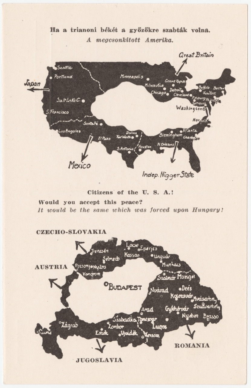
Citizens of the U.S.A. – Would You Accept This Peace?
Protest maps allow marginalized groups to harness the “mythical power” of maps to challenge the status quo. But even protest maps can use harmful stereotypes and gross distortions to make their arguments about social change.
This map is important because it’s easy to view the world of cartography as being bipolar: on the one extreme, are maps that affirm the authority of the powerful. On the other, protest maps that give voice to the oppressed. This case turns that distinction on its head. It shows how a group being subjugated protests using a map with a supersign of self-determination – the belief that the people of a region have a right to govern themselves – yet also a supersign of white racial superiority. The result is a protest map with parts a modern audience can admire and parts a modern audience can’t help but abhor.
The map I’ve chosen features the continental United States and Austria-Hungary. Written in Hungarian and English, this map was an appeal to the general American public to challenge the legitimacy of the Treaty of Trianon’s proposed borders. The Treaty of Trianon was the peace treaty following World War 1 imposed on Austria-Hungary. The treaty severely diminished Hungary’s economic, military, and geographical reach earning it the epithet the “Trianon Trauma” (1). The cartographers challenged the treaty by showing what an equivalent split would do to the United States and asking whether any US citizen could “accept this peace.”
Looking into the map, America is split into five sections. Four of which in black are split up among other countries. The western coast from Seattle to San Francisco is controlled by Japan, the southwest from Los Angeles to Dallas is controlled by Mexico, the American South from Houston to Norfolk is controlled by people of color, and the area spanning New England to parts of the American Northwest is controlled by the British. In the country’s center lies a non-descript, landlocked white pale mass with no distinguishable cities except Washington, DC. The white mass is all that would be left if America was split in a way similar to how the Treaty of Trianon split Austria-Hungary. The cartographers divided the United States up this way to exclude the majority of prominent American cities; while still including the capital, to remove any coastline; and to show four distinct territorial separations.
To communicate their abhorrence to the treaty’s borders and galvanize the American public, the cartographers employed racism. They knew the white American public disliked racial minorities and so when showing the four splits, wherever they could they made racial minorities the groups controlling the segmented territories. For example, in this map, the American South is controlled by people of color (and a harsh expletive is used). As historians, we know that the French and Spanish have a history of controlling what is now the American South, yet, instead of choosing a European power, they chose people of color because they knew it would enrage their intended audience. Evidently, the social relations between Hungarians and Romanians or Hungarians and Yugoslavians are quite different than the relations between White and Black Americans (racism, lynching, and slavery are not the same as serfdom and religious differences). In making this false equivalence, the Hungarian cartographers are grossly oversimplifying the social and political climate of the era.
On the West Coast, instead of choosing Russia (a world power who once controlled territory in North America) or Spain (who actually owned the territory a hundred years earlier), the cartographers chose to have the Japanese control the territory. Prejudice against Asian Americans is widely known, and one prominent example from about the same time can be seen in the San Francisco Chinatown map below.
To conclude, wherever they could, the Hungarian cartographers made choices they knew would galvanize their intended audience (white Americans) the most. In protesting the oppression of their people, the cartographers are ironically oppressing American racial minorities. This should go to show that maps are multifaceted, can have multiple supersigns, and the world of protest cartography is not so black and white.
Atlas Choice: sedac.ciesin.columbia.edu/mapping/popest/gpw-v4/
Columbia University’s Population and Square Footage Estimator. A great resource I used while writing this. You superimpose a shape over a map of the world and it estimates the population and square mileage. I used it to see how accurate the Hungarian protest map’s America would be to Hungary’s in regard to lost population.
Blog Choice: www.themaparchive.com
A cool website selling maps I came across that introduces interesting geographies to the viewer and provides good, general context around each map.


Official map of Chinatown in San Francisco: prepared under the supervision of the special committee of the Board of Supervisors. July 1885.
Sources:
(1) Inotai, Edit. “How Hungary’s ‘trianon Trauma’ Inflames Identity Politics.” Balkan Insight, 2 Dec. 2019, balkaninsight.com/2019/11/25/how-hungarys-trianon-trauma-inflames-identity-politics/.
Maps: digital.library.cornell.edu
Trianon Infographic: Hungarian economic consequences of Trianon. 30 June 2022. Wikipedia, https://en.m.wikipedia.org/wiki/File:Hungarian_economic_consequences_of_Trianon.jpg. Accessed 28 Sept. 2023.
The Treaty of Trianon may have been a loss for Hungary, but it was a liberation for many ethnic groups. This treaty gave Czechoslovakian, Yugoslavian, and Romanian people the independence to run their governments. The Treaty of Trianon was a freedom for the control of Hungary. Under the Hungarian government, other ethnic groups had very little power in government. Ironically, the Hungarians felt oppressed as they had controlled other ethnic groups for so long. Through the map “Citizens of the U.S.A. – Would You Accept This Peace?” Hungarian cartographers are oppressing different ethnic groups in the United States while fighting their loss of power and control. The Treaty of Trianon may not have been the best way to handle dismantling Hungarian power. However, it gave sovereignty to many ethnic groups under Hungarian control.
I love this informative blog post. It is very easy for someone to voice an opinion about a treaty that affects a country thousands of miles away from their home that is poorly researched and does not take into full consideration of the consequences that the treaty had on the imposed country. However, once a countermap is created that represents the outcomes of an identical treaty that is imposed on the same opinionator’s home country which demonstrates the extensive consequences that it would have on the country’s government, resources, and economy, it could be shockingly eye opening not only for the lone individual, but for everyone who comes across the map. I could not imagine living in a prominent United States that I am proud to call home today if a majority of our population, major cities,and resources were suddenly taken away and allocated to other nations. In fact, I think America would become a very fragile state and would struggle to carry out basic national security functions. Through “Citizens of the U.S.A.! Would you accept this Peace?” you have masterfully demonstrated that treaties can have two sides: the side that benefits certain countries and a side that greatly harms other certain countries. Also, you have demonstrated that if the same treaty conditions were implemented on other nations, the consequences would be just as great. Awesome work!