
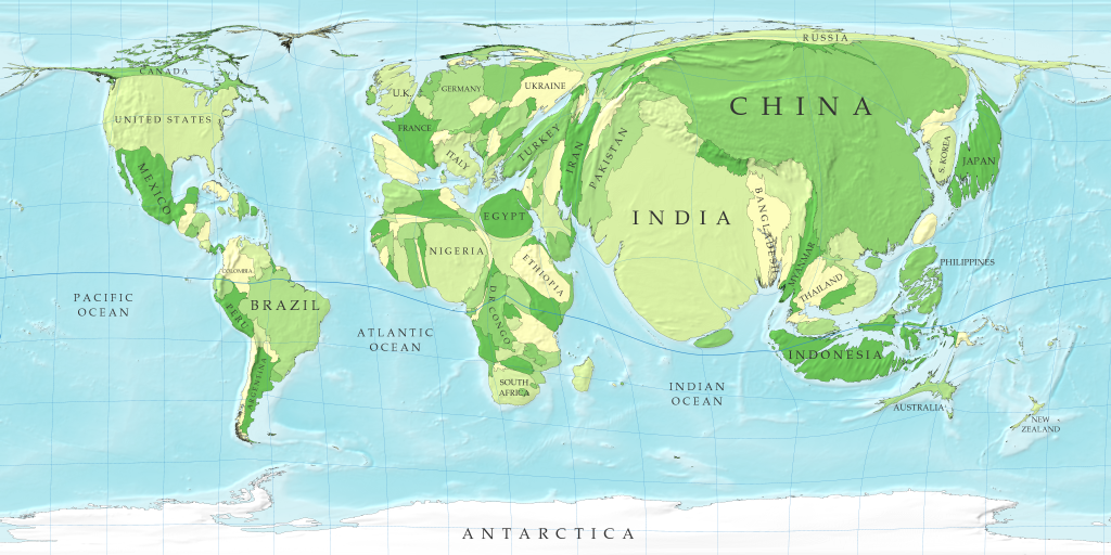
A Cartogram of the World’s Population
David Salisbury, a well-respected geographer from the University of Richmond, said, “all maps are lies and are out-of-date the minute they are published.” Most would hear this statement when seeing a map and be perplexed to why someone would call this scientific document a “lie”. However, in the case of a cartogram, most of these types of maps are distorted in order to show statistical information. A cartogram is defined as a presentation of statistical data in geographical distribution on a map (TheFreeDictionary). Because of this, there is going to be obvious lies throughout the map in order to portray the statistical message it was designed for. Even though the Cartogram of the World’s Population is supposed to be an incorrect portrayal of the world, the inaccuracies highlight the disparities in the populations of the world and give readers a different viewpoint of our world.
The inaccuracy that a cartogram comes with causes the cartographer to make choices throughout their map to give the reader the best view of the statistics. With the Cartogram of the World’s Population, an important choice that the cartographer made was the projection it used. It used a very common projection that most people are familiar with: the Mercator projection. By using this, it is easily read by the public but it also presents problems throughout the map. The first thing one should notice is that the cartographer tried to keep the countries relative to where they are actually projected but this distorts the map heavily in areas close to the poles, especially in northern Europe, northern North America and northern Asia. The most obvious distortion due to this projection is found in Russia. Russia, the biggest country area-wise in the world, is stretched to a point where it borders a countless amount of countries across Asia and Europe. Along with these distortions of reality, the silences of maps come into play, especially in this cartogram. Harley said, “the notion of ‘silences’ on maps is central to any argument about the influence of their hidden political messages” (Harley 67). The things that are silenced throughout this map are the countries with small populations. They are depicted as slivers in this specific projection and do not account for the impact they have in the world’s geography. Surprisingly, a majority of the countries don’t even have a label! Because of that, I would argue that this map has a strong bias towards the world powers and overlooks some of the smaller populations making them seem less significant.
The cartogram is not all bad though. In fact, I would argue that this map has a very distinct usefulness about it. By choosing a cartogram of population, there are positive distortions to small countries with a large amount of people. Take Bangladesh or Ethiopia for example. These are very small countries on a regular map but in a cartogram, its immense population makes it a focal point of the map. This map makes an argument for some of these small countries with big populations to demand more attention from the world. It’s saying that the resources that may be going to the world powers need to be spread out when comparing the populations of “the little guys” in a traditional map. The cartogram can also open the eyes of certain world powers, especially the U.S. The cartogram inflates the growing countries around the world especially India and China. This serves as a very important purpose to the U.S. because the ballooning of these particular Asian countries should give us an idea that the relationships with these countries will be changing too as they demand more economic, political and military resources the larger they get.
Overall, the Cartogram of the World’s Population intentionally distorts reality to show the populations of the world. These distortions come with inaccuracies and cover up some of the things a traditional map doesn’t. However, it gives us an essential and different viewpoint on how the world actually looks with the people in it. Typically, one associates size with power. But on a cartogram, the countries shift (almost to an unrecognizable degree) and challenges the audience in taking perspective on how the world actually is. For that reason, the Cartogram of the World’s Population was deserving of the map of the week.
-David Ruffini
Works Cited
Harley. “The Silence of Maps.” Maps, Knowledge, and Power. N.p., n.d. Web. 02 Oct. 2013. <https://blackboard.richmond.edu/bbcswebdav/pid-989810-dt-content-rid-1081192_1/courses/201310_13467/Harley%20on%20Maps%20and%20Power.pdf>.
The Free Dictionary by Farlex. N.p.: n.p., n.d. TheFreeDictionary. Web. 27 Oct.
2013. <http://www.thefreedictionary.com/cartogram>.
Strange Maps. BigThink, 31 Mar. 2007. Web. 27 Oct. 2013. <http://bigthink.com/
strange-maps/96-a-cartogram-of-the-worlds-population>.
Ruffini’s choice for map of the week was quite interesting and intriguing. It is not often that we encounter a map that uses a distorted projection to shown a specific social aspect: population. The fact that the cartographer chose to manipulate the Mercator projection in this map allows for emphasis on each country’s population. The misrepresentation makes the countries shown look completely different than what they look like in the regular Mercator projection. For example, Canada and Russia, fairly large countries, are hardly noticeable on this map as a result of their populations being relatively small. On the contrary, China and India are enlarged to several times their size on the regular Mercator projection to show that they contain more people than any other country. Ruffini points out that this map not only shows population, but it also depicts power. In the Mercator projection, countries are a specific size and shape as a result of the projection trying to accurately depict each country’s border and size to scale; however, in this map, each country is drawn based off of the magnitude of its population. This shows that the larger the size of a country, measured in population as opposed to land area, the more power the country contains. The fact that most countries do not appear on the map and that several countries are left unnamed is another choice made by the cartographer; this makes the viewer focus on the named countries, especially the bigger ones, and analyze their population size. Though numerous countries are left out on this map, that does not mean that they do not exist on the map. Any person with a solid background of the world’s countries will notice which countries are missing; this, ironically, makes those countries more visible. The absences indirectly show that those countries that are not placed on this map have very small populations compared to the countries that are shown on this map, and those that are unnamed probably have a large enough population to be put on the map, but a population that is not as large as those countries that are emphasized. Though this map is filled with inaccuracies and distortions, it is helpful in visualizing each country’s population compared to every other country. This map is overall a good choice because it shows the world’s population in an unusual way, and that helps viewers gain a sense of how big the world really is.