
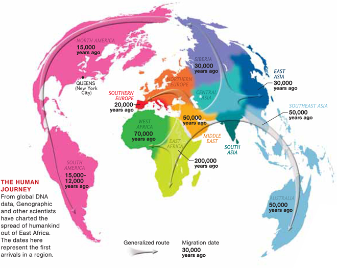
When studying the history of humans, science often points to Africa as the starting point of humankind. Scientists and anthropologists have collected evidence such as fossil records, and radio carbon dating. The history of humankind is important when studying maps about the migration of humans around the world. The Human Journey map is a map of the migration of human beings from East Africa to other regions and continents around the world. The map was created with information collected by Spencer Wells, and IBM’s Genographic Project. The Genographic Project focuses on the DNA aspect of migration. Wells would collect the DNA by using a random sample in Astoria, Queens, New York, by swabbing the inside of random people’s mouths. According to Denis Wood, the authorship of the map is one of the most important things when it comes to perception. Wood also states that a map has the power to construct a reality. The map itself can alter a viewer’s opinion based off what is being portrayed. The Human Journey Map is simple and easy to read, which presents the idea that a map is the best way to convey the information. The Human Journey Map can be viewed as a map that is trying to prove that science can determine migration patterns and the origin of human life.
According to The Human Journey map, human kind began in East Africa. The map is on the National Geographic website making it a credible source of information. From there, humans migrated across the world to West Africa, Australia, the Middle East, Southeast Asia, East Asia, Siberia, Southern Europe, North America, and South America. The use of color in the map compels me to wonder why the authors used the colors as they did. The Western Hemisphere (North and South America) is pink while the Eastern Hemisphere varies in color. The choice of color could have several different meanings, one of which could be because the Eastern Hemisphere was developed and migrated through sooner than the Western Hemisphere. Another possibility could be the colors are based off of the year/years the continent or region was migrated to. Notice how North and South America were both first migrated to 15,000 years ago, and they are both pink, whereas the regions in the eastern hemisphere are not the same colors nor were they migrated to in the same years. This use of color proves that maps are based off the author and what the author wants the audience to perceive. National Geographic portrays the colors this way possibly because they want the audience to perceive the colors as indications where migration began.
When looking at the map, the positions of the land masses tells the audience how the authors wanted the map to be perceived. The map has Africa right in the middle making it so the audience can see that human kind was started in Africa and that it was the center of life 200,000 years ago. The continents/regions are also very close together and almost seem like they are outlined by a circle. This feature of the map makes it so everything seems closer and that migration wasn’t as hard as it really was. It makes it so the audience believes that migrating around the globe was a circular path and that it started in the Eastern Hemisphere and worked its way all the way to the Western Hemisphere. The simplicity of the map makes it easier for an audience to understand it even though this is a very complex matter. The map, The Human Journey, also has a key or a legend that describes the basics of what is going on in the map. It tells the audience how “the dates here represent the first arrivals in a region.” This helps the audience understand how the migration of humans happened.
The Human Journey map describes the migration of humans throughout the last 200,000 and the dates humans migrated to each continent/region. Although the map proves to be decently accurate, there are some areas of concern. The map makes a generalization of where humans migrated to, making it seem as if there was a migration of humans to each part of each region/continent. In reality there were specific points in which humans migrated to and the map clearly leaves them off. In the map there are arrows that point to the region where migration occurred. The map could have shown the exact locations of migration, making the map more accurate. The arrows in the map make it seem that the migration of humans was exactly how the map says it was. There are always other possibilities, the authors decided to not show us or because they are bias toward a certain theory of migration. Another area of concern is the map makes it seem like all humans have been the same for the last 200,000. When reading about the map it states that there DNA evidence was used to make this map. Although this DNA evidence is used to create this map, it does not account for the evolution of humans over this time period. National Geographic only accounts for one side of the migration argument. Although this idea that human life started in East Africa is most widely used theory of migration, there are other theories that are not portrayed in this map. The silences that the Human Journey Map provide us with, show that National Geographic is trying to show their idea about migration.
Maps present an audience with an idea of reality and the reality is determined by its authors. In The Human Journey map the authors use DNA evidence to portray an idea of how human migration occurred. Audiences will read the map and perceive the different aspects of the map to create their own reality. The Human Journey Map proves that all maps have silences due to a specific point that is being made. In the Human Journey Map specifically it shows the audience that National Geographic used DNA to portray that migration started in East Africa.
Vincent Colapinto
Works Cited
“The Big Idea — Genography — National Geographic Magazine.” The Big Idea — Genography — National Geographic Magazine. N.p., 17 Aug. 2009. Web. 17 Mar. 2014. <http://ngm.nationalgeographic.com/big-idea/02/queens-genes>.
“The Story of Africa.” BBC News. BBC, n.d. Web. 17 Mar. 2014. <http://www.bbc.co.uk/worldservice/africa/features/storyofafrica/index_section2.shtml>.
Wood, Denis, and John Fels. The Power of Maps. New York: Guilford, 1992. Print.
Vincent Colapinto,
This is a very fascinating map and you do a good job explaining what the cartographer is trying to get across to the audience. You do a good job giving us background information on the map and stating that the map was made by doing DNA testing to show that migration started in East Africa. It is also very interesting the way the map is shown. It is very distorted at certain sections of the map that are not seen on regular maps of the world. You do a good job relating this map to points that Dennis Wood makes in his book. I agree with you in the fact that I think the cartographer should be more specific about where the people first migrated too instead of giving a very broad area. Overall, I think this map is very intriguing and you do a good job giving us insight to increase our understanding of the map.
-Brendan Hynes