NASA Worldview

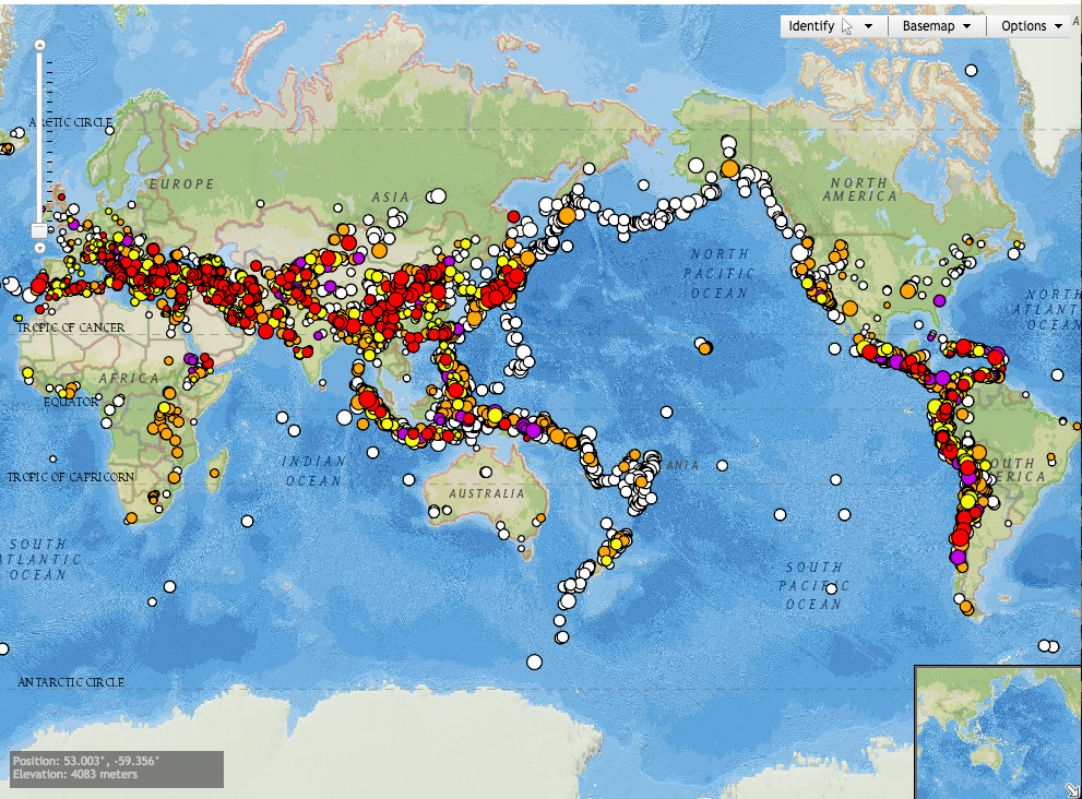
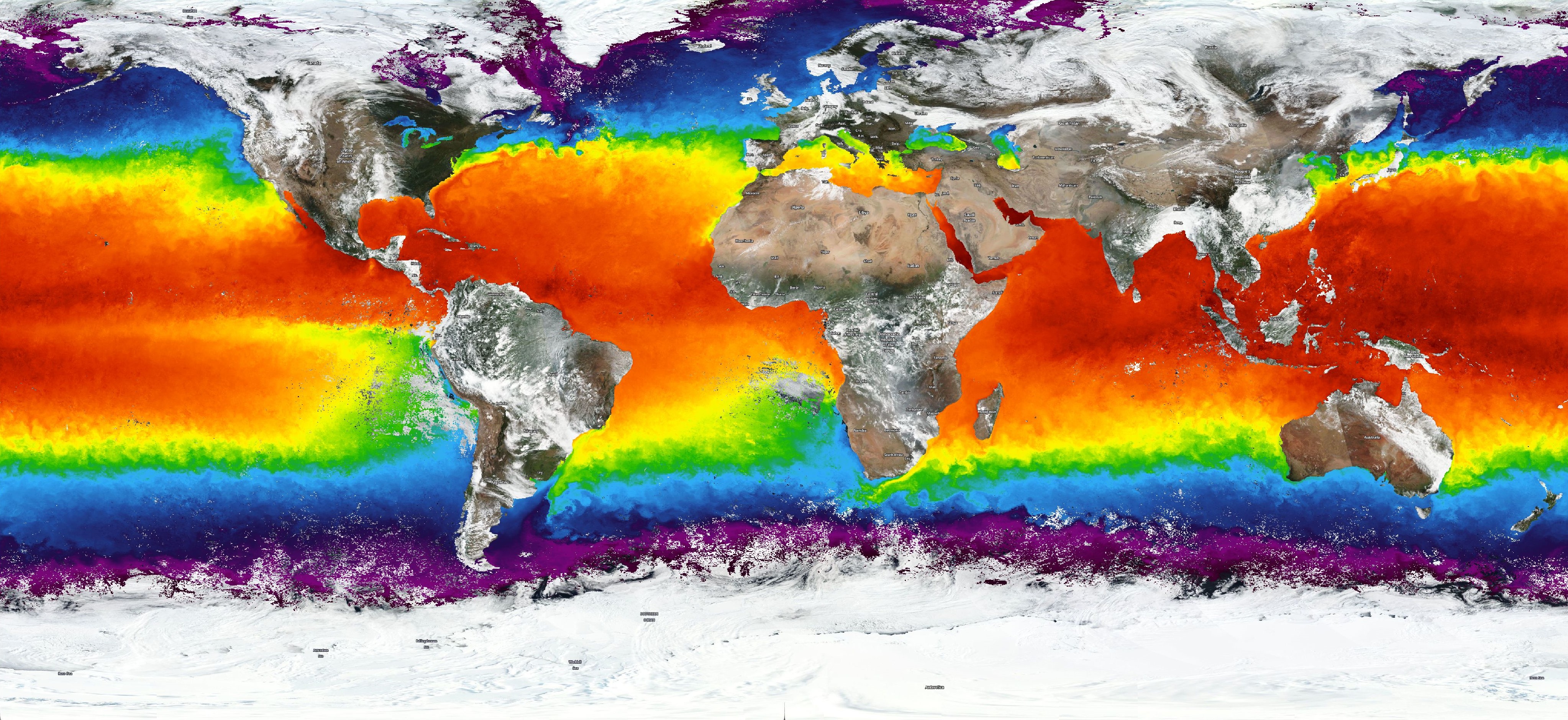
Interested in visualizing how the earth has changed over time in terms of sea temperature, air quality, or flood hazard? NASA’s interactive website, Worldview, uses satellite imagery taken over the past 40+ years to help communities visualize the changes that have taken place over time.

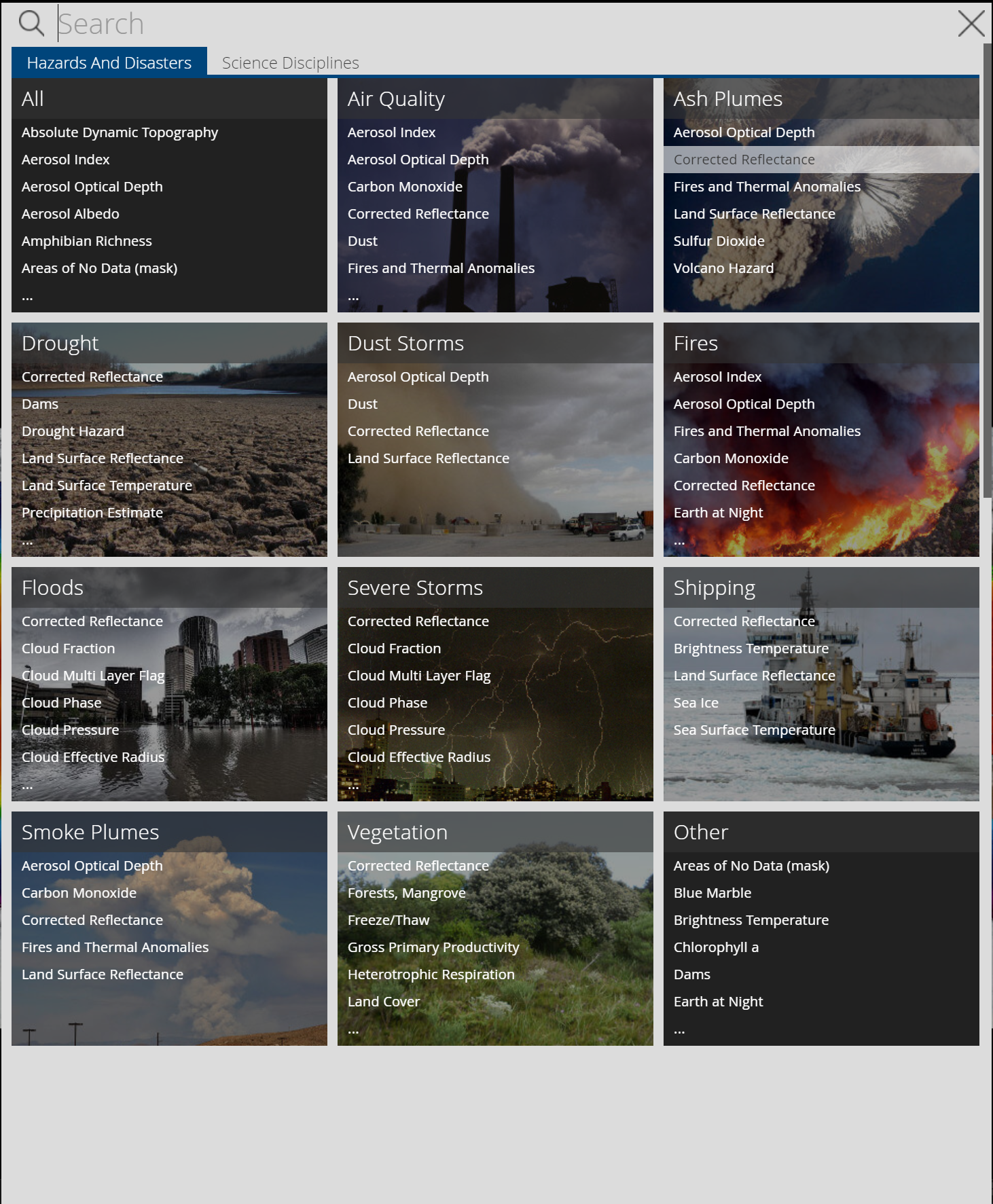
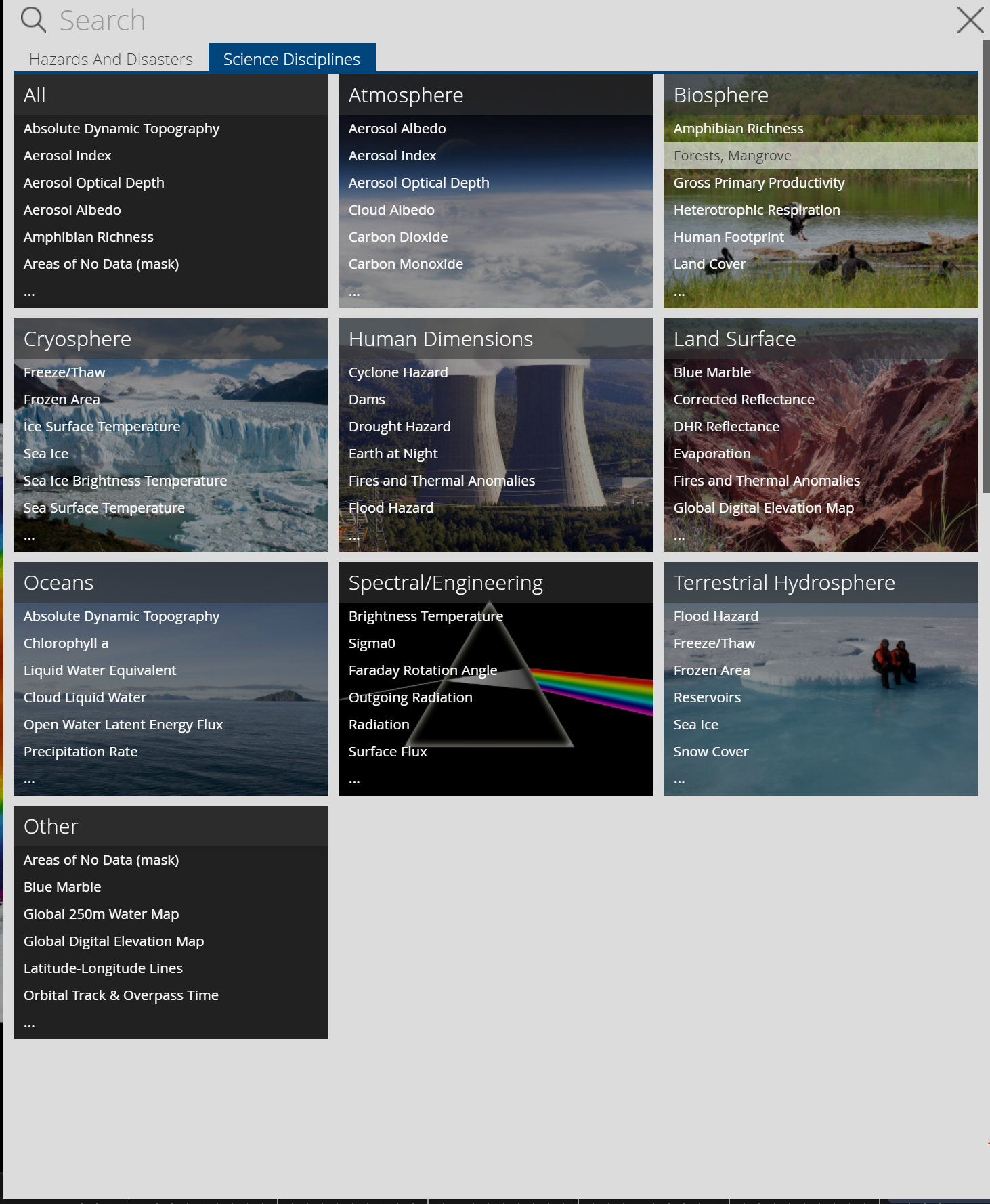
Worldview was created using NASA’s Earth Observing System Data and Information System (EOSDIS) to create 800 satellite imagery layers, allowing individuals to view time-stamped changes in critical focus areas such as wildfire management, volcanic eruptions, tropical storms, and more. Layers are categorized based on topic, as shown below. Users can even view layers based on ‘Science Disciplines’– which separates layers into categories such as Atmosphere, Biosphere, etc.


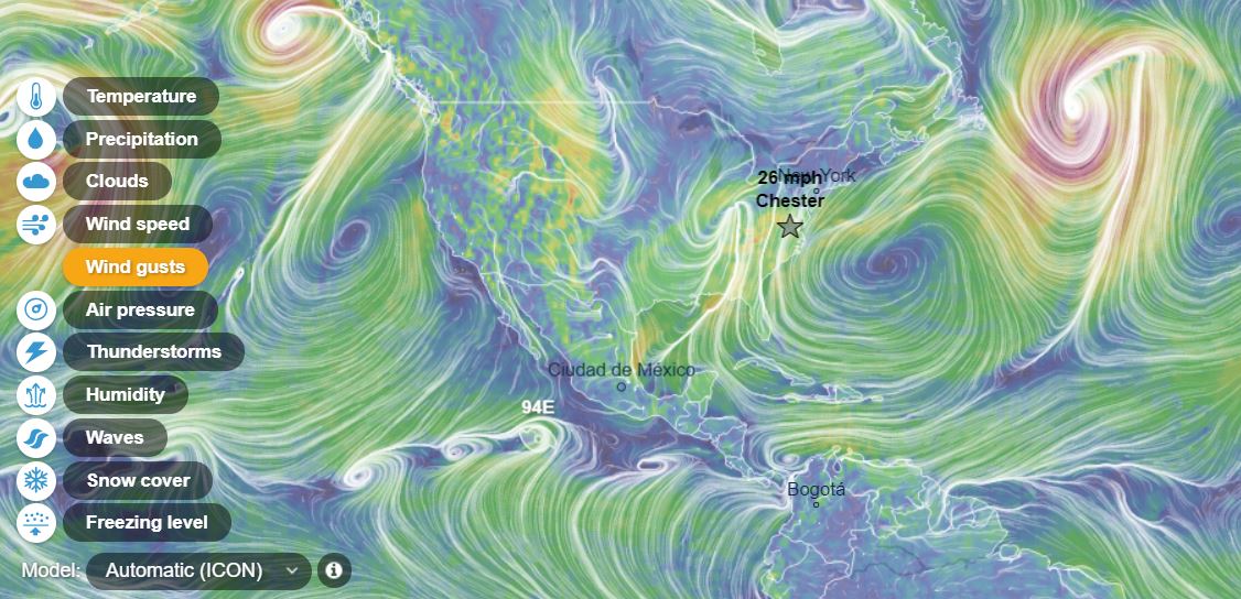
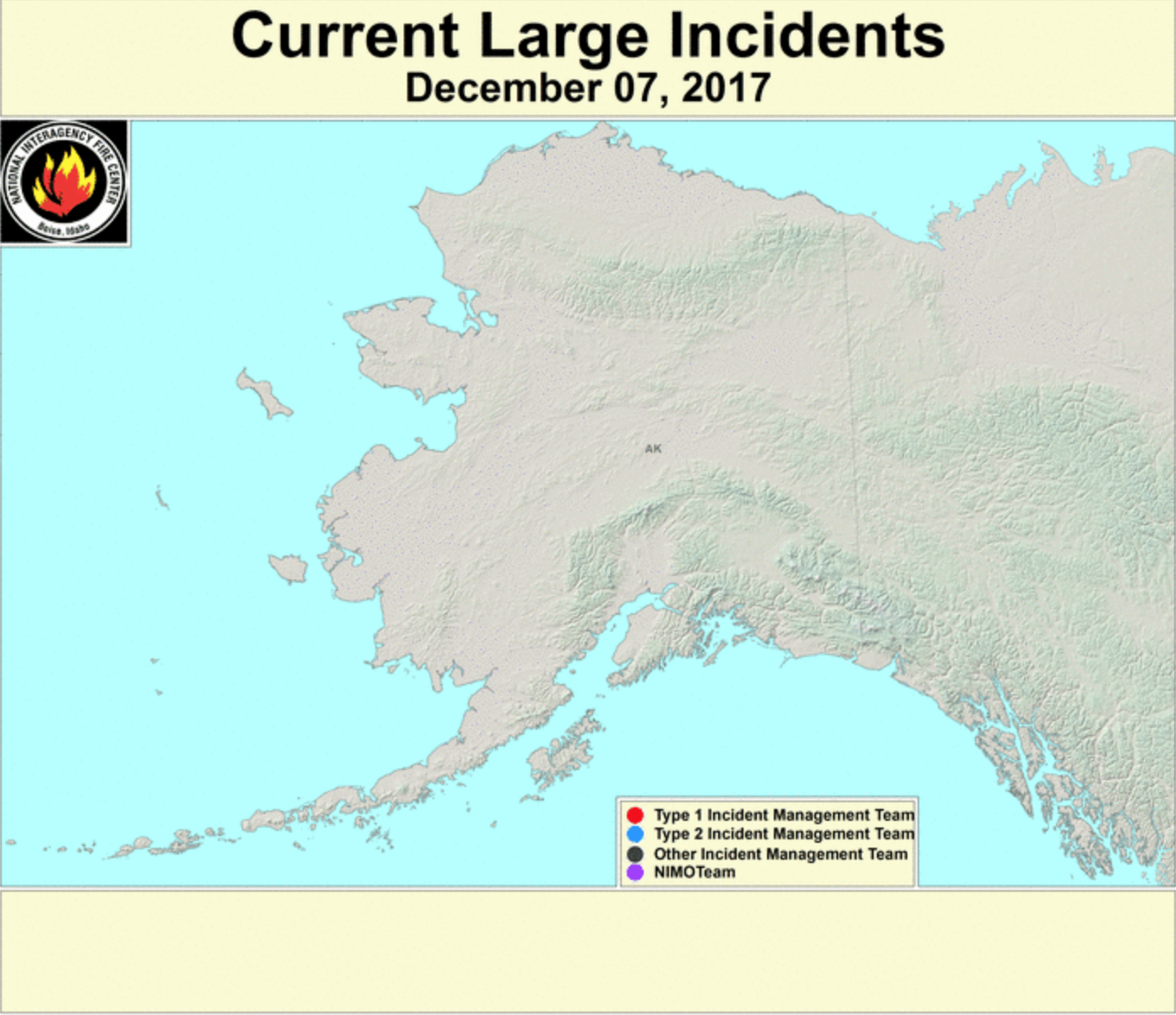
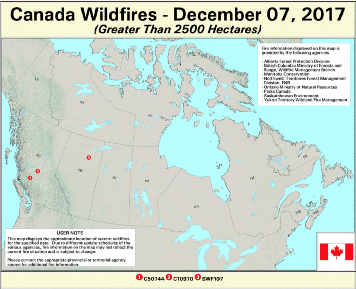
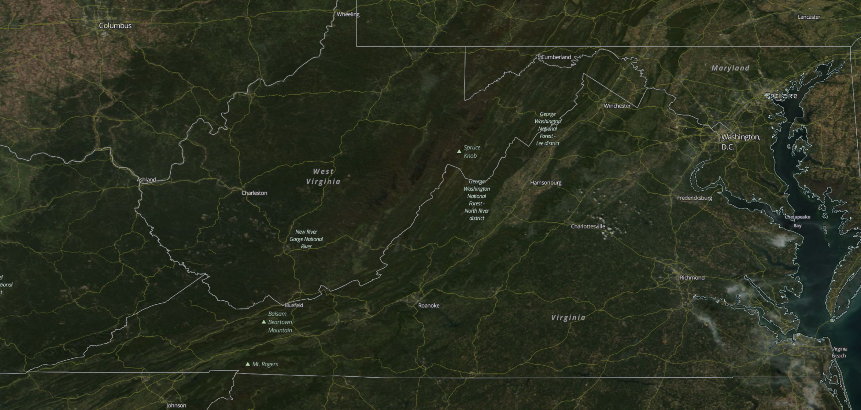
Worldview also allows users to interpret data using different scales! While global data may be valuable for some users, others may benefit from more smaller, more localized scales. Worldview’s zoom capabilities allow users to visualize data from the scale that meets their individual need!

Check out Worldview yourself: https://worldview.earthdata.nasa.gov

Ventusky: Visualizing the Atmosphere and the Hydrosphere

Ventusky is one of my favorite geovisualization websites. Users can select any of numerous physical phenomenon to view in near realtime, from wind gusts to surface temperatures to cloud cover, all with variables for time and altitude. This website serves as an apt companion for our study of the atmosphere and hydrosphere. Most notably, the tradewinds around the equator are often obviously evident, as well as Hadley cells and the acceleration from high to low pressure areas. Also of note, the coriolis effect can be seen if the correct settings are selected.

Ventusky

The Ocean Cleanup – The Largest Cleanup in History

The Ocean Cleanup is an environmental engineering organization that has been designing cutting edge technology for cleaning up the planet’s oceans. Led by 24-year old CEO Boyan Slat, the company has ambitiously focused its efforts on cleaning up the Great Pacific Garbage Patch, a collection of plastic and garbage covering 1.6 million km between Hawaii and California. It is the largest collection of ocean garbage in the world. The Ocean Cleanup is in the process of scaling up their prototype system in the North Sea to prepare it for use in the Pacific Ocean. Once perfected, the system will have the ability to collect trash from the ocean surface and a few feet under water, where garbage ships can come along and pick it up (check out the system in the picture below). At full capacity, the system will be able to remove 50% of the plastic in the Great Pacific Garbage Patch every five years. The website contains information and videos that are extremely helpful in understanding the technological development process and current stage that the company is at in getting the system fully operational. The cool thing about the website is that with the technology it displays being so revolutionary, the site truly allows you to see history unfolding before your eyes! You become a spectator of how an innovative group of people is making an impact in restoring our planet’s oceans closer to their natural state.

“Up in Smoke: The pros and cons of burning rubbish” : Madison Sweitzer

Photo from The Geographical 

An article from The Geographical, the official magazine of the Royal Geographical Society. In London, they are currently burning 53% of trash, which is an amount that has almost doubled in the last decade. The British government is looking to cut down on the amount of burned trash, and the Treasury has announced that it now is considering imposing a tax on the incineration of waste, creating an active opposition to what was originally thought of as a favorable alternative to adding waste to landfills. One positive of the burning trash is that it can be used to generate steam energy, and it lowers the physical amount of trash in landfills. However, opposition to this process critiques that incinerating plants have never been required to report particulate emissions in enough detail to moderate the potential health impacts. The plants are also contributing to greenhouse gas emissions, with approximately each ton of waste burned adding one ton of carbon dioxide to the atmosphere. The last critique is that increasing incineration may decrease motives to recycle. Although the negatives appear to outweigh the positives, this situation does demonstrate the importance of trying to best consider all components of the Earth when making environmentally-conscious decisions. By this I mean that in this instance it appears that the damage to the atmosphere would outweigh any benefit to the biosphere of less physical trash, but it is important to assess both. This article relates to our discussion of climate change in class, and specifically how humans may be contributing to it, through greenhouse gas emissions such as this. It also introduces the political component of addressing climate change, such as the tax considered in this article, and how that may help to combat the further damage.


Article Source

USAID’s Biodiversity and Conservation Efforts


USAID, the US State Department’s foreign aid program, offers a number of initiatives focused on conservation and limiting climate change. They list goals to promote biodiversity in all areas, not just in wealthy countries. Poor countries deal with issues like poaching and destruction of wilderness for fuel which may not be as prominent in wealthier countries. The site goes in depth into statistics of the importance of conservation and biodiversity. They offer suggestions and examples of the implementation of their efforts in foreign countries. For example, their efforts helped secure indigenous peoples land in the Amazon, limit restaurants serving shark fins, and create sustainable forests through promoting sustainable cutting and selling of wood products in Cambodia. There are a number of cool, interesting, and in depth links on the USAID site under the Environment and Global Change tab. https://www.usaid.gov/biodiversity/policy lists the strategic plan of the organization to conquor biodiversity loss. It is interesting to see such a globally influential organization at work. These are goals that are being implemented globally. These policies have the change to affect very diverse lands. Some further topics on the website include sustainable urbanization, property rights, and sustainable tourism. All of these relate to conservation and the protection of the biosphere. With efforts like these, the biosphere will be more heavily protected against threats.

Tracking Animal Migrations

Movebank is an online database that provides an international space for the collection of animal tracking data. Thousands of researchers input data they have collected on animal movement. They fit animals with trackers and plot the point on a map to look at their spatial relation. This database uses GIS technology to track the movement of animals, on a local level as well as across continents. This information helps scientists learn more about climate change, habitat loss, and other environmental issues we have discussed in this class. The way animals migrate can  This is similar to the research of the interviewing professors who used GIS technology to track the impacts of climate change on our environment. National Geographic featured this database on their website to talk about key species which are endangered. Scientists can use this information to track a species’ ability to recover from the endangered list. This database is super helpful and lets

Habitable Exoplanets Catalog

The University of Puerto Rico at Arecibo compiled a list of habitable planets found so far and catalogs news related to the search for exoplanets. The closest potentially habitable exoplanet is Proxima Cen b, just a short 4.2 light years away. The furthest away yet discovered is Kepler-62 f, located 1200 light years away. As expected from the Kepler paper we read earlier this semester, all planets have similar composition, orbit, and size as earth so that they have the potential to contain liquid water.

The University’s overall project is called the Planetary Habitability Laboratory, and its goal is to map the habitable universe. It’s also created a realistic reconstruction of earth’s surface from the last 750 million years using NASA satellite imagery, paleogeographic data related to continental shifts, and paleoclimatic data related to ice ages and milankovitch cycle forcings. Since the Planetary Habitability Laboratory started in 2010, it created the Earth Similarity Index, the first measure of Earth-likeness for exoplanets; and created the first database of potentially habitable exoplanets. Check it out to see a counter for days since the last habitable exoplanet was found and to explore the reconstruction of earth’s historical geography.

http://phl.upr.edu/projects

NOAA Interactive Natural Hazards Map

The National Oceanic and Atmospheric Administration (NOAA) has an interactive map called the Natural Hazards Viewer. This map contains data on both recent and historic significant natural disasters. The dataset includes tsunami events, tsunami observations, significant earthquakes, significant volcanic eruptions, volcanoes, Deep-Ocean Assessment and Reporting of Tsunamis (DART) Deployments, plate boundaries, tsunami times, and selected significant tsunami events. When browsing the user can select which type of hazard they would like to see information on, and then the user can select different data points detailing these events.  There is a wide range of information available between points, some simply contain the date, location, and type of event, while others contain information on the fatalities, social and economic impacts, and information on the individual witnesses, and the events leading up to the natural disaster.

NOAA’s Natural Hazards Viewer compiles a large quantity of information natural disasters onto an easy to navigate and interactive interface. They get their data from the National Geophysical Data Center, which records data on earthquakes, tsunamis, and volcanic eruptions, in order to support research, planning, and mitigation efforts.  I thought this was a really interesting use of GIS in order to create a map that not only compiles all the spatial data, but contains all the social and economic data as well. I would definitely recommend everyone play around with this website at some point, it is a really fascinating, freely available resource!

https://maps.ngdc.noaa.gov/viewers/hazards/

Active Fire Mapping Program

The USDA Forest Service has a website dedicated to show daily updates on forest fire incidents in the United States and Canada. They use remote sensing as well as GIS to make an interactive map on their website. This website isn’t very modernized or updated in terms of it’s look, but it does offer a lot of updates every single day on fire activity around the country. Every incident comes up on the map as a point, and it allows you to click on it, providing a description on the fire report, including the name of the fire, the burnt area in acres, a percentage of increase from the past day if there is one, the location, the cause, the incident type team, the containment status percentage, and the expected containment date. This is all valuable information especially for people who live in the area and have evacuated, as well as for people like me who are not home and can check on the status and locations of the fires so I can make sure my family isn’t near them.  I think this website is extremely relevant especially since there has been an increase in the amount of forest fires in the past couple years as well as many incidents that are currently spreading in the past couple of weeks.

The website also includes different subsections with different maps including: Current Large Incidents, New Large Incidents, Fire Detection Maps, MODIS Satellite Imagery, VIIRS Satellite Imagery, Fire Detection GIS Data, Fire Data in Google Earth, Fire Data Web Services, Latest Detected Fire Activity, and some other subsections that have general information about forest fires.

Click Here to see the website

Building Common Ground for Practical Climate Solutions

The Center for Climate and Energy Solutions has a fantastic and continually updated website that allows all age groups to learn about climate change, their personal impact on climate and the best ways to help the environment. The site has a forum that brings together many perspectives on climate change solutions, it also is constantly updated with he most recent information and research studies regarding climate. Much of the focus of the website is on goverment policy, including ways to show your support for policy, and the latest global and national news regarding environment related policy. The site is extremely effective in teaching the reader that even a small personal change can have a larger impact on the environment and can spur others to make similar changes. 

This image from the website was particularly interesting and relevant to our course because it shows all of the billion-dollar extreme weather events between 2000 and 2017. It also shows the type of extreme weather event as well as the different economic impact of the storms.

Another awesome feature of the website was being able to track your personal carbon footprint. By asking questions about your home, your common forms of transportation, and your zip code the site was able to compare your carbon footprint with the average of your community. My results are below.

Overall, it is a great website and great source to learn about climate, energy solutions, and stay caught up with major research findings, and policy decisions related to the environment.