
Interested in visualizing how the earth has changed over time in terms of sea temperature, air quality, or flood hazard? NASA’s interactive website, Worldview, uses satellite imagery taken over the past 40+ years to help communities visualize the changes that have taken place over time.
Worldview was created using NASA’s Earth Observing System Data and Information System (EOSDIS) to create 800 satellite imagery layers, allowing individuals to view time-stamped changes in critical focus areas such as wildfire management, volcanic eruptions, tropical storms, and more. Layers are categorized based on topic, as shown below. Users can even view layers based on ‘Science Disciplines’– which separates layers into categories such as Atmosphere, Biosphere, etc.
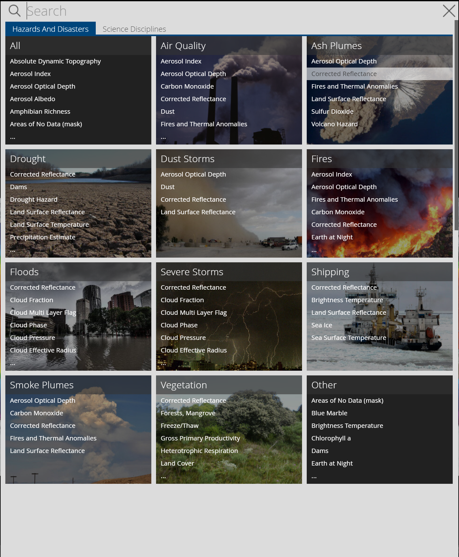
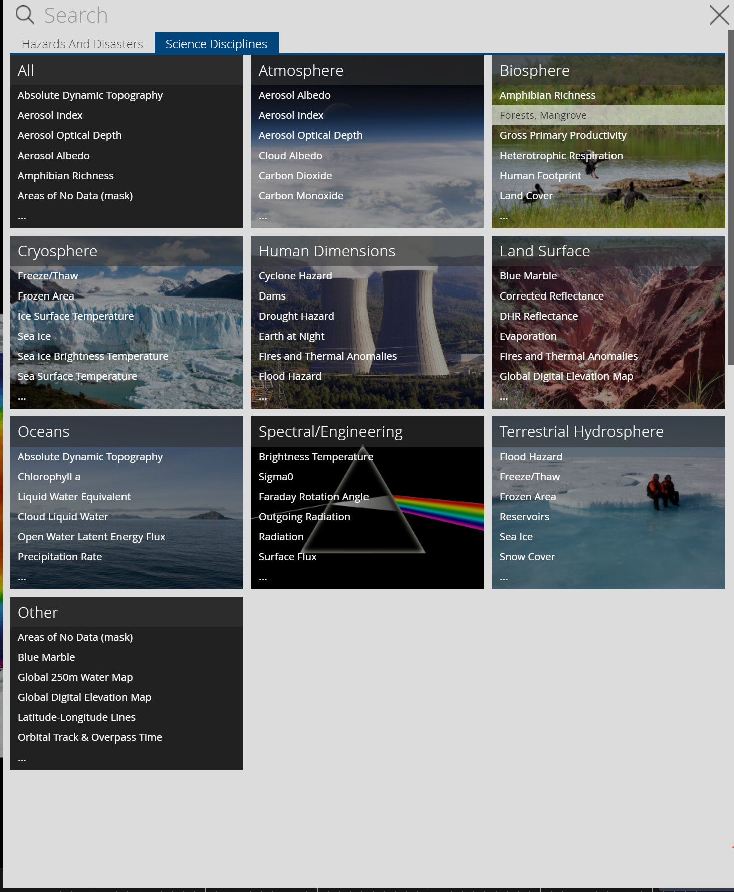
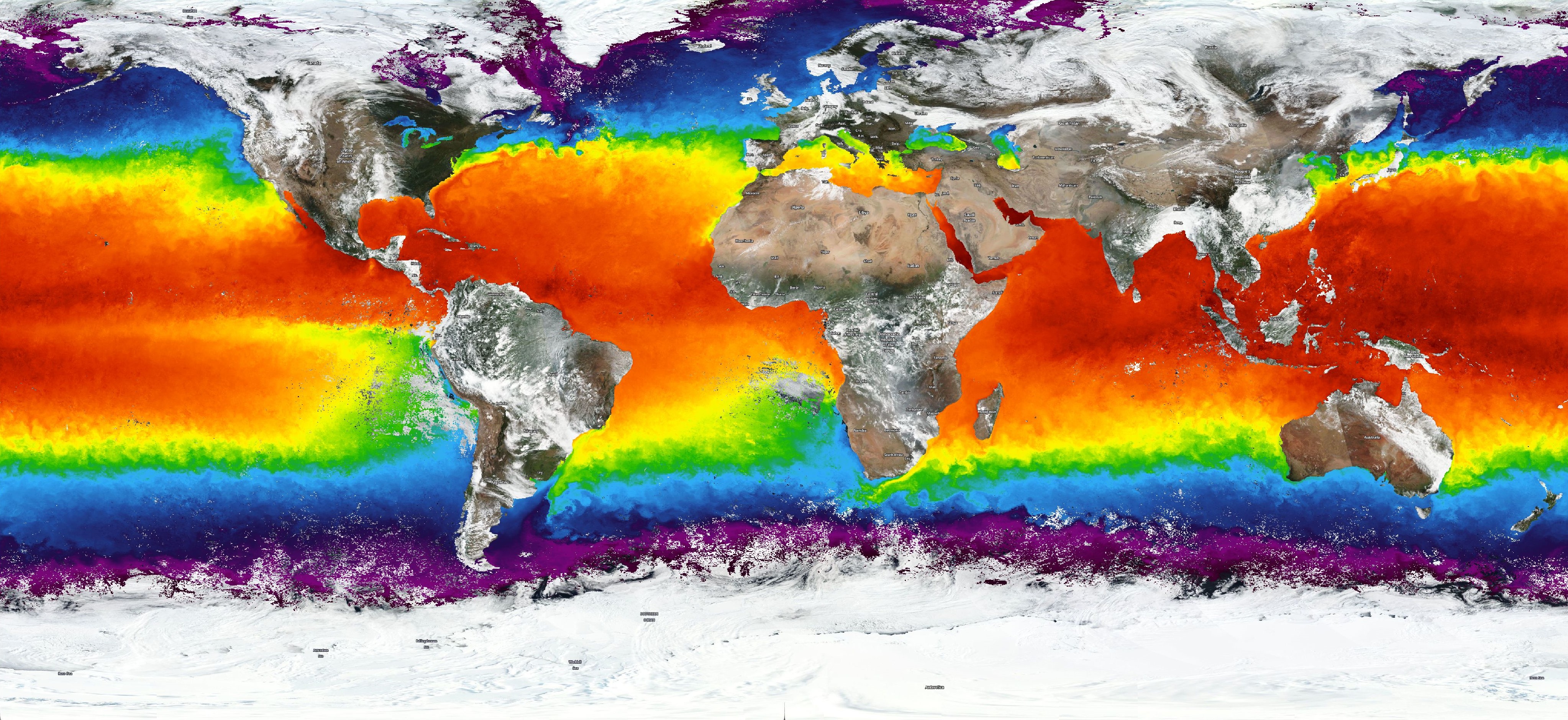
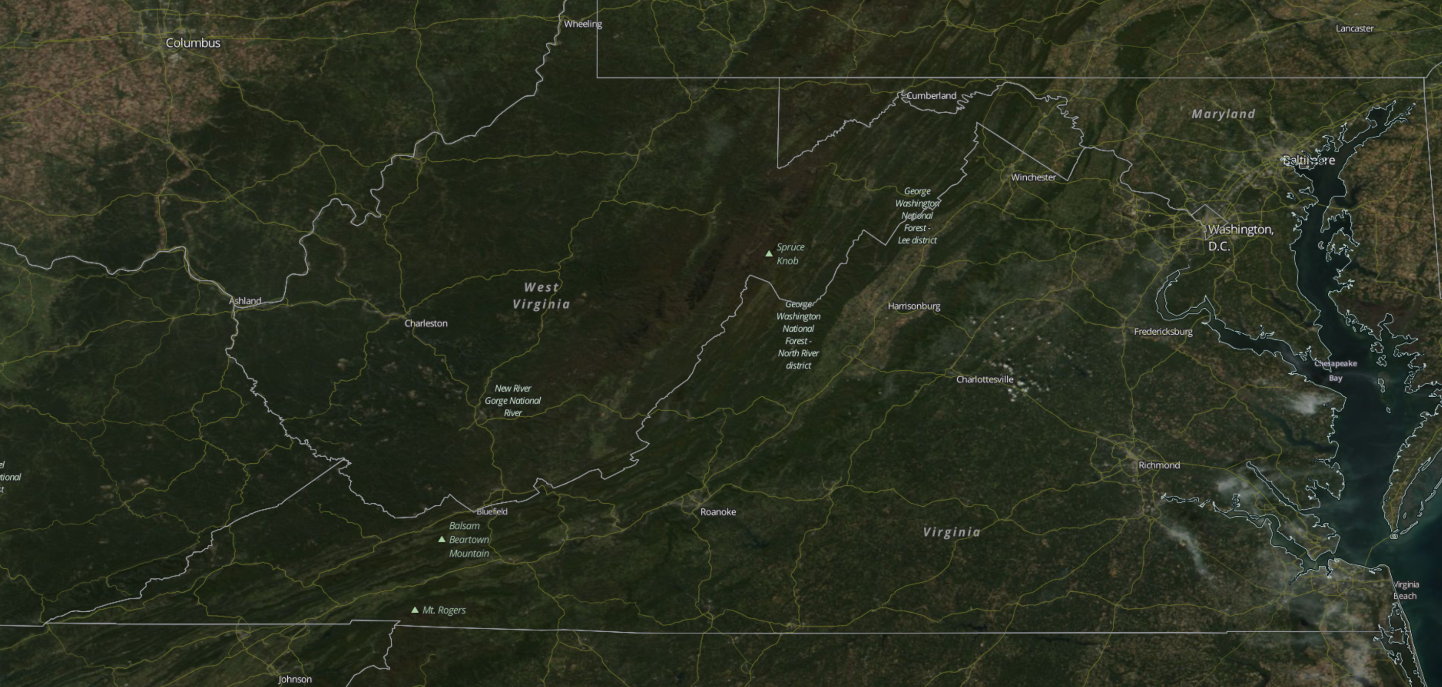
Worldview also allows users to interpret data using different scales! While global data may be valuable for some users, others may benefit from more smaller, more localized scales. Worldview’s zoom capabilities allow users to visualize data from the scale that meets their individual need!
Check out Worldview yourself: https://worldview.earthdata.nasa.gov
This site is so packed with data! So many filters and such incredible capacity to make comparisons with different environmental factors and scales over time. The things that you can do with this website to further your understanding of different processes affecting our world seem limitless. However, using the site was a little difficult, and deciding what/how to measure things was challenging considering the sheer immensity of what was there. Overall, a great and helpful site though.
Wow! This website is extremely relevant to our class and physical geography. More importantly, it gives individuals access to information about the evolving planet, especially if they want to see how the earth is changing as a result of the warming planet. I am curious to see if Worldview and NASA’s Earth Observing System Data and Information System shares the data collected with other organizations and peoples. Great post!
I was unfamiliar with this website prior to reading your post. However, after exploring the site I am very intrigued. The site is filled with data and various filters and layers which can be applied. I could not figure out how to use some of the features, but it was still very interesting. Thank you for sharing!
This is a really cool website, and very relevant to physical geography. It was a bit difficult to navigate; it would be great if the creators of the website made it more user friendly so that it is more accessible to novice physical geographers. But it did have some really good graphics and I like that the layers are separated into categories based on the kind of geographical information they provide.
I’m so glad that you’ve picked this geographic tool share, Alexis! I use this web application for many projects in Global studies courses and for geography courses as well. This app is great for showing data in the global context.