Climate Initiatives Program

The UN Environment and Dutch Ministry of Infrastructure and the Environment-partnered Climate Initiatives Program (CIP) is a platform dedicated to sharing information on current initiatives combating climate change across the world. The number of initiatives is currently 224 and counting. Initiatives are grouped under Themes that range from Finance to Waste to Energy. You can search for specific terms or events or simply browse the data base and sort by Theme. Creating an account helps you stay up to date on all the latest developments in the climate change topics you are passionate about. You can keep initiatives up to date without having to request approval from the administrators.

Perhaps the most interesting parts of this website are its Success Stories and Impacts sections. The former gives the impression that this is not a losing battle and that contributions to this cause do have real, positive effects on the environments around us. You can even opt to create your own success story if you have been active in a certain project in your community. The impacts of international climate initiatives (ICIs) section also offers external information and sources that offer more information on pending and current initiatives covering cities and regions throughout the world.

Storm Prediction Center

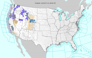
The National Oceanic and Atmospheric Administration’s (NOAA) National Weather Service’s (NWS) Storm Prediction Center contains numerous maps of the United States that show if any severe weather is present or if there will be any in the future.  Their “Forecast Products” include Current Convective Watches and Outlooks, which show the potential for tornadoes and severe thunderstorms from today to eight days away; Current Mesoscale Discussions, which show all current severe weather; Fire Weather Outlooks, which show the potential for wildfires today and up to eight days away; and the Watch, Warning, and Advisory Display (WWA) which shows all types of WWAs.  All of these maps are easy to understand and allow the user to easily see which type of hazardous weather is in their area.  The user can also read a detailed statement released by the NWS that explains what could happen.

It is pretty impressive that the NWS can predict severe weather up to eight days in advance.  People can use this site to see if any storms are heading their way and how bad they will be.  However, the thing about weather is that it is always changing and the NWS constantly needs to update their maps and descriptions.

NWS Watch, Warning Advisory Display 12/02/17 1:16pm EST


The Office of Federal Sustainability

The Office of Federal Sustainability website is a great resource to learn about the energy use of the US government, which is the largest energy consumer in the country. The Office of Federal Sustainability is a sub-department of The Council on Environmental Quality, an executive office of the White House which advises the President on environmental issues and policy.

The site explains the initiatives undertaken by the government to reduce energy use across its 360,000 buildings and 660,000 vehicles. Graphs and charts showing the energy usage of various government agencies are available. There is also a ranking of all federal departments in terms of energy use and sustainability initiatives. The scorecards rate each agency on a green, yellow, red scale in terms of whether or not the agency is compliant with environmental goals in areas such as water use reduction, renewable energy usage, green building development, and emissions reduction. Another section of the site is dedicated to policies, executive orders, and statutes concerning environmental issues. Furthermore, the website provides an array of other resources about energy conservation in the federal government and beyond. It is helpful to understand the US government’s policies regarding the energy use of its own agencies since the federal government serves as an example of sustainability to both citizens and corporations.

Link: https://www.sustainability.gov/index.html


EPA & Urban Heat Islands

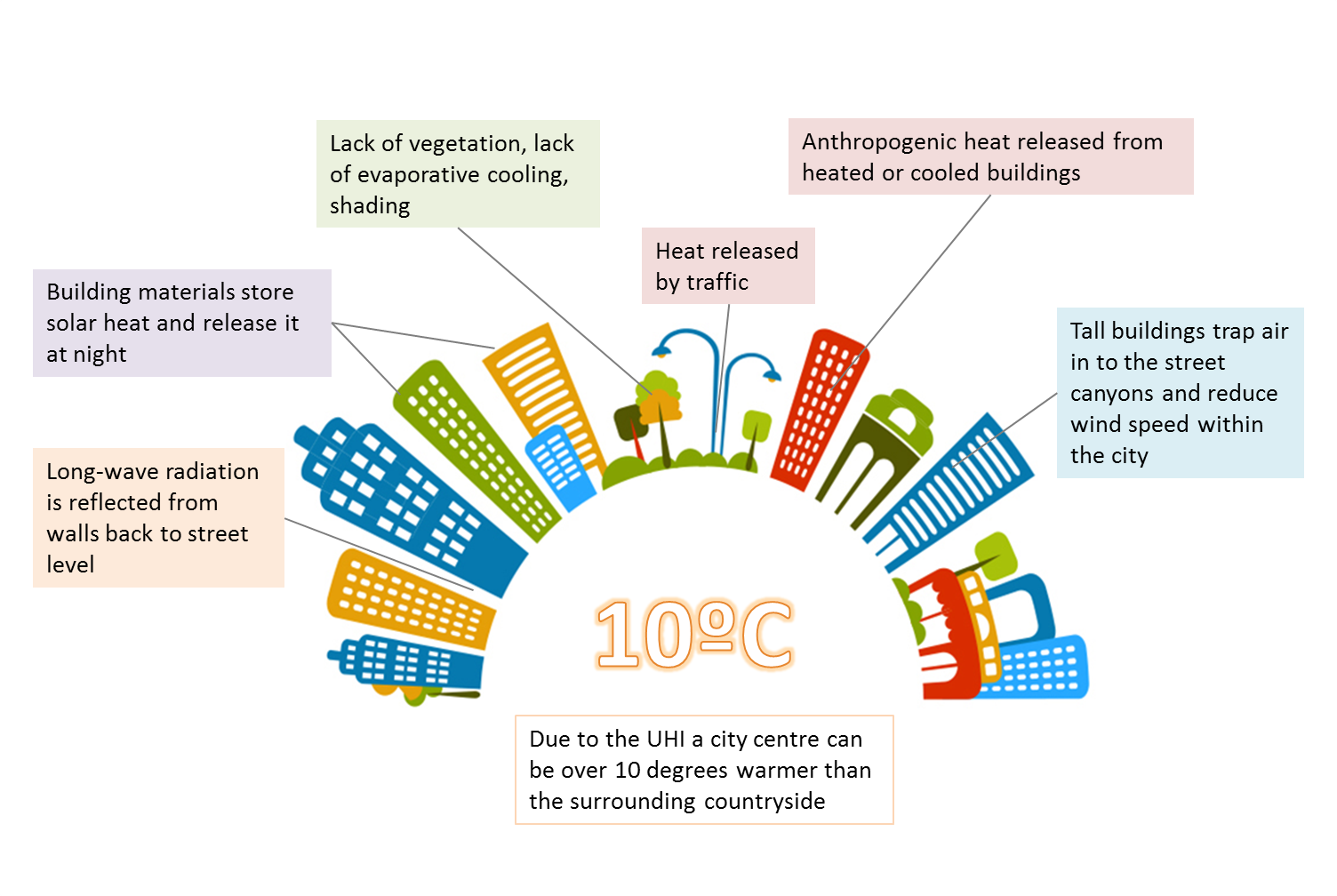
Heat islands are crucial to understand whether one is laying out the blueprint for a city, or just planning out their own home.  The EPA has dedicated a section of their website to teach the public about such heat islands.  The website is divided into two parts, the first is about understanding heat islands and the effects, and the second part is about reducing the effects of heat islands.

On the first part of the website, the EPA discusses how the dark and impervious surfaces (occurring mainly in cities and some suburban areas) reach higher surface temperatures than what the actual air temperature is.  Due to the increase in surface temperature, not only does the air temperature now slowly increase, but there is also an increase in the demand for electricity.  Since the demand for electricity goes up, the production of electricity must also go up; this in turn releases more pollutants into the atmosphere.  Heat islands and higher temperatures have also been linked to an increase in the number of hospital visits in both the young children, the elderly, and the homeless.

The second part of the website aims to inform readers about ways to reduce the effects of heat islands – such methods include planting more vegetation, both on top of and around buildings, and also using materials for pavements and roofs that reflect more energy than they absorb.  These methods to reduce the effects of heat islands are recommended on both the household level, and community level.  Further, cities and towns can change codes so that buildings comply with policies that make heat islands less prevalent.

As the younger generation seems to be the one more involved with climate change and the environment, I found it a little surprising that the EPA did not recommend any solutions for students or non-homeowners.  Just about all the suggestions to reduce the effects of heat islands were only applicable if one is a homeowner in a suburban area.  It would be beneficial for the EPA to market their solutions towards those who are most interested, yet at the same time, marketing effective solutions towards the younger generations is quite difficult given the circumstances of the problem.

SNOWcast through interactive maps

Link: http://www.intellicast.com/Travel/Weather/Snow/SNOWcast.aspx

With much technology advancement, contemporary society demands more accurate weather forecasts. Of all the possible factors for weather forecast, snow forecast is one of the more important weather forecast. This is because now can have detrimental effect on transportation, outdoor activity, etc. Due to the wrong snow forecast, the Fairfax County Public School in Virginia experienced a detrimental effect of having tens of accidents around the schools. Likewise, accurate snow forecast will really help plan to prevent any devastating situation. The intellicast projects different forecasts with maps that are represented at a different angle of the weathers. For snow, it has the delay risk, travel outlook, roadway conditions, snow cover, SNOWcast, 48hr snow, 24hr snow, and many more to inform the public about the possible hazard. Such maps allow the people to easily see and accurately interpret the weather forecast. These information will further help to prevent possible hazard.

How Wildlife May Fare Under Trump

Link to the article: http://news.nationalgeographic.com/2016/11/wildlife-watch-trump-wildlife-trafficking-animal-conservation/

Since the recent presidency elections one of the major questions was about, what would Trump do for the environment? If he becomes the president-elect. The debates in this presidency election surround various of concerns, including some which focus on national security, trade, economics, and to a lesser degree in this election cycle, on the environment. Wildlife, however, plays a part in all those concerns.

“Given our demonstrably disastrous effects on wildlife, there is now recognition that humans have a certain obligation to protect wildlife for its own sake” (Rachel, Jani, 2016). Since 2013 president-elect Obama has worked greatly on the conservation and sustainability of nature and protection of wildlife besides that we even worked on reduction of the pollutants which effects the earth and its climate. Which shows the attempt by the president to really protect the environment for a better and sustainable future.

However, the concern now rises what is the new president-elect going to do for the environment, as some of his campaigns seemed to promote the idea of climate change being a hoax rather a real problem which deserves concern. Trump’s administration seems to promote trophy hunting and other unfriendly- environmental amendments which, may cause a disruption through out the ecosystem, especially the hydrosphere, atmosphere, and biosphere. Besides, the wall which Trump plans to build is going to disrupt the ecosystem especially the biosphere as its going to hinder animal migration which might end up being a cause for the extinction of these animals.

Light Pollution Mapper

Light pollution is a byproduct of most human settlements, especially since the industrial revolution and the harnessing of electricity with the light bulb. Although artificial light has become a nearly unavoidable facet of modern life, light pollution can have adverse environmental effects on both plants and animals, and can also reduce the natural beauty of dark night skies.

This light pollution map [LINK: http://www.lightpollutionmap.info/#zoom=4&lat=5759860&lon=1619364&layers=B0TFFFF] is designed to reveal the extent of light pollution across all of Earth’s continents. The map aggregates Sky Quality measurements from the Earth Observation Group and the NOAA National Geophysical Data Center, and then produces a gradient that overlays a Bing map of the Earth. The gradient reflects anthropogenic radiance in watts per square meter. The user can toggle features of the map layers, including altering which year’s data set is being displayed.

Perhaps the most interesting component of the map is the ability to pinpoint more specific locations and their radiance using the search/pinpoint/drawing functions on the left side of the screen. The ruler feature functions the same way as the ruler featured in Google Earth, allowing the user to measure between two distances. This tool is particularly useful in gauging how far away from a light source the light pollution spreads. For example, measuring the distance from end to end of the patch of radiance surrounding Richmond can help the user make inferences about how intense particular city’s light pollution can be. Also noteworthy is the Radiance Area tool, which allows the user to draw a figure with three or more sides over any area on Earth. The system then produces information about the area given.

Worth noting–and also mentioned in the site’s FAQ–is that Canada appears to be covered in light pollution. This discoloration on the map is somewhat misleading; although Canada does experience light pollution in its major cities, most of the light pollution pictured on the map is actually caused by aurora borealis, which is visible from many parts of northern Canada and disrupts the radiance measurements that are displayed on the map.

Try finding your home town on the map! Looking at my home outside of Los Angeles from high above made it seem like my particular street was contributing to lots of the light pollution, but zooming in, it is actually possible to see the variation from street to street. The street I live on emits nearly 4 times less radiance than one of the larger streets only a few blocks over. It’s very cool!

Interactive Global Map

https://earth.nullschool.net

This website is a great way to visualize many of the things we’ve been learning about in class. Through its huge number of parameters and extensive customization options you can see many global systems. A sampling of options are ocean currents, wind patterns, and particulate pollution flow.

Within each of these categories, you can specify additional controls, such as altitude and type of pollution. Overlays and animations can be modified to show different comparisons of data. You can even change the projection and date (including forecasting the future).

I would encourage you to take some time and poke around (click on the “Earth” button to expand the options menu). It is a great visual way to make connections between different parts of the course and our world!

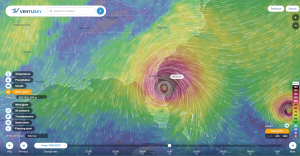
Hurricane Matthew Hits the South-eastern Seaboard of the United States 2016.10.06

Have you ever looked for a free online tool aimed at improving awareness about meteorological events in our atmosphere?  Look no further than Ventusky.com.

Untitled

After devastating several Caribbean countries like Haiti, Hurricane Matthew (pictured above 2016.10.07) followed its predicted path along the coast of the south-eastern seaboard of the United States.  Hurricane Matthew was a category 4 hurricane, meaning just the wind alone has the potential to rip trees out of the ground and even level entire buildings.  The worst part of Hurricane Matthew was the storm surge which is caused by high winds pushing water inland.  Widespread flooding along the coast of the eastern seaboard is the result of storm surge.  The danger during a category 4 hurricane is real, which is why several National Parks, including the Everglades National Park closed for the duration of the storm.

On Ventusky.com, anyone can view a multitude of different atmospheric or hydrospheric measurements of any desired location on Earth.  I used the webpage to track and view the wind speed and gusts, air pressure readings, and precipitation levels during Hurricane Matthew.  I encourage any other amateur geographer out there to utilize this amazing tool to track the next storm in your area.

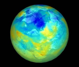
Ozone Hole Watch!!

3

Ozone is a colorless gas. Chemically, ozone is very active; it reacts readily with a great many other substances.

It is located near the Earth’s surface and the ozone is very important because it absorbs harmful components of sunlight, known as “ultraviolet B”, or “UV-B”.

We have learned the basic information in class trough powerpoints and our textbook, but this website allows you to chose 2different days and look to see the changes, if any, that have occurred.

There is also information about the ozone hole for the 2015 season. On the right hand side of the webpage are ozone facts that have been provided to test your knowledge!  1