Test your geography knowledge here

National Geographic’s Quiz Whiz allows kids and adults alike to test their knowledge of various geography topics. Some of the topics include: the Moon, Volcanoes, Space Exploration, Animals, and Earth Day. While the site also provides quizzes with topics that are not related to geography, geography reveals itself as a common thread among the available quizzes. Quiz Whiz provides an interactive platform for kids to engage with geography and learn about geography beyond the classroom.

One of my favorite quizzes, “The Moon,” was created in collaboration with NASA.Screen Shot 2016-03-13 at 5.06.09 PM

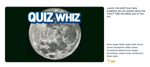
http://kids.nationalgeographic.com/games/quizzes/quiz-whiz-moon/

The quiz addresses space exploration, the rotation and revolution of the moon, the relationship between the moon and Earth, and natural processes on the moon. After each question, the quiz tells you if you answered correctly or incorrectly and gives you information to determine the right answer if you answered incorrectly the first time. The same quiz can be completed as many times as desired.

In our class, we explored some of the same topics as featured on Quiz Whiz, and similar to the website, the lab portion of our class allows the students to participate directly and interact with important geographic concepts. Geography is a hands-on discipline that is best learned through participation. Kids can take the Quiz Whiz quizzes, learn about geography and the natural world, and have fun. If the quizzes are fun, accessible, interactive, kids may be more inclined to complete them and engage with the geographic topics presented in the quizzes. A major criticism of today’s culture is the general lack of geographic literacy. Geographic literary (geo-literacy), a term first adopted by National Geographic, refers to the ability to use geographic knowledge, of both places and humans that inhabit places, to make broad decisions. Quiz Whiz allows kids to interact with geographic concepts from a young age, which could increase the geographic literacy of the future generations.

NASA Journey to Mars

NASA Journey to MarsNASA has a dedicated section on its site for the Journey to Mars initiative. The ambitious plan has two goals: send humans to an asteroid by 2025 and to Mars in the 2030’s.

But why do we need to go to Mars anyway?

Mars is a comparable planet to Earth that once had conditions suitable for life. Exploration to Mars could help answer the age-old questions that get the blood rushing for astronauts and astronomers everywhere: Is there life beyond Earth? Are we alone?

To prepare for this journey, astronauts on the International Space Station are testing technologies and communication systems to make the mission possible, as well as collecting data about how the human body responds to living in space.

NASA will then move into deep space by capturing an asteroid, redirecting it to orbit the moon, and sending astronauts to explore the asteroid on the Orion spacecraft in the 2020’s.

Orion is designed to take humans deeper into space than they have ever been before, including Mars. It will be launched into space on NASA’s new heavy-lift rocket, the Space Launch System. Orion has already been built, and it even completed a successful flight test in December 2014.

NASA's Orion spacecraft awaits the USS Anchorage after a successful flight test on December 5, 2014

There is already a fleet of robotic spacecraft and rovers collecting data on Mars, and in the future, the Mars 2020 rover will seek signs of past life.

Engineers and scientists throughout the world are working with NASA to develop the technologies necessary for traveling to Mars and then living and working there before returning safely home.

The Journey to Mars section of NASA’s website includes the following sub-pages: Orion Spacecraft, Space Launch System, Ground Systems, Asteroid Redirect Mission, Robotic Mars Mission, International Space Station. There are also tabs for: Images, Video, and Media Resources.

http://www.nasa.gov/topics/journeytomars/index.html 


National Weather Service

National Weather Service of the National Oceanic and Atmospheric Administration

http://www.weather.gov/

Many of us check the weather on a daily basis, simply wondering how to dress for the day. Well the National Weather Service (NWS) website is more than your basic weather app with all of the fancy graphics and animations. Instead the website is a comprehensive compilation of historical, real time, and prediction models of weather,  water and climate patterns. This website is a more serious and extensive source of weather information. The website is truly a valuable tool for a geographer.

The mission of NWS is to provide weather, water, and climate data, forecasts and warnings for the protection of life and property and enhancement of the national economy. The website takes on the notion that weather can be very powerful and costly and takes all measures to ensure the American population is prepared for weather events. One of the major roles the website has is to share information about weather warnings. The first thing you see on the homepage of the website is a map of the United States divided up by counties. Some of the counties are shaded in different colors which correspond to different warnings. Beneath the map the websites lists 29 different types of warnings, watches, and advisories which include wind, tornadoes, floods, winter weather, and even high surf. This map is a useful tool to observe the weather patterns occurring nationwide as well as viewing the potential weather threats on a local scale. 

In addition, the website has countless other features. The most useful feature for the casual user is the customized forecast which allows you to search for weather by zip code. Like many other websites, it provides you with a overview of current weather a forecast for your local area. Unlike some other weather sites though, this forecast comes straight from the local NWS weather forecasting office, of which their are 122 nationwide. The website has many of the typical weather features you see on any other website, but far more detailed and comprehensive.Graphic of Air Quality Forecast Guidance for the CONUS

The website also provides countless other useful graphics like the one above which shows air quality or ozone concentration. Additionally the website has real time graphs and maps about floods and fires that can be very useful. The casual web surfer can learn so much about weather, and someone who understands how weather patterns work will be mesmerized by the wealth of information on this website. You could waste lots of time looking at all the historical trends and forecasts for all kinds of natural events that occur in the United States.

Finally the website has some very useful links about safety tips for all kinds of weather related events. This website is a good resource for any skill level of geographers. NWS has a respected name and their website has a very professional feel that would encourage me to use it more often for weather information especially now that I know more about how the atmosphere and hydrosphere work.

-Aaron


Global Carbon Atlas

www.globalcarbonatlas.org

Click on this link and explore the site, I guarantee it’ll capture your attention and you’ll probably spend at least 20 minutes messing around on it.

The above link will take you to the ’emissions’ section of the Global Carbon Atlas. This interactive website collects carbon emissions data from every territory in the world and allows the user to create customized visuals in order to draw comparisons. The image below displays the basic home map for the site, which utilizes graduated bubbles in order to display the total carbon dioxide emission levels in metric tons (Mt) of every territory. Starting with this map, one can begin manipulating the way data is represented in terms of units, countries, resources, and scale of time.

1The right sidebar allows the user to choose from a variety of different visual displays. I first looked at the “ranking” option just to see where countries fall for different types of resource usage. I kept the units in metric tons, but for “type” I chose oil, coal, and gas. In this way I was able to compare 10 countries and their usage of these three resources side-by-side.

1961The image above represents data from 1961 (the absolute furthest I could go back). Beneath this chart there is a time bar, which can be dragged from 1961-2013. This is a really interesting feature because you can watch as the countries on the left shift places, particularly the rise of China and India and the fall of Russia and the UK.

2013


After exploring this feature, I also looked at the “chart view” and “time series” options. Like the “ranking” option, these two tools are immensely helpful in generating easy to understand data visuals. In this way, Global Carbon Atlas can function as a highly versatile tool, which can gain the attention of any audience. Seeing this data on a piece of paper and aligned in grids, may represent the same reality, but it does not tell the same story. With this website, one can better understand how every country contributes to global carbon dioxide emissions.

oil


Additionally, the site also seems well sourced. With each customized chart, one can easily access the sources of data. On the lower-right side of the screen there is a “sources” option, which provides links and citations. Furthermore, there is a “data” option, which allows you to download the data you’re using on the screen into .csv and xls or .pdf and .jpg files.

There are really so many interesting visualizations on this site, I don’t even think I can accurately describe everything. Try checking out the “outreach” tab located in the top bar. Here, you’ll find past, present, and future tabs. The past tab will take you on a story-like journey from hunter-gatherer times, through the industrial. The present time will offer a really creative break down of our current carbon footprints and the future tab will reveal estimates on the continuous patterns of carbon emissions.

Finally, the “research” tab allows you to create maps using different data sets offered by the organization. Again, these maps can be really powerful tools for capturing the attention of an audience and displaying informative messages.

I really do not see any flaws with this site. Its extremely easy to use and seems to have endless possibilities from a user perspective. I hope you guys take a few minutes to check it out; I know I will definitely be using it in the future.

-Dan


ScienceDaily: Your resource for the latest research news

ScienceDaily is one of the most popular scientific websites. About 5,000,000 people visit this website monthly. One of the reasons that people prefer this website for their scientific research is that it is well organized and easy to search for topics that they want. The site has five big categories on the top: Health, Physical/Tech, Environment, Society/Education, and Quirky. There are more specified categories below these five categories like Space and Matters, Animals and Plants.

For example, if you are looking for a resource about Mars, you will go to Physical/Tech, Space and Matters, and click Mars. There is a research about Marsh might has a salty water. It provides summary of the news and information about the laboratory where the research was done. You will see the recent researches about Mars and the related stories additionally on the right side. In addition, “Related stories” section that recommends further research is shown based on your search topic. It helps you to gather more related information about the topic and to develop your study once you search, so that you do not have to search several times.

Screen Shot 2015-04-15 at 1.00.38 AMScreen Shot 2015-04-14 at 11.50.19 PM

The website is designed well for the young people who are interested in scientific issues. It has a Facebook page, Twitter, and Google+ so that you can get the latest news through them. And the website allows you to share the news on Facebook, Twitter, and Google+ simply clicking “Share this”.

The website is useful for our course, Geography 250 because it has great amount of resources about physical geography including Atmospheric, Biospheric, Hydrospheric, and Lithospheric news. In Space & Time section, there are detailed resources about space that can be linked with what we learned in chapter 3, the atmospheric composition. The earthquake news of the website announces a recent issue about the earthquake like Japan Quake and Tsunami Spurred Global Warming which can be associated with Chapter 12.

LiveScience

This website (LiveScience) does not just deal with geography topics specifically, as it offers a broad range of news sources and studies relating to a variety of scientific fields. Many of these stories relate to physical geography.  The website offers a variety of news stories, videos, and images concerning topics like health, space, and animals. The main tabs that I focused on covered “Planet Earth” and “Space.” The stories found on the “Planet Earth” included a large range of topics that we have discussed in class, such as the effects of global warming, access to freshwater, and the state of coral species who are reacting to warmer waters. The “Space” tab provided information such as the effects asteroids could have on Earth and Earth-size planets that could support life. All of these news stories are easy to read and include links to further scientific resources that could be used to learn more. Most stories are also accompanied by videos or photos to help illustrate the story.

LiveScience also shows the scientific topics of the day that are “trending,” such as global warming or military and spy technology. This site also offers links to other additional resources that relate to these scientific topics.

Overall, it is a helpful compilation of recent news stories that relate to a variety of scientific topics. They are fairly easy to read and can be understood by the general public. Based on our recent discussions in class, websites like these could be a helpful link to bridging the gap between the scientific community and the public on matters like global warming.

To visit the site: http://www.livescience.com/.

BiosphereSmart

The website that I chose is an interactive tour of the world. The purpose of the website is to visually show how climate change has affected or will affect the Earth and its systems.  It’s also provides a good visual summary of how much humans have impacted these systems. It offers 4 categories to choose from: Changing World, Climate Change, Biosphere reserves, and Help greening. In changing world, users can choose from one of Earth’s 4 systems: Lithosphere, Hydrosphere, Atmosphere, and Biosphere as well as a 5th one, Antroposphere. Within each system, users can choose a variety of topics that are associated with each system and can visually see the distribution or levels of each topic around the world. Climate change category is of course all about climate change and it’s causes. Users can visually see all the changes that occur with climate change and where on the planet will be most affected. Biosphere reserves category shows the many reserves and world heritage sites on the planet today and their boundaries. Finally the last category, Help greening, talks about how humans can help to slow down climate change and make a contribution to the healthiness of the Earth.


This is a really good website in which it isn’t just about giving facts and information but provide visually appealing graphs/data/pictures, allowing users to quickly determine where on the Earth each topic is occurring. It provides a sense of scale. I really liked the website because instead of actually reading about what’s going on in the planet, I get to actually see how much damage is occurring to the world and where. And so this website relates to everything that we have been learning in class.

http://www.biospheresmart.org/#


Breathing Earth

The Breathing Earth simulation website is really interesting because it shows country by country the amount of tons of CO2 admitted for a certain time period, usually a minute or two, since you’ve been watching and per person. It shows, by color the countries who admitting the most and those who are admitting the least. Lastly, it shows the population of each country, how much it’s growing or decreasing and how many people are being born and dying while you are watching.

This site does a really good job of connecting different aspects of CO2 emissions, in terms of different countries and people. I think being able to compare population and emissions of different countries with each other is a really useful tool, it shows the countries, like America, which are really using more than they likely should be, in terms of population proportion. It is also really useful to see counties that are not currently emitting a lot of CO2 but have rapidly increasing populations, for instance many in Africa, to think about how these pollution may increase as their population do, especially with increasing modernization globally.

This website is relevant to what we are doing because it addresses pollution and human impact on the world, especially in the greater context of human development and changes that are occurring as a result. While it obviously isn’t completely accurate as we don’t yet have the technology to provide real time data with such speed and precision, it is based on reputable statistics and does well to prove the point its trying to make. At the bottom of the site the creators have also provided information on where their data comes from, why it is important and what can be done to reduce emissions on a personal level, which I find to be very helpful and interesting.

http://www.breathingearth.net/

Combining Geography and Art

In science, findings and knowledge are usually spread through papers and reports that are usually contained within the scientific community. Terrain.org is an online journal that helps ordinary people, environment enthusiasts, and experts spread their thoughts and findings through a very different channel: art.

On Terrain you can find literary art like poems and prose; you can find visual art like photographs and videos; or you can read informational pieces through nonfiction work, columns, interviews, and articles about urban centers. Terrain tries to connect the physical and natural environment to the built and human environment. Readers and viewers can really gain insight on issues involving these two contrasting realms. Terrain says that “the works contained within Terrain.org ultimately examine the physical realm around us, and how those environments influence us and each other physically, mentally, emotionally, and spiritually.”

Although the works are more personal pieces and not based on experimental findings, all topics pertain to either environmental/geographical issues or an individuals personal feelings on the topic. It’s a unique space and translator for the natural environment and gives a different perspective to physical geography than what we usually encounter in class.

Suggested Pieces:

BioMap2: Conservation Roadmap for Massachusetts

Antarctica: A Year in Photos by Ben Adkinson

Interview with Andres Duany ( Founder of Duany Plater-Zyberk & Company: the architectural firm in charge of the East End Transformation Project in Richmond)


The Climate Wizard

The Climate Wizard is an interactive map that allows users to view the future predictions for temperature and rainfall as well as historic records for any area in the world; available at http://www.climatewizard.org/ The Climate Wizard allows users to specify analysis area, time period, climate model, average temperature or precipitation, and average or change. Analysis area allows users to select either global or specific regions, such as a state, although increased zoom is available.  Climate model can also be changed to see different prediction levels; low, medium, high.

The interactive map allows users to visualize what a particular region of the world will look like in 2050 or 2080, hopefully educating users on the changes that can be expected. The Climate Wizard also allows users to look back over the past 50 years to see changes that may have already occurred. Modeling precipitation and average temperature may also help local governments and policy makers take climate into account in decision making.

The Climate Wizard was developed in a collaborative effort by The Nature Conservancy, University of Washington, and the University of Southern Mississippi in 2009. The data for creating the predictions for specific regions of the world was gathered from Oregon State University and a variety of other contributors that model changes in precipitation and temperature.  The Wizard uses data and predictions from the IPCC fourth report. Hopefully the Climate Wizard will be updated with the predictions from the IPCC fifth report.