
Click on this link and explore the site, I guarantee it’ll capture your attention and you’ll probably spend at least 20 minutes messing around on it.
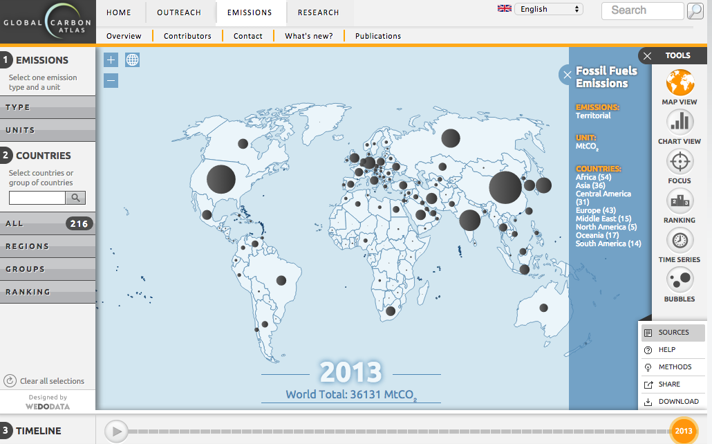
The above link will take you to the ’emissions’ section of the Global Carbon Atlas. This interactive website collects carbon emissions data from every territory in the world and allows the user to create customized visuals in order to draw comparisons. The image below displays the basic home map for the site, which utilizes graduated bubbles in order to display the total carbon dioxide emission levels in metric tons (Mt) of every territory. Starting with this map, one can begin manipulating the way data is represented in terms of units, countries, resources, and scale of time.
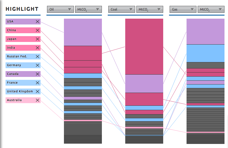
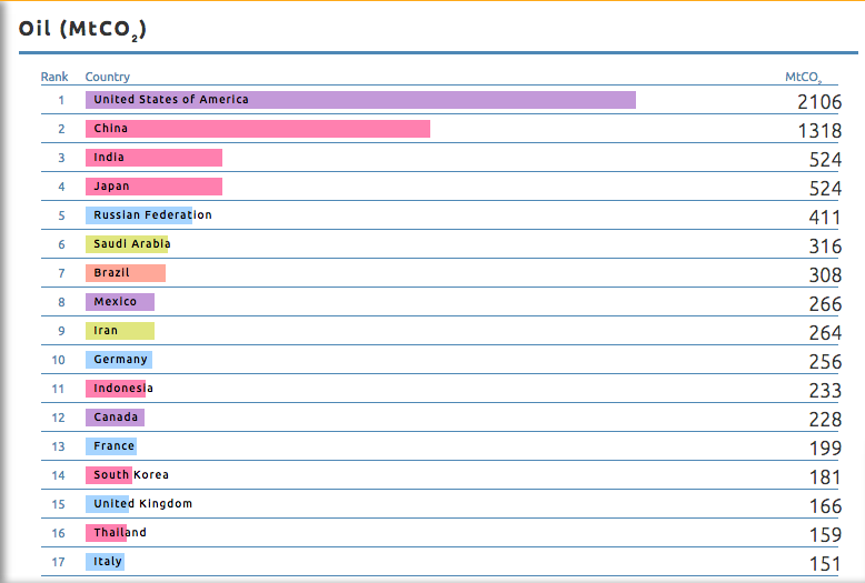
 The right sidebar allows the user to choose from a variety of different visual displays. I first looked at the “ranking” option just to see where countries fall for different types of resource usage. I kept the units in metric tons, but for “type” I chose oil, coal, and gas. In this way I was able to compare 10 countries and their usage of these three resources side-by-side.
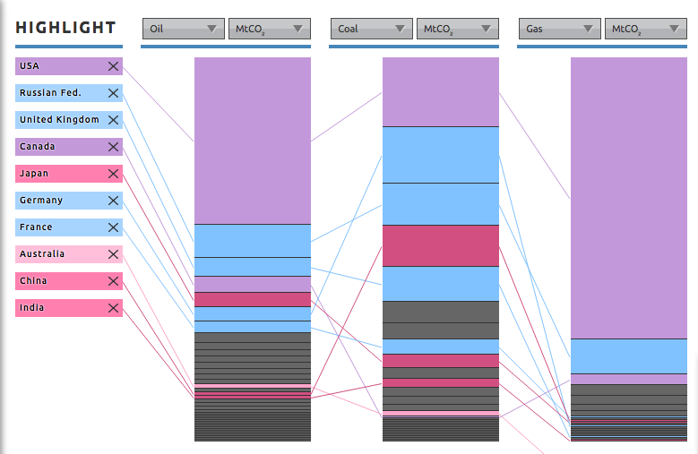 The image above represents data from 1961 (the absolute furthest I could go back). Beneath this chart there is a time bar, which can be dragged from 1961-2013. This is a really interesting feature because you can watch as the countries on the left shift places, particularly the rise of China and India and the fall of Russia and the UK.
After exploring this feature, I also looked at the “chart view” and “time series” options. Like the “ranking” option, these two tools are immensely helpful in generating easy to understand data visuals. In this way, Global Carbon Atlas can function as a highly versatile tool, which can gain the attention of any audience. Seeing this data on a piece of paper and aligned in grids, may represent the same reality, but it does not tell the same story. With this website, one can better understand how every country contributes to global carbon dioxide emissions.
Additionally, the site also seems well sourced. With each customized chart, one can easily access the sources of data. On the lower-right side of the screen there is a “sources” option, which provides links and citations. Furthermore, there is a “data” option, which allows you to download the data you’re using on the screen into .csv and xls or .pdf and .jpg files.
There are really so many interesting visualizations on this site, I don’t even think I can accurately describe everything. Try checking out the “outreach” tab located in the top bar. Here, you’ll find past, present, and future tabs. The past tab will take you on a story-like journey from hunter-gatherer times, through the industrial. The present time will offer a really creative break down of our current carbon footprints and the future tab will reveal estimates on the continuous patterns of carbon emissions.
Finally, the “research” tab allows you to create maps using different data sets offered by the organization. Again, these maps can be really powerful tools for capturing the attention of an audience and displaying informative messages.
I really do not see any flaws with this site. Its extremely easy to use and seems to have endless possibilities from a user perspective. I hope you guys take a few minutes to check it out; I know I will definitely be using it in the future.
-Dan
Dude – this is the coolest website. I don’t know how you found this, but props to you for discovering such a fun-to-use, and useful, site! You did a great job explaining in your post a few things you can do using the website, which was helpful as there are so many options of things to click and see. Good work.
This is an amazing amount of data. It’s really cool how they visualized it in so many ways. The map shows you a basic comparison, but then when you dive deeper into the bar charts and the bubble graphs, you can really see just how much pollution each country has been putting into the atmosphere each year for the past 50 years. Awesome and important information.
Cullen
This thing made my head spin…it’s awesome that the creators were able to come up with a way to make so much information so easy to visualize and understand! The time-lapse feature was my favorite — it’s so crazy to see how much countries have changed, especially China but also the US! It’s interesting to watch the US bubble and see how we declined a bit in emissions during the seventies, and have maintained a seemingly consistent or lower CO2 emissions level for a few years now. Too bad that doesn’t matter in the long run, since this is a global issue and we’re still a huge producer of CO2!