There’s a very confusing graphic in today’s New York Times:
Take the last column for instance. It seems to say that the approval rating among blacks is 57%, and the difference between democrats and blacks is 77%. By using the sophisticated mathematical identity
(democrats – blacks) + blacks = democrats,
I find that 134% of democrats approve of stem cell research.
Is just an editing error? Should the label “democrats minus blacks” just read “democrats”? That’s the only way I can make sense of it.
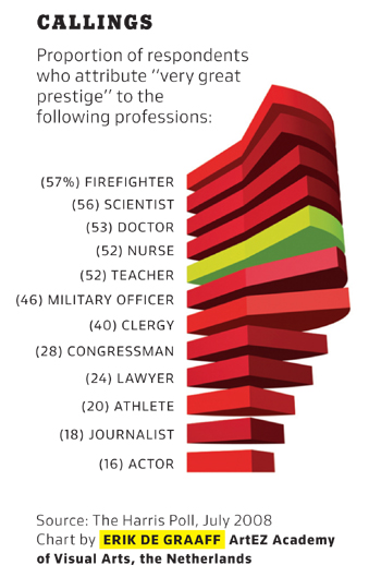
As long as I’m here, I’ll whine a bit more about the Times’s choice of graphics. The Times magazine usually runs a small chart to illustrate a point related to the first short article in the magazine. It’s clear that the editor has decided that making the graph interesting-looking is more important than making it convey information. Here’s a particularly annoying example:
If you wanted to design a way to hide the information in a graphic, you couldn’t do much better than this. The whole point of the pie slices is to allow a comparison of the areas, and they’re drawn in a perspective that almost perfectly hides the areas from view. Where’s Edward Tufte when you need him?


Time magazine has been slipping in standards for quite some time now. The ‘Person of the Year’ feature is a joke – they picked ‘You’ a few years ago! This year they’ve picked Obama. What’s the point of naming him ‘Person of the Year’ before he has even had the chance to get sworn in? Oh, and guess whom they picked to write about Richard Dawkins – Michael Behe!
The standards at the New York Times has been going down hill for sometime now. I agree with the author.