
Need a quick summary of how our earth is changing? Do you like strange background music and outdated websites? If so, Breathing Earth is for you!
Check it out: http://www.breathingearth.net/
Breathing Earth is a simulation of real-time changes to earth’s carbon dioxide emissions and human population. While there are many interactive websites that show facts and statistical information about carbon dioxide emissions, this website makes understanding the intensity of our CO2 outputs more relatable. Instead of counting outputs per year, outputs are measured in real time. While there are facts regarding specific county’s emissions and populations, the first numbers the websites show are for the entire planet. This is important because, as they mention in the text below the map, emissions are a global issue: emissions do not just effect their country of origin.
Breathing Earth is significant to our course because it illustrates some of the anthropogenic alterations to the planet’s atmosphere.
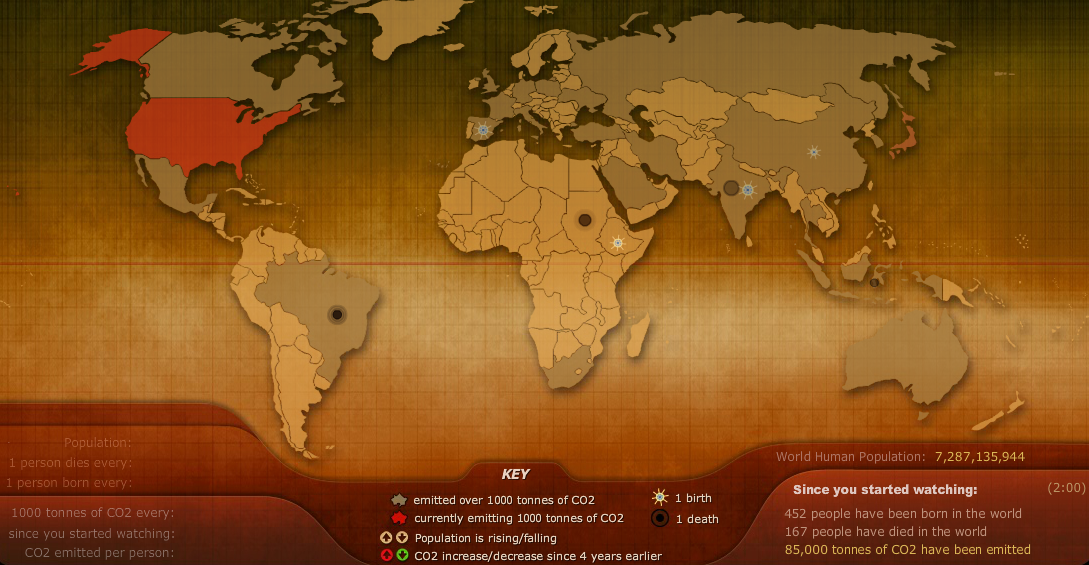
It’s obvious that this page has not been updated for a while (although it’s been copyrighted through 2015). While the website creators mention that approximations may be too low, I am not surprised as their population data is five years old and their emissions data is NINE years old. It would be interesting for them to alter their data to see how much faster our population and emissions are increasing (or perhaps decreasing, depending upon the country?).
Overall, I’d say the concept of this website is great: it’s simple and easy to understand, yet still gets the point across. However, if you’re looking for an interactive, up to date map with some more detail, I would suggest http://www.globalcarbonatlas.org/?q=en/emissions (See Dan’s post below!).
Do you think it’s worth keeping simple maps like this when there are complex, interactive maps that have more info?
-Olivia
 You can gauge just from looking at it, which countries are the biggest and smallest in the world. Notice how the United States, China, India, and most of Europe are emitted heavily.