
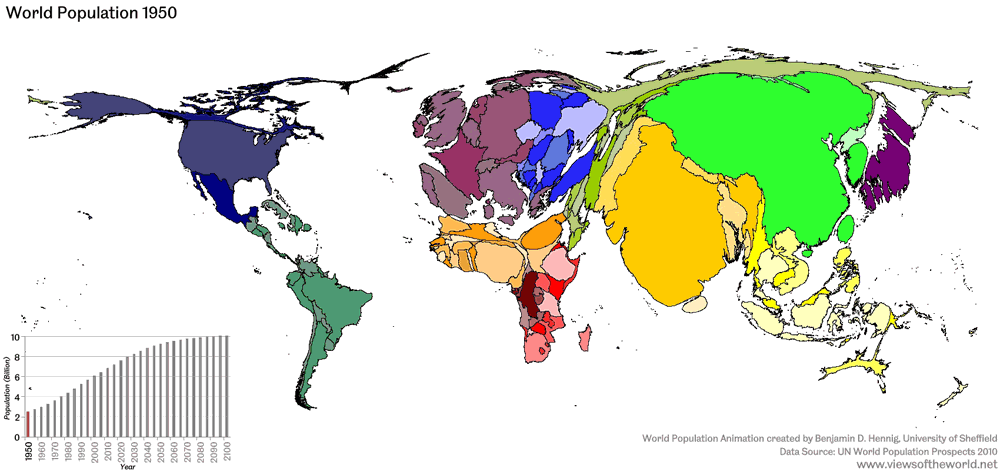
Maps are boring, right? But you’ve never seen maps like this before, ones that can animate the increasing world’s population. Globalization, migration, poverty, diseases, all in the map above. Countries in the world grow or shrink over time depending on what parts of the are population hot spots. The shows the world’s population from 1950 to 2100 (using estimates from the UN). The population around 2100 is expected to level out around 10 billion people, according to UN estimates.
The map animation is made using an algorithm that distorts the map to display where most of the people in the world actually are.IT really puts into perspective different global events, and uses maps in ways people have never imagined.Dr. Benjamin D. Hennig at the University of Sheffield created this animation using animations from a website called World Mapper (www.worldmapper.org)
World Mapper distorts the traditional world map to display things like world leaders in car exports, cases of malaria, CO2 emissions, and plenty more. Check out the different ones they have, here. Worldmapper has been used different university studies and by presenters who want to their audience a sense for how the world is on a map, in relation to a specific issue. Here is an animation, for example, of the world’s countries that emitted CO2 between 2006 and 2009 (on right).
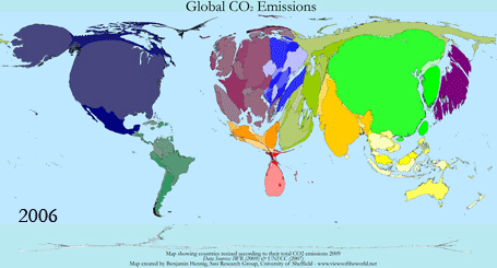 You can gauge just from looking at it, which countries are the biggest and smallest in the world. Notice how the United States, China, India, and most of Europe are emitted heavily.
You can also see a slight shift in CO2 emissions on the left side of the world that suggests decreased emissions. China and most of Asia increase their emissions.
Check out more maps on World Mapper. Get educated…while being interested.