How Will Rising Seas Affect You?

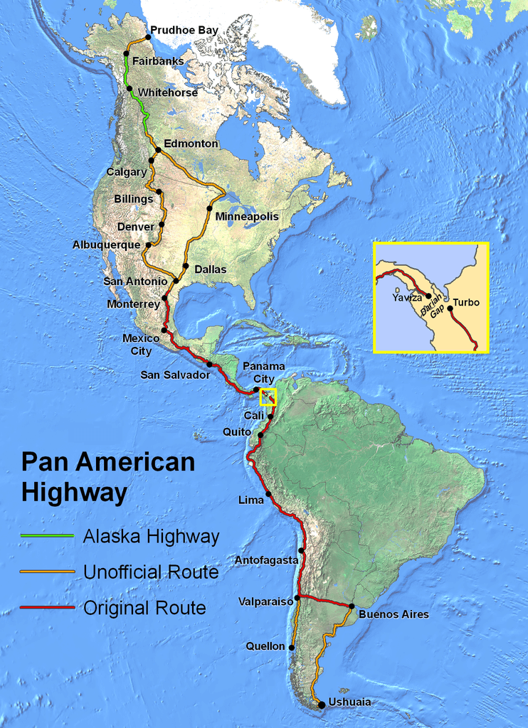
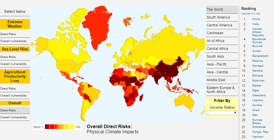
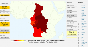
Climate Central is a nonprofit news organization that analyzes and reports key findings on climate change to the public. One feature of their site is a sea level rise analysis, which includes four tools: an interactive map of sea level rise and flood risk areas, flood risk projections, comprehensive analysis of sea level rise and flood exposure by location and heat maps of sea level rise and flood exposure by topic.

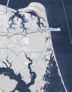
To understand sea level rise in your area, use the map tool and select your state then a specific location within the state. I chose to explore the impact of sea level on Virginia Beach, Virginia. The map allows you to select a water level rise between .5-30 meters. Below are the risk zone maps predicted for .5 meters of sea rise (on the left) and for 3 meters rise (right). You can also choose to examine the social vulnerability, the size of the population impacted, the ethnicity of the majority of people in the area, the income percentile and property values of homes impacted by the level of sea level rise presumed.3 m sea level rise va beachScreen Shot 2016-04-13 at 12.04.25 PM


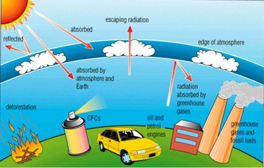
The forecast feature allows you to examine the flood risk projection and probabilities in an area. It includes a graph that relates flood likelihood and period. Historical water levels are indicated in the water level chart. For example, in Virginia Beach, the level of a mild flood risk is 2.3 feet. This level of flood has an annual risk of 100%. Moderate level flood is 3.5 feet and has a current annual risk of 10%. The highest observed flood is also indicated as 4.7 feet, which is considered an extreme flood level and has an estimated current annual risk of 1%. Below is a flood risk graph for floods reaching 5 feet or above in Virginia Beach.Screen Shot 2016-04-13 at 12.15.47 PM
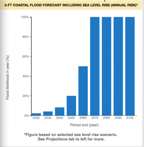
Surging Seas also allows you to compare projections taking into consideration potential policies regarding emissions and warming such as moderate carbon cuts vs. unchecked pollution. Global warming has already raised global sea level about 8 inches in the last 150 years and the rate is accelerating rapidly. These resources are incredibly fascinating to explore the potential impact of climate change on coasts.

The Surging Seas feature of Climate Central can be found at http://sealevel.climatecentral.org

Brilliantmaps: Making Sense Of The World, One Map At A Time

Have you every thought about how many times Scotland’s population could fit inside England, or wondered how many countries have been affected by the current ‘Panama Papers’ scandal, or maybe imagined how the world would look in Harry Potter’s eyes? Maybe? O.k. maybe you’re not that curious…. But we have all scoured the internet to find the perfect map to explain a certain phenomena in our research papers and powerpoint presentations. Well…Brilliantmaps is here for you! Brilliantmaps is the holy grail of maps!

Even if you are not obsessed with cartography, Brilliantmaps has something for everyone. The site regularly updates its content with interactive maps covering everything from current developments such as the Syrian Refugee Crisis to classic maps showing European’s view of the world in the beginning of the colonial era. For the true map lovers out there, the site ups the ante, allowing users to use scratch map templates to create their own maps and showcase it to the world. There is also a list of recommended board games that breathe a breath of fresh air into map making. Have a mentioned the Facebook page? And the newsletter? Brilliantmaps is brilliant because it provides a framework for integrating maps into our everyday life.

Check out some of my favorite maps below and don’t forget to take a look at the thousands of maps available on the website: http://brilliantmaps.com/

The Pan American Highway

PanAmericanHwy

UK regions compared to US States

UK-regions-compared-to-US-States

The Travel Bucket List

Bucket-List-World-Map-Scratch-Edition

Go get your map on! You will be surprised at the power of mapping!

Cheers.

Javanni.


What are People Reading? Am I Reading Something Different?

In this highly covered American presidential campaign season, people from both sides of the political spectrum tend to wonder how others are receiving much different information about candidates, American political issues, and perceptions of the world at large. This is especially apparent in the discussion of climate change and energy development. Cookies on internet browsers and sites enable users to isolate themselves in articles, people, and advertisements amenable to their prior beliefs and ethics.

Google has a neat map that allows people to combat this polarization of news stories at http://www.newsmap.jp. Here, Google displays the most clicked and searched stories of the day, meaning both Fox News and MSNBC stories appear on the website. Updates occur automatically every ten minutes. The default setting shows the most popular stories from the United States, but this can be altered to show stories specific to various European countries, Australia, India, Canada, Mexico, New Zealand, Brasil, and Argentina. Users may customize the stories they see by unchecking or checking news categories: World News, National News, Business, Technology, Entertainment, and Health.

Newsmap not only shows the main articles read by Google users of a country, the website shows the amount of related articles to the trending articles. Instead of seeing a bazillion articles on basically the same topic trending on your Facebook feed, Newsmap offers a more balanced and diverse range of notable topics for the moment.

Newsmap

This a great tool for geographers because it enables spatial analysis of news on the national scale, and shows the propensity of different countries towards scientific and environmental news. Geographers then know what the general population thinks or knows about a topic, enabling more effective education to occur surrounding climate change and human-environment interactions.

Enjoy perusing the diverse news from around the world!

The Arctic is Shrinking!


2016 marks a new record low for the Arctic sea ice wintertime extent.  Frozen seawater at the top of the Arctic Ocean melts during the spring and summer and reforms during the fall and winter.  Sometime between February and April, the frozen seawater reaches its maximum yearly extent.  In 2016, that happened on March 24.  However, this year’s maximum extent is the lowest it has ever been (5.607 million square miles).  There was a slight decrease from 2015’s maximum extent (5.612 million square miles), which was the record low.  Over the past 3.5 decades, about 620,000 square miles of frozen seawater have been lost.  

There are a few reasons for this continued record lowering of the maximum extents.  One has to do with wind patterns – January and February’s wind patterns consisted of bringing warm air from the south to the Arctic, making ice cover expansion difficult.  Another reason for this record low is that the ocean is also growing warmer, which is not allowing the ice to extend as far as it used to.

This pattern is of great concern because the Arctic is essential in regulating the Earth’s temperature.  Its surface reflects the sun (solar energy) instead of the ocean absorbing it.  The loss of sea ice causes more areas to be open water, which will cause more heat to be put into the atmosphere.  A climate scientist at Rutgers University, Jennifer Francis, said “ […] As winter sea ice disappears, areas of unusually warm air temperatures in the Arctic will expand.  These are also areas of increased evaporation, and the resulting water vapor will contribute to increased cloudiness, which in winter, further warms the surface.”

The implications of this phenomenon are clear and dangerous.  


Source:  


https://www.sciencedaily.com/releases/2016/03/160328195126.htm
Science Daily is a great way to stay up to date on current research regarding a number of interesting topics.  I’d encourage you all to check it out when you have the time!

Ozone Hole Watch!!

3

Ozone is a colorless gas. Chemically, ozone is very active; it reacts readily with a great many other substances.

It is located near the Earth’s surface and the ozone is very important because it absorbs harmful components of sunlight, known as “ultraviolet B”, or “UV-B”.

We have learned the basic information in class trough powerpoints and our textbook, but this website allows you to chose 2different days and look to see the changes, if any, that have occurred.

There is also information about the ozone hole for the 2015 season. On the right hand side of the webpage are ozone facts that have been provided to test your knowledge!  1

Test your geography knowledge here

National Geographic’s Quiz Whiz allows kids and adults alike to test their knowledge of various geography topics. Some of the topics include: the Moon, Volcanoes, Space Exploration, Animals, and Earth Day. While the site also provides quizzes with topics that are not related to geography, geography reveals itself as a common thread among the available quizzes. Quiz Whiz provides an interactive platform for kids to engage with geography and learn about geography beyond the classroom.

One of my favorite quizzes, “The Moon,” was created in collaboration with NASA.Screen Shot 2016-03-13 at 5.06.09 PM

http://kids.nationalgeographic.com/games/quizzes/quiz-whiz-moon/

The quiz addresses space exploration, the rotation and revolution of the moon, the relationship between the moon and Earth, and natural processes on the moon. After each question, the quiz tells you if you answered correctly or incorrectly and gives you information to determine the right answer if you answered incorrectly the first time. The same quiz can be completed as many times as desired.

In our class, we explored some of the same topics as featured on Quiz Whiz, and similar to the website, the lab portion of our class allows the students to participate directly and interact with important geographic concepts. Geography is a hands-on discipline that is best learned through participation. Kids can take the Quiz Whiz quizzes, learn about geography and the natural world, and have fun. If the quizzes are fun, accessible, interactive, kids may be more inclined to complete them and engage with the geographic topics presented in the quizzes. A major criticism of today’s culture is the general lack of geographic literacy. Geographic literary (geo-literacy), a term first adopted by National Geographic, refers to the ability to use geographic knowledge, of both places and humans that inhabit places, to make broad decisions. Quiz Whiz allows kids to interact with geographic concepts from a young age, which could increase the geographic literacy of the future generations.

Mapping the Impacts of Climate Change

The Center for Global Development, a think tank based in Washington, DC, maintains an online resource titled “Mapping the Impacts of Climate Change.” This interactive tool allows you to customize a map in order to learn more about how global anthropogenic climate change will affect our planet.

The categories on the left-hand side of the map allow the user to change the specific climate change effect being displayed: extreme weather, sea level rise, agricultural productivity loss, and overall effects. On the map, the darkest red color represents the worst impacts, while yellow represents the least impacts. On the left-hand side of the map, the user can “zoom in” on a certain region of the world by selecting its name from the list. At any point, the user can roll over the countries on the map to view its overall ranking in terms of climate impact when compared to other countries. A total of 233 countries were included in this ranking.

Geography1

Above: The map displaying overall direct risk as a result of climate change shows China is at the greatest risk, out of all countries.


One fantastic feature of this map database is its division between “direct risks” and “overall vulnerability.” If you click on “direct risks” under “Extreme Weather” on the left-hand side of the map, you will see that Australia and Canada are at a relatively high risk of extreme weather in the coming decades. However, if you flip the map to “overall vulnerability” under “Extreme Weather,” Australia and Canada are shown to have only a moderate risk of extreme weather impacts. The ability of this map and analysis to reflect each country’s ability to successfully adapt to the challenges that climate change will pose is impressive, and a very useful tool for the geographer.


Geography2

Above: Zooming in to Central Africa on the map of overall vulnerability to agricultural productivity loss reveals that Somalia will be at the greatest risk in this category, out of all countries in the region.


This map does have an issue in terms of scale, however. While the user can zoom in to specific regions of the world, the map scale is not sufficient enough to view small island developing states and other tiny countries. These small, low-lying coastal and/or island nations will be among the first to feel the impacts of climate change, especially when it comes to sea level rise. This map could be improved through a re-analysis of scale and how that affects country representation.

The “Mapping the Impacts of Climate Change” resource can be found here: http://www.cgdev.org/page/mapping-impacts-climate-change

Check out these cool maps at CityLab

CityLab1

An expansion of The Atlantic magazine, CityLab is a news site that focuses on urban planning and metro areas around the world.  Designed for people who are “creating the cities of the future,” CityLab includes a section dedicated to displaying maps of worldly conflicts and interesting developments.

Clink of the “Maps” tab at the top of the site, peruse the map thumbnails, and explore dozens of stories covering a wide assortment of subjects, including politics, health, history, industry, environmental sciences, and more.

CityLab2

Maps are extremely important visual aids when paired with a news story. Often, maps can more quickly and efficiently present material than an article, so creating a good map is critical for CityLab.  This website is really great at looking at different sets of data and seeing the very different ways to display them.

Depending on the topic, a mapmaker can choose to use a choropleth map, dot map, heat map, etc to show information as accurately as possible.  I challenge you to closely examine a map when you click on it to analyze the cartographer’s choices and think how or why they made them – what do the colors symbolize?  Where are the trends in the map? What are the “silences” or the map, or where was something left out?

Have fun browsing the great maps of CityLab!
http://www.citylab.com/posts/maps/