
Have you every thought about how many times Scotland’s population could fit inside England, or wondered how many countries have been affected by the current ‘Panama Papers’ scandal, or maybe imagined how the world would look in Harry Potter’s eyes? Maybe? O.k. maybe you’re not that curious…. But we have all scoured the internet to find the perfect map to explain a certain phenomena in our research papers and powerpoint presentations. Well…Brilliantmaps is here for you! Brilliantmaps is the holy grail of maps!
Even if you are not obsessed with cartography, Brilliantmaps has something for everyone. The site regularly updates its content with interactive maps covering everything from current developments such as the Syrian Refugee Crisis to classic maps showing European’s view of the world in the beginning of the colonial era. For the true map lovers out there, the site ups the ante, allowing users to use scratch map templates to create their own maps and showcase it to the world. There is also a list of recommended board games that breathe a breath of fresh air into map making. Have a mentioned the Facebook page? And the newsletter? Brilliantmaps is brilliant because it provides a framework for integrating maps into our everyday life.
Check out some of my favorite maps below and don’t forget to take a look at the thousands of maps available on the website: http://brilliantmaps.com/
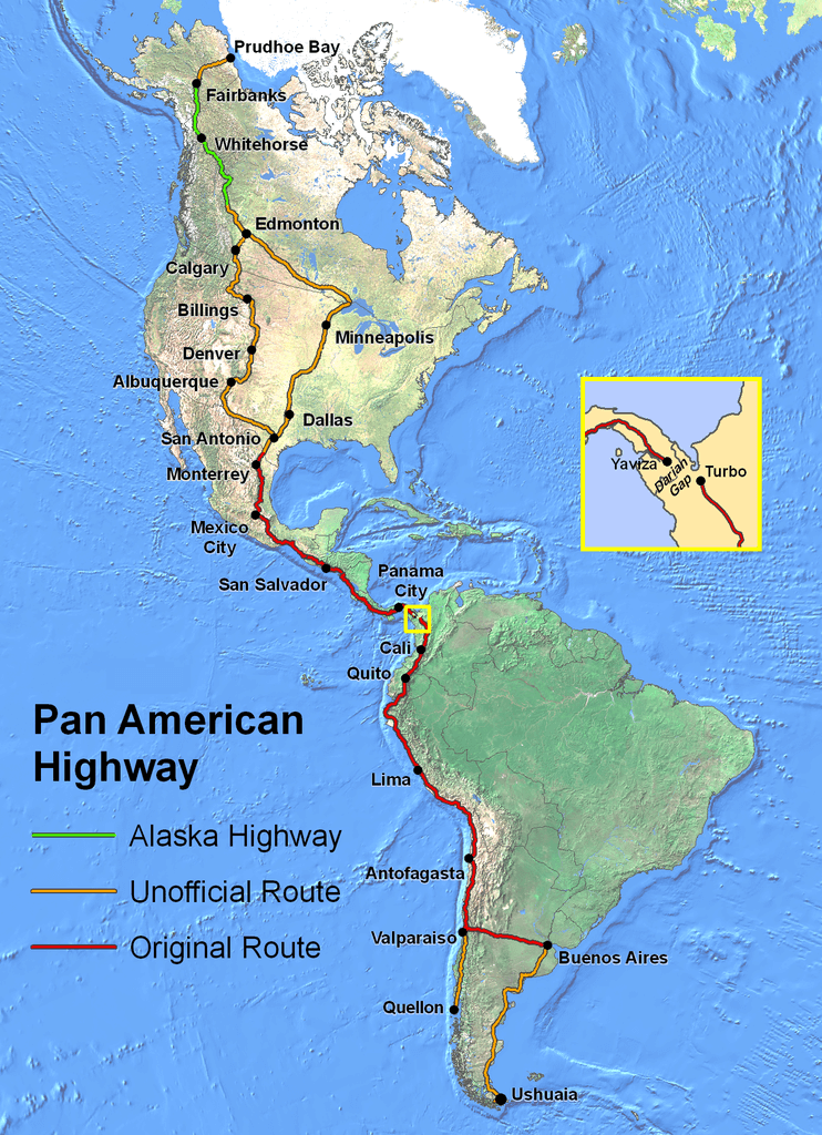
The Pan American Highway
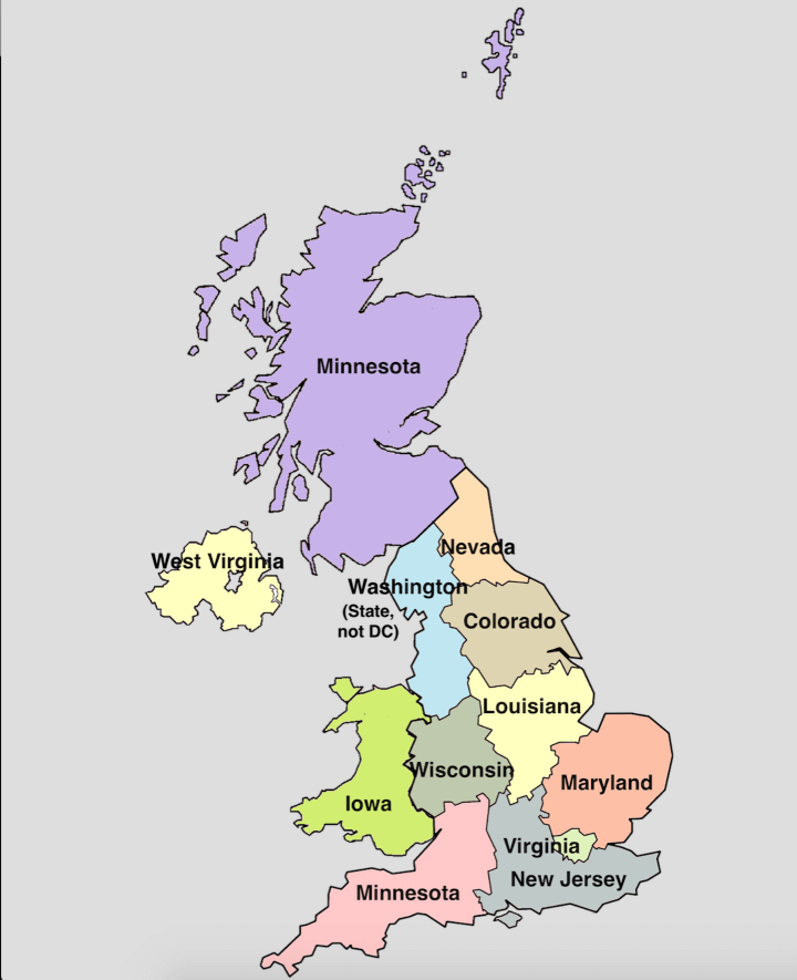
UK regions compared to US States
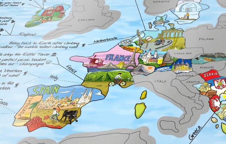
The Travel Bucket List
Go get your map on! You will be surprised at the power of mapping!
Cheers.
Javanni.
There are some really cool maps on there. I like the mixture of historical maps like the population change as a result of the 19th century potato famine, the current events maps like the Democratic and Republican Presidential Primary Results maps and the more “pop culture” maps like the “Jedi Knight Population of the UK” map.
I really like this tool because many times we need visuals to put things into perspective that otherwise we most likely wouldn’t really be able to fully grasp.
I really like the phrase, “Get your map on,” and personally I envision Maggie Latimer saying it before opening her umbrella that has a Mercator projection on it. Also the board games listed on the site seem HYPE, except for the Pandemic game, we are basically living that one through HIV/AIDS, Ebola, and Zika.
I think this website is particularly interesting because it provides maps at so many different scales. Just by scrolling through the home page, I found maps at the global, national, regional, and even local scale. I also think it’s interesting that the maps combine a geographical perspective with a humanistic perspective, such as political results.
The difference between the amount of area a landmass has and what it looks like in proportion to other landmasses on maps is always pretty surprising. When playing around with the website, some places that appear enormous are actually not as large and some places that appear tiny are actually big.