
The Center for Global Development, a think tank based in Washington, DC, maintains an online resource titled “Mapping the Impacts of Climate Change.” This interactive tool allows you to customize a map in order to learn more about how global anthropogenic climate change will affect our planet.
The categories on the left-hand side of the map allow the user to change the specific climate change effect being displayed: extreme weather, sea level rise, agricultural productivity loss, and overall effects. On the map, the darkest red color represents the worst impacts, while yellow represents the least impacts. On the left-hand side of the map, the user can “zoom in” on a certain region of the world by selecting its name from the list. At any point, the user can roll over the countries on the map to view its overall ranking in terms of climate impact when compared to other countries. A total of 233 countries were included in this ranking.
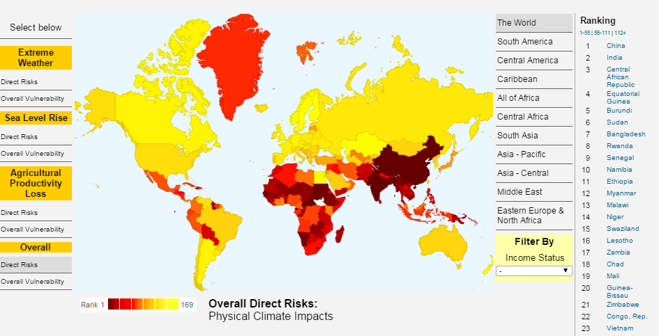
Above: The map displaying overall direct risk as a result of climate change shows China is at the greatest risk, out of all countries.
One fantastic feature of this map database is its division between “direct risks” and “overall vulnerability.” If you click on “direct risks” under “Extreme Weather” on the left-hand side of the map, you will see that Australia and Canada are at a relatively high risk of extreme weather in the coming decades. However, if you flip the map to “overall vulnerability” under “Extreme Weather,” Australia and Canada are shown to have only a moderate risk of extreme weather impacts. The ability of this map and analysis to reflect each country’s ability to successfully adapt to the challenges that climate change will pose is impressive, and a very useful tool for the geographer.
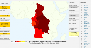
Above: Zooming in to Central Africa on the map of overall vulnerability to agricultural productivity loss reveals that Somalia will be at the greatest risk in this category, out of all countries in the region.
This map does have an issue in terms of scale, however. While the user can zoom in to specific regions of the world, the map scale is not sufficient enough to view small island developing states and other tiny countries. These small, low-lying coastal and/or island nations will be among the first to feel the impacts of climate change, especially when it comes to sea level rise. This map could be improved through a re-analysis of scale and how that affects country representation.
The “Mapping the Impacts of Climate Change” resource can be found here: http://www.cgdev.org/page/mapping-impacts-climate-change
This is a pretty neat took that you found. I read over all of the information that you wrote on the blog and then I went to the site to click around and see the rankings that the countires have. Under extreame weather I found it interesting that Egypt and Libya are a few of the high ranking counties and that the USA was at the rank of 25. Very cool find and your blog is very well written and easy to understand!