Looking to the Stars

Star Map

October 29, 1929 was one of the greatest shocks to hit the United States. Starting on a day known as “Black Thursday,” on October 24th, stocks fell over 23 percent. The Country was sent into a frenzy as 9,000 banks closed over the following three years, dragging billions of dollars in deposits down with them. The massive loss sky rocketed unemployment to 25 percent leaving families without money to spare.  In this devastating time people looked for anything to distract them from the struggles they faced daily. With low income, families had to find cheap means of entertainment. Board games became increasingly popular as did radio shows like Lone Ranger and Jack Benny. Even though money was tight people continued to go to movies and musicals as an escape from everyday life.[1]

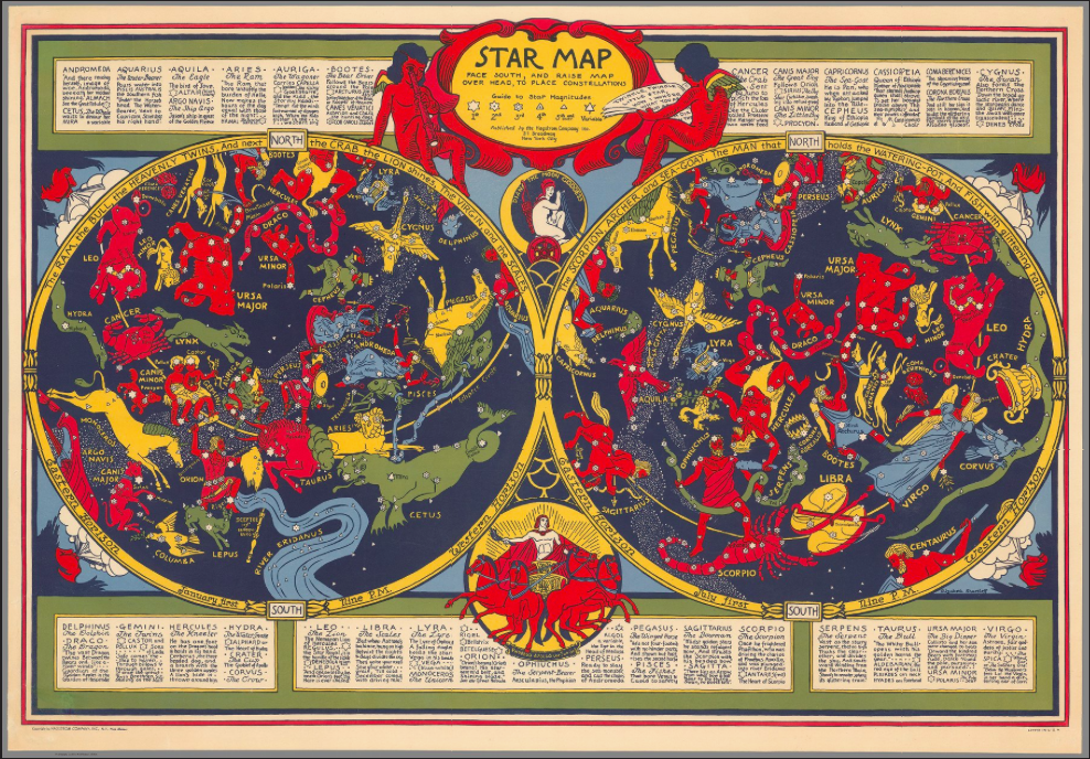
Elizabeth Shurtleff is known for many different maps including maps of Massachusetts and Isles of Sholes, which are are fully embellished with cartouches on and around the map. similar to her other pictorial maps created in the 1930s, her “Star Map” is brightly colored map contrasted the harsh realities of everyday life. Looking at this map, it is very far from what many people think of when they think of maps. It doesn’t depict geography or land masses and doesn’t seem very scientific. This map instead depicts stars and constellations in a very user-friendly manner. On the top there are simple instructions to “Face south and raise map over head to place constellations” along with a brief key of what the different symbols for star types mean. This map is by no means extremely scientific or technical, but instead is an easy medium for entertainment at a very low cost.

Similar to other means of entertainment like movies and theater, astrology, in some ways, can transport a viewer to a different world, removing the present realities from their lives for a moment. The sky has always been a mysterious extraordinary part of life.  There are still many questions that are left unanswered about the sky and stars, so it is a continuous point of exploration.  Interest in the sky was documented as early as 3000 BCE, through the 1930s and even in present day. The Babylonians first recognized the Zodiac, or the sequence of constellations, that serve as a marking points of passage of time, then later in the 6th century BCE the Greeks gave the cycle of constellations links to Greek gods, leading to predictions on affairs of state based on the stars and eventually to casting fortunes like we know today as horoscopes[2]. After losing traction in popularity during the new age of enlightenment, Astrology began to come back into popularity in the early 20th century, with the help of Sepharial and Alan Leo who founded the Astrological Lodge of the Theosophical Society in Great Britain.  Since their revolution western society’s fascination with astrology has continued to grow[3].

The map depicts the constellations in a brightly colored manner that looks more like a painting than an actual map. Instead of lines connecting the stars to show the constellations, images of the animal or figure that the constellation portrays surrounds the stars.  The cartographer of this map chose to omit stars that are not part of the specific constellations leaving only a few for decoration.  The map isn’t a scientific representation of the sky, but instead instructions for every-day individuals to identify constellations and look at the stars.  The simplicity is very important because it can really be used by people of all ages and backgrounds, so the entertainment value of the map is available to everyone. Drawn in a similar manner to the constellations inside the actual map, there are also other images that surround it.  One that especially stands out is at the bottom of the map. It is a depiction of Phoebus Apollo, or the sun god. He is depicted in his four-horse chariot in a yellow circle. This is in reference to the Greek myth that he used this chariot daily to move the sun across the sky. Above Apollo is Diana the moon goddess in an orb representing the moon in the sky. These gods and goddesses included on the map are fairly recognizable to most people. The relatability of the map, makes the users of the map see astrology as something that is assessable to everyone.  Framing the outside of the map is a list of all the constellations, along with riddle like description of the constellation to aid in placing it. For example, Aquarius’s description is “The Water-Bearer pours water into Piscis Australis the southern fish under the House’s head.   The Water-Bearer, next to Capricorn, stretches his right hand.” These riddles add another fun layer to the activities that can be done using the map because all the riddles are like puzzles that can be deciphered along with the main star gazing.

On the top of the map sits two childlike angels, one holding a telescope looking down at the stars and the other holding a book with the opening lines of “Twinkle, Twinkle little Star”. The inclusion of these figures reaffirms that this map is not only for the use of adults but really as an activity for children and their families because” Twinkle, Twinkle little star” is a well-known nursery rhyme. Shurtleff’s cartographic choices were very important to making the map really accessible to all walks of life.

In devastating times people looks for means of escape to remove them from the realities of their everyday lives. The sky is a point of fantasy and wonder, which makes it the perfect means of escape. Elizabeth Shurtleff’s “Star Map” combined a cheap form of entertainment that was vital during the Great Depression along with the wonder of the stars to create the perfect activity map for families to utilize in such a disheartening time.

[1] “WGBH American Experience. Riding the Rails.” PBS. Accessed March 24, 2017. http://www.pbs.org/wgbh/americanexperience/features/timeline/rails-timeline/.

History.com Staff. “The 1930s.” History.com. 2010. Accessed March 24, 2017. http://www.history.com/topics/1930s.

[2] “HISTORY OF ASTROLOGY.” HISTORY OF ASTROLOGY. Accessed March 24, 2017. http://www.historyworld.net/wrldhis/PlainTextHistories.asp?historyid=ac32.

[3] “Short History of Astrology in the Western World.” Short History of Astrology in the Western World. Accessed March 24, 2017. https://thezodiac.com/weird/history.htm.

Posted in Maps of the Week | 4 Comments

Atlas of the Week: Historical Atlas of the American South

atlas

Atlas:

The Routledge Historical Atlas of the American South written by Andrew Frank is a relevant atlas to look at, as it is connected to my “Map of the Week”. The atlas full of beautiful maps and drawings of the South, which clearly define what states make up the American South. Additionally, the atlas takes the reader through the history of the American South up until the “Modern South”. One of the sections is the “Confederate South”, which includes full color maps of the agriculture and railroads. If you are interested in learning more about the “Map of the Week” and its historical context, this atlas is worth the read.

Blog:

At first glance, the Radical Cartography map blog does not appear to contain much content. Despite appearances, this site contains a plethora of dynamic and relevant maps. On the left side of website under projects, a large drop down menu appears which allows the user to choose between a variety of maps to browse through. Since I am from Boston, I went to the geographic section, then to Boston. There were up-to-date subway maps and maps that illustrated the income gap between different areas of the city. Each map has a little description next to it and gives credit to the creators of the maps.

http://www.radicalcartography.net/

Both of these resources are worth checking out to expand your map knowledge, as well as look at some cool maps just for fun!

– Maddie

Reference:

Frank, A., & Carnes, M. C. (1999). The Routledge historical atlas of the American South. New York: Routledge.

Posted in Atlases of the Week | Tagged , , | Comments Off on Atlas of the Week: Historical Atlas of the American South

The Statistics of Slavery

Map

Does the appearance of a map reflect its true intentions? While I was searching for maps, I came across this map and perceived it as a scientific map. After further analysis of the propaganda found in the map, my initial perception was challenged. During the Civil War, one of the tensest times in the history of the United States, maps played a vital part in not only forming public opinion by use of propaganda, but also impacting presidential actions by appearing as factual pieces of war documentation. One specific map that was highly influential was Map Showing the Distribution of the Slave Population of the Southern States of the United States. I chose this map for the “Map of the Week” due to the fact that it was regarded as a highly scientific and statistical map, one of the first of its kind. As a result of the reputation of the map, it is rumored that Abraham Lincoln used this map in deciding where to send troops during the Civil War. This map can be interpreted as a piece of possible historical propaganda created by the Union in order to sway the politicians and citizens, as well as a statistical document. Does the fact that there is bias in this map detract from its objective merit?

In order to answer the question, this map must be explored and analyzed from various perspectives. The map was created by E. Hergesheimer, a cartographer with U.S. Coast Survey’s drawing division, who used data from the Census of 1860. He analyzed the population of various states and calculated the percentage of slaves per 100 inhabitants in each county. The map is color coded such that the areas with the highest percentage of slaves are darker than the regions with a lower percentage. The coloring is a clear decision by the map creator to indicate not only the large population of African Americans in the area, but also the danger that these areas could be to the union. The darkest areas can be found near Richmond, VA, the capital of the confederacy, and along the Mississippi River. The area near the Mississippi River contained an extensive amount of natural resources, and Richmond contained a large amount of influential members of the confederacy. The rhetorical choice by the author to solely include the South creates a separation of the union and the confederacy in a time where there was much division in the country.

The map was published in September of 1861. That September neutral Kentucky faced invasion by the confederates, and the Civil War was in full force. On the surface the map has scientific data to back up the statistics and even a disclaimer at the left bottom, which reads, “After a careful examination of the above interesting map I am prepared to state that it not only furnishes the evidence of great care in its execution, but can be relied on as corresponding with the official returns of the 8th census,” which is signed by Jos. C. G. Kennedy, Superintendent. Since the information on the map is verified by a Superintendent, one may assume that the map is not a propaganda map because of the stamp of authenticity from a figure in power, which plays a key role of in its rhetorical power. Someone who took this map as fact was Abraham Lincoln. It is rumored that the president looked at the map in deciding where to send union soldiers next.  The power of this map not only comes from the data itself, but the verifiableness of the data as it was collected accurately enough for a superintendent to sign off on it. Additionally when authority figures rely on a set of data, the public wants to access this information as well, to get a glimpse into the mind of their leader. Additionally, the map was so influential that it was included in Francis Bicknell Carpenter’s painting First Reading of the Emancipation Proclamation of President Lincoln. The map is shown in the bottom right corner and is identifiable by the naked eye. This is just one testament to the power of maps, especially in wartime.

While Lincoln may have taken this map as fact, not fiction, there are certainly propaganda techniques used in the map. One defining feature of the map is the centered, bold text that reads, “Sold for the benefit of the Sick and Wounded Soldiers of the U.S. Army.” In the union states, citizens walking down the street purchased the map as an act of citizenship and patriotism during a war effort. One simple way to support a war effort is to buy goods that go towards soldiers or supplies. Those who did not enlist did anything that they could to contribute to their nation. If they read the map, they might be encouraged to support the union government in a more active way, besides just purchasing goods that go towards the war effort, such as housing slaves that fled the confederacy. This map could be considered a propaganda map for the union. It highlights the immorality of the south, as it showed how rampant slavery was in the confederacy. Many people in the union were appalled by the idea of slavery and this map, while based on statistics, played on the fears of the union government and its citizens. That said, the bias in the map does not take away from the factual nature of the map, it just gives spin on the map that made citizens more willing to support the union. It is rare to find a map that contains absolutely no bias. Mapmakers are people or organizations with their own opinions and views. This map is a great example of how a map can be factual and full of important statistics, and also contain bias in the reporting of these statistics and the presentation of the map.

References:

Carpenter, F. B. (1864). First Reading of the Emancipation Proclamation of President Lincoln [Painting found in U.S. Capitol]. Retrieved March 12, 2017, from https://www.senate.gov/artandhistory/art/common/image/Painting_33_00005.htm

Hergesheimer, E. (1861) Map showing the distribution of the slave population of the southern states of the United States Compiled from the census of 1860. Washington Henry S. Graham. [Map] Retrieved from the Library of Congress, https://www.loc.gov/item/ody0314/.

Mapping Slavery in the Nineteenth Century. (n.d.). Mapping Slavery in the Nineteenth Century. Retrieved March 12, 2017, from https://www.nauticalcharts.noaa.gov/history/CivilWar/docs/Slave_Density_Map.pdf

Posted in Maps of the Week | Tagged , | 2 Comments

Where the Wall Will Be: An Atlas of the Mexican – United States Border

http://www.wwu.edu/bpri/files/2010_fall_border_brief.pdf


This link leads to an atlas detailing the traffic and activity across the Mexican – US border in 2010. This seemed quite relevant with the immigration uproar the past year or so. This atlas marks where crossings occur, what or who is crossing, and the volume of traffic at that spot. The marked crossing spots are all legal which is important. This atlas was made by the Research Institute at Western Washington University.

Read
Posted in Atlases of the Week | Comments Off on Where the Wall Will Be: An Atlas of the Mexican – United States Border

Atlas of the U.S. Presidential Election Results

http://uselectionatlas.org/RESULTS/

To go along with my Map of the Week “Clinton’s America,” here is a highly detailed atlas of each election result dating all the way back to 1789. Not only will this provide percentages and vote counts to further reinforce the data I had mentioned in my post about the election results based on land mass, but perhaps it will even be useful for a historical report concerning a specific president during a particular era in time. Of course, it is simple to google-search results to a presidential election, but this online atlas provides a simpler, organized, and effective way of comparing result-maps of any desired year.

http://presidentialhistory.com/blog
Here is a blog link of miscellaneous entries regarding various presidents and political related topics over time. Here you can find blog posts from Mike Purdy, a presidential historian and author. Explore Purdy’s entries ranging from recent matters such as the most recent “political storm,” to the effect of negative campaign ads on voters, or even to a news report following electric light installations conducted by Benjamin Harrison in the Executive Mansion.

Posted in Atlases of the Week | Comments Off on Atlas of the U.S. Presidential Election Results

The Cartography of Clinton’s America: Does Size Matter?

If you are a breathing human-being in the United States, or perhaps even elsewhere, you did not go an hour without either hearing or seeing a comment, tweet, picture, video– you name it– regarding the election results on November 9th, 2016. Certainly, with Trump at 62,979,879 and Clinton at 65,844,954 totaling to just over 128.8 million votes, the battle between Hillary Clinton and Donald Trump made its mark in American history (Krieg, 2016). The difference in direction of the electoral college and the popular vote was confounding to the media all over the nation. Not only was the result itself unexpected— according to most polls— but the directional divergence had only occurred four other times in history, three of the four occurring before the 20th century.

Clintonia
With solely the numbers in mind, one might think that the visual of the election map would show a relatively even split; a truly “divided” nation would be both numerically divided and geographically divided, right? According to the map of “Clinton’s America” this was not the case. Despite the numbers, Hillary only won 15% or 3,000,000 square miles of the United States’ land mass, leaving Trump with a perplexing remainder of 85% at 350,000,000 square miles. To reflect these numbers, the seemingly small islands of Hillary would harbor 54% of the nation’s population at 174 million Americans (Jacobs, 2017). With some basic calculations, that comes out to 58 people per square mile whereas Trump’s land would host 1 person for every 2 square miles. So what can we determine from numbers alone? Clinton’s voters have had to come from exceedingly densely populated areas, or particularly cities. When looking at the “Clinton’s America” map, the identified cities— Seattle, San Francisco, Los Angeles, Chicago, New York, Boston, Washington, Atlanta, etc.— prove this conjecture to be accurate. While the state is often represented by the city, the city is certainly not represented by the state. Look at New York, for example. When people think of think of the words “New York,” they immediately think of a skyscraper-lined landscape with mass herds of occupants roaming the streets. Much like other U.S. cities, The Big Apple represents the majority of the state’s population, economic activity, and the identification of the state as a whole. Yet, New York City only covers 0.006% of New York state’s total square mileage. These highly populated urban environments, such as New York City, are essentially isolated from the rest of the state, forming— in correlation to the map—islands. The “island” forms an individual entity and harbors a different group of people in comparison to the rest of the state. Cities are known for minorities and cultural diversity. Somewhere in American history, minority groups became linked to liberalism, setting the foundation of Clinton’s America.

 
Let’s now take a step back past the numbers, past the uneven population spread, past any knowledge you have of the United States— and focus only on the geography of the “Clinton’s America” map. The map gives off the perception that Trump not only won the election, but he dominated in the popular vote count as well as the electoral college. Clinton’s America conveys a distinctly inaccurate representation of the 2016’s election results, however it remains fairly accurate in terms of geopolitical spread. The map focusses on geographic accuracy, and does represent a proportional visual of landmass-to-population density. Of course to do this, city-based regions would need to be deliberately skewed. To say the least, it shows how ineffective the portrayal of land area is in determining overall political views in the United States. If an outsider with no knowledge of American politics were to see this map, he undoubtedly would argue that the United States is unquestionably conservative. As we know from the previously stated data, the popular vote was not in Trump’s favor and the results were remarkably close, deeming this map an inadequate way to represent American political stances.

 
So what can we learn from such an unconventional map? The first take away is that the cross between geography and politics can be extremely misleading if misunderstood. One must realize that the majority of the United State’s population lies within the exodermis of the physical contiguous landmass and the archipelago of liberalism contributes more to the nation’s identity than one might perceive. “Clinton’s America” also evokes the question as to whether our current electoral college system is fair in fully representing American democracy. Does the U.S. need to completely repeal the electoral college and rely on popular vote for further elections? Or have the founding principles of the nation become obsolete and simply need to be reformed to allocate growing population distribution? The conception of one map could be all the nations need to recognize and understand whether or not a more equitable system of democracy is necessary to fully express the voice of the people.


References:

Cook Political Report Staff. “56 Interesting Facts about the 2016 Election” National Politics.
December 16, 2016. Accessed March 04, 2017. http://cookpolitical.com/story/10201

Frank Jacobs, “Trumpistan vs. Clintonesia.” Big Think Strange Maps, January 22, 2017.
http://bigthink.com/strange-maps/trumpistan-vs-clintonesia.

Krieg, Gregory. “It’s official: Clinton swamps Trump in popular vote.” CNN. December
22, 2016. Accessed March 04, 2017.
http://www.cnn.com/2016/12/21/politics/donald-trump-hillary-clinton-popular-vote-final-count/.

Posted in Maps of the Week | 2 Comments

The Perceived Fantasy Land of 1920s Manhattan


WondrousIsleOfManhattan

Never has a map caught my eye so quickly. “A map of the wondrous isle of Manhattan” was created by the cartographer Charles Vernon Farrow in 1926, yet I feel as though I imagined the same captivating New York City he created when I was a child. Farrow was not a famous cartographer, nor did he have truly extensive experience in map making due to his early death, but he encapsulated the wonder and grandeur that massive metropolises often evoke. Farrow creates an intricate and fascinating map of Manhattan Island in one of its most iconic periods, pouring minute details and seemingly irrelevant additions into this work of art. However, this depiction of Manhattan is misleading. Like me, most readers might get caught up in the artistic aspects of the map, instead of the more technical one. Farrow created a romanticized version of Manhattan in this map, ignoring the realistic side. Since maps are generally considered to be factual, or close to it, this over exaggeration of Manhattan’s artistic aspects creates a false presumption about the city’s true state.

This map shows the majority of Manhattan, one of New York City’s five boroughs. It is a pictorial map, one of many created in the U.S. during the 1920s and 30s. Pictorial maps “were not scientific representations of the Earth’s surface, but artistic renderings of places, regions, and countries” (Hornsby).  Manhattan is covered in bright and strong colors and made up of orderly lines. The artistry and detail of the buildings is outstanding, and you feel yourself getting lost on the streets of New York the more you inspect the map. With an almost bird’s eye view of the island, the viewer is given a sense of power, as though they are a giant overlooking a model city. You can make out the smallest window, archway, or even fire escape on the sides of buildings, showing Farrow took great care into the detail of his work. This sense of power from the aerial perspective and attention to detail create an aesthetically pleasing pictorial map.

When a map is pictorial and made more in an artistic view instead of a technical view, the interpretation of the map must be different. This map of Manhattan would obviously not be used for city planning or navigating the streets precisely, but it can give you a sense of how the creator of the map feels about his subject material. Farrow seemed to try to portray Manhattan as a sophisticated and cultured city, drawing and labeling cathedrals, museums, theatres, and colleges on the island. These all may have been there in reality, but Farrow neglects to find and label less artistic and refined buildings and locations, like warehouses and factories. Maps have factual connotations All helped make the city what it was, but Farrow decided to highlight the more glamorous side. There are even some giant money bags and top hats sitting on roofs of buildings, small additions that add to the posh image the city takes on. This may seem like a harmless exclusion, but maps are generally seen as factual pieces of media. Maps have a powerful influence in that they are considered accurate without further investigation. When people view the “wondrous isle of Manhattan”, they will not be seeing an entire part of the city that Farrow omitted. These forgotten portions of the city mean the true nature of Manhattan is not conveyed. The grittier portions of the island add character and contrasting perspectives that becomes missing once you focus on the refined parts of the city alone. This diversity is what many say defines New York City.

One less polished part of city that does get a banner to label it is “The Ghetto”. Positioned at the bottom of the map, “The Ghetto” is one of the only indications that Manhattan has people living there not in the elite class. In the real Manhattan during the 1920s “two-thirds of New Yorkers lived in tenement houses” (The Progressive Era). This divide between the upper and the lower working class is not immediately noticeable in Farrow’s map, but when one of the largest cities in the world at that time is shown with no discernable poverty or problems, it becomes clear something is missing. The Ghetto, placed at the bottom of the map, with little dignity, indicated how poverty and the lower class were considered at that time. The upper class were living comfortable in the Midtown business district (Miller), while the poor were ignored for the most part.

While Farrow seemed to insert social commentary into his work, he also created a map that is lighthearted and fun, almost like a cartoon. The entire island is drawn meticulously, creating an ideal setting for a thriving metropolis. This unrealistic depiction doesn’t care so much about the real Manhattan, as much as the Manhattan it is trying to show people. This subtle omission of less desirable parts of the city, shows how a pictorial map can mislead and sway a reader’s view of a place or city. The map is surrounded by images of cars and people racing about, depicting the bustling and fantastic feel of Manhattan. The cartouche in the bottom right is two couples, dressed in the stereotypical Roarin’ Twenties garb. My favorite example of the ultra fancy Manhattan Socialites, is in the top left cut away section of the map; if you look closely you can see a banner labeled “Polo Grounds”.  The entire piece is reminiscent of The Great Gatsby and the era that it romanticized. This new, over the top cultural boom that was the 1920s is exactly what Farrow is trying to convey with his map. The 20s were a time of lavish overspending and cultural prosperity for the U.S., and what better way to show the world our brilliance by overemphasizing our greatest city’s sophistication (Zeitz).

Being a pictorial map, the actual land of the island seems to be less important than the buildings, bridges, and other manmade structures. This may be commentary on how people viewed New York and other places in America during the 20s. Men and their creations were more important than the land they inhabited. This map makes the viewer feel the grandness that was New York City in the 20’s. This grand image was warranted, as it was a cultural hub and considered by some as the greatest city in the world, but this great city was not all glitz and glamor. There was a tension between the rich and the poor inhabitants of the city, and this allure was displayed through a more artistic representation of Manhattan than a more technical map would have demonstrated. Manhattan was the center of the universe for those who were looking at it in the 1920s, and this map captures its wonder and grandeur.


Works Cited:

HORNSBY, STEPHEN J. PICTURING AMERICA: the Golden Age of Pictorial Maps. S.l., UNIV OF CHICAGO PRESS, 2017.

Miller, Donald. “Built for Business: Midtown Manhattan in the 1920s.” Entrepreneur (2014): n. pag. Web. 16 Mar. 2017.

Zeitz, Joshue. “F. Scott Fitzgerald and the Age of Success.” The Gilder Lehrman Institute of American History, Accessed 16 Mar. 2017.

“1890–1928.” The Progressive Era | History of Poverty & Homelessness in NYC. N.p., n.d. Web. 16 Mar. 2017.

Posted in Maps of the Week | 2 Comments

“How Communists Menace Vital Materials” by Bryan C. Carapucci and Michael Roberts


Picture1

Above is a complex yet fascinating map created by the congressional House Un-American Activities Committee (HUAC) in 1956, a pivotal point within the Cold War era. The map itself is a constituent of a report given to congress in the same year called “The Great Pretense,” which further solidified a growing anti-Communist agenda. Based on the information within the report, the descriptions at the bottom of the map describe how Communists – namely the U.S.S.R. – threaten nations around the globe not just politically, but economically, using any means, e.g. cheaper trade and vulnerability, to their advantage. While HUAC attacks the Communist model of governance and the Soviet romanticization of social prosperity and economic stability, it, too, fabricates its own skewed realizations and conclusions of the “enemy” by fighting propaganda with propaganda.

The frantic and exaggerated presence of the Soviet Union and the corresponding arrows pervading the map helped emphasize an image of a United States itself resisting its newfound adversary. A global threat pictured so close to home attempted to elicit a sense of fear and urgency out of the reader, appealing to emotions. While the descriptions appear somewhat factual, the data to back their assertions is mostly found within the document/report and not on the map itself, which proves problematic for those reading the map separately or alone. Words like “menace” carry with them a negative and even manipulative connotation, making the map more serious and grim. The actual sizes and scales mirror that of a Mercator projection, which is the most widely used and arguably most widely accepted among the American people, something to keep in mind.

Discussing these topics with our peers and providing the map on the handout really helped the material sink in and got the class more engaged in the map. Leading with a class discussion before offering our own interpretations of this map helped shed light on a fair amount of points and ideas that we had not considered or touched on in the slides that followed. This map has a lot to offer students of cartography and history alike, really resonating with the class.


References:


https://blackboard.richmond.edu/bbcswebdav/pid-709681-dt-content-rid-405336_1/courses/201410_15580/Great%20Pretense%20HUAC%20Report%282%29.pdf

Posted in Uncategorized | Comments Off on “How Communists Menace Vital Materials” by Bryan C. Carapucci and Michael Roberts

The Map of China’s Ethnic Groups

First Map:

original map

Second Map:

map of the week

We all know that America is a diverse nation. It embraces people from all over the world. China is also a diverse country, but its diversity is not same as America’s. Even though most of Chinese are yellow race, they are distinctive in their ethnic groups. This is the reason I chose these maps, in order to introduce the special Chinese diversity-the ethnic groups. There are two maps. The first one is the original map of Chinese ethnic groups’ distribution, and the second one is the translated map. I am going to focus on the comparison of these two maps. Maps about a nation can be created by the native people or by foreigners. From various perspectives, the maps can look totally different, and they can be embedded with diverse values. From native people’s perspectives, the map can show more details and reveals more national values, but it also can be misleading. As foreigners, they can make the map straightforward and clear, but sometimes they will leave out important contents, which I will explain more later.

Looking at the first map, which is created by Chinese authors, we can see how Chinese people deal with their own nation’s map. The authors of this original Chinese map may know the pattern that the places where ethnic minorities live are related to geographic environment, so they embedded this idea in the map, which allows the readers see the pattern from the map of the ethnic groups. Therefore, even though this is a map about ethnic groups’ distribution, it also reveals the topographic features of China. In the southwest part of China on the map, there is a mix of green and orange and also many symbols that represent different ethnic groups. That is the Hengduan Mountain Range, which contains many mountain ranges, creating one of the most complicated landforms in China, mostly run roughly from north to south. The distributions of ethnic groups also show the same trend that are mostly in a long shape from north to south. Due to the living environment, people normally lived in the valley, so the mountains cut off the relationship between nearby ethnic groups. It was hard for people who lived in opposite side of mountains to communicate, so then they formed as two distinguished ethnic groups. In this way, the map introduces more information to the readers by suggesting the relationship between ethnic groups’ distribution and Chinese topographic features. However, this information may only allow people who are familiar with Chinese topographic features to see it, so it is not very helpful to other readers.

However, as we all know, every map has its own point of view. Therefore, when Chinese authors make a Chinese map, it is understandable for them to intend to make China look better. When first looking at this map, readers will easily be astonished by how diverse China is. There are 55 ethnic groups showed in the legend. Different ethnic groups are displayed by different colors and symbols. China has 56 ethnic groups in total, including the largest one—the Han ethnic group, which is not showed in the legend. According to the National Bureau of Statistics of China, the Han ethnic group takes about 91% of the total population last year. This number is slowly decreasing these years because the policies on ethnic minority have more advantages than policies on Han ethnic group. If you look up for Family Planning Policy, you can find that before last year, families of ethnic minorities can have more than one child, while for the Han ethnic groups’ family can only have one. Same as the National Higher Education Entrance Examination, students from ethnic minorities can gain bonus points in their exams. Therefore, when people can choose between Han ethnic group and ethnic minority due to their parents’ ethnic groups, they normally choose to become the ethnic minority in order to gain more benefit. However, the ethnic minorities still only take a small part of the population, but the map actually makes the readers think that nearly half of Chinese people are ethnic minorities. That is because of the special color coding method. The areas are colored based where different ethnic groups live, not on the percentage of the population. Therefore, even though the population of ethnic minorities is small, due to the large living area, the map exaggerates China’s diversity. The viewers of this map are both Chinese people and foreigners. As Chinese viewers, especially those ethnic minorities, by looking at this map, they will have a sense that they are no longer the minority in the population and they are important to other Chinese people. Therefore, it will enhance the sense of unity within all ethnic groups. To foreigners, it helps to show China diversity because if the ethnic groups’ areas are colored base on data (population), then the whole map will only have the Han ethnic group.

The second map is a translation of the original Chinese map. However, it was not just a simple translation. The changes in the map also reveal the translators’ ideas, as foreigners, how they viewed this map and what they thought was important to this map. Comparing the new map with the original one, we can see that the map only displays China rather than other connected countries. It is understandable because the purpose of this map is to show the ethnic group distribution in China not other countries, to serve as an introduction of China, so eliminating other countries can emphasize China and let the readers focus on China. Since on the original map, it shows not only the boundary of each country, but also the main rivers, lakes and even some cities in those countries, the map looks really messy and complicated. However, the editor of the new map makes China stand out, and everything is more clear since most of the readers find out this map to look for Chinese ethnic groups, rather other countries’ information.

However, this elimination also weakens some meanings that the original author wanted to reveal. Since foreigners might not be able to know what is important to this map. Not only the China itself is essential in this ethnic groups’ distribution map, many other parts are also crucial. First of all, in the lower right corner of the original map, this is a small map showing the position of China in East Asia and its boundary of both land and water, which is one of the most important pieces of information on the map. China takes its boundary problems very seriously, especially in the South China Sea. In these years, the South China Sea is one of the most sensitive political issues. According to Chinese history, almost in every dynasty, there was a clear statement that the South China Sea was part of Chinese territory. However, as more countries were established in Southeast Asia, and the growing awareness of the wealthy natural resources and benefit around the South China Sea, many other countries started to announce their sovereignty on the South China Sea. I cannot conclude that China has the sovereignty on the South China Sea because of the lack of consensus. However, since this is a Chinese map and it represents Chinese perspective, the boundary on the South China Sea must be clear. In the new map, it excludes the small map, which prevents the readers from seeing how Chinese think about their country’s territory. Secondly, the original map not only shows the distribution of different ethnic groups in China, it also helps readers to understand the distribution by showing other connected countries. However, because the translators did not know this background knowledge, they ignored and deleted this essential value of the map. China has 15 connected countries, so it is normal that people in China are actually from the same ethnic groups with the people in the connected countries. For example, on the upper right part of China, there is an olive color showing the area of the Korean ethnic group, which is the same group of people from Korea, and most of them even use Korean in daily life. The Dai ethnic group on the south part of China, showed in green, is also the main ethnic group in Thailand and Lao People’s Democratic Republic. By deleting the connected countries, the information provided by this map is reduced.

This map of ethnic groups in China provides us the basic information of Chinese ethnic groups. More importantly, it allows us to see how maps created by different people can be different. A person who is familiar with the map’s background can make the map contain more values, but it can also exaggerate the author’s point of view. A map created by foreigners might be a lack of information, but it can be simple and clear. Both of these maps have advantages and disadvantages. Neither of them can be objective and accurate. All maps reveal and conceal important contents to show the authors’ point of view intentionally or unintentionally. As a result, it is better for readers to see maps from different perspectives to gain a relatively objective view.


Reference:


National Bureau of Statistics of China: http://www.stats.gov.cn/tjsj/pcsj/rkpc/6rp/indexch.htm


Posted in Uncategorized | 1 Comment

Calling All Immigrants

Turn on your television, log onto Facebook, or open a newspaper and you will be hard pressed to finish your morning routine without hearing or seeing a news story on immigration. This is not a new phenomenon; immigration policies have lead to the creation of some of the most controversial laws in the history of the United States. Just as fears over terrorism color our perception of immigration today, the spread of fascism and communism dominated the discussion of immigration policies in the years leading up to the outbreak of World War II. The Council Against Intolerance in America, an organization that promoted a wide range a civil rights during the early 20th century, included the map seen below in their wartime pamphlet Calling All Americans which was published in 1940, months after France and Great Britain declared war on Germany. Entitled “America – A Nation of One People from Many Countries,” it was published in an effort to celebrate the diversity, unity, and strength of democracy in the face of fascism and communism rising in the east. This post includes a discussion of the map’s historical context, an analysis of the map’s visual and stylistic elements, and a critique of the map’s purpose and cultural biases.

MapoftheWeek!

In the years leading up to the production of this map, immigration was on the forefront of the public’s mind. The United States had just experienced the largest wave of immigration since its founding. Between 1870 and 1930, 30 million immigrants entered the United States, fleeing famine and poverty in search of a better life (Ewing 4). While history textbooks often paint a rosy picture full of fresh starts and prosperity, the process of immigration was arduous and littered with bureaucratic red tape that prevented many would be immigrants from making a new home in United States. The first of several explicitly exclusionary measures, passed in 1882, was the Chinese Exclusion Act, which followed the arrival of hundreds of thousands of Chinese laborers in the west (3). They worked for extremely low wages in agriculture and industry and built many of the western railroads, effectively driving non-Chinese laborers out of work. The Chinese Exclusion Act was only the beginning of a movement that called for more and more stringent immigration regulations. By the outbreak of World War II, immigration had been capped at 165,000 people per year, and was further reduced by the quotas tied to countries of origin and the requirements for obtaining a visa (4). Even as the United States was closing its ports to immigrants, other threats to the country began to surface. In 1929 the stock market crashed, sending the United States and the rest of the world into a period of extreme economic hardship known as the Great Depression. In Europe, still recovering from the devastation of World War I, new forms of government emerged, fascism in Germany, Spain, and Italy and communism in the Soviet Union, dividing Europe in two and challenging the future of western democracy.

The map and the pamphlet try to allay fears of fascism and communism by praising the diversity and strength of the American people. This map is layered in presentational codes that reflect the great variety of the American people’s nationality and religion (Wood 112). The immigrants’ nations of origin are literally bound together on ribbons, bringing to mind the phrase “cut from the same cloth” and unifying these different groups. The illustrations of Americans doing hard manual labor on ranches, in fields, and in factories imply an attitude of self-reliance and hard work, both traditional American values. The map pushes all immigrants in the United States to cohere to these values that are part of a distinctly American identity. In combination with the banners of countries, the codes embedded within the map create a bridge that unites the immigrant with this identity. And what is the reason for the unity? According to the creators of this map- democracy.

Look at the map a little longer and an undercurrent of codes surfaces. Alongside the cultural differences of the American population are illustrations of natural resources, industry, and agriculture. In the southeast, the midwest, and on the west coast the primary sector of the economy, agriculture, mining, and forestry, dominates the landscape. Fields and orchards standout in green, while livestock and mines draw the eye to the little details sketched in black. Principal in the northeast and the midwest is the secondary sector of the economy, manufacturing. Factories with tall chimneys blowing smoke are labeled steel and coal and cigarettes and textiles. They cluster around Chicago, Detroit, and the cities on the northeastern seaboard like moths to a flame. The diversity seen in the country’s commerce mirrors the diversity of the population of the United States. By showing the United States with such abundant natural resources and thriving industry, the map suggests that the country is fully self-reliant, a value that is also emphasized by the depiction of the population. All of these economic bounties fall within the borders of the United States, which implies the strength of the country as a unified democratic nation.

Calling All Americans IntroductionCall to Unity

Looking at the pamphlet the purpose of the map is immediately clear, at least how the publishers saw fit to depict it. It states, “This handbook was prepared to help group leaders in planning and organizing programs for this purpose,” that purpose being the study of democracy and the understanding of the propaganda from “dictator nations.” Ironically, both the map and the pamphlet are perfect examples of propaganda. The map celebrates the United States by elevating the hard labor and diversity it depicts to part of the national identity. Additionally, the subdued colors, light blue, dark green, and soft orange create a soft and non-threatening atmosphere quite suitable for educational material. By presenting their biases in this medium, the creators of the map persuade the audience to view the United States and its democracy in a positive light.

At the same time, the authors of the piece express their views on American involvement in World War II, or more specifically their belief in American neutrality. While this map emphasizes the backgrounds of the American people, they are ultimately overshadowed by the American identity. Literally under the umbrella of the title banner proudly proclaiming “A Nation of One People,” the national heritage of the American citizens is minimized and transformed into a single unified identity. Neither the Axis or Allied powers is concealed or highlighted, downplaying support for either side in favor of American neutrality. The economic self-sufficiency is also reflective of non-involvement as the United States faced no monetary threat at the time by abstaining from the war. By depicting the United States and its citizens as separate entities from Allied and Axis nations, this map argues for American neutrality. The United States would eventually be forced into the war by the Japanese attack on Pearl Harbor in 1941, only a year after the map was published. In retaliation Japanese immigrants would be sent to internment camps for the rest of the war, as the United States abandoned all pretense of and support for a unified American identity.

While the map serves as powerful emblem of democracy that champions diversity, there are underlying tensions within the map. It is distinctly Eurocentric as it minimizes the presence of Native Americans, African Americans, Asians, and Middle Easterners. While Native Americans are not typically thought of as immigrants, they did at some point migrate to North America. Their representation on the map has been reduced to a portrait of a stereotypical Native American chieftain and a short sentence on the margin of the map. Immigrants from Asia are listed, but their appearance is localized in California and the northeast, and immigrants from the Middle East are not listed at all, despite a large uptick in immigration to the northeast during the late 19th century (Camarota 2). One of the most striking elements of the map is its treatment of African Americans. Here, it is less of a case of under representation, but of label. American politics were steeped in racism during this time; Jim Crow laws governed the lives of African Americans and only one man of African American descent was serving in Congress when this map was produced. This deeply rooted racism peaks through in the map through the decision not to list African Americans by their country of origin. Instead, they are all grouped together under the title of “Negro”, a word which came to be synonymous with “slave” (Bennett 1). There is no attempt by the map’s creators to detail the countries that these slaves came from, though historical records, kept by nature of the slave trade, are available. Even European countries with relatively low immigration numbers are listed and differentiated reflecting the European bias of the mapmakers. So while this map claims to celebrate diversity, in reality the map represses much of the diversity it argues makes democracy and the United States strong.

This map has earned its place as Map of the Week! for several reasons. It is visually exciting and has clear ties to United States foreign relations, the underlying theme of our course. However, what makes the study of this map even more interesting is its relevance to politics in the United States today. The fight over immigration in the United States has existed ever since the creation of the country. Every United States president since Eisenhower has taken executive action on immigration (Wolgin 2). As such, it is unlikely and foolish to believe that a consensus will be found regarding immigration policies, but policy makers and the public should take the opportunity to learn from the propaganda of the past. The former can learn to use propaganda to sway popular opinion and the later can learn to recognize it and understand and even lessen its influence on their daily lives, just as the authors of the pamphlet hopefully wrote in 1940.


References

“America- A Nation of One People from Many Countries.” Calling All Americans, The Council Against Intolerance in America, 1940.

Bennett, Lerone. “What’s In a Name? Negro vs. Afro-American vs. Black.” Ebony, Nov. 1967.

Camarota, Steven A. “Immigrants from the Middle East.” Center for Immigration Studies, 29 Apr. 2013, cis.org/MiddleEasternImmigrantsProfile.

Ewing, Walter A. Opportunity and Exclusion: A Brief History of U.S. Immigration Policy. Immigration Policy Center, 2012, Opportunity and Exclusion: A Brief History of U.S. Immigration Policy.

Wolgin, Philip E. “By the Numbers: Every President Since Eisenhower Has Taken Executive Action on Immigration.” Center for American Progress, 6 Oct. 2014.

Posted in Maps of the Week | 2 Comments