
If you are a breathing human-being in the United States, or perhaps even elsewhere, you did not go an hour without either hearing or seeing a comment, tweet, picture, video– you name it– regarding the election results on November 9th, 2016. Certainly, with Trump at 62,979,879 and Clinton at 65,844,954 totaling to just over 128.8 million votes, the battle between Hillary Clinton and Donald Trump made its mark in American history (Krieg, 2016). The difference in direction of the electoral college and the popular vote was confounding to the media all over the nation. Not only was the result itself unexpected— according to most polls— but the directional divergence had only occurred four other times in history, three of the four occurring before the 20th century.
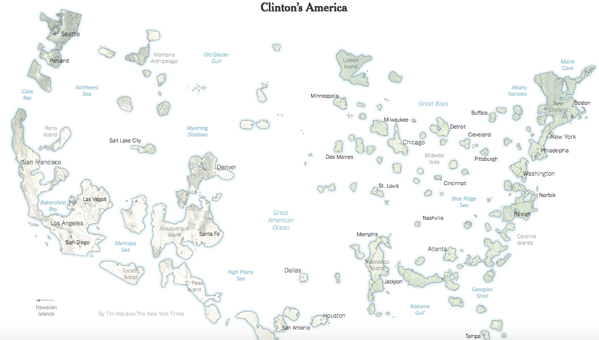
With solely the numbers in mind, one might think that the visual of the election map would show a relatively even split; a truly “divided” nation would be both numerically divided and geographically divided, right? According to the map of “Clinton’s America” this was not the case. Despite the numbers, Hillary only won 15% or 3,000,000 square miles of the United States’ land mass, leaving Trump with a perplexing remainder of 85% at 350,000,000 square miles. To reflect these numbers, the seemingly small islands of Hillary would harbor 54% of the nation’s population at 174 million Americans (Jacobs, 2017). With some basic calculations, that comes out to 58 people per square mile whereas Trump’s land would host 1 person for every 2 square miles. So what can we determine from numbers alone? Clinton’s voters have had to come from exceedingly densely populated areas, or particularly cities. When looking at the “Clinton’s America” map, the identified cities— Seattle, San Francisco, Los Angeles, Chicago, New York, Boston, Washington, Atlanta, etc.— prove this conjecture to be accurate. While the state is often represented by the city, the city is certainly not represented by the state. Look at New York, for example. When people think of think of the words “New York,” they immediately think of a skyscraper-lined landscape with mass herds of occupants roaming the streets. Much like other U.S. cities, The Big Apple represents the majority of the state’s population, economic activity, and the identification of the state as a whole. Yet, New York City only covers 0.006% of New York state’s total square mileage. These highly populated urban environments, such as New York City, are essentially isolated from the rest of the state, forming— in correlation to the map—islands. The “island” forms an individual entity and harbors a different group of people in comparison to the rest of the state. Cities are known for minorities and cultural diversity. Somewhere in American history, minority groups became linked to liberalism, setting the foundation of Clinton’s America.
Let’s now take a step back past the numbers, past the uneven population spread, past any knowledge you have of the United States— and focus only on the geography of the “Clinton’s America” map. The map gives off the perception that Trump not only won the election, but he dominated in the popular vote count as well as the electoral college. Clinton’s America conveys a distinctly inaccurate representation of the 2016’s election results, however it remains fairly accurate in terms of geopolitical spread. The map focusses on geographic accuracy, and does represent a proportional visual of landmass-to-population density. Of course to do this, city-based regions would need to be deliberately skewed. To say the least, it shows how ineffective the portrayal of land area is in determining overall political views in the United States. If an outsider with no knowledge of American politics were to see this map, he undoubtedly would argue that the United States is unquestionably conservative. As we know from the previously stated data, the popular vote was not in Trump’s favor and the results were remarkably close, deeming this map an inadequate way to represent American political stances.
So what can we learn from such an unconventional map? The first take away is that the cross between geography and politics can be extremely misleading if misunderstood. One must realize that the majority of the United State’s population lies within the exodermis of the physical contiguous landmass and the archipelago of liberalism contributes more to the nation’s identity than one might perceive. “Clinton’s America” also evokes the question as to whether our current electoral college system is fair in fully representing American democracy. Does the U.S. need to completely repeal the electoral college and rely on popular vote for further elections? Or have the founding principles of the nation become obsolete and simply need to be reformed to allocate growing population distribution? The conception of one map could be all the nations need to recognize and understand whether or not a more equitable system of democracy is necessary to fully express the voice of the people.
References:
Cook Political Report Staff. “56 Interesting Facts about the 2016 Election” National Politics.
December 16, 2016. Accessed March 04, 2017. http://cookpolitical.com/story/10201
Frank Jacobs, “Trumpistan vs. Clintonesia.” Big Think Strange Maps, January 22, 2017.
http://bigthink.com/strange-maps/trumpistan-vs-clintonesia.
Krieg, Gregory. “It’s official: Clinton swamps Trump in popular vote.” CNN. December
22, 2016. Accessed March 04, 2017.
http://www.cnn.com/2016/12/21/politics/donald-trump-hillary-clinton-popular-vote-final-count/.
This map is extremely fascinating and relevant. As I watched TV during the election, I heard many commentators talk about the difference between the two campaigns and the different demographics that each campaign targeted. This is clearly shown in this map. Hillary’s voters are clustered in larger cities, where there are many people in a small area of land. Trump’s voters are more spread out. While what a map shows is important, it can be just as important as what is left off of the map. The creators of the map clearly decided to only focus on Hillary’s votes and leave off where Trump had the most voters. This choice shows the true discrepancies between geography and politics, which you wrote about in your analysis. I really liked how you calculated how many people each of the candidate’s land would host. These numbers in context give much more meaning to the map and can help readers better understand the election. Personally, I felt like I learned more about the election by reading the analysis and looking at the map. Great map choice!
“Clinton’s America” is definitely an interesting interpretation of this past election. I think it goes to show just how divided America is, especially when it comes to the political divide between the various regions of the United States. I agree with your assessment that those who decided to vote in favor of the liberal candidate, Hillary Clinton, tended to be concentrated in highly populated areas such as New York City or San Francisco. It raises the issue of how geography influences how one will vote or what they will see as the major issues facing America. One thing that I think should have been mentioned was just how contentious this election was. Many people considered both of the candidates to be unappealing to say the least. I would like to see how this map would have looked if the two candidates that had run were less polarizing. Also, the question you raise about whether or not the United States should change the voting process is something worth looking into. Should we have a system that heavily favors the big cities, or should we stick with our current system that may not always grant the popular vote the victory. On the whole, this map is an important tool in understanding the basis of this past elections results and American politics in general. It would be interesting to see how this map would look if it is remade after the 2020 elections.