
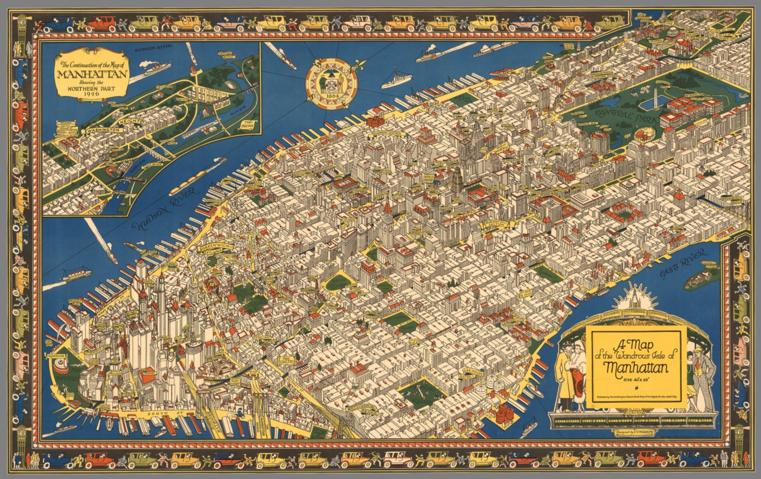
Never has a map caught my eye so quickly. “A map of the wondrous isle of Manhattan” was created by the cartographer Charles Vernon Farrow in 1926, yet I feel as though I imagined the same captivating New York City he created when I was a child. Farrow was not a famous cartographer, nor did he have truly extensive experience in map making due to his early death, but he encapsulated the wonder and grandeur that massive metropolises often evoke. Farrow creates an intricate and fascinating map of Manhattan Island in one of its most iconic periods, pouring minute details and seemingly irrelevant additions into this work of art. However, this depiction of Manhattan is misleading. Like me, most readers might get caught up in the artistic aspects of the map, instead of the more technical one. Farrow created a romanticized version of Manhattan in this map, ignoring the realistic side. Since maps are generally considered to be factual, or close to it, this over exaggeration of Manhattan’s artistic aspects creates a false presumption about the city’s true state.
This map shows the majority of Manhattan, one of New York City’s five boroughs. It is a pictorial map, one of many created in the U.S. during the 1920s and 30s. Pictorial maps “were not scientific representations of the Earth’s surface, but artistic renderings of places, regions, and countries” (Hornsby). Manhattan is covered in bright and strong colors and made up of orderly lines. The artistry and detail of the buildings is outstanding, and you feel yourself getting lost on the streets of New York the more you inspect the map. With an almost bird’s eye view of the island, the viewer is given a sense of power, as though they are a giant overlooking a model city. You can make out the smallest window, archway, or even fire escape on the sides of buildings, showing Farrow took great care into the detail of his work. This sense of power from the aerial perspective and attention to detail create an aesthetically pleasing pictorial map.
When a map is pictorial and made more in an artistic view instead of a technical view, the interpretation of the map must be different. This map of Manhattan would obviously not be used for city planning or navigating the streets precisely, but it can give you a sense of how the creator of the map feels about his subject material. Farrow seemed to try to portray Manhattan as a sophisticated and cultured city, drawing and labeling cathedrals, museums, theatres, and colleges on the island. These all may have been there in reality, but Farrow neglects to find and label less artistic and refined buildings and locations, like warehouses and factories. Maps have factual connotations All helped make the city what it was, but Farrow decided to highlight the more glamorous side. There are even some giant money bags and top hats sitting on roofs of buildings, small additions that add to the posh image the city takes on. This may seem like a harmless exclusion, but maps are generally seen as factual pieces of media. Maps have a powerful influence in that they are considered accurate without further investigation. When people view the “wondrous isle of Manhattan”, they will not be seeing an entire part of the city that Farrow omitted. These forgotten portions of the city mean the true nature of Manhattan is not conveyed. The grittier portions of the island add character and contrasting perspectives that becomes missing once you focus on the refined parts of the city alone. This diversity is what many say defines New York City.
One less polished part of city that does get a banner to label it is “The Ghetto”. Positioned at the bottom of the map, “The Ghetto” is one of the only indications that Manhattan has people living there not in the elite class. In the real Manhattan during the 1920s “two-thirds of New Yorkers lived in tenement houses” (The Progressive Era). This divide between the upper and the lower working class is not immediately noticeable in Farrow’s map, but when one of the largest cities in the world at that time is shown with no discernable poverty or problems, it becomes clear something is missing. The Ghetto, placed at the bottom of the map, with little dignity, indicated how poverty and the lower class were considered at that time. The upper class were living comfortable in the Midtown business district (Miller), while the poor were ignored for the most part.
While Farrow seemed to insert social commentary into his work, he also created a map that is lighthearted and fun, almost like a cartoon. The entire island is drawn meticulously, creating an ideal setting for a thriving metropolis. This unrealistic depiction doesn’t care so much about the real Manhattan, as much as the Manhattan it is trying to show people. This subtle omission of less desirable parts of the city, shows how a pictorial map can mislead and sway a reader’s view of a place or city. The map is surrounded by images of cars and people racing about, depicting the bustling and fantastic feel of Manhattan. The cartouche in the bottom right is two couples, dressed in the stereotypical Roarin’ Twenties garb. My favorite example of the ultra fancy Manhattan Socialites, is in the top left cut away section of the map; if you look closely you can see a banner labeled “Polo Grounds”. The entire piece is reminiscent of The Great Gatsby and the era that it romanticized. This new, over the top cultural boom that was the 1920s is exactly what Farrow is trying to convey with his map. The 20s were a time of lavish overspending and cultural prosperity for the U.S., and what better way to show the world our brilliance by overemphasizing our greatest city’s sophistication (Zeitz).
Being a pictorial map, the actual land of the island seems to be less important than the buildings, bridges, and other manmade structures. This may be commentary on how people viewed New York and other places in America during the 20s. Men and their creations were more important than the land they inhabited. This map makes the viewer feel the grandness that was New York City in the 20’s. This grand image was warranted, as it was a cultural hub and considered by some as the greatest city in the world, but this great city was not all glitz and glamor. There was a tension between the rich and the poor inhabitants of the city, and this allure was displayed through a more artistic representation of Manhattan than a more technical map would have demonstrated. Manhattan was the center of the universe for those who were looking at it in the 1920s, and this map captures its wonder and grandeur.
Works Cited:
HORNSBY, STEPHEN J. PICTURING AMERICA: the Golden Age of Pictorial Maps. S.l., UNIV OF CHICAGO PRESS, 2017.
Miller, Donald. “Built for Business: Midtown Manhattan in the 1920s.” Entrepreneur (2014): n. pag. Web. 16 Mar. 2017.
Zeitz, Joshue. “F. Scott Fitzgerald and the Age of Success.” The Gilder Lehrman Institute of American History, Accessed 16 Mar. 2017.
“1890–1928.” The Progressive Era | History of Poverty & Homelessness in NYC. N.p., n.d. Web. 16 Mar. 2017.
This is a great analysis of such a visually-oriented map. I like how you recognize the significance of the artistic aspect of the map rather than any accuracy that Farrow might be trying to convey. As you include, it is important to understand “false presumptions” that overly-visual maps might convey. It is likely that this is a common issue with maps based on artistic appeal and aesthetics. The fact that the map is portrayed from an “aerial view” is also intriguing because we know how limited technology was in the 1920’s; a cartographer could not fly a drone into the sky and snap a photograph like a person could do at the present time. Farrow must’ve had a unique method for being able to capture and illustrate such a detailed map. Furthermore, you provide an interesting analysis of “the ghetto” and how its placement on the map is reflective of its societal insignificance at the time. Lastly, you make a good connection of how the crowded rendering of the maps relates to the culture of the city at that specific era.
I like how the map captures the awe that not only Farrow saw for the city of New York, but also the American population. In the roaring twenties, American culture rallied around growing cities and the vibrant, layered lives that they fostered. This map, though, in particular highlights the idealism and excess of this time period. Any reference to the lower class is relegated to the one small symbol that reads “the ghetto,” leaving that which is undesirable unseen, much like the mindset of this time period. When I first looked at the map, I didn’t even notice it, and wouldn’t have without the blog post bringing it up. What is also notable are the small details that indicate Farrow’s intent to portray an ideal American life. The border of the map is comprised of cars–something we now see as inherent to American culture, but was still a luxury for many people, especially in a city. The skyscrapers are prominent and seem to pop from the page, giving a focus on how American capitalism claimed that people could grow as much as possible. It is a fascinating, beautiful map. While it does not have a practical purpose, it does give a great perspective on American life in the early 20th century. Great work!