
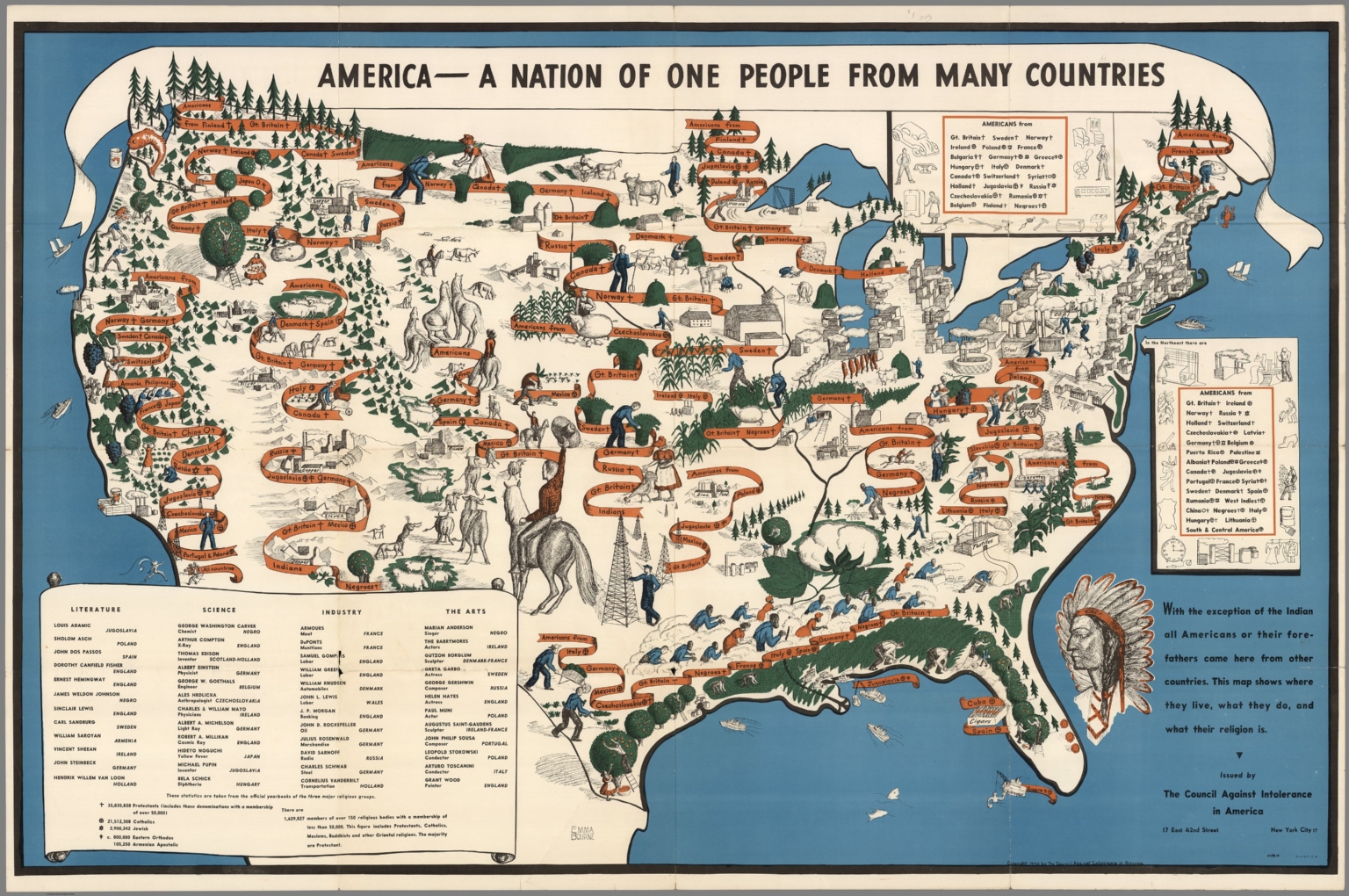
Turn on your television, log onto Facebook, or open a newspaper and you will be hard pressed to finish your morning routine without hearing or seeing a news story on immigration. This is not a new phenomenon; immigration policies have lead to the creation of some of the most controversial laws in the history of the United States. Just as fears over terrorism color our perception of immigration today, the spread of fascism and communism dominated the discussion of immigration policies in the years leading up to the outbreak of World War II. The Council Against Intolerance in America, an organization that promoted a wide range a civil rights during the early 20th century, included the map seen below in their wartime pamphlet Calling All Americans which was published in 1940, months after France and Great Britain declared war on Germany. Entitled “America – A Nation of One People from Many Countries,” it was published in an effort to celebrate the diversity, unity, and strength of democracy in the face of fascism and communism rising in the east. This post includes a discussion of the map’s historical context, an analysis of the map’s visual and stylistic elements, and a critique of the map’s purpose and cultural biases.
In the years leading up to the production of this map, immigration was on the forefront of the public’s mind. The United States had just experienced the largest wave of immigration since its founding. Between 1870 and 1930, 30 million immigrants entered the United States, fleeing famine and poverty in search of a better life (Ewing 4). While history textbooks often paint a rosy picture full of fresh starts and prosperity, the process of immigration was arduous and littered with bureaucratic red tape that prevented many would be immigrants from making a new home in United States. The first of several explicitly exclusionary measures, passed in 1882, was the Chinese Exclusion Act, which followed the arrival of hundreds of thousands of Chinese laborers in the west (3). They worked for extremely low wages in agriculture and industry and built many of the western railroads, effectively driving non-Chinese laborers out of work. The Chinese Exclusion Act was only the beginning of a movement that called for more and more stringent immigration regulations. By the outbreak of World War II, immigration had been capped at 165,000 people per year, and was further reduced by the quotas tied to countries of origin and the requirements for obtaining a visa (4). Even as the United States was closing its ports to immigrants, other threats to the country began to surface. In 1929 the stock market crashed, sending the United States and the rest of the world into a period of extreme economic hardship known as the Great Depression. In Europe, still recovering from the devastation of World War I, new forms of government emerged, fascism in Germany, Spain, and Italy and communism in the Soviet Union, dividing Europe in two and challenging the future of western democracy.
The map and the pamphlet try to allay fears of fascism and communism by praising the diversity and strength of the American people. This map is layered in presentational codes that reflect the great variety of the American people’s nationality and religion (Wood 112). The immigrants’ nations of origin are literally bound together on ribbons, bringing to mind the phrase “cut from the same cloth” and unifying these different groups. The illustrations of Americans doing hard manual labor on ranches, in fields, and in factories imply an attitude of self-reliance and hard work, both traditional American values. The map pushes all immigrants in the United States to cohere to these values that are part of a distinctly American identity. In combination with the banners of countries, the codes embedded within the map create a bridge that unites the immigrant with this identity. And what is the reason for the unity? According to the creators of this map- democracy.
Look at the map a little longer and an undercurrent of codes surfaces. Alongside the cultural differences of the American population are illustrations of natural resources, industry, and agriculture. In the southeast, the midwest, and on the west coast the primary sector of the economy, agriculture, mining, and forestry, dominates the landscape. Fields and orchards standout in green, while livestock and mines draw the eye to the little details sketched in black. Principal in the northeast and the midwest is the secondary sector of the economy, manufacturing. Factories with tall chimneys blowing smoke are labeled steel and coal and cigarettes and textiles. They cluster around Chicago, Detroit, and the cities on the northeastern seaboard like moths to a flame. The diversity seen in the country’s commerce mirrors the diversity of the population of the United States. By showing the United States with such abundant natural resources and thriving industry, the map suggests that the country is fully self-reliant, a value that is also emphasized by the depiction of the population. All of these economic bounties fall within the borders of the United States, which implies the strength of the country as a unified democratic nation.

Looking at the pamphlet the purpose of the map is immediately clear, at least how the publishers saw fit to depict it. It states, “This handbook was prepared to help group leaders in planning and organizing programs for this purpose,” that purpose being the study of democracy and the understanding of the propaganda from “dictator nations.” Ironically, both the map and the pamphlet are perfect examples of propaganda. The map celebrates the United States by elevating the hard labor and diversity it depicts to part of the national identity. Additionally, the subdued colors, light blue, dark green, and soft orange create a soft and non-threatening atmosphere quite suitable for educational material. By presenting their biases in this medium, the creators of the map persuade the audience to view the United States and its democracy in a positive light.
At the same time, the authors of the piece express their views on American involvement in World War II, or more specifically their belief in American neutrality. While this map emphasizes the backgrounds of the American people, they are ultimately overshadowed by the American identity. Literally under the umbrella of the title banner proudly proclaiming “A Nation of One People,” the national heritage of the American citizens is minimized and transformed into a single unified identity. Neither the Axis or Allied powers is concealed or highlighted, downplaying support for either side in favor of American neutrality. The economic self-sufficiency is also reflective of non-involvement as the United States faced no monetary threat at the time by abstaining from the war. By depicting the United States and its citizens as separate entities from Allied and Axis nations, this map argues for American neutrality. The United States would eventually be forced into the war by the Japanese attack on Pearl Harbor in 1941, only a year after the map was published. In retaliation Japanese immigrants would be sent to internment camps for the rest of the war, as the United States abandoned all pretense of and support for a unified American identity.
While the map serves as powerful emblem of democracy that champions diversity, there are underlying tensions within the map. It is distinctly Eurocentric as it minimizes the presence of Native Americans, African Americans, Asians, and Middle Easterners. While Native Americans are not typically thought of as immigrants, they did at some point migrate to North America. Their representation on the map has been reduced to a portrait of a stereotypical Native American chieftain and a short sentence on the margin of the map. Immigrants from Asia are listed, but their appearance is localized in California and the northeast, and immigrants from the Middle East are not listed at all, despite a large uptick in immigration to the northeast during the late 19th century (Camarota 2). One of the most striking elements of the map is its treatment of African Americans. Here, it is less of a case of under representation, but of label. American politics were steeped in racism during this time; Jim Crow laws governed the lives of African Americans and only one man of African American descent was serving in Congress when this map was produced. This deeply rooted racism peaks through in the map through the decision not to list African Americans by their country of origin. Instead, they are all grouped together under the title of “Negro”, a word which came to be synonymous with “slave” (Bennett 1). There is no attempt by the map’s creators to detail the countries that these slaves came from, though historical records, kept by nature of the slave trade, are available. Even European countries with relatively low immigration numbers are listed and differentiated reflecting the European bias of the mapmakers. So while this map claims to celebrate diversity, in reality the map represses much of the diversity it argues makes democracy and the United States strong.
This map has earned its place as Map of the Week! for several reasons. It is visually exciting and has clear ties to United States foreign relations, the underlying theme of our course. However, what makes the study of this map even more interesting is its relevance to politics in the United States today. The fight over immigration in the United States has existed ever since the creation of the country. Every United States president since Eisenhower has taken executive action on immigration (Wolgin 2). As such, it is unlikely and foolish to believe that a consensus will be found regarding immigration policies, but policy makers and the public should take the opportunity to learn from the propaganda of the past. The former can learn to use propaganda to sway popular opinion and the later can learn to recognize it and understand and even lessen its influence on their daily lives, just as the authors of the pamphlet hopefully wrote in 1940.
References
“America- A Nation of One People from Many Countries.” Calling All Americans, The Council Against Intolerance in America, 1940.
Bennett, Lerone. “What’s In a Name? Negro vs. Afro-American vs. Black.” Ebony, Nov. 1967.
Camarota, Steven A. “Immigrants from the Middle East.” Center for Immigration Studies, 29 Apr. 2013, cis.org/MiddleEasternImmigrantsProfile.
Ewing, Walter A. Opportunity and Exclusion: A Brief History of U.S. Immigration Policy. Immigration Policy Center, 2012, Opportunity and Exclusion: A Brief History of U.S. Immigration Policy.
Wolgin, Philip E. “By the Numbers: Every President Since Eisenhower Has Taken Executive Action on Immigration.” Center for American Progress, 6 Oct. 2014.
This map and blog post immediately grabbed my attention. The title, “Calling All Immigrants”, reads like a recruitment flyer, drawing you in for a closer look. As Cat mentioned, immigration is an extremely hot topic in the United States nowadays, and maps seem to be the perfect way to portray immigration. The visualization this map provides is spot on, placing images of ethnic groups at points of the map where groups of immigrants were drawn to, along with the images of cities and resources in those same places. This visualization is poignant for a map about immigration because it puts to paper how many people view the United States, a mixing pot of races and people. I enjoyed how this post touched on the political implications of the portrayal of ethnic groups and how the 1940’s map makers were extremely biased in who they included on the map. This topic of immigration is a great one to write about and I thought Cat had a great balance of analyzing the physical map itself, and talking about the rhetorical aspect of the map as well.
Cat’s map depicting the diversity of immigrants is a great map to include in our collection of maps of the week because, as Cat mentioned, immigration has been and will continue to be one of the hottest topics in American politics. In addition, it is an example of the intrasignification codes we learned about in Denis Wood’s The Power of Maps. Cat does an excellent job of deciphering the material by Wood and applying his concepts to her map as she discusses the presentational codes that help create what we as the audience see and understand about the map. The aspect of this map that I found most interesting was one I completely overlooked until Cat pointed it out in her critique. The names of nations painted on the banners represent clear author biases. Nations the size of West Virginia are deemed worthy of individual attention while the entire continent of Africa is grouped together under the title “Negroes.” The detail with which European nations are treated compared to the lack of detailed paid to African nations is striking and contributes to the Western stereotype that still exists today of all of Africa being essentially the same. Such language would never appear on a modern map produced by an organization claiming to fight intolerance, but its inclusion on this map does offer insight into the attitudes toward race of the time. This aspect of the map shows the tension between a map’s intent and its effect; as Cat noted, the map has the effect of repressing the very diversity it intended to celebrate.