National Weather Service

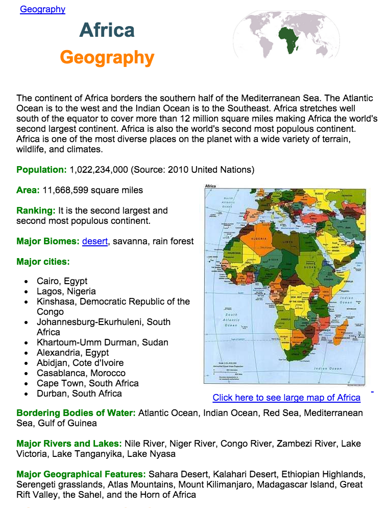
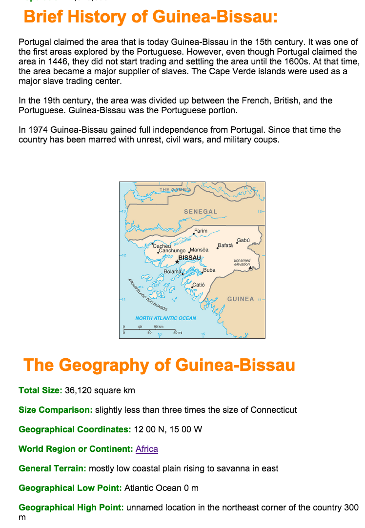
National Weather Service of the National Oceanic and Atmospheric Administration

http://www.weather.gov/

Many of us check the weather on a daily basis, simply wondering how to dress for the day. Well the National Weather Service (NWS) website is more than your basic weather app with all of the fancy graphics and animations. Instead the website is a comprehensive compilation of historical, real time, and prediction models of weather,  water and climate patterns. This website is a more serious and extensive source of weather information. The website is truly a valuable tool for a geographer.

The mission of NWS is to provide weather, water, and climate data, forecasts and warnings for the protection of life and property and enhancement of the national economy. The website takes on the notion that weather can be very powerful and costly and takes all measures to ensure the American population is prepared for weather events. One of the major roles the website has is to share information about weather warnings. The first thing you see on the homepage of the website is a map of the United States divided up by counties. Some of the counties are shaded in different colors which correspond to different warnings. Beneath the map the websites lists 29 different types of warnings, watches, and advisories which include wind, tornadoes, floods, winter weather, and even high surf. This map is a useful tool to observe the weather patterns occurring nationwide as well as viewing the potential weather threats on a local scale. 

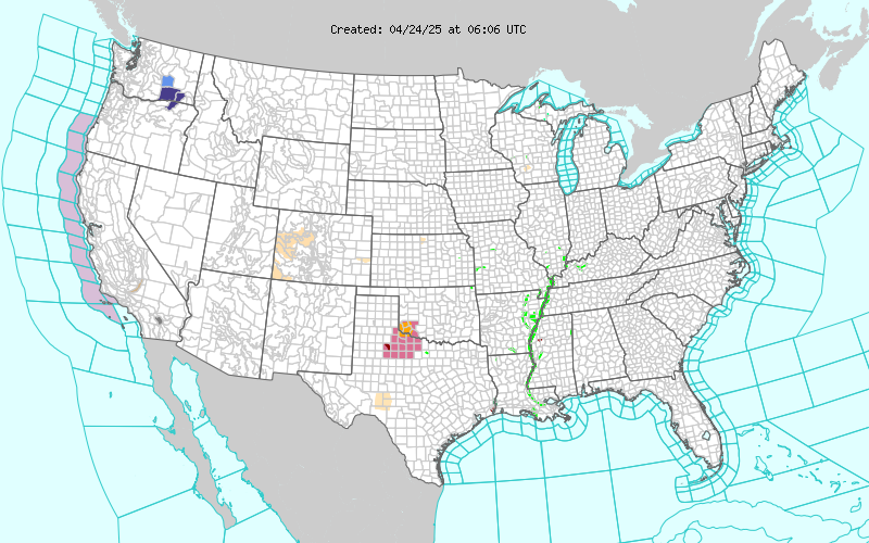
In addition, the website has countless other features. The most useful feature for the casual user is the customized forecast which allows you to search for weather by zip code. Like many other websites, it provides you with a overview of current weather a forecast for your local area. Unlike some other weather sites though, this forecast comes straight from the local NWS weather forecasting office, of which their are 122 nationwide. The website has many of the typical weather features you see on any other website, but far more detailed and comprehensive.Graphic of Air Quality Forecast Guidance for the CONUS

The website also provides countless other useful graphics like the one above which shows air quality or ozone concentration. Additionally the website has real time graphs and maps about floods and fires that can be very useful. The casual web surfer can learn so much about weather, and someone who understands how weather patterns work will be mesmerized by the wealth of information on this website. You could waste lots of time looking at all the historical trends and forecasts for all kinds of natural events that occur in the United States.

Finally the website has some very useful links about safety tips for all kinds of weather related events. This website is a good resource for any skill level of geographers. NWS has a respected name and their website has a very professional feel that would encourage me to use it more often for weather information especially now that I know more about how the atmosphere and hydrosphere work.

-Aaron


UNESCO World Heritage Sites

United Nations Educational, Scientific, and Cultural Organization (UNESCO)

http://whc.unesco.org/en/interactive-map/

Tools of the Geographer

UNESCO is such a great website and one that I wish I had found earlier! This website encompasses all sites that are considered to be a part of the ‘World Heritage List,’ recognizing places that are of “outstanding universal value. ” These sites include those that are considered human masterpieces, monumental developments, testimonies of cultural presence, and architectural remnants. Additionally, these sites are also examples of early human settlements, natural phenomena, historical and ongoing geological process examples, instances of evolutionary biological processes, and biological diversity conservatives.

So why is this site important? Why is this site useful? UNESCO introduces us to the wonders of the world, and does so in a clear, organized way. One page includes an outstanding interactive map. This tool presents a global map with points of varying shape and color, representing World Heritage Sites that are recognized as cultural, natural, or both cultural and natural sites. They are further divided into those places that are in danger and those that are not.

Screen Shot 2015-04-20 at 1.29.47 PM

Simply by selecting a point, you are given the site’s name and a representative picture. By clicking on this icon, you are taken to another page that has the site’s description and additional information, including maps, documents regarding the importance and history of the site, as well as additional photos and videos.

Screen Shot 2015-04-20 at 1.33.16 PM

UNESCO’s aim is to educate its viewers on these heritage sites in the hope that people may be able to recognize, safeguard, and preserve these locations. So, viewers, take a look, take action, and enjoy!

Taylor and Francis Social Geography Journal

The Taylor and Francis Social Geography Journal mixes political issues such as the fight for equality with the geography of location. Through the lens of space, place, and geographical features, the Social Geography Journal explores such societal problems as crime, inequality, poverty, scarcity of resources, uncleanliness, and housing shortages. It also explores cultural and social practices such as work, leisure, and outdoor exploration. A model for cross-sectionalism, the journal explores how geographical considerations shape society and culture.

One article on Dying and Death examines the mortality rate, particularly at birth, as it varies from region to region. It also explores some factors, such as the cleanliness of the air and water in the region, and how it affects the overall mortality rate. It further discusses how grieving processes vary depending on location, and even how ceremonies can either tend be indoor or outdoor depending on the climate and features of the region.

This journal takes a unique approach on geography, in that it not only explores geographical problems and practices, but it makes a larger connection to political, cultural, and social issues that are relevant today. When I think of geography, I am likely to think about the death of local aquatic communities, or the long-term threat to humans through the ever-growing problem of global warming. This journal explores present-day threats however, and threats to our society and not just our ecosystem. How to save lives, and how to increase the quality of life by reducing crime and poverty are topics discussed.

In an era in which startlingly few politicians are scientists or have a sturdy foundation in science, journals like this are essential to bridge the gap between experts. When politicians formulate policy based on problems that can be solved with science such as disease, clean water, and alternative energy, they should have a strong basis for their arguments.

The scope of geography is stretching ever further, and I welcome the overlapping of the spheres of geography and politics. Let’s hope we’ll have no more egregious scientific blunders like this one.


– Richard Jennis


Protecting Marine Life from Pirates

The Marine Conservation Institute works at the intersection of the hydrosphere and the biosphere to ensure that the oceanic environment is conducive to marine life. The organization acknowledges that marine habitats are essential, not only to marine life, but to humans as well, who rely on these environments for nourishment, water and transportation. In order to continue the use of the oceans for these varied purposes it is crucial to conserve them for future generations so that ocean ecosystems and human survival can thrive.

One significant way that humans impact the oceans is through fishing and overfishing the marine life that reside in them. One of the primary goals of the center is to protect key ocean areas from fishing and they have succeeded in doing this by designating certain areas of the ocean as protected areas where fishing is not permitted.

Illegal fishing has a severe impact in the Southern Ocean. Six ships known as the “Bandit 6” fish Chilean Sea Bass illegally and are drastically affecting the health of this species. This issue hurts the entire food chain and damages entire ocean ecosystems. In order to combat pirate fishing, the Marine Conservation Institute is working to pressure countries such as Malaysia and Thailand, who have jurisdiction over these ships, to hold the pirates accountable for their actions so that marine ecosystems can be sustained for years to come.

Global Carbon Atlas

www.globalcarbonatlas.org

Click on this link and explore the site, I guarantee it’ll capture your attention and you’ll probably spend at least 20 minutes messing around on it.

The above link will take you to the ’emissions’ section of the Global Carbon Atlas. This interactive website collects carbon emissions data from every territory in the world and allows the user to create customized visuals in order to draw comparisons. The image below displays the basic home map for the site, which utilizes graduated bubbles in order to display the total carbon dioxide emission levels in metric tons (Mt) of every territory. Starting with this map, one can begin manipulating the way data is represented in terms of units, countries, resources, and scale of time.

1The right sidebar allows the user to choose from a variety of different visual displays. I first looked at the “ranking” option just to see where countries fall for different types of resource usage. I kept the units in metric tons, but for “type” I chose oil, coal, and gas. In this way I was able to compare 10 countries and their usage of these three resources side-by-side.

1961The image above represents data from 1961 (the absolute furthest I could go back). Beneath this chart there is a time bar, which can be dragged from 1961-2013. This is a really interesting feature because you can watch as the countries on the left shift places, particularly the rise of China and India and the fall of Russia and the UK.

2013


After exploring this feature, I also looked at the “chart view” and “time series” options. Like the “ranking” option, these two tools are immensely helpful in generating easy to understand data visuals. In this way, Global Carbon Atlas can function as a highly versatile tool, which can gain the attention of any audience. Seeing this data on a piece of paper and aligned in grids, may represent the same reality, but it does not tell the same story. With this website, one can better understand how every country contributes to global carbon dioxide emissions.

oil


Additionally, the site also seems well sourced. With each customized chart, one can easily access the sources of data. On the lower-right side of the screen there is a “sources” option, which provides links and citations. Furthermore, there is a “data” option, which allows you to download the data you’re using on the screen into .csv and xls or .pdf and .jpg files.

There are really so many interesting visualizations on this site, I don’t even think I can accurately describe everything. Try checking out the “outreach” tab located in the top bar. Here, you’ll find past, present, and future tabs. The past tab will take you on a story-like journey from hunter-gatherer times, through the industrial. The present time will offer a really creative break down of our current carbon footprints and the future tab will reveal estimates on the continuous patterns of carbon emissions.

Finally, the “research” tab allows you to create maps using different data sets offered by the organization. Again, these maps can be really powerful tools for capturing the attention of an audience and displaying informative messages.

I really do not see any flaws with this site. Its extremely easy to use and seems to have endless possibilities from a user perspective. I hope you guys take a few minutes to check it out; I know I will definitely be using it in the future.

-Dan


Ducksters Geography Website

When some of my friends talk about the location of countries and cities around the world, I get a strong sense of second hand embarrassment. One of my best friends was telling me about how she was the last to choose in her FYS, but still got a European city for her research project, she picked Johannesburg… I have also heard one of my other friends talk about how close Belize is to China if you study abroad in Hong Kong, and by Belize she meant Bali, Indonesia. There is a clear lack of geographic education in our school systems. Being from the United States, many think that the knowledge of other locations around the world is useless. But, not to fear, there are a variety of geographic websites about mapping and the location of countries around the word that students can use to get a better understanding of other countries around the world.

Screen Shot 2015-04-15 at 4.59.10 PM Screen Shot 2015-04-15 at 4.59.24 PM

One of my favorite websites to use for basic facts and information is called Ducksters. Ducksters is very easy to use and handy for kids, adults, and anyone who has an interest in geography. It can be used to learn the locations of states, countries, and places around the world. Although it has a funny and childish name, I have used this website since my 6th grade geography class and it is very helpful to learn about the countries around the world. I used this website to help me pass my blank map of the world test in AP Human Geography my senior year.

This website separates each section of the world into parts, has a variety of maps, and lists every country in each region. For example, the section for Africa provides information regarding the population, area, ranking, major biomes, major cities, bordering bodies of water, major rivers and lakes, major geographic features, and the countries in Africa. You can also click on a specific country’s link to gain a brief history and more geographic information such as total size, climate, major cities, general terrain, national GDP, and more. This website is one of my favorites because it is very easy to read and information is bulleted rather than presented in paragraph form.

Screen Shot 2015-04-15 at 5.00.40 PM Screen Shot 2015-04-15 at 5.00.54 PM

The website is a tad immature and juvenile, but it is a great website for someone who wants basic and easy to read facts, figures, and information. The website provides its users with a multitude of information in one convenient location. As someone who is very interested in where places are located around the world and mapping, I hope people can use this website to gain a better knowledge about global geography. If elementary school students are taught this information at an early age, it will hopefully result in a better globally educated future!

-Haley Close

KidsGeo! Geography for the young’uns.

www.kidsgeo.com

It may seem rather juvenile to write my review about this site – and indeed, it is a website catering to children – but I thought it would add an interesting perspective to the overall course to review this type of geography-related website. This website, as an information base and resource, falls under the category of Tools of the Geographer; I will focus my review of website content on the material included about the Hydrosphere.

First impressions, which are usually visual, are very important – the aesthetics of this website are thus the first subject of my review. The color scheme doesn’t appeal to my personal eye; however, the bright and multiple colors will attract the attention of the children the site is made for; the images serve this same purpose. There is a lot going on, in terms of content and words, on the home page; the sheer amount of words and click-through opportunities are overwhelming and may detract from the ability of users to actually find the information they are looking for. Additionally, there are a few places on the page containing advertisements – it is not fitting, though, to have ads on a website catered towards young children.

The overall content of this site is quite broad in the scope of information it covers. Geography and geology, two broad studies of the Earth, are subjects within this website; individual topics include the atmosphere and its processes, the hydrosphere, the biosphere, and others. The range of subject matter is a strength of this site. Another strength is the inclusion of several other websites linked to this particular one, such as one that takes the site users to a different website about dinosaurs. The website, KidsGeo, is a good resource for curious children who have the desire and ability to search around and find information. The content and the wording used is very relatable to the audience; for example, in explaining salinity of the ocean, the text of the website asks the reader if they have ever tasted the ocean, and if so, what does it taste like?

This website has several sub-sections under the general category of the hydrosphere. These include some basic background information about water, specific details about each of the earth’s major oceans, several sections about the ocean, and a section about each of the other major existences of water (ice, lakes, rivers, etc.). There are images and diagrams within each section; the diagrams are over-simplified versions of the processes they describe, but simplicity is often beneficial in getting main ideas across – the simple diagrams are appropriate, then, for a kids’ geography website and for teaching them the primary concepts.

Overall, this website is rather visually overwhelming and very simple in regards to the depth of information covered. However, it serves its purpose as a resource for children to find out information about the earth.

–Natalie Somerville

ScienceDaily: Your resource for the latest research news

ScienceDaily is one of the most popular scientific websites. About 5,000,000 people visit this website monthly. One of the reasons that people prefer this website for their scientific research is that it is well organized and easy to search for topics that they want. The site has five big categories on the top: Health, Physical/Tech, Environment, Society/Education, and Quirky. There are more specified categories below these five categories like Space and Matters, Animals and Plants.

For example, if you are looking for a resource about Mars, you will go to Physical/Tech, Space and Matters, and click Mars. There is a research about Marsh might has a salty water. It provides summary of the news and information about the laboratory where the research was done. You will see the recent researches about Mars and the related stories additionally on the right side. In addition, “Related stories” section that recommends further research is shown based on your search topic. It helps you to gather more related information about the topic and to develop your study once you search, so that you do not have to search several times.

Screen Shot 2015-04-15 at 1.00.38 AMScreen Shot 2015-04-14 at 11.50.19 PM

The website is designed well for the young people who are interested in scientific issues. It has a Facebook page, Twitter, and Google+ so that you can get the latest news through them. And the website allows you to share the news on Facebook, Twitter, and Google+ simply clicking “Share this”.

The website is useful for our course, Geography 250 because it has great amount of resources about physical geography including Atmospheric, Biospheric, Hydrospheric, and Lithospheric news. In Space & Time section, there are detailed resources about space that can be linked with what we learned in chapter 3, the atmospheric composition. The earthquake news of the website announces a recent issue about the earthquake like Japan Quake and Tsunami Spurred Global Warming which can be associated with Chapter 12.

Ocean access to a cavity beneath Totten Glacier in East Antarctica

Caroline Dougherty

Recently published research from scientists at the University of Texas at Austin reveals that Totten Glacier in East Antarctica might melt more quickly than previously predicted. If the glacier melts in its entirety, it contains enough ice to raise global sea levels by 3.4 meters, or 11 feet. Scientists have previously observed that warm waters on the seaward side of the glacier might be responsible for the majority of ice melt. The University of Texas scientists used laser surface altimetry and ice-sounding radar and magnometers, among other technologies, to assemble exhaustive data about the glacier’s interactions with warm sea waters.

Using the new data scientists were able to identify a previously unknown inland trough that connects the main ice-shelf of the glacier to the ocean. Scientists also identified entrances to the ice-shelf cavity below depths of 400-500 m that could allow intrusions of warm water. Water at deeper levels of the ocean is usually colder than water near the surface of the ocean—but if warmer waters are saltier than cold waters, the warm water can sink, allowing it to enter ice shelves at extreme depths. The recent research by Greenbaum et al. reveals that glaciers in East Antarctica are facing the dangerous melting processes that were thought to be limited to West Antarctica.

As global temperatures rise, warm sea waters will accelerate arctic and antarctic ice melt. It may take centuries for Totten Glacier to melt, but its melting will probably be irreversible. Melting sea ice will lead to rising sea levels, which will surely have vast and largely unknown impacts on complicated earth systems and coastal communities.


Greenbaum, J. S., Blankenship, D. D., Young, D. A., Richter, T. G., Roberts, J. L., Aitken, A. R. A., & Siegert, M. J. (2015). Ocean access to a cavity beneath Totten Glacier in East Antarctica. Nature Geoscience.