Tracking Ocean Explorations with the NOAA

The National Oceanic and Atmospheric Administration (NOAA) has a website called ocean explorer, which allows you to track the recent ocean explorations by the NOAA from 2001 to the present. Each exploration provides extensive data that was collected and used, and gives an extensive background as well as the mission’s motivation. There are constant updates of new findings and new missions for each exploration, so you can see what has been found already and what the researchers are hoping to discover. Each exploration also provides photos and maps to help explain where it is taking place, and why the exploration is important to the certain area. The website provides a digital atlas that shows all of the current explorations around the world, allowing you to click on a certain mission and use GIS tools to examine dive locations, dive tracks, and ship tracking. You can also quickly view the education, data and summary of each mission on the map.

This website can help connect the general public to the advances in geographical research, and help inform them of what work is being done around the world to further the knowledge of our oceans. It also will help keep the public aware of the past history of the world, and what artifacts are found in oceans that help piece together important historical events.

http://oceanexplorer.noaa.gov/explorations/explorations.html

Dude Where’s our Water? Drought conditions across the United States

Although, news media coverage of the California drought has fizzled over time, the reality is that many parts of my home-state continue to be under “Extreme” or “Exceptional” drought conditions.

The United States Drought Monitor (USDM) is a useful tool in analyzing current drought conditions across the United States. The USDM is a joint project by the National Oceanic and Atmospheric Administration, the U.S. Department of Agriculture, and the National Drought Mitigation Center at the University of Nebraska-Lincoln.

With weekly comparisons, data tables, and even GIS data (among other useful tools), anybody can log on and examine the different effects of drought conditions. Users can examine specific attributes such as percent of normal rainfall and the Vegetation Drought Response Index (VegDRI) of a given state.

As the drought in California and other parts of the United States drag on, it is important to be informed about conditions and develop plans to save water.

USDM: http://droughtmonitor.unl.edu/Home.aspx

Tracking Water Quality in the United States

Tracking Water Quality in the United States

Nicole Murgia

https://www.epa.gov/waterdata/waters-watershed-assessment-tracking-environmental-results-system

The United States Environmental Protection Agency (EPA) provides an in-depth look at water quality in the United States. Through a program referred to as the “Watershed Assessment, Tracking, and Environmental Results System” (WATERS), anyone can access details of water quality of watersheds across the country. The program was designed under the Clean Water Act to improve communications regarding water conditions among the government and citizens.

WATERS allows anyone to access information regarding the quality of the nation’s surface water through a variety of different data tools. The data program provides information such as the designated uses of bodies of water, water quality monitoring results, and assessments of water qualities.

One of the helpful programs that is included on the site is called “How’s My Waterway”. This tool allows the user to enter their current location and observe the water conditions of nearby bodies of waters. Once selected, one can view updated condition and pollution reports of the waterways near them. In addition to the technical report, the EPA provides an option to read the report in an edited, “Plain English” version that makes the scientific terms used understandable for the average citizen. https://watersgeo.epa.gov/mywaterway/mywaterway.html

Programs like WATERS allows everyone to stay informed on the quality of the waters around them as well as the hydrosphere as a whole.

Water Use in the United States

This section of the United States Geographic Survey website deals specifically with the water use in the United States. The National Water-Use Information program collects and spreads the data. This data is gathered at county levels and then compiled by state, leading to the final culmination at the national-level.

By analyzing this data, we gain a better understanding of the hydrosphere. We can see where and how this resource is being utilized by exploring the different water use categories. These categories include, public supply, domestic, irrigation, thermoelectric power, industrial, mining, livestock and aquaculture. This data also accounts for surface & groundwater use as well as trends in water use. Looking at this data on a state level helps us understand why certain states differ so vastly compared to others. Not only can we analyze current data, but the section for trends helps us see how we have recently decreased freshwater withdrawal.

With the limited amount of available freshwater, it is important for us to be aware of our current water use and freshwater withdrawal overtime. This is the main objective of the USGS Water-Use Data and Research program. The importance of the data has led the program to develop improved water-use data through state water-use resources. This has to be a priority if we want to maintain our hydrosphere.


Website: http://water.usgs.gov/watuse/

Retreat of Glaciers in Glacier National Park

https://www.usgs.gov/centers/norock/science/retreat-glaciers-glacier-national-park?qt-science_center_objects=1#qt-science_center_objects

This article, by the USGS, discusses how glaciers in Glacier National Park reveal the “big picture” of climate change in the hydrosphere. Because glaciers are unable to adapt similar to living creatures, they are a good indicator of the impacts of climate change throughout the park. Weather data analyses shows an increase in summer temperatures and a decrease in winter snowpack (that forms and maintains glaciers), resulting in glacial melt. The mean annual temperature for Glacier National Park and the surrounding region has increased 1.33C (1.8 times greater than the global mean increase) according to USGS. This has consequently resulted in rain, rather than snow, increasing with precipitation over the past century. The fact that glaciers have continued to shrink in the region shows that the snowpack is not enough to counteract the temperature increase.

Climate proxies that we have talked about in class, such as tree-ring data, were used to obtain the temperature records for this study. Tree-ring based climate records indicate Pacific Decadal Oscillation impacts such as 20-30 year periods of “hot, dry summers coupled with decreased winter snowpack.” These proxies are important because they help scientists determine the causes for the induced rapid recession of the glaciers which now influence the current rate of recession. However, it has also been observed that even during the cooler phases of the PDO, the glaciers have continued to shrink – leading us to believe that this melt is not caused by natural cycles alone but by anthropogenic causes. In the end, the continual loss of glaciers in Glacier National Park will have significant consequences on the park’s ecosystems, as well as impact the landscape aesthetics valued by park visitors.

Personal Water Footprint Calculator: The Results May Surprise You

Have you ever wondered how much water you use? Even though the average American uses 100 gallons a day, the actual amount you use may vary greatly. National Geographic has created this interactive (and in my opinion, pretty entertaining) water footprint calculator. It can be found at:

http://environment.nationalgeographic.com/environment/freshwater/change-the-course/water-footprint-calculator/

This is a very thorough questionnaire. It start off by asking where your zip code, household size, year of your house, and what water using amenities you have in it such as sinks, toilets, showers. It even asks if any of them have been replaced recently to use less water. It then asks you about your usage habits of these and any other things you may have that use water such as a dishwasher.

It doesn’t just stop there. It asks you about your eating habits because it takes a lot of water to feed America whether it is to water livestock or plants. It then follows that with your energy usage, and finally, the things you buy (especially clothing and paper products). You’re able to see how your water consumption changes as you answer each question and you can see the average American usage statistic for each question.

At the end, it’ll tell you your usage summary. For me, I use less water, on average, in my home in Charlottesville, my food consumption, and the things I buy. However, I can reduce transportation and energy usage. I urge all of you to try this: it takes 5 minutes and you may be shocked at how much water you’re actually using.

This directly relates to the hydrosphere and human water consumption. Because we only have 0.3% of freshwater available to us, we need to be smart about our usage. Additionally, our water resources vary based on the area we live in so there may be an abundance or shortage if people are using water without having an idea of how much.

Interactive Global Map

https://earth.nullschool.net

This website is a great way to visualize many of the things we’ve been learning about in class. Through its huge number of parameters and extensive customization options you can see many global systems. A sampling of options are ocean currents, wind patterns, and particulate pollution flow.

Within each of these categories, you can specify additional controls, such as altitude and type of pollution. Overlays and animations can be modified to show different comparisons of data. You can even change the projection and date (including forecasting the future).

I would encourage you to take some time and poke around (click on the “Earth” button to expand the options menu). It is a great visual way to make connections between different parts of the course and our world!

Hurricane Matthew Hits the South-eastern Seaboard of the United States 2016.10.06

Have you ever looked for a free online tool aimed at improving awareness about meteorological events in our atmosphere?  Look no further than Ventusky.com.

Untitled

After devastating several Caribbean countries like Haiti, Hurricane Matthew (pictured above 2016.10.07) followed its predicted path along the coast of the south-eastern seaboard of the United States.  Hurricane Matthew was a category 4 hurricane, meaning just the wind alone has the potential to rip trees out of the ground and even level entire buildings.  The worst part of Hurricane Matthew was the storm surge which is caused by high winds pushing water inland.  Widespread flooding along the coast of the eastern seaboard is the result of storm surge.  The danger during a category 4 hurricane is real, which is why several National Parks, including the Everglades National Park closed for the duration of the storm.

On Ventusky.com, anyone can view a multitude of different atmospheric or hydrospheric measurements of any desired location on Earth.  I used the webpage to track and view the wind speed and gusts, air pressure readings, and precipitation levels during Hurricane Matthew.  I encourage any other amateur geographer out there to utilize this amazing tool to track the next storm in your area.

Algal Toxins Detected in One-Third of Streams Assessed in Southeastern United States

In the first study of its kind, scientists from The United States Geographical Survey have determined that microcystins, a toxin produced by algae, infect 39% of small streams in the South East. However this number is subject to grow as 74% of streams contained cyanobacteria, which is capable of producing microcystins. Human ingestion or just exposure to microcysins can result in nausea, dermatitis, and liver failure. Wild and domestic animals experiences similar side effects. According to the World Health Organization’s standards, none of the streams held a concentration high enough to exceed the moderate risk threshold, but more research is showing that this standard is not necessarily accurate, which is disconcerting especially when it comes to human health. Similarly, the effects of this toxin may be amplified downstream in drinking water supplies and aquatic ecosystems.

Many attribute these high levels to the increasing development and suburbanization of the South Eastern United States. We replace hardwood forests and Spartan grass lowlands with expansive parking lots and manicured lawns, thus turning our watersheds into cement funnels. This lack of riparian buffers compounded with the increasing use of systems (i.e. agriculture and sewage) that leach nutrients like nitrates and phosphorous exponentially increases the amount of nutrient runoff, algal blooms, and thus microcystins in our water.

How Will Rising Seas Affect You?

Climate Central is a nonprofit news organization that analyzes and reports key findings on climate change to the public. One feature of their site is a sea level rise analysis, which includes four tools: an interactive map of sea level rise and flood risk areas, flood risk projections, comprehensive analysis of sea level rise and flood exposure by location and heat maps of sea level rise and flood exposure by topic.

To understand sea level rise in your area, use the map tool and select your state then a specific location within the state. I chose to explore the impact of sea level on Virginia Beach, Virginia. The map allows you to select a water level rise between .5-30 meters. Below are the risk zone maps predicted for .5 meters of sea rise (on the left) and for 3 meters rise (right). You can also choose to examine the social vulnerability, the size of the population impacted, the ethnicity of the majority of people in the area, the income percentile and property values of homes impacted by the level of sea level rise presumed.3 m sea level rise va beachScreen Shot 2016-04-13 at 12.04.25 PM


The forecast feature allows you to examine the flood risk projection and probabilities in an area. It includes a graph that relates flood likelihood and period. Historical water levels are indicated in the water level chart. For example, in Virginia Beach, the level of a mild flood risk is 2.3 feet. This level of flood has an annual risk of 100%. Moderate level flood is 3.5 feet and has a current annual risk of 10%. The highest observed flood is also indicated as 4.7 feet, which is considered an extreme flood level and has an estimated current annual risk of 1%. Below is a flood risk graph for floods reaching 5 feet or above in Virginia Beach.Screen Shot 2016-04-13 at 12.15.47 PM
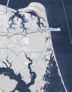
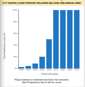
Surging Seas also allows you to compare projections taking into consideration potential policies regarding emissions and warming such as moderate carbon cuts vs. unchecked pollution. Global warming has already raised global sea level about 8 inches in the last 150 years and the rate is accelerating rapidly. These resources are incredibly fascinating to explore the potential impact of climate change on coasts.

The Surging Seas feature of Climate Central can be found at http://sealevel.climatecentral.org