Hurricane & Tropical Cyclones

Image

Weather Undergroundprovides a map for hurricanes and tropical cyclones. On this website, one can also find a hurricane archive which gives all the data from previous tropical storms dating back to 1851. For example, listed in the table under archives are things like the year they occurred, number of deaths, damage (in millions), etc. In addition, this site has a tab labeled “hurricane preparedness” where individuals can find resources and other helpful tips and tricks when preparing for an extreme weather event.

I think this website can be very useful when studying the impacts of hurricanes throughout history. I also like that it goes beyond the field of science and provides information on the economic loss involved with extreme storms. Beyond that, it can be strictly educational. People who do not live in areas prone to severe weather events can simply learn about and track them through here. While others who live in areas near the Atlantic coast or the Gulf of Mexico, having a map and satellite imagery showing current events will be very useful in preparation for a storm. Thus, this website can be a useful tool to a wide range of users. I find this website very interesting because I live in Florida, a state heavily impacted by hurricanes. Using the data and live trackers, it might help me be extra safe the next time I inevitably encounter a storm.

Source: https://www.wunderground.com/hurricane 

NOAA Sea Level Rise Map

This interactive map created by the National Oceanic and Atmospheric Administration serves as a highly useful tool in understanding where rising sea levels are occurring throughout the US and their effects. Using a vertical slider this website visualizes how sea levels ranging from 1 to 10 feet could affect coastal areas. It also includes information about the varying risk levels of counties along the coast in regards to flooding and possible damage. On a more local scale, the website allows users to select “local scenarios” to observe the projected sea levels for that specific area by year. In Richmond, our current intermediate level is approximately 0.5 feet, however according to the map, by 2100, this number is estimated to be 3.87 feet. Additionally, this map provides information about high tide flooding and the alteration of marsh areas over time

This information on this site can be used for both educational and preventative purposes. Data on what areas will suffer the most from rising sea levels and the approximate timeframe for when areas will become “high risk” can be used by both the local and national governments to create plans for mitigating these consequences. Not only will this provide a baseline for when and when actions must be taken, such as building floodwalls or elevating surrounding infrastructure, but I also helps people visualize this rapidly growing threat. Illustrating how many people and ecosystems are at risk due to rising water levels is an extremely effective way to get people to understand the severity of this situation, regardless of one’s education on climate change.


https://coast.noaa.gov/slr/

Earth:: a global map of wind, weather, and ocean conditions

https://earth.nullschool.net/ 

This website functions like google earth where you can spin the globe around, zoom in, and zoom out. However, instead of displaying satellite images, the earth’s surface displays patterns of wind, weather, and ocean movement. Using this site one can look at the live wind patterns such as jet streams and identify large ocean currents. Similarly, users can use the site to investigate trends in temperature seeing both the latitudinal and continental effects on temperature. Finally, this site can also be used to display concentrations of particulate matter and chemical pollutants. for example, users are able to see clear trends of higher CO2 levels in population centers.

Overall this site provides an easy to use interface to visualize and explore trends in abiotic factors including the atmospheric and hydrosphere conditions. This site could be particularly useful as a teaching tool. Teachers could ask their students to identify and screenshot areas of the world that exhibit the trends and patterns that are being taught, such as those related to the Coriolis effect, unequal warming, particulate matter, or ocean currents.

American Rivers

American Rivers is a website all about educating and influencing policy to protect wild rivers, restore damaged rivers, and conserve clean water for people and nature. They provide updates in science as well as social updates related to their mission.  They include have a sustainable approach by approaching this with the triple bottom line. They discuss how rivers connect to environmental justice, how they are economic engines, and the new policy in Colorado that is a win for healthier rivers.

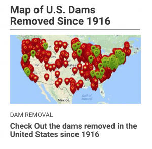
They go into a lot of depth on each one of their goals and the science behind what they do. For example, in their restoring damaged rivers section, they start by explaining key figures like how many dams have been removed since 1912 as well as a spatial analysis of this by providing a map.

Then they talk about all the different ways to restore rivers like restoring flood plains, replacing culverts, and river restoration resource centers.

They acknowledge a systems thinking approach by including information about energy development. Hydropower, mining, and fracking all contribute to river health. For all of their claims and steps forward, they provide external links and scientific research to support their information.

Coastal Change Hazards

The Coastal Change Hazards (CCH) site developed by the USGS features a plethora of information to equip anyone, average citizen or researcher alike, living near or simply concerned about any coastal area within the US. The CCH features information on a variety of natural phenomena that impact coastal communities including tides, waves, and weather – namely the hazards presented by severe storms, equipped with the Coastal-Marine Hazards and Resources Program (CMHRP). This information is acquired from Research, delivered to the Stakeholder Engagement and Communication (SEC) sector, and is applied in the Technical Capabilities and Applications (TCA) sector of the CCH program. Secondary pages within the CCH site include the Coastal and Marine Hazards Resource Program (CMHRP) -which includes a USGS Coastal and Marine Geology Data Catalog, a decadal strategic plan, and newsletter – Pacific Coastal and Marine Science Center, St. Petersburg Coastal and Marine Science Center, Woods Hole Coastal and Marine Science Center, and “science stories” about coastlines around the nation.

While coastal counties (with the exclusion of Alaska) account for only 10% of the landmass of the US, 40% of the nation’s total population occupies them!

https://www.usgs.gov/natural-hazards/coastal-marine-hazards-and-resources/science/coastal-change-hazards?qt-science_center_objects=0#qt-science_center_objects

World Meteorological Organization: Climate Indicators

This website provides a trustworthy source for climate data. The data presented is assessed, catalogued and verified by an International Expert Group on Climate Data Modernization (IEG-GDM) assembled by the World Meteorological Organization from various disciplines. This section of the website contains a list of seven (7) main indicators scientists use to evaluate the state of the climate. These indicators are: surface temperature, CO2 concentration in the atmosphere, ocean heat content, sea level, ocean acidification, sea ice, ice sheet extent, glacier mass balance, precipitation, and extreme indices for temperature and precipitation. These statistics all provide up to date information, most of the graphs showing data from 1950 forward to 2020. Additionally each of the 7 indicators feature data visualizations from a variety of sources. Pros of the website are that it is easy to navigate and the information is visually presented in a readable and straightforward format. Since there isn’t an overwhelming number of graphs for most of the indicators, I think it would be better however, to include a small description of the information being presented for each graph rather than requiring the user to open a link to another page for more information.

USGS’s Waterwatch

The U.S. Geological Survey’s WaterWatch displays data relating to hydrological events throughout the country in real time.  Interactive graphs, maps, and tables show streamflow, flood areas and drought areas. Maps and data can be viewed on both national and state scales.  Past streamflow data can be easily accessed. Annual summaries of streamflow data are also kept on this website. All this data can be displayed in a surprising number of ways.  WaterWatch’s toolkit section features 21 different graphs, charts, tables, and maps displaying and comparing streamflow data. My personal favorite is the customizable Streamflow Map Animation that shows streamflow data on a map over a period of time:

https://waterwatch.usgs.gov/index.php?id=ww_animation

The USGS stores enough water data to drown any student or professional researcher.  Such data is collected by over 3,000 USGS stream gauges throughout the country. Streamflow data is important to measure on such large scales because rivers and streams connect surface runoff to to large water bodies and groundwater.  Streamflow for all streams is therefore vital to the water cycle.

NASA’s Scientific Visualization Studio

NASA’s Scientific Visualization Studio (SVS) showcases a wide variety of NASA programs using striking images, animations, videos, and other visuals. By synthesizing complex scientific research and data with visual elements, the Scientific Visualization Studio creates a largely accessible platform to promote education and a broader scientific understanding of earth and space processes. The website has curated various galleries tied to specific NASA projects. These collections range from Air Quality to Astrophysics to Carbon and Climate projects. One of the featured collections is of ICESat-2, or the Ice, Cloud, and land Elevation Satellite-2, which launched on September 15th, 2018. ICESat-2 is NASA’s most advanced laser satellite instrument (ATLAS) and will be used to monitor changes in height, depth, and mass of ice sheets and glaciers with extreme levels of precision to better understand and predict sea-level rise. ICESat-2 will also provide essential information about forest vegetation, ocean surfaces, and urbanization, among other applications. To explain what the ICESat-2 project is hoping to accomplish and how they have gotten to this point, the SVS with Goddard Media Studios has produced many videos that explore the importance of ice sheets, how the laster altimeter technology works, and even documenting the 470-mile research expedition in Antarctica that accompanied this project. This website, with its galleries of scientific information and mapping related to climate change, glacial melt and sea level rise, hurricane and storm impacts, stratospheric ozone depletion, and forest fire intensity and prevalence are all topics we have discussed in our class. Additionally, projects like ICESat-2 demonstrate how different remote sensing technologies are being implemented for environmental and geographic research purposes.

Lightning Maps.org

This website tracks present lightning strikes and includes a database of past lightning, using colored dots on a world map to show the locations of strikes. The map on the homepage updates almost in real-time, with a delay of only a second or two, allowing you to see lightning as it strikes in Europe, Oceania, or North America. You can also use the website to see past lightning strikes in each of the regions, and you can view this information either as still images or in animations that show the lightning throughout a given day. In addition to documenting the lightning strikes themselves, the website also keeps track of the density of strikes, or how many strikes are occurring in close proximity to each other, and information on the the number of strikes that have occurred within any month in 2011 or later and for each full year in 2011 or later is also available.

The content of this website relates to our course in that it allows for a visual representation of storm systems through the electrical charges they produce. For example, when I looked at the real-time animation, the enormous number of lightning strikes occurring in the Gulf of Mexico indicated there was probably a large storm or storm system in the Gulf at that time. Similar evidence suggested to me there probably was a storm occurring in far Southeastern Australia. This website, examined over a period of time, would allow for an increased understanding of the trends affecting the development of storms likely to produce lightning. Such storms may be from larger systems, such as midlatitude cyclones, or they could be the result of isolated convection patterns in areas such as beaches, cities, and cropland. Nevertheless, the representation of lightning overlaid on a map allows for an understanding of where lightning-producing events tend to occur, and in which locations larger storm systems are likely to cause lightning and in which locations it is more likely that an isolated event is the cause. Additionally, the graphs available on lightning patterns over a period of months or years provide the opportunity to observe any trends in lightning strikes that may take place over time and to determine in which parts of the year lightning tends to strike the most.

NASA – State of the Ocean

NASA has created an online tool called “State of the Ocean”. This tool displays an interactive map of the world’s oceans populated with data collected from satellites. Users can select which data is being presented on the map to learn about variables like temperature, currents, and salinity. For variables with years of data collection, users can select specific date ranges to view change in one variable in a particular time frame. For example, if I wanted to observe changes in surface temperature off the coast of Vietnam between 2012 and 2014, I could easily do so and even create an animation so the map will visually change. This tool is useful for oceanographers who use this data and it’s fun to use.