ScienceDaily: Your resource for the latest research news

ScienceDaily is one of the most popular scientific websites. About 5,000,000 people visit this website monthly. One of the reasons that people prefer this website for their scientific research is that it is well organized and easy to search for topics that they want. The site has five big categories on the top: Health, Physical/Tech, Environment, Society/Education, and Quirky. There are more specified categories below these five categories like Space and Matters, Animals and Plants.

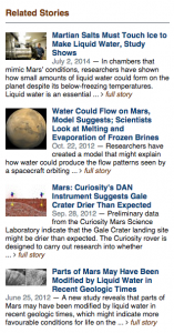
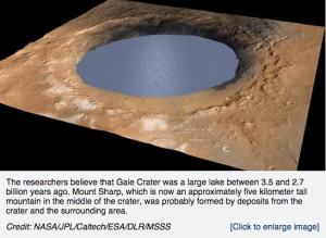
For example, if you are looking for a resource about Mars, you will go to Physical/Tech, Space and Matters, and click Mars. There is a research about Marsh might has a salty water. It provides summary of the news and information about the laboratory where the research was done. You will see the recent researches about Mars and the related stories additionally on the right side. In addition, “Related stories” section that recommends further research is shown based on your search topic. It helps you to gather more related information about the topic and to develop your study once you search, so that you do not have to search several times.

Screen Shot 2015-04-15 at 1.00.38 AMScreen Shot 2015-04-14 at 11.50.19 PM

The website is designed well for the young people who are interested in scientific issues. It has a Facebook page, Twitter, and Google+ so that you can get the latest news through them. And the website allows you to share the news on Facebook, Twitter, and Google+ simply clicking “Share this”.

The website is useful for our course, Geography 250 because it has great amount of resources about physical geography including Atmospheric, Biospheric, Hydrospheric, and Lithospheric news. In Space & Time section, there are detailed resources about space that can be linked with what we learned in chapter 3, the atmospheric composition. The earthquake news of the website announces a recent issue about the earthquake like Japan Quake and Tsunami Spurred Global Warming which can be associated with Chapter 12.

LiveScience

This website (LiveScience) does not just deal with geography topics specifically, as it offers a broad range of news sources and studies relating to a variety of scientific fields. Many of these stories relate to physical geography.  The website offers a variety of news stories, videos, and images concerning topics like health, space, and animals. The main tabs that I focused on covered “Planet Earth” and “Space.” The stories found on the “Planet Earth” included a large range of topics that we have discussed in class, such as the effects of global warming, access to freshwater, and the state of coral species who are reacting to warmer waters. The “Space” tab provided information such as the effects asteroids could have on Earth and Earth-size planets that could support life. All of these news stories are easy to read and include links to further scientific resources that could be used to learn more. Most stories are also accompanied by videos or photos to help illustrate the story.

LiveScience also shows the scientific topics of the day that are “trending,” such as global warming or military and spy technology. This site also offers links to other additional resources that relate to these scientific topics.

Overall, it is a helpful compilation of recent news stories that relate to a variety of scientific topics. They are fairly easy to read and can be understood by the general public. Based on our recent discussions in class, websites like these could be a helpful link to bridging the gap between the scientific community and the public on matters like global warming.

To visit the site: http://www.livescience.com/.

BiosphereSmart

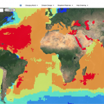
The website that I chose is an interactive tour of the world. The purpose of the website is to visually show how climate change has affected or will affect the Earth and its systems.  It’s also provides a good visual summary of how much humans have impacted these systems. It offers 4 categories to choose from: Changing World, Climate Change, Biosphere reserves, and Help greening. In changing world, users can choose from one of Earth’s 4 systems: Lithosphere, Hydrosphere, Atmosphere, and Biosphere as well as a 5th one, Antroposphere. Within each system, users can choose a variety of topics that are associated with each system and can visually see the distribution or levels of each topic around the world. Climate change category is of course all about climate change and it’s causes. Users can visually see all the changes that occur with climate change and where on the planet will be most affected. Biosphere reserves category shows the many reserves and world heritage sites on the planet today and their boundaries. Finally the last category, Help greening, talks about how humans can help to slow down climate change and make a contribution to the healthiness of the Earth.


This is a really good website in which it isn’t just about giving facts and information but provide visually appealing graphs/data/pictures, allowing users to quickly determine where on the Earth each topic is occurring. It provides a sense of scale. I really liked the website because instead of actually reading about what’s going on in the planet, I get to actually see how much damage is occurring to the world and where. And so this website relates to everything that we have been learning in class.

http://www.biospheresmart.org/#


Breathing Earth

The Breathing Earth simulation website is really interesting because it shows country by country the amount of tons of CO2 admitted for a certain time period, usually a minute or two, since you’ve been watching and per person. It shows, by color the countries who admitting the most and those who are admitting the least. Lastly, it shows the population of each country, how much it’s growing or decreasing and how many people are being born and dying while you are watching.

This site does a really good job of connecting different aspects of CO2 emissions, in terms of different countries and people. I think being able to compare population and emissions of different countries with each other is a really useful tool, it shows the countries, like America, which are really using more than they likely should be, in terms of population proportion. It is also really useful to see counties that are not currently emitting a lot of CO2 but have rapidly increasing populations, for instance many in Africa, to think about how these pollution may increase as their population do, especially with increasing modernization globally.

This website is relevant to what we are doing because it addresses pollution and human impact on the world, especially in the greater context of human development and changes that are occurring as a result. While it obviously isn’t completely accurate as we don’t yet have the technology to provide real time data with such speed and precision, it is based on reputable statistics and does well to prove the point its trying to make. At the bottom of the site the creators have also provided information on where their data comes from, why it is important and what can be done to reduce emissions on a personal level, which I find to be very helpful and interesting.

http://www.breathingearth.net/

Combining Geography and Art

In science, findings and knowledge are usually spread through papers and reports that are usually contained within the scientific community. Terrain.org is an online journal that helps ordinary people, environment enthusiasts, and experts spread their thoughts and findings through a very different channel: art.

On Terrain you can find literary art like poems and prose; you can find visual art like photographs and videos; or you can read informational pieces through nonfiction work, columns, interviews, and articles about urban centers. Terrain tries to connect the physical and natural environment to the built and human environment. Readers and viewers can really gain insight on issues involving these two contrasting realms. Terrain says that “the works contained within Terrain.org ultimately examine the physical realm around us, and how those environments influence us and each other physically, mentally, emotionally, and spiritually.”

Although the works are more personal pieces and not based on experimental findings, all topics pertain to either environmental/geographical issues or an individuals personal feelings on the topic. It’s a unique space and translator for the natural environment and gives a different perspective to physical geography than what we usually encounter in class.

Suggested Pieces:

BioMap2: Conservation Roadmap for Massachusetts

Antarctica: A Year in Photos by Ben Adkinson

Interview with Andres Duany ( Founder of Duany Plater-Zyberk & Company: the architectural firm in charge of the East End Transformation Project in Richmond)


The Climate Wizard

The Climate Wizard is an interactive map that allows users to view the future predictions for temperature and rainfall as well as historic records for any area in the world; available at http://www.climatewizard.org/ The Climate Wizard allows users to specify analysis area, time period, climate model, average temperature or precipitation, and average or change. Analysis area allows users to select either global or specific regions, such as a state, although increased zoom is available.  Climate model can also be changed to see different prediction levels; low, medium, high.

The interactive map allows users to visualize what a particular region of the world will look like in 2050 or 2080, hopefully educating users on the changes that can be expected. The Climate Wizard also allows users to look back over the past 50 years to see changes that may have already occurred. Modeling precipitation and average temperature may also help local governments and policy makers take climate into account in decision making.

The Climate Wizard was developed in a collaborative effort by The Nature Conservancy, University of Washington, and the University of Southern Mississippi in 2009. The data for creating the predictions for specific regions of the world was gathered from Oregon State University and a variety of other contributors that model changes in precipitation and temperature.  The Wizard uses data and predictions from the IPCC fourth report. Hopefully the Climate Wizard will be updated with the predictions from the IPCC fifth report.

BBC – Climate Challenge

With scientists around the world gathering data in support of climate change accelerated by human factors, the BBC created a game to introduce some of the dilemmas this may present to governments around the world.  The goals of the interactive atmosphere is to give players awareness of what causes climate change, describe policy options available to governments, and give a sense of the challenges facing international climate change negotiators.

In this interactive game, you play as the president of the European United Nations, and you represent part of the Intergovernmental panel for climate change.  The game consists of ten turns, with each turn representing a decade.  In each turn, you choose up to six policies to enact during the decade, which impact the economic standing of the European nations, as well as energy, food, and water factors.  Some policies also have a positive or negative environmental impact, to reduce or cause more emissions linked to climate change.  Linked with these policies are popularity meters, based on how the public likes or dislikes the proposed policies – as the President of the European United Nations your job is to establish a strong policy on climate change while keeping the countries happy with your decisions and healthy so that they will continue to elect you to the intergovernmental panel for climate change.

The policies that you choose from in the game are based on actual governmental policy documents (except for those near the end of the game in more futuristic conditions).  The scale of the decisions and their impact was scaled back to a single turn for simplicity, and even with this simplistic model the game presents the player with good background knowledge on where policy makers may be having the most trouble meeting climate change requirements and ensuring cooperation with politicians from other governments.

When I played the Climate Challenge, I tried to meet every goal set for the climate reduction plan every 30 years (3 turns).  While I was effective in keeping my popularity up for the majority of the game and successfully meeting environmental and emission standards, sometimes my concern for the well being of the people in the European Nations wasn’t as high as it should have been. My results page showed scores of Environmental policy: 89% effectiveness; Wealth: 13% effectiveness; Popularity: 20% effectiveness.

The content of the game does a remarkable job of highlighting different consequences for potential actions, placing the player in the role of a politician fighting to recognize climate change and enact policies corresponding to their impact on reducing human impacts on climate change.  It is easy to get lost in the game, learning as you make policy decisions and seeing the potential impacts on the status of nations having to enforce these policies.

The link to the game is here: http://www.bbc.co.uk/sn/hottopics/climatechange/climate_challenge/

A link to the background and description of the game is here: http://www.bbc.co.uk/sn/hottopics/climatechange/climate_challenge/aboutgame.shtml

GeoGuesser – Let’s Explore The World!

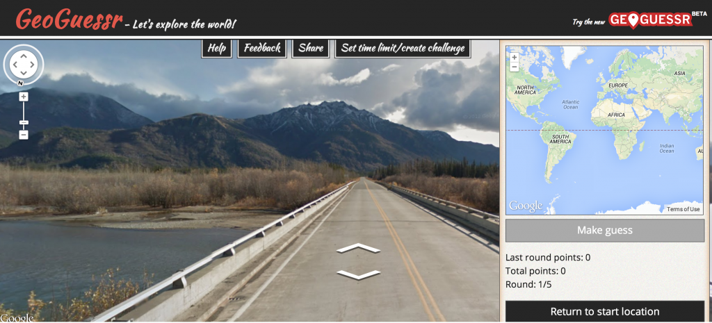
Use your knowledge of the lithosphere, pedosphere, and biosphere to guess where in the world these google map locations are!

Think you’re a geography expert? Test your knowledge with BBC Travel’s Geoguessr – the game that proves how well you know the world! As we explore the Lithosphere and Pedosphere and Biosphere check your skills against your knowledge. First, move around using your mouse and figure out where you are. Do you see some rich, red soil? What about volcanoes, palm trees, deserts, or oceans? Using your physical geography knowledge, try and guess where in the world you are located.Then click on the map in the lower right hand corner to place your marker (zoom in to increase your accuracy). When you’re sure, click the “make a guess” button, and find out how close you were!

Over 5 million miles of roads in street view by June 2012.

Unfortunately, because the site relies upon google maps, all locations will be along roadways limiting the world to just the 5 million miles of roads with street view images in over 39 countries.  Once you’ve mastered the basics, challenge my most recent score by clicking on this link. The world’s a huge place – get exploring and post your highest scores in the comments below!

Find out how close you were to each guess!

Breathing Earth—A Simulation of CO2 Emissions, Birthrates, and Death Rates

This website offers viewers an interesting and interactive way to conceptualize global CO2 emissions, as well as the birth and death rates of different geographical locations. The simulation uses statistical data for these different rates to provide general information about worldwide trends. The changing colors and the flashing dots and symbols explained in the key allow you to absorb the areas of highest CO2 emissions, as well as the highest birth and death rates by simply watching the map. As this simulation is interactive, you can also place your cursor on areas of the world that interest you to learn more about their specific rates. In the U.S., for example, one person dies every 12.1 seconds, one person is born every 7.4 seconds, and 1000 tons of CO2 are emitted every 5.3 seconds. If you click on a country, a box pops up suggesting useful climate change websites for that particular country, and on the bottom righthand side of the page, there is a box that shows how many tons, births, and deaths have occurred while you’ve been on the page.

Though we often hear or read statistics about increasing population and dangerous levels of CO2 emissions, this website applies these statistics to a world map, and thus allows us to visualize the areas in which these rates are the most problematic. By poking around on this page, I not only feel that I gained a slightly better sense of the the way these trends play out on a global scale, but I also found several other interesting websites about climate change that are specific to certain countries or areas of the world.

www.breathingearth.net