GEOLOUNGE

GEOLOUNGE is an informational and interesting website. It has information about physical geography, human geography, maps, and more. Under the physical geography tab, they have tabs for biogeography and climatology. After learning about both biogeography and climatology in our class, I was intrigued by the different articles that I found. I wanted to share this article, “These Wolves in Minnesota are Very Very Territorial” that is posted on their site because it relates to our class. The article discusses how researches have used GPA collars to track the movements of 7 wolves at Voyageurs National Park in Minnesota. The data that was collected on the wolves locations is being used to understand pack boundaries and for the Project’s predation research. The screenshots I have included below show the travel paths for each of the wolves. The travel paths show how each pack adheres to territories with little overlap with other packs in the area. I thought GPS tracking of the wolves is an interesting concept and could be used to track more animals and possibly provide insights about animals travel habits which could be used to make better protected conservation areas. 

After reading this article, I clicked on a related link: “Using Remote Sensing for Mapping and Counting Animals.” This took me to GISLOUNGE, which is also another interesting and informational site, related to GOELOUNGE. 

Global Cropland Cover

Link

This website is an interactive site created by the United States Geological Survey that shows global crop production. Specifically, it produces visualizations of cropland extent/area, crop types, irrigated versus rainfed agriculture, cropping intensities, and cropland change over space and time. The data is projected using 30-meter resolution derived with Landsat imagery and examines over 1.8 billion hectares (12.6 percent of global  terrestrial area) of cropland. It also has a feature that shows where human settlements are located which is interesting because it can show disparities of food production and brings into question how certain places became large settlements. It relates to our class because of its use of Landsat, but also because of the interaction of the lithosphere, atmosphere, and hydrosphere that create the biosphere and dictate where crop production occurs. (https://www.usgs.gov/centers/wgsc/science/global-food-security-support-analysis-data-30-m?qt-science_center_objects=0#qt-science_center_objects)

NASA’s App, Earth Now

Looking online at NASA’s website, I saw that they released an app called Earth Now. I was interested and downloaded the app (its free). Earth Now shows you recent global climate data from Earth Science satellites. You can choose to see different elements including surface air temperature, carbon dioxide, carbon monoxide, ozone, water vapor, and gravity and sea level variations. The 3D model of Earth will show a color-coded visualization of the relative strength or weakness of an environmental condition. The app tells you the latest events going on around the world as well. It is real time and will show the most up to date data that it has. You can also go back in time to see how the environmental conditions have changed. This is a really great app because it allows you to stay up to date by checking on your phone (especially when everyone seems to be on their phones these days). This is app is very beneficial because it is an easy way for people to stay up to date and informed about the current environmental conditions of our Earth. 

I have posted screenshots from my phone of Sea Level Variation and Day Air Temperature. The third photo shows the Earth when you open the app, and it has its latest event: Phytoplankton bloom off South Africa. It also provides further information about each environmental condition and other options for viewing the data.

National Geographic Biosphere

For those interested in learning more about the biosphere, National Geographic’s page on the Biosphere provides a plethora of useful information. This could be a tool utilized by geographers as a reference, particularly for those who either are just beginning In their field or those who are interested in becoming geographers. The page begins by defining the biosphere, which is made up of the parts of earth where life exists. The webpage is broken up into three parts. It begins with an introduction, followed by information regarding the origin of the biosphere, and concluding with information regarding the biosphere reserves. Another useful tool the site provides is a vocabulary tab, which defines various key words which are used throughout page.


Shark Attack Data

Shark Attack Data is a cool website that complies human and shark interactions around the world. It logs shark attacks by either provoked, unprovoked, fatal, or non-fatal. It describes each attack by date, location, type and size of shark, and the activity the person was doing at the time of the incident. The main goal of the website is to increase understanding, and to promote informed discussions on shark attacks. The data comes from the Global Shark Attack File and is compiled by the Shark Research Institute. The website helps you understand where and how shark attacks occur and how they have changed over time on a global scale. You can click on any country to find their statics and data on shark attacks. However, there are some gaps and missing information in some of the logs, but regardless it still provides useful information.


NASA Worldview

Interested in visualizing how the earth has changed over time in terms of sea temperature, air quality, or flood hazard? NASA’s interactive website, Worldview, uses satellite imagery taken over the past 40+ years to help communities visualize the changes that have taken place over time.

Worldview was created using NASA’s Earth Observing System Data and Information System (EOSDIS) to create 800 satellite imagery layers, allowing individuals to view time-stamped changes in critical focus areas such as wildfire management, volcanic eruptions, tropical storms, and more. Layers are categorized based on topic, as shown below. Users can even view layers based on ‘Science Disciplines’– which separates layers into categories such as Atmosphere, Biosphere, etc.


Worldview also allows users to interpret data using different scales! While global data may be valuable for some users, others may benefit from more smaller, more localized scales. Worldview’s zoom capabilities allow users to visualize data from the scale that meets their individual need!

Check out Worldview yourself: https://worldview.earthdata.nasa.gov

USAID’s Biodiversity and Conservation Efforts


USAID, the US State Department’s foreign aid program, offers a number of initiatives focused on conservation and limiting climate change. They list goals to promote biodiversity in all areas, not just in wealthy countries. Poor countries deal with issues like poaching and destruction of wilderness for fuel which may not be as prominent in wealthier countries. The site goes in depth into statistics of the importance of conservation and biodiversity. They offer suggestions and examples of the implementation of their efforts in foreign countries. For example, their efforts helped secure indigenous peoples land in the Amazon, limit restaurants serving shark fins, and create sustainable forests through promoting sustainable cutting and selling of wood products in Cambodia. There are a number of cool, interesting, and in depth links on the USAID site under the Environment and Global Change tab. https://www.usaid.gov/biodiversity/policy lists the strategic plan of the organization to conquor biodiversity loss. It is interesting to see such a globally influential organization at work. These are goals that are being implemented globally. These policies have the change to affect very diverse lands. Some further topics on the website include sustainable urbanization, property rights, and sustainable tourism. All of these relate to conservation and the protection of the biosphere. With efforts like these, the biosphere will be more heavily protected against threats.

Tracking Animal Migrations

Movebank is an online database that provides an international space for the collection of animal tracking data. Thousands of researchers input data they have collected on animal movement. They fit animals with trackers and plot the point on a map to look at their spatial relation. This database uses GIS technology to track the movement of animals, on a local level as well as across continents. This information helps scientists learn more about climate change, habitat loss, and other environmental issues we have discussed in this class. The way animals migrate can  This is similar to the research of the interviewing professors who used GIS technology to track the impacts of climate change on our environment. National Geographic featured this database on their website to talk about key species which are endangered. Scientists can use this information to track a species’ ability to recover from the endangered list. This database is super helpful and lets

NOAA Interactive Natural Hazards Map

The National Oceanic and Atmospheric Administration (NOAA) has an interactive map called the Natural Hazards Viewer. This map contains data on both recent and historic significant natural disasters. The dataset includes tsunami events, tsunami observations, significant earthquakes, significant volcanic eruptions, volcanoes, Deep-Ocean Assessment and Reporting of Tsunamis (DART) Deployments, plate boundaries, tsunami times, and selected significant tsunami events. When browsing the user can select which type of hazard they would like to see information on, and then the user can select different data points detailing these events.  There is a wide range of information available between points, some simply contain the date, location, and type of event, while others contain information on the fatalities, social and economic impacts, and information on the individual witnesses, and the events leading up to the natural disaster.

NOAA’s Natural Hazards Viewer compiles a large quantity of information natural disasters onto an easy to navigate and interactive interface. They get their data from the National Geophysical Data Center, which records data on earthquakes, tsunamis, and volcanic eruptions, in order to support research, planning, and mitigation efforts.  I thought this was a really interesting use of GIS in order to create a map that not only compiles all the spatial data, but contains all the social and economic data as well. I would definitely recommend everyone play around with this website at some point, it is a really fascinating, freely available resource!

https://maps.ngdc.noaa.gov/viewers/hazards/

NOAA Marine Protected Areas Network

Have you ever wanted to learn more about marine protected areas (MPAs) in the United States? Look no further than the National Oceanic and Atmospheric Administration’s (NOAA) website completely devoted to MPAs.

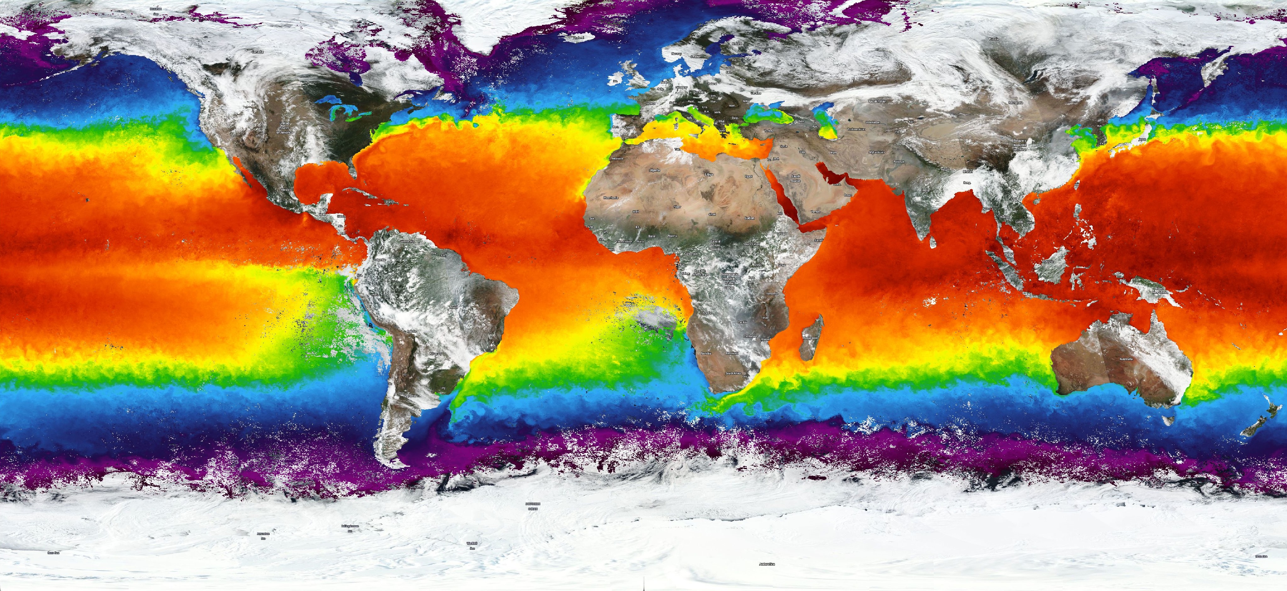
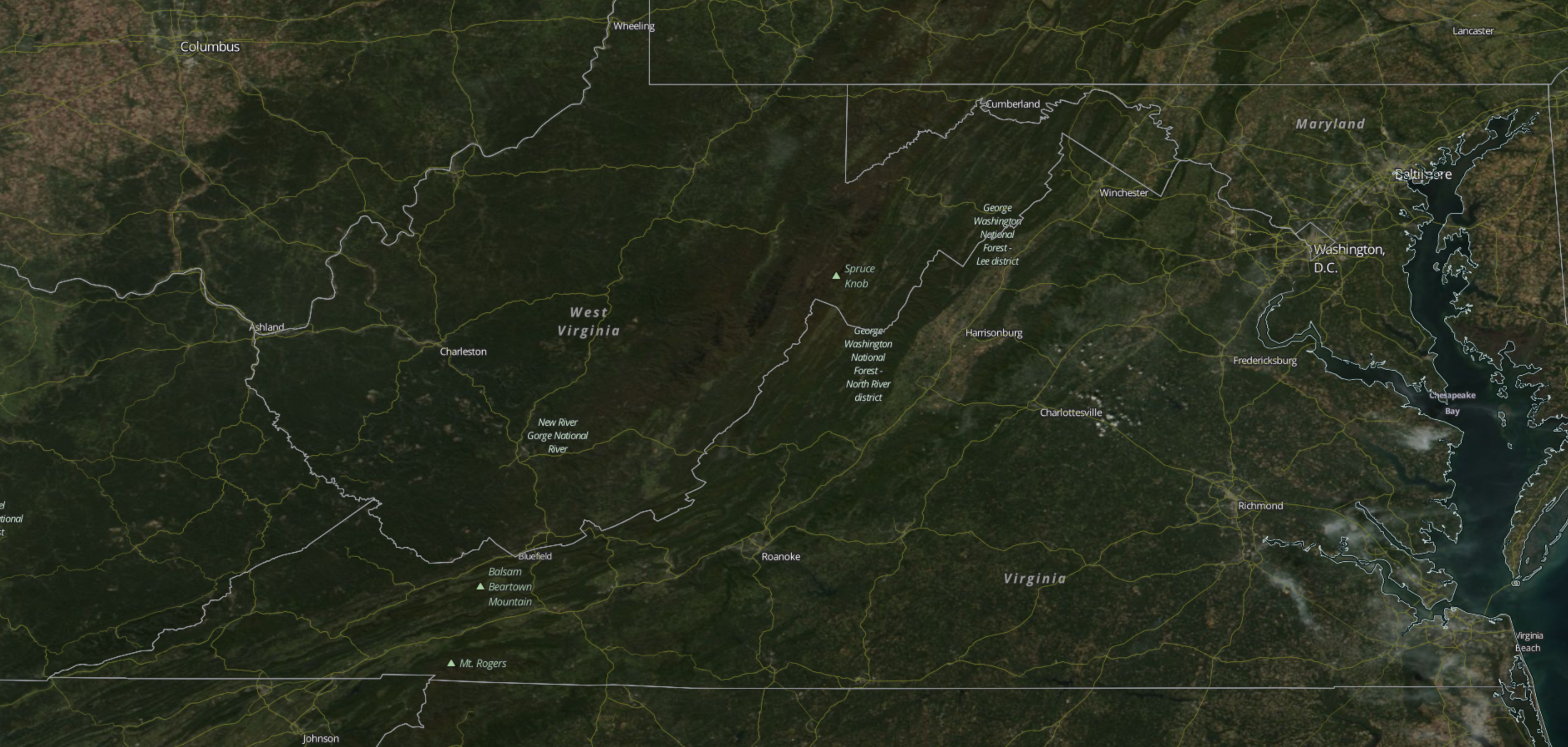
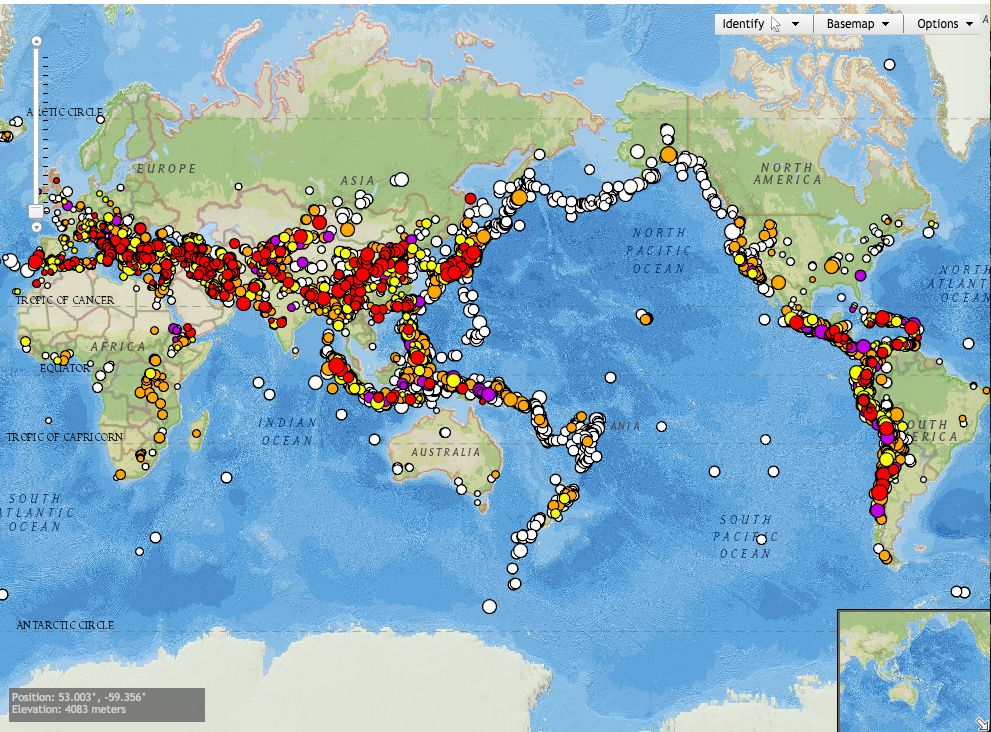
The about section defines MPA as “a broad term for a park or other protected area that includes some marine or Great Lakes area” and gives information on the classification system used for MPAs that describes MPAs in functional terms using five characteristics common to most MPAs: 1) conservation focus; 2) level of protection; 3) permanence of protection; 4) constancy of protection; and 5) ecological scale of protection. MPAs are important for conservation of oceanic ecosystems and can be found all around the country and world. The website contains numerous informational sections and content for viewers of all ages and levels of knowledge on MPAs. One feature is an interactive MPA Date Viewer that allows visitors to click on any of the 1600 MPAs in US waters  on a map that have been compiled in a database by NOAA’s Marine Protected Areas Center on a map and view information on them.

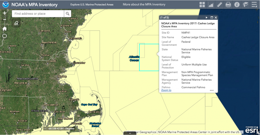
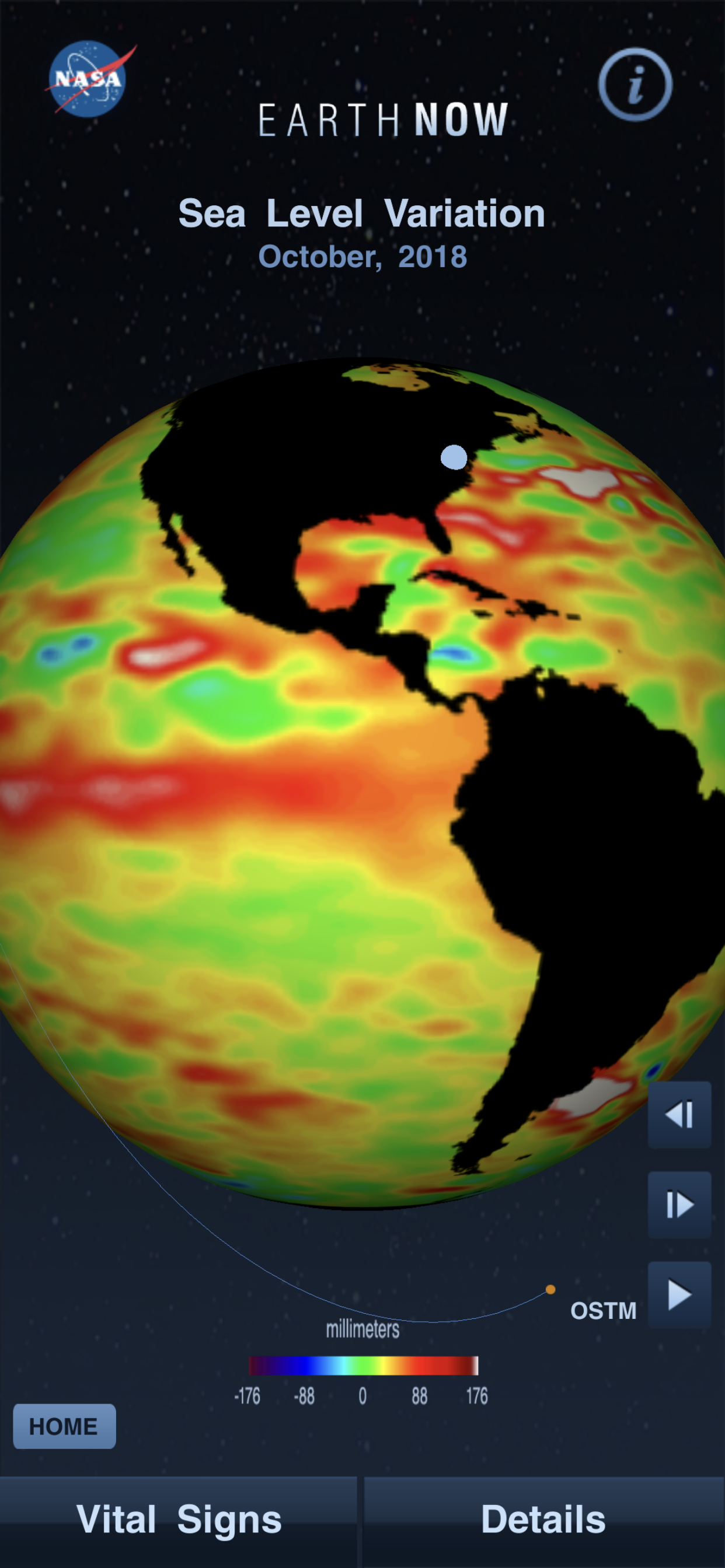
Example of MPA Data Viewer in use

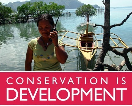
NOAA also provides an extensive management section, which contains a section on Ocean Use Data with pdf documents on regional ocean use data, which are slightly dated, ranging from 2015 to 2010.  For example, the most recent is the Pacific Regional Ocean Uses Atlas, which was designed to document a full range of human activities and sectors in the ocean to support offshore renewable energy planning in the Bureau of Ocean Energy Management’s Pacific region. Along with the pdf document GIS data is also provided. One part of this page I found interesting was their participatory ocean use mapping process, used to gather ocean use data by engaging local and regional ocean experts through interactive mapping. This allows NOAA to more effectively collect data on MPAs while engaging a wide range of people that use these MPAs on a daily basis. Along with this, the website contains numerous informational pdfs on a wide variety of topics and studies involving MPAs. For further reading and an example, the informational pdf “Marine Protected Areas Building Resilience To Climate Change Impacts” can be found here.

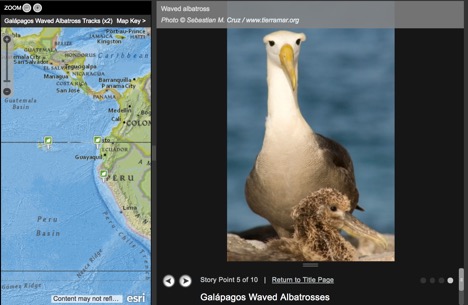
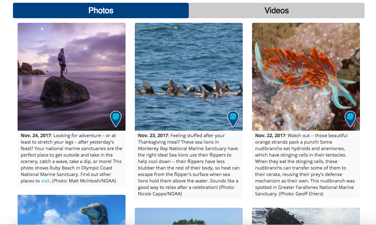
Another great section of their website is the Experiencing MPAs section, which is meant for all visitors. The page greets visitors by saying “The best way to understand and enjoy our nation’s diverse MPAs is to visit. But for now, you can dive in from wherever you are to our MPA viewer, multimedia page, blog and more.” The page provides links to the subsections MPA Viewer, Multimedia, Marine Protected Areas Blog, and What Can You Do. The multimedia section contains numerous phots and videos of MPAs as well as podcasts produced by the National Ocean Service. My favorite part of this is Earth Is Blue, a blog where NOAA’s Office of National Marine Sanctuaries posts a photo each day and a video each week highlighting the wonder and beauty of marine sanctuaries and MPAs and the work they do to protect them.

I have only just barely scratched the surface of all this website has to offer. Be sure to give it a look!