Map of the Week: The Life of Plastics

Plastic plastic plastic. What started as a convenient, effective, and cheap way to revolutionize medicine, travel, safety, and water consumption has turned into the world’s most significant environmental issue. The map “Tracing the Life of Plastics” by Malaika Rosenfeld and Lynn Miranda shows the complex migration of plastics from their origin of consumption to the ocean gyres that consume and collect plastics that made their way into the ocean’s ecosystems. (Plastic Pollution, 2019)

Plastic’s stronghold on the environment started less than a century after its creation. Chemists created plastic from synthetic polymers, and although found in nature, synthetic polymers do not decompose quickly. Plastics soon became a staple in consumer products such as candy wrappers, plastic bags, and water bottles, used by millions every day, but only for a few minutes to an hour before they are thrown away. The “throwaway” culture of plastic created continues to harm the environment, particularly the oceans, for years because although “throwaway” plastics are used frequently and quickly, their life span is long, taking at least 400 years to break down. (Plastic Pollution, 2019)

According to National Geographic, half of the plastics ever made have been produced in the last 15 years as production increased from 2.3 million tons in 1950 to 448 million tons in 2015. Furthermore, every year, about eight tons of plastic make their way into our oceans to make matters worse. (Plastic Pollution, 2019) By this logic, all of the plastic ever made is still sitting on the earth somewhere, mostly in our oceans, slowly decomposing and creating adverse effects on marine life.

This worldwide crisis seems to be never-ending for two reasons: misinformation and societal neglect. To stop plastic pollution, the US created a recycling goal to increase the national recycling rate to 50% by 2030. This effort was put in place to keep up with the changes in worldwide plastic consumption but failed to solve the problem. Wilkins (2018) reports that “more recycling won’t solve plastic pollution” because although individual recycling efforts have spread across the country, the problem is too significant for individual people to fix. Instead, Wilkins (2018) says, “recycling plastic is to saving the Earth what hammering a nail is to halting a falling skyscraper,” too little. However, consumer industries, such as Coca Cola have created a false narrative that consumers can help with plastic pollution by recycling and being environmentally friendly. Instead, the real problem is large corporations’ inability to change the materials that they use to produce goods and their manufacturing processes that add to the problem. (Wilkins, 2018)

This false solution came to a head in the past couple of years as companies tried to reduce the number of plastic products produced and consumed. A paper straw initiative spread across the US to start the reduction of plastic but was met with pushback from the public and those purchasing the products. (US EPA, 2020)

I can speak on this from personal experience as the paper star initiative was introduced to the University of Richmond in 2019, my sophomore year of college. As a self-proclaimed coffee addict, I used plastic cups and straws multiple times a day, thinking that if I just recycled them, I would be doing my part, naive to the actual hold plastic had on my life. When I entered my University’s coffee shop one spring morning, I was met with utter disgust as I was handed my iced coffee, in a plastic cup, with a paper straw. Silent at first, my contempt for this paper straw grew as it became soaked with the liquid from my cup. If I did not drink my coffee fast enough, I found myself unable to even slurp from my soggy, bent, and misshapen straw. I started asking for plastic straws, which was unhelpful to the initiative, and my family even began buying plastic straws from the store in case they were ever given a drink with a paper one. This was my contribution to the second issue of plastic pollution. I did not realize that recycling did not significantly affect the environment, nor did my peers. We did not understand that plastic took over 400 years to decompose because we were raised in the age of recycling. This societal refusal, both individually and by corporations, is the reason that plastic pollution is so high to this day.

Because of my ignorance, I choose “Tracing the Life of Plastics” as the “Map of the Week” because I have experienced the same misconceptions that I believe sparked the creation of this map in the first place. “Tracing the Life of Plastics” is not a complex map; it is a classic map of the world created by National Geographic. Rosenfeld and Miranda adapted a classic map with hand-drawn keys and graphics showing the journey of plastic. The map shows the journey of plastics from where they were initially consumed to where they remain on the ocean floor waiting for decomposition. It provides insight into how much plastic each major country consumes and the amount of plastic that accumulates in each ocean. In addition, the map uses pathos to appeal to the audience in a rhetorically unique way by adding a picture of a fish with a thought bubble that states, “plastic debris have been found in around 700 marine species”, making the problem a reality by relating it to living marine life, a tactic that was extremely useful in the paper straw movement. (Rosenfeld & Miranda, 2019)

Rosenfeld and Miranda’s additions to the map allow viewers to recognize many individuals’ misconceptions about plastic pollution and recycling. The map draws attention to the production of plastic as the problem instead of individual mistakes, by reporting the “Top 5 PET Plastic Producing Regions” with China producing 27%, Asia and India producing 23%, Europe and North America both producing 17%, and the Middle East producing 9% of the world’s plastic. (Rosenfeld & Miranda, 2019) By doing this, Rosenfeld and Miranda proved Crampton and Krygier’s (2018) argument that “today’s critical movement is part of a longer cartographic critique” of mass media. We as a society have relied for centuries on trained cartographers to show us what our world looks like and what problems should be seen spacially. Therefore, the new wave of critical cartographers such as Rosenfeld and Miranda reject authority’s portrayal of reality and instead “illuminate[d] the role of space in people’s lives by countering generalized and global perspectives” that were previously created about plastic pollution and recycling. (Crampton & Krygier, 2018)

Rosenfeld and Miranda used “everyday mapping”, a technic that allows anyone to map not only cartographers, by using an open-source map that classically portrays the globe and inserted knowledge on plastic previously left out. Their knowledge insertion did not undermine information that was already provided; it just drew attention to an issue that was already there but left out of the mass-made cartography. By doing this, Rosenfeld and Miranda created a political critique of knowledge by adding alternative information that could, in turn, influence their audience, bringing attention to an important social issue. A political critique of knowledge, spoken about in Crampton and Krygier (2018) competes with already existing information that is not regularly displayed by those in power. This map is a political critique of knowledge becasue makes competing but powerful claims on the social issue of plastic pollution, an issue often neglected. (Crampton & Krygier, 2018)

This knowledge does not undermine the classic map. Instead, it implicitly critiqued previous cartography by providing new knowledge to the public that others left out. This implicit critique coincidence with Michael Foculat’s thoughts that “the critique of what we are is at the one and the same time the historical analysis of the limits that are imposed on us.” What are these limits? Moreover, who is imposing them on us? Mass media and consumer corporations would prefer to blame plastic pollution on the consumers instead of the habits they refuse to break. (Crampton & Krygier, 2018)

References

Brown , N. (n.d.). Debris Free Ocean . The Life Cycle of Plastics. Retrieved 3 January 2022, from https://debrisfreeoceans.org/the-life-cycle-of-plastics
Crampton, J. W., & Krygier, J. (2018). An introduction to critical cartography.
Plastic pollution facts and information. (2019, July 6). Environment. https://www.nationalgeographic.com/environment/article/plastic-pollution
Rosenfeld , M., & Miranda, L. (2019). Tracing the Life of Plastics . https://www.guerrillacartography.org/atlases-download
US EPA, O. (2020, August 26). U. S. National recycling goal [Announcements and Schedules]. https://www.epa.gov/recyclingstrategy/us-national-recycling-goal
Wilkins, M. (2018). More recycling won’t solve plastic pollution. Scientific American Blog Network. https://blogs.scientificamerican.com/observations/more-recycling-wont-solve-plastic-poll ution/
Posted in Maps of the Week | 4 Comments

Atlas of the Week: Global Sports

https://googlemapsmania.blogspot.com/2020/01/the-global-sports-atlas.html

This atlas showcases the different mappings and information on sports across the world. Being a college athlete, sports have always been an important element of my life and have allowed me to recognize how culturally important they are. In class, we discuss how maps can showcase culture across the different spheres and are huge proponents in showcasing our past, present, and future (as Wood would say). Sports play a role in the culture of different areas and this site allows us to explore that idea.

Posted in Atlases of the Week | Comments Off on Atlas of the Week: Global Sports

Link of the Week: Maps of College Football

https://www.sbnation.com/college-football/2014/8/20/6030683/25-maps-that-explain-college-football

The link above is a mapping site/blog that explains college football through maps. This site includes maps of the geographical areas of teams, the history of college football, playoff expansion, and other information. My favorite part about this site is how it maps the USA based on favorite teams within each state/area which I thought was a cool visual. People are also able to comment.

Posted in Uncategorized | Comments Off on Link of the Week: Maps of College Football

Atlas of the Week: Global Conflict Tracker

https://www.cfr.org/global-conflict-tracker/?category=us

The Global Conflict Tracker provides resources, background information and visuals regarding all the international conflicts that could have an impact on the United States. This atlas is centralized around the interests of the U.S., in which the Center for Preventative Action (CPA) monitors conflict developments and consults government reports to determine how Americans could be affected by tensions escalating across the globe. This website categorizes each global conflict by critical, significant or limited impact on the U.S., and as expected, the Ukrainian crisis is defined as critical. While Russia’s invasion of Ukraine is a pressing issue in the world, this website also draws attention to all the other conflicts in the world that may not be getting as much attention. Therefore, this atlas serves as a beneficial resource to increase Americans’ awareness about the international conflicts that could negatively affect their country. 


Posted in Atlases of the Week | 1 Comment

Map of the Week: The Ukrainian Conflict

After years of building tensions originating from the end of the Cold War and NATO’s expansion, Russian President Vladimir Putin launched a broad invasion on Ukraine on February 24, 2022. Russian military troops had surrounded Ukraine’s borders starting in late 2021, however, the attacks did not mobilize until recently. The conflict between Russia and Ukraine intensified when NATO offered Ukraine membership to join their western military alliance, in which Putin found that potential membership as a direct threat. Since that offer in 2008, tensions have continued to escalate as Ukraine’s borders have been surrounded by Russian troops, according to an article in the New York Times (Bilefsky, Pérez-Peña, Nagourney, 2022). Suffering, displacement and death have been the direct result of the Russian attacks on Ukrainians, while economic imbalances will have a further effect on the rest of the world. CNN’s editors published various maps to contextualize the tensions that led to the Russian invasion and to argue the magnitude of this international conflict. 

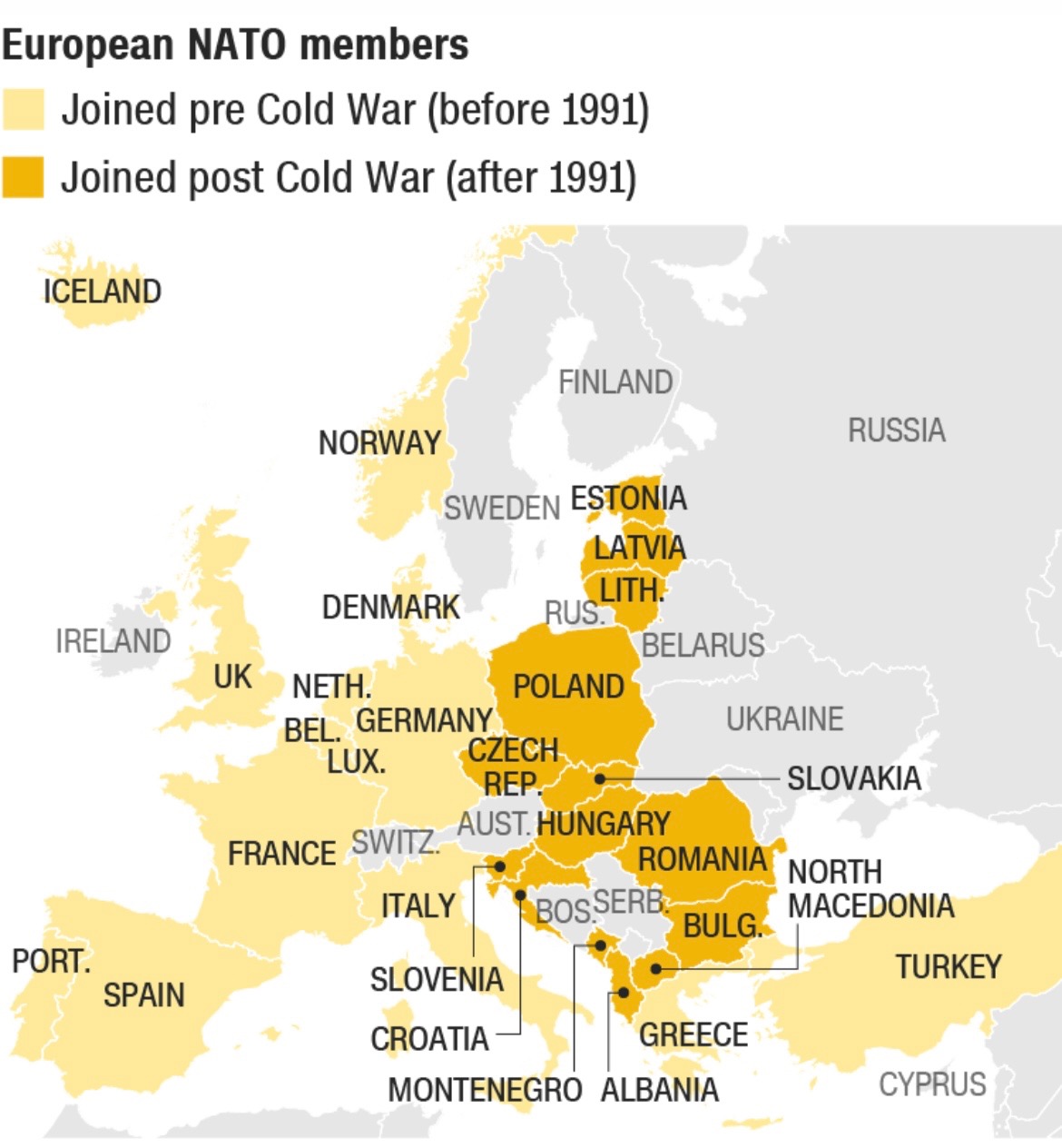
 CNN’s article includes multiple pieces of visual rhetoric that actively map Russia’s ongoing invasion of Ukraine, starting with a map of European NATO members that joined before and after the Cold War in 1991. Using two different colors to shade the appropriate countries, viewers are able to discern the time period each Eastern country joined and where they are located spatially in relation to Russia. The neighboring countries of Ukraine and Belarus, are not shaded because they are not a member of NATO, thus providing the audience with further context to this conflict. This simple map clarifies the global positioning of each country in the former Eastern bloc from the Cold War era, and introduces viewers to where the tensions developed if they did not have much background knowledge. Because this is the first map shown in CNN’s article, it serves as a historical reference that viewers can rely on to learn which countries have been in alliance with the West pre Cold War, which countries became peacekeeping allies after the Cold War and which countries have no affiliation with the West. Countries such as Russia, Belarus, Ukraine, Georgia, Sweden, Finland, Switzerland, Austria and Ireland are shown as not being members of NATO, which could lead viewers to speculate if their absence in the international peacekeeping organization is because they want to remain isolated or disagree with its purpose. A potential consequence of this rhetorical visual is that it could lead its audience to make assumptions about each countries’ stance on international politics, meaning they could falsely label Georgia as being in support of Putin’s decision to invade Ukraine. Likewise, viewers could assume Austria wants to uphold an isolationist approach to foreign policy, when perhaps it never got a bid to join NATO in the first place. Besides that critique, this map situates the international conflict well and offers historical insight that explains how NATO membership was a catalyst of this invasion. 

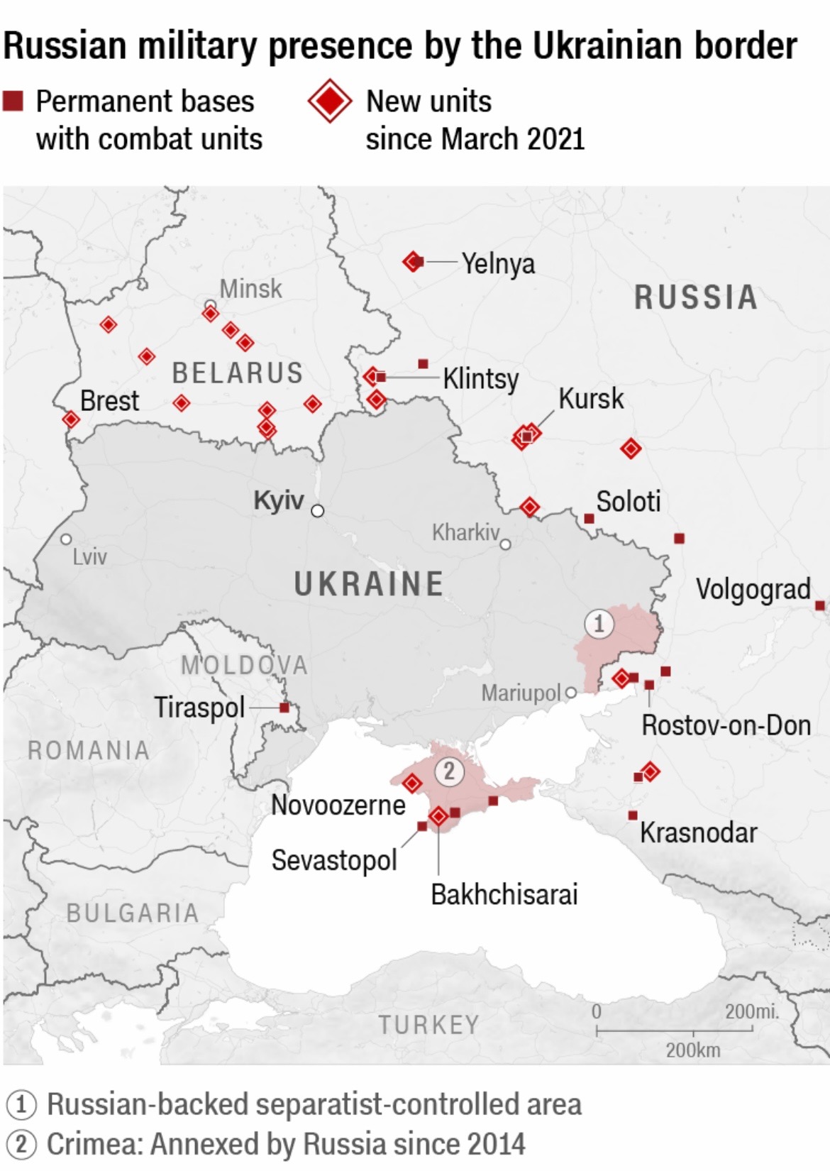
Furthermore, CNN editors created another piece of visual rhetoric to highlight the location and number of Russian military troops bordering Ukraine, dating back to March of 2021. This map is centralized around Ukraine, as a dark line is used to distinguish its border in relation to its surrounding countries. Red boxes signify the Russian military’s permanent bases with combat units, while red diamonds are used to show new units since March of 2021. Red is the sole color employed in this map, which creates a clear visual for its audience to recognize the escalation of Russia’s presence in Ukraine. This magnified projection of Ukraine works to demonstrate the severity of the conflict in Europe, particularly proving how intentional and forceful Putin’s military movement has been over the past year. One key takeaway from this map is how many new Russian units have been posted around Ukraine’s border in the last year as tensions between the two countries intensified. The CNN editors created this map to argue that Russia’s invasion did not happen overnight, but instead it was heavily calculated moves that led to the attacks.

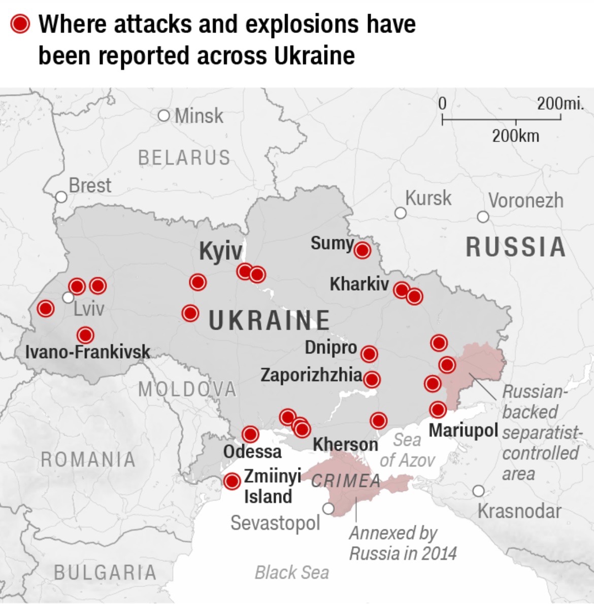
Lastly, CNN’s article offered a visual that located where the attacks and explosions were reported in the early hours of February 24, 2022. With red being the only color employed once again, red dots map where the attacks were concentrated in Ukraine. This map lists nine cities in Ukraine that endured attacks and explosions, specifically on the initial day of the Russian invasion. The editors of CNN published a visual that uses large dots and the color red to show the assault Ukraine withstood, and is continuing to face. Kyiv, which is a major city in Ukraine, is written in slightly larger font, perhaps arguing how Russia targeted a popular city to maximize destruction. However, this map could be more interactive if it offered viewers the chance to click on the location to learn about the damage done to that specific city. This map serves as an argument to show the abundance of attacks that occured in a matter of hours, asserting that Russia launched unprovoked violence on its neighboring country.
All three maps published by CNN editors argue the severity of Russia’s invasion of Ukraine, contextualizing the conflict, illustrating the inflamed tensions and highlighting the abundance of attacks. Each map takes place in a different time period, which aids viewers to understand the tension between Russia and Ukraine in its entirety. CNN’s maps work to contextualize Ukraine’s global position as being caught in the crossfires between the East and the West. Colors, font size and projection all work to support the editors’ argument, which show the audience what events led to the war in Europe. 

A popular media source like CNN has substantial influence in the U.S., which means millions of Americans rely on its reporting to develop an understanding for what is happening around the world. Because CNN published a series of maps that provided visual context regarding the conflict between Russia and Ukraine, Americans were able to gain a sense of a global geographic imagination. Therefore, these maps function to connect us to the rest of the world and allow us to visually interact with the tensions abroad that we are incapable of seeing for ourselves. While Americans may feel isolated from the current conflict in Europe, these pieces of visual rhetoric can argue how severe and unwarranted the Russian attacks have been in Ukraine. Even though some of CNN’s maps may seem rather fundamental, they function to bridge the visual engagement gap between our experiences and other experiences, often including an embedded argument with what they want us to see. 


Bibliography

Bilefsky, Dan, et al. “The Roots of the Ukraine War: How the Crisis Developed.” The New York Times, The New York Times, 10 Jan. 2022, https://www.nytimes.com/article/russia-ukraine-nato-europe.html. 

CNN, Henrik Pettersson, Eliza Mackintosh, Dakin Andone, Natalie Croker and Sarah-Grace Mankarious. ‘Six Maps Explaining the Ukraine-Russia Conflict’. CNN, https://www.cnn.com/2022/02/24/europe/ukraine-visual-explainer-maps/index.html. Accessed 4 Mar. 2022.


Posted in Maps of the Week | Comments Off on Map of the Week: The Ukrainian Conflict

Atlas of the Week: Tobacco Atlas

https://tobaccoatlas.org/

This website provides tools and information about everything that involves tobacco use and raises awareness for areas of the world that need help. There are different sections of the website (Issues, Solutions, Countries and more) that key in on particular facts and history of tobacco use and abuse. This is supplemental to my map of the week, and is cited within my curation post.

Posted in Uncategorized | Comments Off on Atlas of the Week: Tobacco Atlas

Map of the Week: Smoking Prevalence & Tobacco Advertising Policies

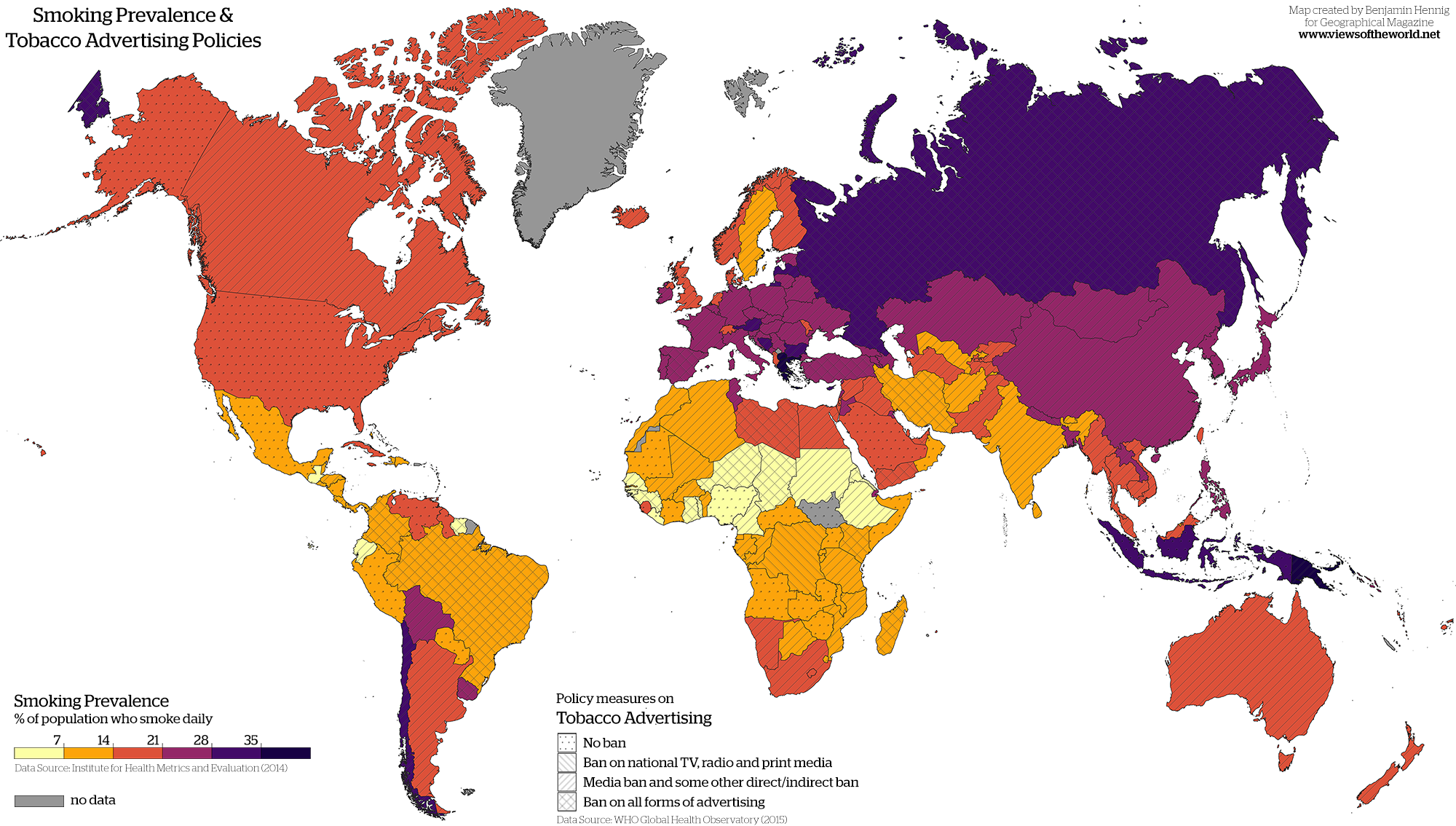
Smoking tobacco has been a major pastime in certain societies all over the world. Whether that be for financial gain or social practice or both, most if not all countries have been affected by the production of cigarettes. As research has expanded, many countries have put bans on the advertising of tobacco products. These bans range from TV, radio and print media and escalate upward. A website named “Views of the World” presents a map that illustrates both smoking prevalence and tobacco advertising policies for the entire world. This site is run by a geographer named Benjamin Hennig, and his maps “investigate social and spatial inequalities, humanity’s impact on Earth, global sustainability and the development of concepts for analyzing, visualizing and mapping these issues.” This particular map of Hennig’s makes a provocative comparison on tobacco use and tobacco advertising. Creating this view is both informative and critical because it gives us an insight into how other countries deal with tobacco advertising, and the impacts that these variables have on the popularity of tobacco in the world.
When initially looking at this map, it is easy to see that most countries have some sort of ban on tobacco advertising. For the United States, there is no ban whatsoever on any advertising. This is interesting because they are also not near the high percentage of smoking prevalence compared to other countries. The author might be implying that the US has a strong health communication system and that citizens had been made properly aware that the use of tobacco and smoking cigarettes is not healthy. It would seem likely that with this scientific information and study that the United States would put some sort of ban in place, but they do not, which is likely due to the fact that it is a key part of the nation’s economy. Without these products in circulation, the United States would lose a lot of money and global power.
On the other hand, the highest percentages of smoking prevalence seem to be in Europe and parts of Asia, where there are a lot of strict bans on advertising. Russia, which traverses Europe and Asia, is a compelling example where there is a complete ban on advertising, but the rates of smoking tobacco are extremely high. This particular fact is not highlighted or exaggerated in the map, which keeps the continuity of the entire illustration. Asia is one of the leading growers of tobacco , which might be an explanation for the high use. However, this particular map does not show when these bans were put in place, but they might have been a result of the high percentage of smokers. Hennig might have used this as a tactic to persuade map audiences that advertising might not have an effect on the percentage of the population that smokes. Creating this structure in the map might have also crowded the map and potentially loses the main argument. If these details were put in, the map might not be as interesting because it could provide a possible argument.
In the continent of Africa, there is varying information. There are several countries that have low numbers in this area, which might act as a counter argument to the United States. With this data, Hennig might be showing that it does not matter what bans you have on advertising, and that countries with more access to these drugs will have higher percentages. South Sudan does not have any data reported for their smoking prevalence, which is intriguing because according to The Tobacco Atlas, “more than 6000 children (10-14) years old and 533000 adults (15+ years old) continue to use tobacco each day.” Either Hennig did not research this area heavily enough or he purposely left it out to disregard the problem that is ongoing in South Sudan. Leaving out critical information about a country that has an obvious problem with tobacco is vital when analyzing this map.
This map provides very important information about the current state of the world regarding tobacco use and advertisement. Rhetorically speaking this map could tweak some things to provide a more inclusive picture, and talk about certain facts pertaining to countries with particular problems . These “silences” speak volumes for certain countries, where there needs to be changes and reforms. While some countries have no bans in place for advertising tobacco products, there are several warnings on packages that strongly don’t suggest the use of them. For others, it gives us an insight to the inner workings of governments such as the United States, and their lackluster regulation of this drug due to its importance in the economy. I believe this map and organization provided the audience with clear and concise data, like most maps do. These comparisons help us spatialize activities like tobacco use for us to appreciate the comparisons.

Works Cited:

Hennig, B., 2019. Smoke and mirrors: Smoking Prevalence and Tobacco Advertising Policies. [online] Views of the World. Available at: <https://www.viewsoftheworld.net/?p=5721> [Accessed 9 March 2022].

Hennig, B., n.d. About m. [online] Views of the World. Available at: <https://www.viewsoftheworld.net/?page_id=631> [Accessed 9 March 2022].

Shahbandeh, M., 2022. World tobacco production by country | Statista. [online] Statista. Available at: <https://www.statista.com/statistics/261173/leading-countries-in-tobacco-production/> [Accessed 9 March 2022].

Tobacco Atlas. 2022. South Sudan – Tobacco Atlas. [online] Available at: <https://tobaccoatlas.org/country/south-sudan/> [Accessed 9 March 2022].

Posted in Maps of the Week | 2 Comments

Link of the Week: Bloomberg MapLab

https://www.bloomberg.com/citylab/maplab

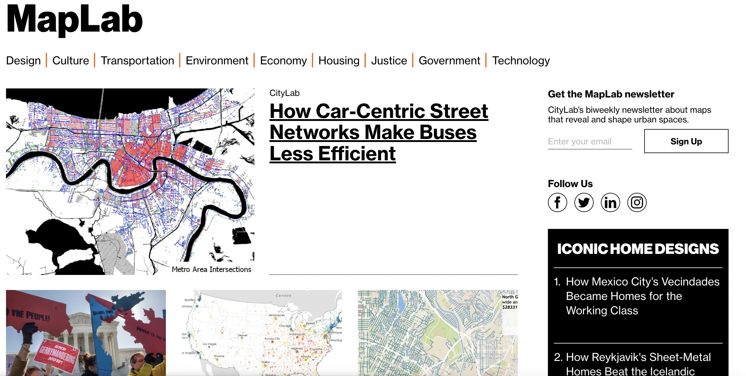
For the Blog of the Week, I decided to highlight Bloomberg CityLab’s site. According to the website, the Bloomberg CityLab “focuses on the problems that cities face, focusing on Transportation, Environment, Justice, Culture, Design, and Housing.” Through their MapLab tab, the site collects and displays a wide variety of maps, and users can sign up to receive their biweekly newspaper. They have built a community of mapmakers and subscribers that discuss and analyze issues in cities throughout the United States through cartography and mapping.

Posted in Uncategorized | Comments Off on Link of the Week: Bloomberg MapLab

Atlas of the Week: Prison Map

http://prisonmap.com/ 

http://prisonmap.com/about

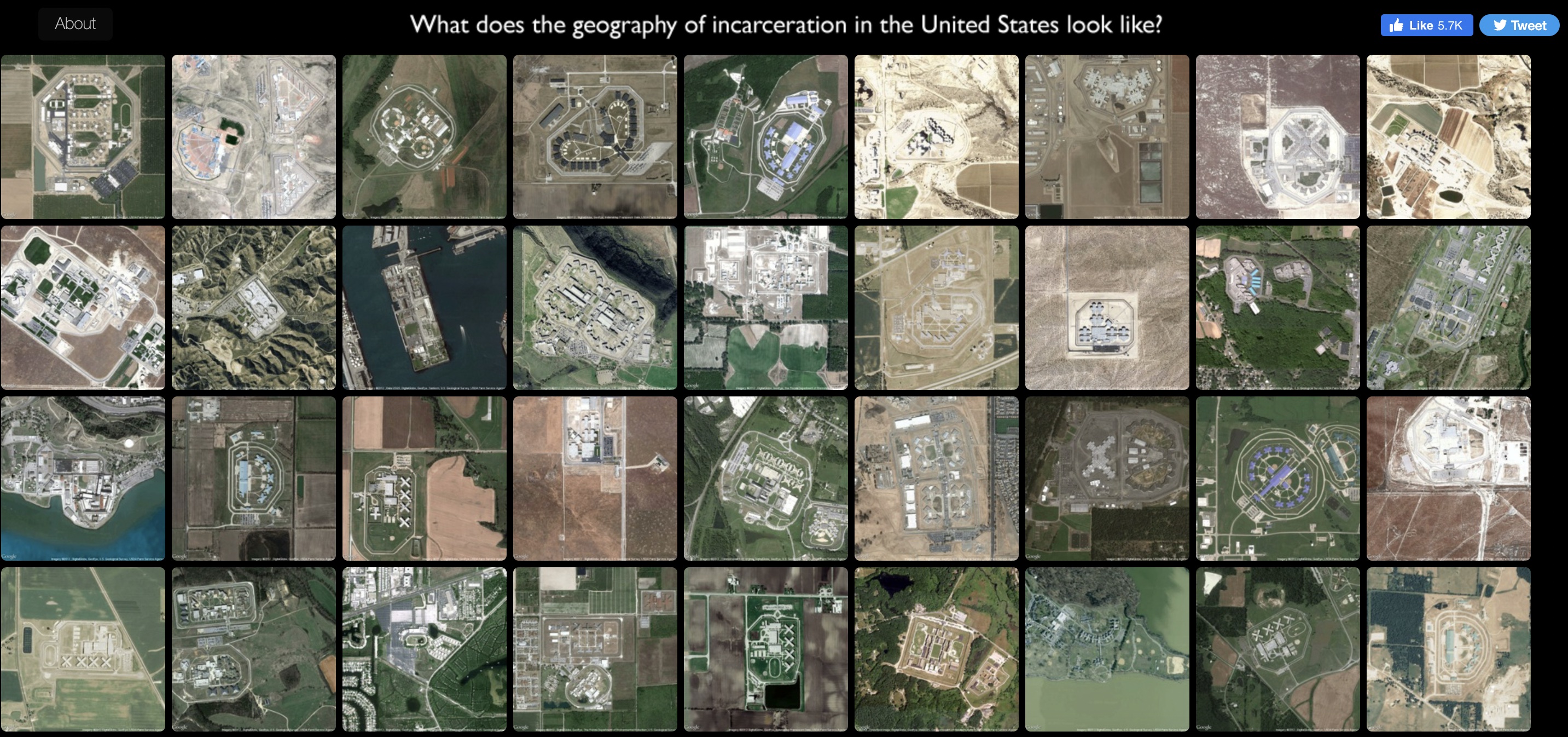
Prison Map, by Josh Begley, a student at NYU studying Interactive Telecommunications, created a collection of satellite images of prisons throughout the United States. Through his collection of photographs, Begley aims to answer the question, “what does the geography of incarceration look like in the United States?” Begley has created an atlas of satellite images that map out several prisons across the United States, looking beyond statistics and focusing more clearly on space and design. Begley uses these images to compare and contrast the architecture of prisons, showing viewers the true scale of incarceration in the United States. 

Posted in Atlases of the Week | Comments Off on Atlas of the Week: Prison Map

Map of the Week: Baltimore City Crime Map

https://arcgisportal.baltimorepolice.org/publiccrimemap/

Baltimore City was ranked number four for “the most dangerous cities in America” by CBS News in 2019, based on FBI data from the Uniform Crime Reporting Program. Growing up in Baltimore myself, I was privileged to not have had to experience this facet of Baltimore. Over the past few years, Baltimore City has become one of the most dangerous cities in the U.S., a title that breaks my heart and leaves Baltimoreans questioning the systems in place in our city and the leadership that has clearly failed our communities. 

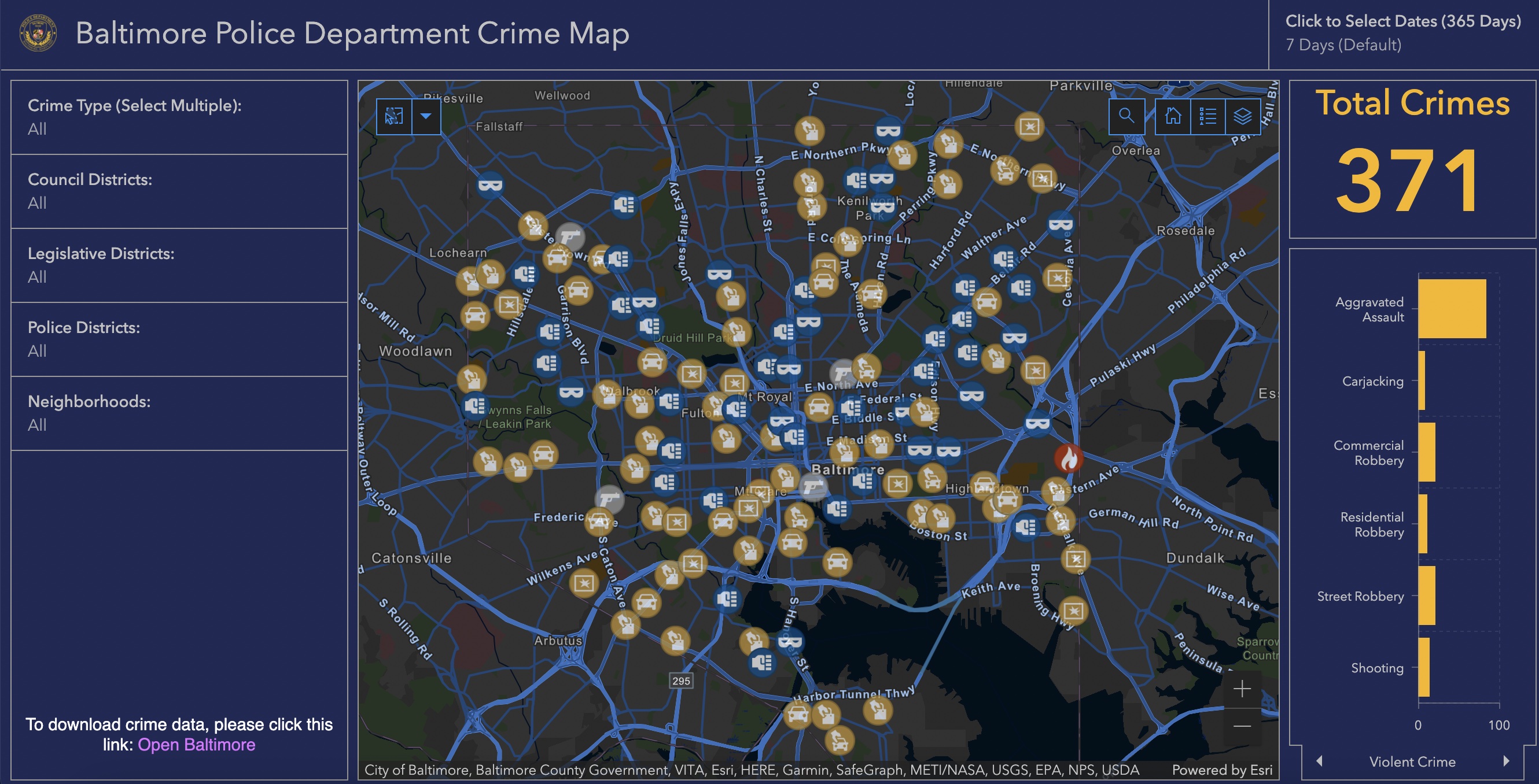
The map I chose to focus on for our “Mappenstance” blog project is the “Baltimore Police Department Crime Map” provided by both the City of Baltimore and the Baltimore City Police Department. The Baltimore Police Department has put together a crime map that provides an interactive way to pinpoint and learn about the violence that has consumed the city in the past few years. The Police Department utilized data based on the General Offense Reports which they obtained from the Baltimore Police Department’s Records Management System. 

The interactive crime map houses data from the past 365 days and is updated each morning therefore, the data shown on the map is extremely accurate and up to date. Additionally, the map allows you to filter all crimes from the past 365 days, the past 28 days, or the past 7 days. The map also has a calendar that allows you to select specific days or weeks that you want to isolate and see the crimes that happened over a specific period. The map also highlights many different crimes, both violent crimes, and property crimes, counting the number of homicides, shootings, robberies, assaults, arson reports, larceny, and auto theft. If you choose to click on a crime on the map you will see the type of crime that was recorded, the location of the crime, the time and date it happened, the neighborhood, the police department that recorded it, and both the council and legislative district the area is associated within Baltimore. These specific settings on this map allow users to see where exactly these crimes took place and also highlight where the crimes are not taking place as often. 

While this map clearly shows the immense amount of crime taking place in Baltimore City, I argue we have to think more deeply about why the Baltimore Police Department created this map and how this map aids their work. The map can quickly pinpoint high crime areas in Baltimore where repeated crimes are happening or violence is extremely higher than in other areas. In J.B. Harley’s Deconstructing the Map, the author discusses how maps can legitimize and express power. Mapping crime in this way allows the police to be more aware of the crime and to know where they need to have a larger presence in certain areas, pushing for more police power in neighborhoods. If we were to think about Denis Wood’s argument and the importance of thinking about the intention behind the use of this map, I think many would argue the police can use this as a tracking, policing, and powerful device. However, it is portrayed more as a useful tool to build an informed community at first glance. In Imagined Communities by Benedict Anderson, he discusses how mapping has become more political as many maps are now used for surveillance and surveying the population on the area the map focuses on. Throughout the U.S., many police departments have adopted the use of crime mapping. Crime maps are easy to interpret, making it even easier for police departments and other power groups to use these maps to surveil and observe individual people and neighborhoods. Additionally, Benedict Anderson discusses how maps are not abstract and they create real boundaries that have even more realistic consequences. This map has created a boundary that specifically focuses on Baltimore City, highlighting crime hot spots and the few areas where crime is significantly less. This map works to prove why Baltimore has been listed as one of the most dangerous cities in the U.S., making that claim even more realistic when basing it on the data.

Benedict Anderson also focuses his analysis on the connection between censuses and maps and how maps clearly identify why some groups are being tracked or let into the “census” and others are not. In this case, the higher crime in Baltimore City tends to be isolated in areas in the city where there are more minority communities, less access to adequate and safe schooling, and lower-income areas. However, none of this information would be identified directly on this map, so this perspective is only obtained through further research and examination into the areas highlighted. The map specifically chooses to highlight these vulnerable areas and the police department labels them as “high crime areas.” If you were to zoom into North Baltimore City between Falls Road and Charles Street on this map, there are almost no serious crimes being committed other than the occasional theft incident. Being from Baltimore, I know that this area is a predominantly white middle and upper-class neighborhood called Roland Park, bordered by two other wealthy and predominantly white neighborhoods, Guilford and Homeland. This is one of the only areas in Baltimore City where this map has little to no serious crimes taking place, begging us to identify the privilege of safety and how that ties into the predominant whiteness and wealth in this area. While this map focuses on high crime rates, it pushes viewers to question the safety, crime prevention tactics, and protection of neighborhoods that are clearly lacking. 

The Baltimore City Crime Map shows how maps are productively reductive while also being problematic as this map lacks the context needed to fully understand the larger issues at hand. The map clearly shows the spatiality of crime in Baltimore and by simply glancing at the map, a viewer would easily be able to tell crime is an issue in this city, however, it leaves out a large part of the conversation. While these may not be considered silences on a map that clearly focuses on crime, if contextual information was shared more explicitly, this map would take on a new meaning of questioning systems of power, identifying places of violence caused by unrest and inequality, and could be a push for new policies and structures to empower these communities to rise above the violence and crime that has consumed them.

Works Cited 

Anderson, Benedict. “Imagined Communities: Reflections On the Origin and Spread of      Nationalism,” (1983), 1-185.

Fieldstadt, Elisha. “The Most Dangerous Cities in America, Ranked.” CBS News. CBS  Interactive, November 9, 2020. https://www.cbsnews.com/pictures/the-most-dangerous-cities-in-america/.

Harley, J.B. “Deconstructing the Map,” (1989), 1-19.

Public Crime Map. City of Baltimore, https://arcgisportal.baltimorepolice.org/publiccrimemap/. 

Wood, Denis. “The Power of Maps,” (1992), 4-27.

Posted in Maps of the Week | 4 Comments